As a design studio, we appreciate puns almost as much as we appreciate cute, furry, aquatic creatures. Which made us the ideal designers to handle Otterter’s (pronounced Aud-it-ter) logo. Full disclosure, one of our t-shirt designs actually inspired the founders in their naming process for the company. It’s a service that helps businesses with management and auditing media for their organizations – clever, huh?

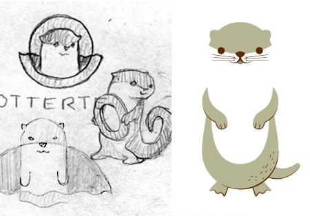
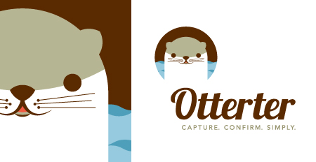
The Otterter logo and mascot had to, of course, be an otter, but figuring out how it would look was no easy feat. We took multiple approaches, from detailed and playful, to simple and geometric. The final design landed right in the middle of the two. We took our geometric concept and gave it some character, adding whiskers, waves, and of course a big smile. We paired that with a modified, lively script. In order to pull the otter away from the lockup, we took an extra step and built a full body off of our initial illustration of the face. Two webbed feet and one plump belly later, an Otterter was born!
