Art Direction

Get Your Bath On

Family owned and operated for over 50 years, the Murray Design showroom showcases a variety of bath and kitchen appliances from top industry brands. The Murray Design marketing team felt the previous identity and branding were no longer representative of the products they offer. Furthermore, they were concerned the branding didn’t connect with their changing demographic.
MurrayDesignLogo
Alphabet Arm set out to create a clean, sleek identity to reflect the beauty of Murray Design’s product collection and honor their talented team of designers. Drawing inspiration from the curvature of the many fixtures and appliances found in the showroom, we rendered a mark that embodies both a faucet and an M that embraces a sophisticatedly, minimal aesthetic. For the color system, we utilized a calming blue and a metallic silver, naturally representing both water and the reflective finish found on many of Murray’s products.
MurrayDesignBCards
Previous logo before Alphabet Arm got our hands on it:
MurrayDesignLogoBefore

An Artistic Ecosystem Aesthetic

Alphabet Arm recently finished a branding project for a new home-grown arts organization.
 
AlterProjectsLogo
 
Alter Projects is dedicated to fostering social innovation with and for the arts. Built on the core ideology that a healthy arts ecosystem has a direct effect on the social, cultural and economic viability of our community, they design custom experiences with contemporary art and artists. Ensuring their clients with a new era of access, appreciation and support for the arts in Greater Boston and beyond.
AlterProjectsBCardsBLOG
Expressing connection and customization in a static mark is an exciting challenge. The very literal name of the organization led the process in the creative direction; an alteration of letterforms. By leveraging the Gotham typeface, and it’s inheirant geometric qualities, it streamlined the dissection of its form. We painstakingly segmented the typeface in order to show its structure in an architectural way, alluding to the tailored and connected nature of Alter’s community. The logo can be used simply as a one color, in a multi-colored form (preferred) or in a dynamic state with integrated photography revealing the many faceted sides of the organization.
AlterProjectsMasks

If you see Harold, simply say "Hey".

Alphabet Arm was tasked with developing an identity for an original web series featuring the legendary Judge and Analyst, Harold Lederman. Harold joined HBO World Championship Boxing broadcasts in 1986, and now has his own series discussing the sweet science and fight match-ups. Harold often refers to classic bouts when analyzing boxers and breaking down boxing styles. We were well aware of his great reverence for the rich history of the sport and used that as inspiration for the series logo. Like a left hook to the chin, it’s to the straight to the point and makes an impact.
 
HeyHaroldLogo
 
Need to get schooled in the art of boxing? Check out Hey Harold! This World Boxing Hall of Fame member knows!
 
HeyHaroldImages

get up and glo…

glomagLogos
Glomag is the name, funky fashion is the game. Gloria Magale recently took her fun, personal, fashion project to a new level with an official brand: Glomag. Alphabet Arm worked with Gloria to refine the company name, and create a unique, cost effective, branding system. We developed hang tags, rubber stamps, apparel hem tags and a beefy set of 34pt. business cards which feature edge painting.
 
glomagBCards01
 
When tasked with creating a mark that captured the edgy nature of Gloria’s clothing, we pulled inspiration from the clothes themselves. After a review of the line, we picked up on the common use of oversized flowers which felt like a bold differentiator to our eyes. We embraced the vibrance and overall shape of the flower when creating the logo, and developing the Glomag color palate. The type treatment was inspired by graffiti and black letter letterforms. The sum of the parts harmoniously create a beautiful, feminine, and edgy brand system.
Here are a few of our favorite additional Glomag logo treatments that didn’t not make the final cut:
 
glomagAltLogos
 
glomagBCards02
 

Official Release : Day 5

CompositeABC-Day05Bloggery
It’s official, the new website countdown has begun! We know it can be difficult to wait, but there are just five days left. Stay tuned for the launch next Monday!
– Team Alphabet Arm

Official Release : Day 4

CompositeABC-Day04Bloggery
 
It’s official, the new website countdown continues! We know it can be difficult to wait, but there are just four days left. Stay tuned for the launch next Monday!
– Team Alphabet Arm

Official Release : Day 3

CompositeABC-No03Bloggery
 
The fully official, officially licensed, completely official countdown continues for the launch of our new website! We appreciate your continued patience and enthusiasm, now just three days left. Stay tuned for the launch next Monday!
– Team Alphabet Arm

Official Release : Day 2

CompositeABC-No02
 
The weekend has come, but that does not stop our countdown, just two days left before our new website goes live. Stay tuned for the launch on Monday!
– Team Alphabet Arm

Official Release : Day 1

CompositeABC-No01bloggery
 
Sundays are magical for a number of reasons… sleeping in, glorious brunches, professional football tournaments, and of of course, just one day before the new and improved www.alphabetarm.com is released into the wild.
– Team Alphabet Arm

Alphabet Animal Farm, Part 01

Friends of The Bloggery, we hope this post finds you well. We are kicking off a series of recent logo projects that feature animals. Whether they are simple and iconic, or stylized brand mascots, an animal can often function as an ideal visual for a brand or service.
ScoutLogo-BloggeryThe Scout Tint Meter is an innovative, handheld, new tint reading device developed by a State Trooper.
Alphabet Arm was hired to conduct a Naming Exercise and create the initial step of the brand voice. We typically begin the process of name development by defining the audience the brand must speak to. We take a broad look at the competing brands (if they exist) and we define the characteristics and key brand attributes. Then we brainstorm, create word lists, free associations, brainstorm, mind map, and brainstorm some more. Generally, the sessions generate a furious list of hundreds of names. We dissect them, deconstruct and recombine. A significant part of the vetting process is rooted in online research to ensure none of the proposed names are being used verbatim. Ultimately, we look for simple answers to complex ideas.
In the case of Scout, avoiding the commonly used technical naming strategy (most often initial and number combinations) and utilizing a familiar pet name was the ideal solution. To offset the product name, we introduced a concrete, descriptive tagline. Pairing the new name with a focused, trustworthy, shepard illustration has already set Scout apart from the pack and reinforces their primary demographic of law enforcement professionals who will be using this device.
ScoutLogo1Color-Bloggery
Due to the nature of the mediums that will be branded (molded plastic tint meter shell, carrying case, operating instructions, etc.) the Scout logo system utilizes a number of lock-up options and a simple atomized version of the mark.
ScoutLogoVerticals-Bloggery

Alphabet Animal Farm, Part 02

Vista Clothing Company is among the new breed of conscious-minded  apparel companies that have a charitable giving commitment integrated within their business model.
Drawing influence from classic and iconic brands like Izod and Penguin, the Vista bird mascot will carry the lions share (no pun intended) of the branding responsibility. At it’s root, it is a simple and graphic form that is easily removed from the typographic lock-up. It features a subtle V form across it’s chest – honoring the company name. VistaLogo-Bloggery
The flexibility of the simple mark, not only allows the color palette to constantly evolve, but will make embroidery and skill-screening both cost effective and very clean.
 
VistaLogoColorways-Bloggery
 
VistaLogoReversed-Bloggery

This report, just in…

Branding identity
It is the duty of the court reporter to record spoken word in the form of written language. This documentation process is invaluable in a courtroom setting, as well as for live captioning for broadcast television. Reporting companies – more often than not – bare rather lackluster branding, but Jones & Fuller Reporting decided that it was time for Alphabet Arm to give them a new look to stand out from the pack. The process began with a conversation regarding the company name itself.
J&Fbloggery
In order to depict the note-taking nature of Jones & Fuller’s business, it was important that the mark featured both the appearance of a “verbal” graphic element to imply speech as well as an element based in writing. By dividing the form of a speech bubble in two and making one half representative of a transcript, we create an opportunity to visually explain the responsibilities of court reporting itself. Once the logo re-brand was complete, Alphabet Arm developed the system of office materials and marketing collateral.

Branding identity

Branding identity

Branding identity
Logotype + naming prior to Alphabet Arm’s re-branding:
J&Fpriorlogotype

…Over Troubled Water

bridj-blogBetter transit. For everyone. We can definitely get behind the tagline of our newest client, Bridj. In their words, “Bridj is the world’s first smart transit system which uses big data and awesome shuttles (WiFi!) to adjust to your individual commuting needs.” Our primary intent, when starting the design process for the Bridj logo, was to create a mark that read cleanly and distinctly at both very small sizes (on a smart phone) and very large sizes (on the side of a bus). We feel the logo achieves this legibility with a bold sensibility and clean lines that suggest a sense of classic modernity. Not to suggest that the design was easy, but the final mark looks remarkably like the very first sketch we did. Throughout the entire process, this mark seemed to lead the pack and just simply felt “right.”
Keep an eye out for Bridj, they are poised to do some really exciting things in the near future. The app is nearly ready for release and we’re currently in talks to design bus wraps, signage, off systems and more.

Geometrically Speaking

Another notch in the logo belt… presenting the new mark and business card we designed for Curl Simitis Architecture + Design. From their website: “With a deep appreciation for New England’s long tradition of craftsmanship and a love of contemporary design, Curl Simitis Architecture + Design’s work is unapologetically eclectic.” This brand identity was a great chance to revisit our roots of strong geometric design principals. The underlying grid structure is composed of 4 modular squares. At first glance the rectangular forms are a beautifully balanced abstract design. However, upon further investigation, the rectangular shapes reveal the negative spaces of the initials of C and S.

Old School Baking

The Ancient Bakers is a specialty baking company that focuses on ancient grains and medicinal plants as ingedients for cakes, cookies, muffins, breads, brownies and even bagels. The company enlisted Alphabet Arm to embark on a logo design project. Our creative process started with the name. Initially the company was called Vision’s Sown, an Ancient Baking Company. We suggested pairing the lengthy name down to its essence: The Ancient Bakers.
Original name and logo:


Creating a logo for The Ancient Bakers meant exploring type and imagery that expressed the tradition, sustainability and pureness of ancient baking practices. The stalk of wheat has remained the heart of natural baking techniques since the dawn of time. This — along with the addition of a nutrient-rich rose hip and a traditional serif typeface — tells The Ancient Bakers’ story: that the best, most wholesome ingredients will always withstand the test of time.
New name and logo:


knock knock, collateral knocking

There are few things we enjoy more than building a visual language inspired by one of our logos. Creating a cohesive branding system can be challenging endeavor, fortunately for the studio, we develop long-standing relationships with our clients. Which in turn, allows a great deal of trust and open discussions that enable us to extend their brand assets across a variety of mediums. Thus is the case with the innovative childproofing company, Rhoost.

This whimsical brochure and postcard set is our take on the typical – and somewhat uninspiring – trade show materials normally distributed.

The modular, oversized postcard system allows Rhoost to update the set whenever they add a new product. Now, play safe you kids!


M to the C


We recently had the dubious honor of working with long-time-friend-of-the-studio, Maggie Cavallo. Maggie is a proud bay state based curator who needed a bit of personal branding for her various endeavors. Maggie’s exhibitions are typically performance based and focus on elevating underground / alternative subject matter to a fine art atmosphere. When it came to designing her logo, we wanted to create a logo that had a refined feel with a definite edge. The custom “M” and “C” letterforms framed by a system of bars offer a decidedly alternative feel, and might relate to yet another one of her creative passions (stay tuned here for more regarding that). The black and white color scheme and Futura Condensed Bold elevate the logo for a gallery setting.

 
When it came to designing her business cards, we thought long and hard about incorporating a tertiary color. In the end, we decided that the strong contrast of the black and white had an elegance and punch that was appropriate for the fine art world. Word up.

Down the Hatch!


Our pals and collaborators at G2 Technology Group asked us to design a logo for their annual NOCtober Fest event. They were quick to educate us that NOC was an acronymn for Network Operations Center, used commonly among technology professionals. NOC + everybody’s favorite beer-centric german holiday = a bunch of tipsy geeks technology professionals (it sounds like a party to us). We started by designing a custom typeface based on german blackletter type for the word NOCtober. Legibility was a key factor, since the title is not an actual word and could be difficult to read. Our sketches lead us to experiment with combining elements from both traditional beer steins and computer circuitry to create a unique emblem. Can’t wait to see how this looks emblazoned onto a pint glass full of IPA.

Get Some Shut Eye


Recently launched by Rest Devices, Peeko is an awesome new product for the parents of infants. We were excited to design the logo, packaging and branding, which was just unveiled and this year’s ABC Kids Expo. Peeko monitors a baby’s respiration, room temperature, and body positioning by wearing a cotton bodysuit. The device transmits the information to the cloud so that it is available to your smartphone or tablet from anywhere in the world. Our goal was to create a brand that was warm and approachable to new parents, while still feeling modern and technology based. We felt it was crucial to retain the simplicity and sophistication of our iconic character in order to help it stand apart from the vast sea of cute and cuddly mascots used in the baby product industry. In other words, our aim was to create plenty of personality, whimsy and adorable-ness without entering the forbidden territory of fuzzy ducks and pastel bunnies.

Weighing in on the ‘Grams

Marketing your service, product or business has changed forever. It is remarkable how differently (and successfully) savvy companies use social media to promote their brand. The power of platforms like Instagram to use imagery and video content to create awareness and engage with new consumers is by far my preferred medium.
Its always inspiring to see companies I brand pop up in my feed, here are a select few doing it right:

Gracenote
Altatude Beverage Company
Eatable Popcorn
Perfect Fuel
Porto
Rider
Copilot
Loco Coffee
Rhoost

P.S. you can always find me at @alphabetarm

Set. Brand. Love.

One of my first design initiatives when joining the creative leadership team at New Balance was to update the antiquated and counterintuitive (in my humble opinion) logotype that was being used for one of the brand’s biggest and most successful collections; Fresh Foam. Check this IG post for more.

The hexagon form itself is a key visual for the technology of the collection, so I opted to build a logotype utilizing the hex to define the character terminals (see process image). The final result is a distinctive, bold – if not somewhat subtle – logotype that features a great deal of flexibly. Due to the fact the logotype is used on product, as well as our print, digital, in-store marketing efforts, it was important to have a variety of lock-up options within the branding family. For context, note the before and after.

This branding system is featured on the new Fresh Foam Lav men’s tennis shoe.

We teamed up with professional tennis player Milos Raonic to develop this dynamic model. It features a Fresh Foam cushioned midsole, external heel counter and Kinetic Stitch to ensure lockdown stability.

Like the Fresh Foam visual identity, Kinetic Stitch is another example of a custom logotype created for New Balance. Kinetic Stitch is an upper technology that helps athletes lock in their feet during lateral cuts on court.

BAD LOGO, BAD! (Part 1.)

Over my 20+ years of creating visual identities, logos and branding systems, I’ve always taken the “high road” when it comes to being overly critical of fellow creatives. That said, within this new blog series, I intend to shine a light and call out identities that are poorly constructed, feature crap typography, do not seem to leverage any kind of conceptual thinking, and are just bad science.

Today, I saw a commercial for the branded wearable company, 4 Imprint. There is a lot to unpack here, not just that they are in the business of promoting brands primarily through a company logo, and this is what 4 Imprint comes to the table with?
No bueno.
Typographically, it appears like they have taken the antiquated typeface and further squashed the “imprint” type to be condensed (see distorted dots over i’s). Apparently, they determined the number 4 didn’t deserve the same punishment. Then, time traveled back to 1957 and borrowed the – 100% stylistically different – Newport Cigarette swoosh. Unlike the oval shaped dotted i’s, they opted to include a perfect circle to be a… dot or some sort representing some high ideal? An oversized period sitting above the baseline? A point to the exclamation swoosh? Dunnoh, but it saddens me.


Run London Run

In the early stages of my design career (prior to being computer literate) I would draw + re-draw letterforms, photocopy type as small as possible (only to blow it back up), crumple paper, sponge water, tear + tape, use blender pens, etc. to replicate worn typography and illustrations I would find in archival books and vintage signage. In my own low-fi way, I was trying to age branding elements in the most honored and authentic way I could. Given that, it is pretty sweet when you can go back to your design roots and kick out a type treatment that feels just as relevant and appropriate now. Honoring the New Balance relationship with the London Marathon, we created a special branded RUN LDN pack, blimey!


Music Matters

If I can lament for a moment, back in the early days of the design studio (2002 – 2007 gulp), the primary workload was creating visual identities (logos) for bands, music management companies, record labels and radio stations. Beyond that, we would art direct a lot of albums, up to 75 CDs (see Compact Disc) a year. For designer – and recovering musician – this was very coveted work. A lot if designers were interested in working at Alphabet Arm specifically because of our reputation as specializing in “music-based-design”.
As the music industry struggled to embrace a new digital medium, new modes of listening, and changing consumer trends, many record labels were forced to close. As a studio, we had to make some hard decisions and shift our business model. That said, I still have opportunities to design and art direct albums. Here are a couple recent covers.
I will will share some process work, package photos and design details on another post, but thought it might be fun to share the cross section of cover treatments sooner than later.

no moles were harmed…

ABC_moleskin_Bloggery
This just in, new Alphabet Arm branded Moleskine notebooks! And just who doesn’t need a rockin’ pocket notebook handy at all times? Whether you are taking field notes, sketching future facial hair options or scrawling a shopping list, this little fella will ensure you look crazy stylish doing it. This 3.5″ x 5.5″ features graph paper pages and a sweet laser-cut Alphabet Arm logo on it’s cover. Nab one here.
As a added incentive, any t-shirt or baseball hat purchases in the month of August will earn you a free Moleskine, how-you-like-them-apples? Get to it > http://alphabetarm.bigcartel.com

A Few Thoughts Regarding Logo Life Span.


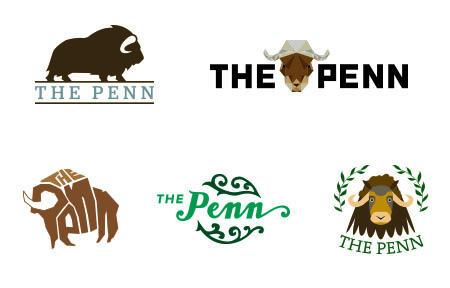
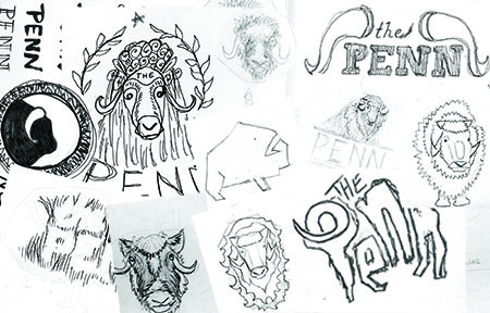
How long should a logo last? It’s a question most business owners, universities, corporations and entities wrestle with. The answer justifies the time, effort and cost of developing a logo that should stand the test of time. Consider that the iconic Coca-Cola logotype script was developed in 1941, the fact that Paul Rand’s restrained television network identity for ABC from 1962 still rings true, and the legendary Saul Bass designed the original Lawry’s brand mark in 1959. Of course these may be extreme instances, but its safe to say the companies “got their money’s worth”. Most agencies, art directors and designers attest: a well considered, thoughtfully executed logo should last 10 to 15 years. As a studio, we can only hope to have an identity stand as long as some of our design heroes.
As we were writing this post, we decided it might be more powerful to ask a couple clients to share their thoughts on their logo:
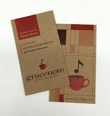
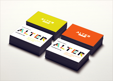
Almost as soon as Fenway Recordings had a name, it had a logo. Neither decision was complicated. The logo is, and will remain timeless, looks great any size, and recently had a bit of a renaissance as we just celebrated the 10th anniversary of it’s creation. Alphabet Arm knew how to make our identity graphic and iconic, and as far as I am concerned, it will last forever, and may be the most reasonable investment that we have made.
Mark Kates / Fenway Recordings

We never seem to tire looking at the Harlem Vintage logo, even after the eight years of our wine store’s existence. It was important for us to have a graphic representation reminiscent of the renaissance in Harlem juxtaposed with “newness” of the wine experience we were creating in this neighborhood. Alphabet Arm exercised patience and perseverance in creating just that perfect balance to convey who we were…even as we were trying to figure it out ourselves.
Jai Jai Greenfield / Harlem Vintage

Ten years ago I had a meeting with the team at Alphabet Arm and proposed the name and concept behind BzzAgent, which was a task in and of itself . No one had a clue what Word-of-Mouth was at the time, and what it would become. Before I knew it, a brilliantly simple solution was proposed and we quickly had the logo that still stands and represents our social marketing company perfectly. A lot has been made of the “angry bee” which we have embraced and used as a talking point about the logo, “he’s not angry you see, he’s determined.” The logo has been the visual cornerstone of our marketing strategy. It’s been imprinted on hundreds of thousands of our BzzGuides, carved into a conference table and its likeness cast in 3D sculptures. The logo and branding remains front and center, even after our acquiring by Tesco.
Dave Balter / BzzAgent, Inc.

T-Shirt of Champions


Just in time for the upcoming Summer Olympics, the graphic tees we designed for team Saucony’s Wallace Spearmon Collection have been released. Saucony asked us to propose several apparel designs for the decorated 200M sprinter. Most of the Alphabet Arm crew are avid sports fans, so we jumped at the chance to design pieces that would represent the style of a 2008 and 2012 Olympian. We created an emblem that encompassed the qualities of a world class athlete: speed, precision and symmetry. We then did some distressed the crest to give a the feel of  diehard training and exhaustive preparation. In the end, we’re very happy with the colorways Saucony finalized for the line. Hopefully we’ll see some dedicated fans rocking these shirts in their support of Spearmon in London. Good luck, WS.

Go BiG or Go Home

We recently had the privilege of branding Black is Global, an organization dedicated to a worldwide cultural connection. The founder has big plans on how to build awareness for charitable organizations and businesses that draw all black people together through their roots.

The logo we developed speaks to a shared identity. Although all people are unique, everyone of African descent can identify by embracing their history. Within the process, we were definitely not afraid of getting our hands messy, making good old fashioned handprints with speedball ink. After a bit of scrubbing and rinsing, we pieced the elements together digitally to build the final icon and paired it with a contrasting type solution.

Watch out for splinters


That’s right folks, our latest self-promo postcards are printed on actual wood veneer. The fine people at cardsofwood.com have carved themselves into a unique spot of specialty printing — focusing on printing 4 colors on wood. What better way to show off our love for scratched-up, well worn, rustic typography? Each card has its own unique wood grain pattern. If you happen to have the perfect design project that might involve printing directly on wood, we should talk.

Road to Recovery

Over the past few months, we have had the privilege of working with the team at New Road Fitness. Their newly founded fitness enterprise is not your average gym. By forming partnerships with health facilities around the country, they are able to provide specialized fitness regiments for individuals with unique health constraints.

When developing concepts for their logo, we wanted to create a visual language that emphasized the close association that New Road Fitness shares with the medical community. By combining a traditional medical icon and an imagery of a crossroad, we identify the gym as a place where people can turn a corner and make choices to better their health. The asymmetric typography offsets the strict symmetry of the icon, giving it a unique and modern sensibility. We are currently working on floor graphics, exterior signage, office systems, marketing materials, wayfinding, consulting on interior design elements and designing all internal signage. Stay tuned for a full portfolio unveiling, but for now, grab a towel and start stretchin’.

Nice as Ice


Being a studio that prides itself on having a wide array of design experience, we can now cross Design Graphics for a Curling Rink off the list! That is correct, one of our longtime clients and colleagues, G2 Technology Group, employed Alphabet Arm to design their very own, private, super exclusive, curling and hockey rink. Utilizing a number of design elements from their visual language and embellishing upon that for the rink, we developed a system that would make the 1924 Winter Olympics Curling Team proud.

They even requested we have a credit within the design which marked another first for us, we had never frozen our logo before. Pass the hot coca.

Time To Clean It Up

TroupeFinalTheBloggery
 
Troupe Waste Services, Inc. came to us with a new vision for the future of their brand: Troupe Waste & Recycling. It was important to emphasize their new outlook on sustainability and the environment while maintaining the existing typography that trusting clients have come to recognize for nearly a decade. In order to both modernize and reinvigorate the logo, we tracked out the name and meticulously kerned the letters, elevating the presence of the word mark, and then introduced a single leaf, which along with the complimentary “fresh” green makes it unmistakable that Troupe is looking toward the future. Keep your eyes peeled for beautifully branded barrels, dumpsters and trucks coming to a neighborhood near you!
Prior to our re-brand:
 
TroupeBeforeTheBloggery

This Triangle is Impossible

jprizm
JPRiZM is an up and coming producer, emcee, DJ and singer. It’s a top secret project we can’t really talk about. What we can tell you is that we just put the finishing touches on his new logo. The artist pulls inspiration from sci-fi, comic books, video games and urban culture. Our aim was to create a mark that is hip and youthful, while still maintaning three vital design principals: simplicity, geometry and usability. One might think we were tempted to use the full spectrum of color to illustrate the use of a prism. But in the end, a limited color palette created a sense of clarity and restraint. It also proves easier (and more cost effective) to reproduce across various media and merchandise.
Here are several other proposed designs that show the range of options we strive to present for any given logo project:
jprizm_process

On The Mark…

draftmark1
We were hired by our long-time collaborators, BzzAgent, to design a print piece for the Draftmark tap system. Draftmark enables customers to have draught beer straight from the tap, right in the comfort of their own home.
The collateral utilizes a gloss foil stamp contrasted against a sleeve of uncoated, felt textured, cover stock (sorry to get all print-nerd on you). We were able to harness of an already nicely designed brand and tailor it toward the specific audience of BzzAgent.
draftmark2

It's That Time Again…

webupdates
 
We’re happy to announce that we’ve just updated our website with the latest round of featured projects. Head on over to alphabetarm.com to get the details on the very newest of new projects we’ve been working on.

get schooled!


Alphabet Arm recently finished creating the logo for intelligent.ly and is well underway crafting the overarching brand for the smart, new learning environment. Intelligent.ly helps entrepreneurs and business owners learn what they need to know to win, from people who’ve done it before. A wide array of engaging classes from some of the most respected thought leaders in the Boston startup ecosystem are being offered. We wanted the logo to feel as dynamic and exciting as the teaching concept itself. With that in mind, we felt it was important that the identity’s icon take on a structured and dimensional form playing off the physical space of the campus. Extra Credit: Our very own Art Director will be offering a series of need-to-know design classes as well, sign up for the initial course, “The Importance of Design & Branding” on May 21st.
 

Hey, What's the Big IDEA?

BBI_logo
Alphabet Arm and our partners: G2 Technology Group and Amazon Web Services are calling all Entrepreneurs & Start-ups for a new competition. 

There is a local scene of innovation here in Boston’s Innovation District, and we want to show future generations of entrepreneurs that their ‘Big IDEA’ means something to all of us here in the Boston community.
You could win $10,000 in cash and more than $30,000 in prizes for your innovative business idea. It’s easy, all you have to do is provide links, upload a document, or fill out the online form with an Executive Summary of your Business Proposition and a short “Elevator Pitch.” Find out more here>
And, yes, of course we designed the logo and collateral.

Workin' Some Magic…

ModernTrick
Let’s face it, some clients are just more bad ass than others. Such is the case with the talented Sarah Borges. As we are knee deep developing the Art Direction for her new release, Radio Sweetheart, it was determined she needed an identity for her new imprint, Modern Trick. Having the opportunity to work with Sarah for several years now, there is wonderfully liberating mutual respect and trust we share. We know she will record a killer collection of well-crafted roots rock pop gems, and she allows us complete freedom to create the visual counterpoint to her songs. Stay tuned for the Radio Sweetheart, but in the meantime, have a look-see at this little logo.

this here league is rich with talent.

talentleague01
 
Talent League is an online marketplace that matches curated pre-professional student talent with companies facing evolving business and resourcing challenges. Re-imagining traditional student engagements, Talent League enables companies to enhance their workforces by leveraging an underutilized pool of qualified, affordable and flexible labor,  either remotely or on-site. Creating the visual identity for such a complex business model and service offering was a daunting challenge. We tackled it head on, being the gamers that we are. In the end, we victoriously waved our flag (ummmm, pennant, that is) in triumph. Above is the final Talent League logo lock-up, below are some of the other directions we developed along the way. Go team!
talentleague02

Shine On You Crazy Gem

GemvaraBloggery01
 
He went to Jared? We should hope not. We had the unique opportunity to work on The Gemvara Experience retail store with our key partners, Heart and Brandon Bird Design. Being a successful online, custom jewelry destination, the Newbury Street location is Gemvara’s initial foray into a brick and mortar storefront. We designed the logo and store branding and worked closely with Brandon Bird to develop the concepts – and ultimately – execution of the window displays, wall installations, signage, display cases and general aesthetic of the store. A multitude of partners, vendors, architects, electricians, carpenters, painters, former interns, friends of former interns, friends of intern’s friends formally known as friends, were all employed to help us realize the vision.
GemvaraBloggery02
 
We introduced a cornucopia of mediums and fabrication techniques to the project. As a studio specializing in print design, we embraced the chance to really push ourselves as 3 dimensional, creative problem solvers. Look for a full blown case study on our portfolio soon, but for the time being, go create some custom jewelry and see the space for yourself!
 
GemvaraBloggery04
 

just what's in the boxx you ask?

Building upon an established brand sensibility can be a challenge for a designer. Respecting the existing system while introducing a new aesthetic requires a delicate hand. As you might expect, we prefer to develop logo and branding elements ourselves, but there are times we are hired to work with an existing system. Take Promoboxx as an example. They have a unique approach helping companies work with retailers to market their products. Promoboxx hired Alphabet Arm to build a modular logo system for their Client Services offerings. Each service having it’s own messaging but serving the overarching brand as a whole.
 
promoboxx01
 
As part of our creative process, we developed some recommended usages of the system. Signed, sealed and delivered!
 
promoboxx02

Badges of Honor

Buttons! Button! Who doesn’t love buttons? What about a big ole box of buttons? Well, our pals at purebuttons.com now offer custom printed button boxes. Bright, full color printing and heavy stock makes these boxes perfect branding for trade shows or bands on tour.
 
abc-button-boxing-1
abc-button-boxing-2
abc-button-boxing-3
abc-button-boxing-4
 
Alphabet Arm got the chance to design two custom boxes, full of fun buttons. Check out our ode to classic boxing aesthetics and our latest robotic creation. Contact Pure Buttons today and order yourself some. And of course, contact us if you need them designed! Get buttoned up.
 
abc-button-robot-1
abc-button-robot-2
abc-button-robot-4abc-button-robot-3
 

Raisin' Up

Bloggery-Raisr
Looking for a great job in the Boston area? Raisr may be the answer. You see, Raisr is a new online platform that utilizes complex algorithms to streamline your experience of locating, and applying for your ideal employment. It’s all about finding the right job for you, efficiently. The name Raisr is meant to suggest raising your career status, profile, and pay grade. Alphabet Arm was employed to create a new logotype for the company. Our approach was to craft a custom type treatment that could be uniquely theirs. Both the full logo and the pull-away R icon are an exercise in simplicity with a decidedly modern sensibility. It’s all buttoned up (like you should be for that job interview).

Much Respect for the Musk Ox.

ThePennBloggery01
Well Hello there friendly Bloggery enthusiasts. For this blog entry, we can’t think of a better solution than to simply have a recent client share their experience of working with us.
“As an educator who is trying to change the way that people view education with a brand new (and very different) program, the first impression that I make, and the program makes, matters a great deal. When I approached Alphabet Arm to inquire about whether or not they’d be able to help me come up with a logo that appropriately represented the program I am starting. Not only was my contact (Aaron) more than happy to help out, he employed Alphabet Arm’s group of incredibly skilled designers to come up with a number of absolutely beautiful logo designs for The Penn. 
ThePennBloggery02
Every single one of these designs was original and all are more eye-catching than almost any logo I see in my daily life – it seems kind of crazy that those companies wouldn’t have already been in touch with Alphabet Arm to have him help them. Out of the choices presented, there were two that I felt fit the personality of The Penn the best, and after all their hard work and ingenuity, it was now my turn to work. Although I wish I could choose all of the logo treatments as the final design, I feel that the final logo that I settled upon could not possibly better represent the program. Aaron and the team at Alphabet Arm were able to give me a visual representation of the thing that I’ve spent years pouring my heart into and for that, I am unbelievably grateful.”
– Andrew Lapham Fersch / The Penn thepennprogram.com
 
ThePennBloggery03
 

A House of a Different Color.

SWUbloggerySM
Not long ago, we branded Stillwater Unlimited  –  a division of the Ferree Group, Inc. Stillwater Unlimited is an all inclusive, concierge level service that delivers best-in-class home services to their client’s doorstep. In laymen’s terms, high level property & lifestyle management. Once their logo, branding elements and marketing collateral were solidified, we were tasked with developing a website that spoke to the level of thoughtful and unique service Stillwater Unlimited offers its clients.
StillwaterURL
 
We immediately felt a parallax scrolling site with a boatload of custom illustration would be a wonderful way for potential customers to be educated about the services. The site’s platform also felt like a great way to set Stillwater Unlimited apart from the competition – which felt a bit antiquated and too hoity toity (in our humble opinion). So, are you ready to get your property & lifestyle management kicked into high gear? Look no further > Stillwater Unlimited.
 

Fox Got Your Tongue?

Recently, Alphabet Arm’s senior designer and resident beer snob, Ryan, tried his hand at a little brew-you-own-beer experiment. After much deliberation, a recipe for American Pale Ale was chosen. A bit hoppy, floral, citrusy and well balanced — it seemed like a great choice for drinking in the (hopefully) warmer months ahead. Of course, for a graphic designer, at least half of the fun of brewing your won beer is getting to name the product and design the brand in whichever way you choose, with no pesky clients to get in the way.
Pale Fox was the chosen name (pretty much, any excuse to spend some time drawing a fox) and the clean, modern take on a beer label followed suit. Pale Fox turned out to be a tasty brew. The process of brewing the ale, bottling, and design was good fun. Thanks to Hopsters for assisting in the brew process and all-around rad experience.
BeerMaking PaleFox

Grace(note) Under Pressure

“Alphabet Arm has been great to work with. They’re professional, human, creative, and in touch. All of these attributes made re-branding with Alphabet Arm an enjoyable and valuable undertaking.”
– Patrick Barter, Founder, Director – Gracenote Coffee Roasters
GracenoteBefore+After
If you know anything about Alphabet Arm, you know we are almost as passionate about coffee as we are about branding. So, when these worlds collide, we are happy designers. Initially, Gracenote reached out to us to develop some branded merchandise for them. After discussing the state of their current identity and it’s inherent challenges, it was determined a re-brand was in order. Beyond the new typographic updates and streamlining the color palette, we also finessed the graphic elements themselves, creating a kinder balance between the lock-up elements. The next step was to propose new business card layouts. Given their aesthetic, utilizing a robust chipboard stock and a new graphic language to contain and organize information seemed to serve their needs.

 
GracenoteBCards
 
Next, we updated the retail bag labels, utilizing the established framework developed for the business cards.
 
GracenoteBags
 
Now, we are receiving all kinds of fun images from the founder sharing his various applications as he is exploring branding opportunities with the new logo. He seems as inspired as we did (not to mention, he fueled our creativity with several bags of his spectacular product!)
 
GracenoteSignage01