We had developed a number of cover comp for The Boston Conservatory’s Gala invitation this year. They ended up going with a different option but we really liked this one.

Branding
Mixed Media Piece
Our good peeps at Jakprints purchased a mixed media piece we did for our now infamous design installation, Graphic Takeover. Here’s a shot of it hanging in their lobby (spray paint + cut vinyl on archival tin sign – original photo courtesy of Michelle Perez). Happen to be in need of any printing?

The Savant Project
We recently developed the identity for the hippest new lounge in Boston, The Savant Project. Check out their sweet logo and signage we created for them:


The Machinery of Love
We recently worked on a very fun project in conjunction with Pod Design for the The Biography Channel. It’s an interactive game called The Love Machine, and just in time for Valentine’s Day! The goal was to seamlessly fuse 50’s style technicolor artwork with victorian age illustrations within an interactive user interface. Sounds easy right? Well, in our minds, we did have the easier aspect of the project (with the exception of the 184 live Photoshop layers we supplied to Pod). Pod Design had to fully animate the game, and they did an amazing job. It was a very different project for us to work on and was a creative blast. Check it

From the Top
Tim Linberg has been a staunch advocator of Alphabet Arm for years. Now functioning as the Director of Marketing & Communications at From the Top, he hired us to develop this fun ad campaign for their new season. After he approved our sketch for the design we recommended he hire Liz Linder for the photography.

BzzGuides a plenty!

Here’s a quick sampling of just a few recent marketing materials (BzzGuides) we’ve developed for BzzAgent and their clients. These BzzGuides vary in length, but are normally 12-20 pages, to get your hands on one you’ll have to sign up to be an Agent. As you can tell they keeps us extremely busy!

Stick this FNX!
Last year we designed the packaging for a WFNX sampler CD. The design was such a hit that they just asked as us to retrofit it into a sticker. There’s been rumors of a t-shirt being made too…our fingers are crossed!
Alphabet Arm desktops for all!
Here’s a sweet new desktop pattern for you all to enjoy. It’s made up of an assortment of elements we have used in the past for ABC promos—hope you like it!
Choose one of the following sizes and download away! You can either right click and then “Download linked file” or control-click to do the same.
1680 x 1050
1600 x 1200
1440 x 960
1280 x 960
1024 x 768
Flagship Press Hybrid
We have a long standing relationship with Flagship Press, who have always been a cut above the rest when it comes to quality printing and great customer service. Now they are leading the way as an advocate for environmental sustainability in the printing field. Not only do they print with soy inks and have a large selection of recycled stocks, but they are also powered 100% by wind energy. Flagship decided to highlight some of their environmental initiatives with a Ford Explorer Hybrid and a full vehicle wrap, which they asked us to design. Our design features a lush, detailed landscape that has something to look at from every angle.


Ewald Spieker
Aaron spent much of the past two weeks in Europe, namely Barcelona and Amsterdam. While in Amsterdam he visited the Dutch Typographer Ewald Spieker’s type gallery. Ewald Spieker has an amazing body of work that you can check out on his website, here. He may or may not have even included a picture of Aaron on his blog, but you didn’t hear that from us.

Paperback Writer
Dave Balter, CEO and Founder of BzzAgent and longtime client asked us to design the paperback edition of his book, Grapevine. He gave us a great deal of leeway and allowed us to develop an unexpected color-scheme that really pops off the shelf. If you are at all curious about word of mouth marketing, we’d highly recommend this book.

Zipperpulls!
Just when you thought it couldn’t get any better than our new ABC pins—we bring you zipperpulls! Our friends at PureButtons.com did’em right. Feeling like you want a set of your own? Check out our store!

If you haven't noticed, we really like robots.
We also dig monsters and kitschy old comics. That was the inspiration for our latest self-promo piece. Once again, we teamed up with Jakprints, our partners in crime with ton of super-powered printing abilities (not to mention, they are industry trailblazers in eco-friendly printing). They did an amazing job printing the piece we designed and illustrated — including a sweet multi-level embossing of a giant radioactive lizard. P.S. You can get your very own when ordering a sample pak!

Everybody I know has a big butt(on)…let's talk about your big butt(on).
If you can guess what amazing movie our title references we’ll send you one of our new button packs.

It's in the Bag
Go GaGa designs and produces bags that are stylish, versatile and ergonomic. In the past we designed their logo and office system and now a fresh new docket of interchangeable postcards, folders, and even hangtags. We worked with a great photographer, Ion Sokhos, on the lifestyle shots. You can check out the bags here. They are super well designed and all around awesome (and we’re not just saying that).

New Year, New Look
It’s fall and the smell of viewbooks are in the air. We just received The Boston Conservatory viewbook samples back from the printer and we couldn’t be happier. We received a hand written note form the Director of Marketing & Communications stating, “The final product is sleek, stylish and stunning…and we are absolutely thrilled with the results.” She went on to say, “Thank you for your patience with us throughout this process and your adherence to detail and overall style.” Honestly, we couldn’t say it better ourselves (plus, that would have been mighty bigheaded of us).

Eat Healthy Live Healthy
In an increasingly crowded market, NRG BAR differentiates its product by using only all-natural ingredients to create a snack that’s good for you and also really tasty. Definitely not mono-glycero whatsits or yellow #47 in these bad boys, and any samples that get left around the studio disappear quickly. They also stand out in part due to a powerful logo that we designed for them.
![]()
We also designed the packaging for the individual bars and the display box. Our friend Tony Luong helped us out by shooting the packaged bars, along with some of the ingredients that are in each flavor. These shots will get used in some promotional materials and on the client’s website.


Reel Rocking + Red Rocks

We don’t work on DVD packages as much as we would like, but we just finished two so we thought we’d share them with ALL of you. Our friends at Q Division, who run a stellar recording studio and record label, now offer in-house music services for TV and film. We pulled together the packaging design for their director’s reel. We also just wrapped up Big Head Todd and the Monsters new DVD titled, Red Rocks, which features a live performance at the famed amphitheater in Colorado.
This one's for the ladies
One of our recent projects designed for BzzAgent is a box showcasing the new CoverGirl lipstain. The scope of the project allowed us to design a unique box that each agent will receive. Printed with silver metallic ink, each box contains a BzzGuide booklet—also designed by us—and product samples. Featuring the likeness of Drew Barrymore and silver ink throughout, the guide is a sophisticated way to communicate the quality of the CoverGirl lipstain. Or so we hear, since none of us dudes are that into wearing lipstick.


Safety for your nest
While a myriad of products exist to help parents ensure the safety of their children, many are only marginally functional and most are visually unappealing. Enter Rhoost: an inventive start-up, who have developed a line of furniture safety accessories that are functional while being complimentary to the urban household.
Our take on their identity was to echo the company’s mindset and keep it simple, yet stylish. We opted to develop a logotype from the ground up and integrated a Swiss-inspired stencil set (if you will). Now for some design lingo + insight: while we were exploring the stencil counter option, we kept the base letters in purple (randomly) to keep track of each letter’s progress. When the heavy lifting was finished, the final form of the logo in purple felt like a perfect match. Fortunately, both of the Rhoost co-founders agreed. If only color selection was always this effortless.
We thought lovely letterpress business cards would compliment the logotype perfectly. Our friends at The Mandate Press did them justice!
![]()

Spread the Word
The BzzAgent Overview marketing piece opens with the quote “We hate brochures as much as you do.” It’s this kind of tongue-in-cheek humor that makes it fun to work with these word-of-mouth media gurus. The booklet was developed to show off BzzAgent’s capabilities as well as explain some of the basic concepts of word-of-mouth media to outsiders. Their team did a great job of keeping copy to a minimum to allow us the luxury of developing a dynamic layout that utilizes everybody’s favorite design element: whitespace. Check out the unique finishing, including grommet binding and pages with diecut tabs.


Flexing our artsy B(oNE)
We’re in the midst of a really fun project for AIGA Boston’s upcoming BoNE Show. It’s a bit out of the scope of the average design project, but the idea is to create one character in the “AIGA B(oNE) SHOW” title, which will eventually become the signage for the exhibit. Our assigned character is an “i,” and we’re taking somewhat of a sculptural, assemblage approach to it. We’re bringing disparate elements from the aspects of our lives, and creating a unified whole. Also, there will be electricity.
 SHOW character")
Just Like a Rolling Stone
Things are moving quickly with the character for the B(oNE) Show. As you can see, we’ve got a pretty good collection going of materials with which to assemble the letter. We couldn’t help ourselves, though, and just had to follow Mick’s advice…

June Bloom
Are you aware of the fact that we update our website with new, featured projects every month? (This month’s featured projects include: Monolith Festival branding + collateral, Flock logo design, Lisa Rigby Photography logo design, Daily Grommet branding + collateral, Style Boston logo design, and a Canadian Pork BzzGuide)
If you have a moment, we’d dig it if you dug them: Go [here].

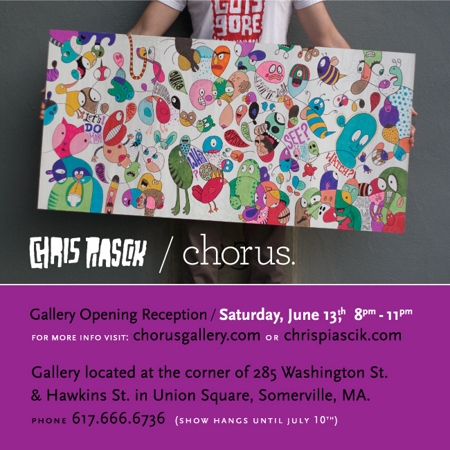
Chris Piascik at Chorus Gallery
We are excited to announce that Chris has a solo-show of his paintings and prints opening up next Saturday at Chorus Gallery in Union Square, Somerville, MA.
Opening Reception: June 13, 2009 / 8pm – 11pm
Facebook event page
None More Black
After countless man hours, numerous trips to the hardware store, and and the sacrificing of several plastic toys, we’re finally done. Last week we put the finishing touches on our character for the B(oNE) Show’s signage, and we’re pretty happy with it. We’re going to keep the final assemblage under wraps, though, until the actual show. You’ll have to turn up to see it in all its glory. See you Thursday.
 Show character detail shot 1")
 Show character detail shot 2")
 Show character detail shot 3")
The Big Reveal
For those who’ve been keeping track, we were asked by Brandon Bird, of the AIGA B(oNE) Show and Brandon Bird Design, to create one character in the title’s signage for the B(oNE) Show. We’ve been teasing the final design here, here, and here. Hopefully, some of you got to see the final piece in all its glory, but for those who didn’t, here a couple shots of the “i” in place. Each of the thirteen characters were auctioned of to benefit AIGA:Boston, with the one prize being bragging rights. We’re not usually ones to brag, but in this case we might make an exception.
 Show signage")

The Bear Necessities
One of our designers, Ira F. Cummings, was invited by the art director of Select Design to participate in a show of custom-painted Qee figures. The show is part of Select Design’s South End Art Hop festivities, and features Qees painted by Dalek, Gary Baseman and other big names from the art world. Check out his finished bear:


Repercussions
Consequence of Sound is a New York and Chicago based, heavily influential online music publication that seeks to cover the music world as it has never been covered before. They were in need of some equally bad a** business cards and we were happy to be of service. For those of you new-schoolers, that shot on the back of the cards is a wall of vinyl, long-playing records. We had some help from intern extraordinaire Michael Deal on this project.


Monolithic Pile
Between our blog posts and tweets you’ve probably heard us mention the Monolith Music Festival on a number of occasions. We posted the logo and the festival director’s business card on our site but thought it would be beneficial to show how we branded the entire festival. People often ask what branding entails—so while we had our photographer shooting a bunch of new projects to be featured on our website we had him shoot a pile of collateral left over from Monolith. Here you can see a range of items from VIP passes to ads to schedules. We actually have another package of samples on the way as we type this, including merchandise and other print samples. Keep an eye on the website to see the rest!


Hollywood Squares
Sure, it’s a bit of a shameless plug—but we still get a kick out of seeing our (we mean their) branding being used on a regular basis. In this instance as Twitter icons. We decided to gather a list for you.

Empire Attire / Moustache Sally / New Collisions / Rhoost / Arts Boston / Mediadonis / Plus1tv / BzzAgent / Monolith Festival / Harlem Vintage / Sarah Borges / Schranghamer Design Group / Viximo / Boston Phoenix / Fenway Recordings / GoGaga / Clarias / Daily Grommet / Well Rounded Radio / Open Bicycle
"I always feel like somebody's watching me"
From time to time we get the opportunity to design event posters for The Boston Conservatory student performances. In this case, Machinal is the story of a woman driven to murder. We intended for the poster to reflect the tension and paranoia of the main character — who is essentially drowning in the dark urban landscape of society. We spent a lot of time away from the computer on this one. One of our favorite tools, the photocopier, was used to create texture. We also cut up the type by hand and then pasted it all back together for the title treatment.

The other side of branding
Few things make us happier than seeing our clients succeed. NRG BAR is one of our long-standing clients, and things are really catching on for them. Having proven themselves at outdoor sport shops and bike shops throughout the area, you can now find NRG BARs in Whole Foods stores throughout New England. As part of the owner’s push to get into more stores, we were hired us to design a box that would stand on the shelves with the national big hitters. Our solution replaces the brand stripes with typographic stripes that showcase the product’s main bullet points. Utilizing the brand’s distinctive and bold colors, we created a box that showcases the brand from all sides.


Better than the hunky fireman version

In order to start the year off on the right foot, we’ve teamed up with Flagship Press to create a unique, fine-art inspired calendar. The coolest aspect is that each month will feature radically different artwork and printing techniques. Each month will serve as a handy guide to different print processes and paper stocks, as well as ample eye-candy. The calendar comes with an all-in-one easel/envelope. When you are done viewing a particular month, you can store it in the envelope for later reference.
As we kick off the new year, we can’t help but to look even further forward to what lies ahead for humanity. The other source of inspiration for January is a collection of satellite photos being released by High Resolution Imaging Science Experiment (HiRISE), capturing the surface of Mars. Simultaneously familiar and alien, these images sparked our creative fires and our imaginations; leading us to wonder what marvelous technologies the future will bring. After all, we’re also still waiting for our very own flying DeLoreans.
January’s calendar was printed on 12 pt. Nordic cover stock, with process inks. Additionally, it was printed with both matte and UV gloss varnishes to give extra contrast between the dull and shiny surfaces.
We’re offering the calendar for sale on our store. You can get it both as a yearly subscription, or just your favorite month. Take a look here.


February, The Saga Continues

Well, it’s a new month—so you know what that means! It’s time for our newest addition to the Alphabet Arm / Flagship Press 2010 calendar. February features a blind-emboss matched with opaque white ink on the stunning Curious metallic silver stock.
The name February comes from the Latin word “februum,” which translates to purification. After the densely-layered imagery we created for January we wanted to make something stark and elegant to purify our “design” palettes—if you will. As a studio we obsess over typography and we certainly enjoyed creating this strictly-typographic composition. Did you know that February doesn’t always have a full moon? This year it ends with one!
Interested in ordering one? We have both subscriptions and single month pieces available on our BigCartel store.


March: Fasten Your Seat Belts

If you hadn’t guessed, we’re huge fans of vintage comics and the campy look of old B-movies. Our March calendar takes the old adage about March weather: In like a lion, out like a lamb and gives it a fresh new take. Finally a project where we can illustrate some boss muscle cars. Zipatone dots and out of register printing on French Paper’s newsprint cover stock gives the piece a truly authentic feel. Flagship Press hooked us up with a killer print job of 2 colors overprinting to create a third. You can get your hands on a subscription to the entire set of calendars here.

A Literary Magazine For Your Ears

The Drum is a new online literary magazine. They publish short fiction, essays, and author interviews in audio form. Here is the age old project description: honor the history and create classic look, while evoking a modern sensibility. Although literature can be serious business, we wanted the mark to convey The Drum as approachable and unpretentious. A unique, decidedly modern interpretation on graphic elements typical of vintage book design gives this identity a voice of contemporary sophistication. We also did a business card design and the lovely bright white Via felt textured paper does a great job of echoing that point.
What seemed like a really fun and interesting identity project turned out to be just that. It’s nice to know our client also enjoyed the process. Henriette, the magazine’s editor had this to say:
“Alphabet Arm did a wonderful job of explaining the logic behind the team’s decisions as they created my logo through various drafts. It was clear that every element they put into the design came out of considerable thought—about how the logo would work in different environments or media…. The whole process was very smooth, efficient, and quite fascinating. I ended up with a logo I really like and that people really respond to.”
Running of the Blogs

Hello there, over the last week or so our work has been mentioned, recommended and we’ve even penned a guest blog post ourselves. We thought we’d make it easy for you and compile them here:
Daily Grommet
ÜberGeekGirl
Greenhorn Connect
April: Hidden Messages
Sure, we’ll admit we’re slaves to our computers and fancy-pants design applications, but we consider them just another tool we use within our creative process. Back in the early stages of our collective careers, a number of us cut our teeth using pencils, Letraset, transparencies, and copy machines. We genuinely enjoy the process of rolling up our sleeves and getting our hands dirty in honor of creating honest design. It allows us to feel less confined by perfect alignment and precise registration and actually embrace all the imperfect little characteristics that often occur. Not to mention that we really dig apes, cats and old school hip hop. Given that, we decided to put our spin on an advent calendar and offer some thoughts or activities to make each day of April a little more fun. By printing all the type as an offline, tinted varnish utilizing Pantone 8340 (10% to be precise), we achieved a slightly “hidden message” vibe to the piece.

We have an Idea(Paint)!
Ideas happen everywhere, and IdeaPaint is the perfect creative solution to turn almost any surface into a useful and interactive workspace.
Marcus from IdeaPaint recently can by to assist us in painting our conference table with IdeaPaint PRO to create a unique space to engage our clients, and improve our team collaboration.
We are excited about using this table in a totally new way, and equally excited about doing away with the mounds of index cards we typically use at each meeting. So now instead of killing more trees, Alphabet Arm has an Earth-friendly workspace that allows us to work together in a dynamic, evolving way. When they’re done with a brainstorming sessions or a wire-frame design, they just snap a photo and store the notes digitally. Eureka.
Our friends at Amory Group + Plus1TV came along to film the installation. Enjoy!
Bianca Signing Out

I made it through the winter months and I’m in the clear for spring, no rats in my bed this time around, but I’m sure my nickname R.Q (Rat Queen) will forever stick here at Alphabet Arm. My internship for the past 4 months at Alphabet Arm Design had a significant impact in my life. The boys opened my eyes and ears to so many things that I feel like I was living in the dark before interning here. School and classes can only teach someone so much, but its truly this experience that has taught me the most so far in my design life.
Some things that I wish I was leaving with: an undying love for coffee, a logo design that is done faster than Ryan can, meeting Soledad, knowing the right typeface to use right away without opening linotype, seeing June’s calendar, a complete understanding of Twitter and the pristine knowledge of key commands Aaron has.
Haaa, honestly no complaints, I’m going to miss Alphabet Arm and all the good company, the laughs and stories I got to share every day here. On to my next adventure! As I graduate in just one week I will be getting ready to bike from Boston to San Francisco bringing everything that I’ve learned with me and seeing where the road takes me. My friend and I are going on this trip to raise money for Autism and celebrate the end of our college careers. Follow us along the road www.crosscountryforautism.tumblr.com and get in touch if there is any advise, job offers in states that I’m pedaling through, warm showers you know of along our route, or support you would like to share bpettinicchi@gmail.com.
This is Rat Queen signing out
P.S. As you can see even after spending all this time in an award winning design studio, my love for cheesy Photoshoping will never die*
Signs of a Feather

When we complete an identity project and let a new logo out into the wild, we are normally both parts excited and somewhat protective. We like to work closely with our clients so their branding + messaging is cohesive across all platforms. As satisfying as it is to see our logos used consistently any one of many applications (websites, in advertising, as Facebook and Twitter profile images), nothing beats a lovely, crafted, dimensional store front sign. Such is the case with the swanky, hippie-chic women’s boutique, Flock. We worked closely with the boutique’s owner as well as a sign maker to propose the most engaging brand solution. The sign sets the tone for the apparel and accessories found within. You should fly in sometime.
Jerry Jerry Jerry Jerry!

JerryChant, JDOT aka Jeremiah J. Louf here. I’m one of two new, true blue interns at Alphabet Arm. Much like the little bee girl in the “No Rain” video, I seem to have found a place where I’m surrounded by others that share a passion for wearing tight yellow and black striped spandex and costume wings. Alright, alright, I mean a place full of skinny jeans & plaid button ups (not button downs, I’m an optimist) deep fried tofu, PB & ME (J.), and music. Oh right, they mentioned something about graphic design.
Currently I’m a pupil, often trapped on the 9th floor of the Tower Building at Mass College of Art down on Huntington studying design. It’s a fantastic place that comes complete with everything you need to make anything in the world and everyone you’ll ever need to teach you how to do it. Many people there will also give hugs and cookies when needed during the grueling end of semester reviews.
I hopped on the noodle train here at Alphabet Arm last week and the guys treating me more than well. As is the great smelling hand soap in the restroom on the 3rd floor of a gorgeous building in the South End surrounded by restaurants that I can’t afford to eat at. The vibe here is killer, eat your heart out Guitar Center (yeah, I worked there). I’m extremely excited to dig my hands into some projects this summer and try not to make too much of a mess of things.
All of my tattoos are blue, I write and record music as much as I can, and I only listen to hip hop, Black Metal, and Blues. Shoot me over an email to bicker with me about drop shadows, or better yet, write me snail mail!
Jeremiah@AlphabetArm.com
500 Harrison Avenue {3R} Boston MA 02118 Attn: JerrryChant
500 Harrison Avenue {3R} Boston MA 02118 Attn: JerrryChant
NRG CAR

Like many of our clients, we’ve developed a long standing relationship with our friends NRG BAR. This is both convenient for our clients — because they know and trust us — and exciting for us to design new ways to promote their business. Recently, we developed the artwork that wraps the NRG BAR company vehicle. We jumped at the chance to emblazon the Land Rover with the vibrant color palette and lightning bolts that are the cornerstones of the brand. If you happen to see bright orange, yellow and blue SUV streak by, do your best to catch up and ask for a sample… you’ll be glad you did.
"Dude, you must seriously like the alphabet, right?"
In a word, yes – yes we do. Which is why famed author Ina Staltz asked one of us (can you guess who?) to be part of the second volume of her Body Type series. The book collects over two hundred new typographic tattoos and explores the ideas and emotions behind this indelible commitment. This stunning photography collection features commentary on the letterforms as well as personal recollections by the tattooed on the motivations for their decided words. Order your copy here. Special thanks to the talented Janet King who shot the images for us.

Go Crimson!
Here is a look at some buttoned-up print materials we developed for the Harvard Medical School. We designed a modular system that is flexible enough to apply to various formats and sizes. The grid we employed works well with photography as well as large blocks of copy. Obviously, we were sure to use good old Harvard Crimson throughout. Don’t tell Ryan’s brother about this piece, he went to Brown.

Apparently…Design Matters (but we knew that).
Rockport Publishers have done it again, another stellar collection of inspired design samples. This go-round, they contacted Alphabet Arm to include our Sample Paks + promotional materials as a case study for the book. Pretty fancy – right? They interviewed us and everything, and wouldn’t you know it, we came off sounding real, real smart! Pick up a copy for yourself here.

Tables for Ladies: NickyGee™ Signing off.

Wow…did this summer fly by or what? I remember my first day here at Alphabet Arm, I was nervous as ever. The guys made me feel like I was apart of the design family in no time. This internship at Alphabet Arm has had a big impact on my life. My perspective on design has strengthened. Even in the first couple weeks I learned more than I thought I would. I am so thankful for Aaron and Ryan to give me the opportunity to intern for them. Being able to experience how a design studio works and actually take on projects for clients was awesome for me to be apart of. Being able to use my photography skills this summer was a big plus. The quality and attention to detail throughout my images look stronger and well-polished. What I will be taking away from Alphabet Arm are my newly improved prepping designs for print skills, my newly installed logo generating techniques, my expertise at designing albums, and many more.
I’m going to miss all the laughs and lunch breaks that made everyday such a fun atmosphere to be apart of. I will miss our breaks to watch Dr. Steve Brule inform us with his rules(…For Your Health), myself and Ryan’s deep conversations on what should have not been changed in the special edition versions of Star Wars Episodes 1-3, Jerry and his usage of ketchup, Aaron’s quick statements about how close of a relationship twitter and I should have, and many many many more. Even though I was quite known to space out during conversations and eventually enter my way back in by thinking I knew what they were talking about (yeah…fail on my part), I was always prone to have funny jokes make about me. Getting to work along side intern #2, JerryChant, was the best. We’ve become great friends through this experience and I know that we’ll definitely stay in touch, life after Alphabet Arm.
“Note to self lessons” and goals accomplished here:
1. Apple + y (in illustrator) = very, very, VERY important when designing.
2. Open files FROM the application, DO NOT drag files to icon. CAUTION: will cause computer to take a while to load and Aaron will make fun of you.
3. Become a mastered Sushee-lady…check.
4. Pencil sharpeners must always work effectively.
5. Add more key commands to my memory…check.
6. Rubber Bands create excellent and efficient weapons on defeating enormous flies.
7. Do not leave the table when eating lunch because your food could be tampered with.
8. Take a picture of Ryan without him knowing…CHECK! (See below)
So my fall semester starts early for me and I’m heading down south to Ringling soon. If anyone wants to stay in touch feel free to email me at ngavrilles@gmail.com
Stay fancy Alphabet Arm fans,
-Nicole / cargocollective.com/nicolegavrilles

Proud as a…
On quite a few occasions we have discussed the idea of having a studio pet. The obvious choices have been proposed: dalmatian, guinea pig, canary or possibly a turtle named Gary. None of those options were colorful enough for a design studio. So…a peacock seemed like a perfect solution. Part of the inspiration for this month’s design comes from the artwork of fruit crate labels produced in the mid 1950s. We respond to the bold and vivid aesthetic of these classic American labels. As we got deeper into the design process, we proposed the idea of treating Hank (the peacock) as a die-cut to add some dimension to the calendar. Watch where you step.
Ride the Branded Stallion.
 We have had the distinct pleasure of working on a number of projects with the lovely and talented Sarah Borges and her band The Broken Singles. It’s a pleasure, because Sarah embraces the collaborative design process and fully appreciates that we are always looking out for her and her band’s best interest. We’ve consciously established a number of consistent design elements (their logo, typography standards, reoccurring patterns + textures) between all of the band’s releases. Within those standards, we like to vary usage as much as possible and keep the band’s look evolving and their imagery fresh. This live DVD was filmed at a club in Michigan called The Livery. A 100 year prior to it’s current club status, it was a horse stable, hence the branded stallion on the cover! Ride on!
The following poster has been approved for all audiences

The Boston Film Festival contacted us to create the artwork for the poster and program cover for this year’s festival. Now in its 26th year, the BFF is one of the country’s longest running and most recognized celebration of films. As clients, they were great to work with and gave us full creative control. The only requirements for the artwork was to feature Boston and cinema in some way, and of course, no yellow. We wanted to create a poster that was simple, striking and maybe even a little clever. During the brainstorming process, we made 2 lists: icons for Boston and icons for cinema. We basically mixed and matched items from each list until we happened upon this final solution.
Choke on this!

While working on the promotional poster for an appearance by the infamous Stevie Starr aka “The Regurgitator,” we caught ourselves thinking, “are we really working on a poster for a gentleman who has made a living by eating and regurgitating that which should not pass one’s lips in the first place?” The Nobles and Greenough School challenged us with the task of working up an old school, horror inspired poster that utilized images of specific faculty and alumni members—around 30 to be precise. Intern extraordinaire, Jeremiah Louf, spent quite a few days clipping out the people that populate the bottom of this image. The build-out was rather time consuming, with a great many elements to prepare before developing the various type treatments and lovingly setting the poster with a delicious halftone pattern.

Masters of the Logoverse – The Sequel
The Logolounge Master Library Vol.2 book has arrived and we’re incredibly proud to announce the editors included ten of our logo designs, including a number of in-studio pieces (the “El Cahote” design-bot and Arno, the Alphabet Armadillo).
We are always stoked to have our work included in any volume of a Logolounge collection, but the Master Library book series feels extra special! Get your own copy here.

It's Alive!

We admit it, we’re total suckers for Halloween. The challenge became how to creatively integrate a calendar into a frighteningly familiar horror icon? That’s easy—design the calendar to be used as a mask. With the help of our good friends and collaborators, Flagship Press, we even went so far as to perforate the eyes and nose to make the mask actually wearable.
Do you happen to be one of those people that doesn’t wear a costume to the office party because you couldn’t get it together in time? Fine, we did the work for you… just grab a string, and strap this bad boy on. We also recommend a couple of bolts and a black turtleneck sweater. Arghhhhh!
¡Viva Lucha Cubby!
Not to toot our own tacos, but we have a sweet new piece o’ artwork in the studio we thought we would share. We hired the vinyl wizardry of Bob Shane / Vinyl Countdown to assist us with 40+ inches of lucha love we developed. He labored over the placement and multitude of individual pieces until the 2 color imperfect off-registration was perfect. Bob is the man, interested in seeing some of his other work?

Thinking Outside the Bun…

It’s always both refreshing and exciting to see a long-standing business with years of success embrace a new way of thinking about their brand’s reach. That couldn’t resonate any truer than our new client, Joe’s Famous Steak & Cheese. Instead of resting on their 40 + years of proudly serving Dudley Square, they have opted to go viral. The initial phase of their marketing efforts is a line of playful, stylish t-shirts. And guess what fortunate design studio they have decided to work with? Go ahead – take a bite!

Play it again Sammy…

We recently developed a business card system and postcard set for Sam’s at Louis Boston. If you’re not familiar, Sam’s strikes a balance between the simplicity of an American Diner and the timeless appeal of a classic French Bistro. They proudly feature local product from New England’s farms and artisans. The physical aesthetics of the restaurant’s space are a stunning contrast as well – poured cement, brushed steel and the open floor plan against the picturesque waterfront view. All these attributes influenced the bright, organic, industrial slant we brought to their print system. Pull up a chair and tell Esti + Drew we sent you!

The toughest clients in the world

As a design studio, one of the greatest challenges can be designing for yourself. The flip side of that coin is that the process can also be extremely liberating. Being free to explore solutions, finishing options and stock that clients may ultimately shoot down. Such was the case with the new Alphabet Arm business cards.We utilized three separate vendors to complete these bad boys: Letterpress cards (220# Cranes Lettra featuring magenta edging) – Mandate Press / themandatepress.com Wrap-around Die-Cut Labels (with metallic ink) – Flagship Press / flagshippress.com Custom-tooled arrow hole punch – Hole Punch World / holepunchworld.com Our loyal army of interns have been champions of assembly! And a special thank you to our friendly neighborhood photog Tony Luong tonyluong.com for the killer macro shots!
The Bone Machine is no more.

Alright! It’s about that time. 22 projects, 35 lunches, 4 football breaks, and 12,621 jokes* later, I am hanging up my intern gloves here at Alphabet Arm. In an effort not to gush about how appreciative I am about my time here, I won’t go on about how awesome it was to work with Diego, how Aaron and Ryan were completely willing to help us learn the ropes, or how I feel like this experience has been one that has helped me grow in quite a few ways, both as a person and as a designer. I almost can’t believe how much we were able to fit in during 16 weeks (bobo). Instead, I’d just like to say that I’ve had a fantastic time here at Alphabet Arm, and I’m glad to have been apart of the team. Thanks for everything guys!
– John
*Edit – Ryan just told another joke while I was typing this. 12,622 Jokes to date.
The Big Give Back

It’s that holiday time again and the studio continues our tradition of volunteering in the toy room at The Home for Little Wanderers in Boston. It’s one of the small ways Alphabet Arm likes to give back to the great city we inhabit. We were particularly excited to have current, intern rockstars Amy and John (aka Boneyard) join us this year! The Home for Little Wanderers still needs your help, would you like to donate toys or clothing to children in need? See The Home.
Out of the Vault / Onto the Streets!

Nothing kicks off a New Year like a new logo! We recently designed the identity for Tape Vault, a one stop, all-in-one hip-hop record label, apparel line, and recording studio. It was suggested by Tape Vault that the new identity be wide reaching and aesthetically in line with some of the vintage logos of yesteryear. Since the company is ever expanding from their roots as an independent label, we thought it was only fitting to represent them as the worldly entrepreneurs that they are. Black and Cyan offer a bold contrast that speaks to the attitude of the brand, but the identity holds it’s own when a one color application as needed. Now that the logo is complete, we are currently hard at work on the office system for the brand.
Anatomically Correct

Adam Levy is a singer-songwriter and guitar player residing in New York. We recently finalized the art direction and design for his latest solo album, The Heart Collector. Adam pretty much left the door wide open for our creative interpretation on his record. We used the lyrics and dark mood of the title track for inspiration which was full of interesting descriptions and metaphors — perfect for creating visuals. Vintage anatomy text books quickly became the device we used to structure a diverse sampling of textures and imagery we associated with the themes of The Heart Collector. Look close and you can even see how we were able to tuck some of Adam’s lyrics and a map of his NYC stomping grounds cover collage itself.
The Show of Poster Prowess

The Say Something Poster Project concludes it’s epic battle of considered communication and stunning design at the end of this month. Curated by the savvy Jason Stevens, the competition benefits The Home for Little Wanderers. Among an impressive line-up of caregivers, creatives and professors, our very own Art Director was selected as a judge for the contest. The project concludes with a gallery show of the final 25 semi-final posters to be whittled down to the final 10. Should YOU get involved? In a word – Yes.
Location: The Fourth Wall gallery
132 Brookline Avenue Boston MA
Date: February 26th, 2011 – Time: 7:00pm – 11:00pm
Embracing Individuality

If you’re a regular reader of the bloggery, you may know we do quite a bit of design work for BzzAgent and their word-of-mouth marketing clients. From time to time we’re asked to design various projects for their internal use. In this case, as BzzAgent was reassessing their company values, they asked to us to create a piece showcasing each of their affirmations. Although we were quite temped to design an inspirational poster involving a majestic bald eagle, we opted for a expressive typography approach. The project took shape of a poster that could be perforated into six core values for display around the office. Employing a vivid, but limited color palette allowed us to create unity from one statement to the next. The end result is a striking new poster for BzzAgent and it doesn’t hurt that we created a design using multiple arrows and lightning bolts — a win-win in our book.
Our Favorite Lounge

Rockport’s successful series of design books, LogoLounge, has just released their 6 volume. Once again, it is completely gratifying to see our work included among such talented company. With a showcase of 2000 logos and a color scheme featuring magenta, black and gray, what else could you ask for? Buy one.
Pedal to the metal
A few months back we wrapped up a new logo design for Joe Wallace Photography. After spending countless hours tweaking the perspective of his Dodge M37 and finessing the shadows to create just the right amount of detail, we wanted to give the same attention and focus to his new office system. You’ll notice we created layers of design elements inspired by passports, luggage tags and other utilitarian materials. We liked the fact that the cards seem to have a voice that suggests Joe is a hard working photographer who get’s it done. Yet, they still maintain an approachable personality and they don’t take themselves too seriously (kind of like Joe, himself).

Goin' Big / Part 02

Hi there, as previously promised, we have some more merchandise testing examples with our home skillets Jakprints. It’s a relatively new process implementing full color, high resolution dye sublimation. This old chestnut, in particular, revives a previous t-shirt design we sold out of a few years back. “Giant Squid Attack” was limited to three colors in it’s previous incarnation. With dye sub printing, both numbers of colors and the imprint size are no longer an issue. Ink on!!!
Goin' Big / Part 04

All good things must come to an end. Here is the last of the one-off, full color, high resolution dye sublimation t-shirt series all lovingly printed by Jakprints. This design is a graphic, cautionary tale inspired by the dangers of keeping wild animals as household pets. Oh, and also because we heavily dig wood cut type.
NO WOMEN, TIGERS OR TYPE WERE INJURED DURING THE MAKING OF THIS T-SHIRT.
Save me a seat

Our client, RSmeP, has created a web-based application/tool used to add online interaction to event planning. Essentially, the tool allows users to create interactive seating charts specific to their event. When the partners asked us to create a new identity for the company, we knew it would be a challenge. The name, RSmeP plays on the well known acronym R.S.V.P. — with the “V” replaced by “me” to emphasize the fact that the application empowers the user or attendee. So… if the logo itself doesn’t hint at the missing “V” then essentially, we’ve missed the clever wordplay that is the title of the company. You follow?
Along with the logo, we also designed a set of nine icons that will be used as navigation on the app. Obviously, the icons had to be quite small, yet communicate clearly and be visually compliment the logo. Check, check, and check.
Geared up!

Once again, we have designed a poster to promote the latest production from The Boston Conservatory.
“Factory Girls tells the story of best friends Sarah Bagley and Harriet Farley, factory operatives in Lowell, Massachusetts in 1844. High wages and a chance to improve their family’s lives draws Yankee farm girls to the “City of Spindles” by the thousands. Even after laboring for up to fourteen hours a day, the girls write and publish their own company-sponsored publication, The Lowell Offering, which becomes a worldwide literary phenomenon. When working conditions deteriorate due to competition and economic hardship, Sarah speaks out against the corporation; Harriet, as editor of the Offering, refuses to sacrifice the gains the women have made. The resulting battle rips their friendship apart and alters the course of the American worker.”
Our intent was to create a poster with a dark, ominous feel to reflect the struggles and harsh working conditions of the characters. We were especially excited to find scans of the antique newspapers that inspired the production… which we quickly incorporated into the design itself.
I Know You're All Jello!!!

Heyyyyy Yooooo,My Name is Silvi and I just started here at Alphabet Arm as a Design Intern for the summer. I know you all love Alphabet Arm, and let me tell you that it is incredible being here. It was one of the happinest news I received that I would be interning here with two amazing designers and people.
I graduaded from NESAD at Suffolk University this May with two degrees in Fine Arts and Graphic Design. I’ve been attending art school ever since i was 6 yrs old. Life doesn’t make sense to me without art in it. The work that I do goes from, Printaking, Letterpress, Graphic Design, Illustration, Web design and Animation. I love how a piece of art has it’s own life, from conceptualization to realization. I’ve always known that Art was the path I’d be on for the rest of my life. Being able to translate and convey the ideas fermenting in my brain into a tangible form and then share it with the world still amazes me. I actually find the whole process almost shocking. Design should make us think, surprise, fill us with wonder and exhilarate our senses.
Being an artist makes everything I do that much more stimulating and intoxicating. Sometimes even my bike rides get so exciting, looking up at the clouds and cooking up some great idea that I can’t wait to share with the world. Being at Alphabet Arm makes all this goodness happen and I can’t wait to sink into more design as the time passes.
If you’re feeling bored and such, you can check out my work here:
http://www.behance.net/silvinaci
http://www.flickr.com/photos/silveroris
Thanks for reading, Silvi
No Bumping!

We can’t think of a project much more awesome than branding a new go kart track for the summer. The Salisbury Speedway is soon to be opening in (you guessed it) Salisbury, Massachusetts in the very near future. You could say we are super excited to be in the driver’s seat for this type of project. Both the design team here at Alphabet Arm and the owners of the track agreed we would draw on old filling stations of the 1950’s as inspiration for the new logo and branding. For this particular project, we want to hand-draw a classic looking script to contrast the blocky “speedway” typeface. We’ve dabbled in creating custom scripts in the past, but this was a chance to really immerse ourselves in the tedious process of drawing the thick and thin strokes, as well as the hours of pulling points and finessing the bezier curves. Here are some process images.


Initially, we were very pleased with how the the “Si” ligature worked out. But, unfortunately we had to lose it and the swoopy “y” which just didn’t fit into this particular lock-up. We added some speed lines onto the “S” and “l’s” in order to give the type an extra bit of flare. Here is a larger image of the final script:

We’re currently working on a signage system, stickers, t-shirts and a custom paint job for the ticket booth and shop on site. We’ll post more images once it all comes together. Buckle up!
As American as Ollie
Actually, Ollie Childs is not American at all, the singer / songwriter was born in England, but he has written a stellar track celebrating the states. Non-Drip Gloss Records was savvy enough to coincide its release with Independence Day. Here is the cover for the single (available on iTunes):

Being a studio with an extensive record collection of our own, we are never satisfied to stick with the expected singer / songwriter “glamour shot” album motif. Much credit goes to Ollie and his management to allow us much visual leeway. In this instance, we also didn’t want to be overly nationalistic, but liked the idea of introducing something as iconic as the American flag into the layout. We used a great deal of layered Photoshop images and textures (close to 30) to achieve the final cover treatment. We were greatly inspired by the depth, tone and lyrical content of Ollie’s songs. Here are a couple detailed views to wave your flag to:

Sweet Rewards

Our longtime clients and friends at BzzAgent have been keeping us quite busy lately. This recent project included collaborating with the BzzAgent Marketing team and designing a piece based around the concept of “Sweet Rewards.” With bold messaging on the cover, a clear description of BzzAgent’s mission and a surprise gift of artisanal honey, this nontraditional marketing piece is sure to get attention… and it compliments any cup of tea.
DILLWLWBE*?

*Does It Look Like We Like Writing Blog Entries? Only when they pertain to B.A. merchandise design projects.

After re-branding the apparel company Dilligaf, we designed a number of apparel pieces for the acronym inspired business. As the new line and branding is being rolled out we don’t want to give away too much, but, here’s a sneak peek at some of the new merchandise we developed. We are particularly excited about the embroidered label that brands the exterior of each shirt as well as the phrases we developed that tie in the designs with overarching concepts.

BBFN!
Soundtrack to the Future


This Summer, our fantastically talented set of interns participated in an awareness campaign for the Future of Music Coalition’s groundbreaking survey for musicians and composers. The task: create an informative, eye-catching poster design to promote the Artist Revenue Streams project. The lengthy copy led all three of the designers to take a hands on approach and experiment with a bevy of hand drawn typography and rough-hewn textures. We were very pleased to see the high level of detail (including a couple hand drawn QR Codes!) and creativity they brought to the posters. Nice work, team.
None of Your Bees Wax
 We worked with word-of-mouth marketing experts, BzzAgent, to create a new piece for the for Burt’s Bees Natural Skin Solutions BzzCampaign. It was great to work with such a recognizable brand, not to mention the fact that we happen to be devoted users of several Burt’s Bees products. The cover was printed and embossed on a lovely recycled, felt textured paper. Our objective was to design an approachable feeling brochure with a sophisticated look that suggested the natural ingredients used in the products themselves. We hope those bees are hard at work, this stuff doesn’t grow on trees.
No Zaboobs Allowed*

After designing the identity system for the surf-inspired apparel company, Invisible Sun, Alphabet Arm was hired to develop a number of merchandise designs for the company’s launch. The entire studio team jumped into the deep end to generate a cross section of styles, phrases and illustrations. Big props to Silvi Naci + Matt Kaiser for their great work. Surf around and let us know if you like what you sea.

*Completely wacked out surfer who never touches the water.
Old Lucky 13

Richard Shindell is an expatriate New Yorker currently living in Buenos Aires, Argentina. Richard is a craftsman of folk songs that are often laden with rich storytelling. Thirteen Songs You May or May Not Have Heard Before is “a relatively spare, no-frills revisit of some of the songs from his catalogue.” To compliment his rustic sound, we designed his upcoming CD package with a hands-on approach. We stamped each letter of the title by hand and made sure to retain the beautifully imperfect character of the type. An archival scan of wood type (which had definitely seen better days) was incorporated to reinforce the unrefined quality of the cover. Props to Richard for embracing the stark, bold, type-only design that we think is quite eye-catching.
Look Sharp

As you might recall (if you’re a frequent reader of our blog) we recently designed several art pieces in the form of skate decks. They were exhibited in the gallery show, Human Powered Works, curated by Silver Oris. Look Sharp is an homage to The Outsiders, Johnny Cash, Arthur Fonzarelli, James Dean, Marlin Brando, and rebellious, greasy-haired tough guys everywhere. Props to James T. Edmondson for designing the boss typeface Wisdom Script available at the Lost Type Co-op. Now, who want’s a knuckle sandwich?

Rainy Day Deck

If you are a frequent reader of The Bloggery, you might recall the previous decks we designed for the gallery show Human Powered Works, here’s another one in the set. This piece is appropriately titled Rainy Day Deck. It features a little character we illustrated for a skateboard shop in Austin 5 or 6 years ago. They skipped out on the balance of their invoice and this fella (“Harry Knees”) was archived, never to see the light of day. We finally brushed him off and gave him some shine (not literally – mind you – he’s attempting to outrun a lightening storm). For the record, this design was printed courtesy of BoardPusher.


For the record, it’s raw and rainy here in Boston today, how is that for keeping it real?
Amory Man

Our friends at Amory Group (a marketing agency specializing in social, digital and inbound marketing services) asked us to create an illustration incorporating their logo (which we happened to design a couple years back). Tim Linberg, the founder, described his vision as an old school superhero ripping away his dress shirt to reveal the Amory Group insignia emblazoned across his crime fighting costume. Of course, we covet any project that draws on vintage printed material (especially of the comic book or sci-fi genre) as inspiration. Below is a detail image that depicts the distressing and the mottled texture we developed to create a vintage, golden age look. Also, check out the original pencil sketch we presented before fully rendering the final illustration. This was a fun one to work on and Amory Group seems to think it’s just super.

Comfort For Less

Here is the latest segment of our ongoing series of skate decks as fine art. This one just fell into place and it didn’t even seem like we were trying — a rare (but highly coveted) project where there is very little artistic struggle and it just feels right. It started as a loose pen and ink drawing (see process photo below) and finished with a quick brayer of yellow ink, some zipatone dots and a bit of photoshop. Done and done. Expertly printed by BoardPusher.

say hi to pete…
Sad to say, but this post concludes our series of skate decks as fine art.

This decks was inspired by a book of soundtrack artwork from the 60’s we have in the studio.

After acquiring a couple new typefaces we were all geared up to use, and wanting to work up a whimsical deck to offset some of the slightly more serious directions already completed, this one came about. We also like the play of “for Pete’s sake” to “for Pete’s skate.” We’re just hoping Mr. Sellers would approve. Expertly printed by BoardPusher.

Tastes Like Medicine

Here is a first look at a branding project we are currently finishing up. “Know the Signs, Know Sepsis” is a campaign for the Boston Medical Center to increase awareness of the life threatening condition of severe sepsis. As a studio, we embrace the opportunity to take on different types of design work and show our range — and who knows, we might even learn something in the process. In addition to the logo design, we also named this campaign. We’ll post a more comprehensive look at the project once all of the posters, pens, pocket cards, notepads and buttons are back from production. Now go eat your veggies.
Their Legend Continues…

Houghton Mifflin Harcourt contacted Alphabet Arm to design a simple, yet flexible logo to be consistently used for their series of books, Good Sports (not to be confused with Good Sport).
Prolific sports writer Glent Stout’s new series for middle-grade readers focuses on the careers of trailblazing ballplayers, professional athletes who serve in the military, and female sport pioneers.
Special props to the talented Laurie Mildenhall for shooting these for us.

No Assembly Required

A short time ago, one of our existing clients — who shall remain nameless at this time — asked us to create a mascot to use as a secondary branding tool for their I.T. company. We proposed a short list of possible directions that included an otter, a mongoose, a robot, a crime fighter and several other quirky choices. Of course, the robot was the winner (because robots are the best… duh). We wanted to make her a lady robot (or “Shebot” as we’ve been calling her around the studio) to give a twist to the typical notion of a retro tin robot. She’s smart, a bit sassy and she’ll fix your computer in the blink of an eye.
Here is a quick look at the process that made her the robot she is today. As you can see, the smirk gives her just the right bit of attitude.

Through the process, we also developed this crime fighting super hero. She didn’t make the final cut, but we were really excited with how she turned out. In other words, we couldn’t bear to see her fade away into the logo graveyard without showing her to the world.

Everybody Loves Raygun

We recently tried our hand at some traditional screen printing. It had been a long time since we’d tried pulling prints by hand and there was quite a learning curve. The strategy was to do ourselves a favor by designing a piece with overprinting that did not require tight registration. After overexposing the screen 3 times, we finally got it right. We learned a lot in the process, although we got neon green fingerprints on everything.
Why did we spend our time getting covered in ink, spilling emulsion and inventing new swear words, you may ask? The answer is two-fold. We wanted to promote our recent public artist talk at Montserrat Collage of Art. And we’re psyched to report that our piece will be hanging among amazing creative company at The National Poster Retrospecticus. “Lincoln Arts Project presents The National Poster Retrospecticus, a collection of hand-printed posters from over 50 local, regional, and national artists.” Not to mention, the show is curated by none other than JP Boneyard, friend of the studio and former intern. Check out the list of participating artist for a seriously impressive list of poster creatives.


Worthy of Hype
BzzAgent, one of our long-standing clients, recently came to us with a unique design challenge: create an award identity honoring the best new consumer products of the year. Often, our job is to create logos, collateral, etc. for existing companies, but occasionally we are asked to take part in choosing the name itself. As you may or may not know, naming an identity is a fun and challenging process, so we were happy to oblige. Plus, with a savvy client like BzzAgent, we were able to fully remove our pun-filters! Here are a few of our finalists: The Nextagons, Remarkabees, The Counter Top, The Hypeworthies and Jabber-talkies. In the end “The Hypeworthies” was chosen, and step two began, brainstorming and sketching:

From there, we scanned and stream-lined our favorite concepts. Here are a few of our finalists:

To see the final logo in all its glory, head to hypeworthies.com. Cast your vote for the most hypeworthy product of 2012!
SUB \ URBANS

We are enthusiastic to announce that our very own Ryan Frease and his wife Jessica will be featured in an upcoming gallery show presented by our friends at Goosefish Press (and they were kind enough to create a Facebook event page for the reception).
Please join us at the opening reception on May 4th from 5:30pm – 8:30pm
Sowa First Friday at Goosefish Press, 450 Harrison Avenue (#65)
The show will be up from May 1 – June 28
Heads up!

We’ve updated alphabetarm.com with a brand spankin’ new set of featured projects. A little something here for everyone: package design, die cut logos, medical illustration, ginseng, CD art direction, higher learning, rocket ships and woodgrain. As always, thanks for checking out what we’re up to.
Adventures in Graphic Design

Have you ever imagined an all-powerful Ray Gun that you could blast at any lame design – and presto – it would be transformed with turbo-boosted, super-rad, visual awesomeness? Well, that was the inspiration behind our latest t-shirt design. Not to mention a plethora of snobby typographic tirades. If you look close, you’ll even notice a nifty overprinting of transparent yellow (engineered especially for design nerds). We know, this all sounds like science fiction, but you can order yours now!
T-Shirt of Champions

Just in time for the upcoming Summer Olympics, the graphic tees we designed for team Saucony’s Wallace Spearmon Collection have been released. Saucony asked us to propose several apparel designs for the decorated 200M sprinter. Most of the Alphabet Arm crew are avid sports fans, so we jumped at the chance to design pieces that would represent the style of a 2008 and 2012 Olympian. We created an emblem that encompassed the qualities of a world class athlete: speed, precision and symmetry. We then did some distressed the crest to give a the feel of diehard training and exhaustive preparation. In the end, we’re very happy with the colorways Saucony finalized for the line. Hopefully we’ll see some dedicated fans rocking these shirts in their support of Spearmon in London. Good luck, WS.
The (wearable) Golden Rule
What better way to remind ourselves to be good human beings, and treat fellow humans with respect and grace?

Simply combine a sweet set of otters and a little pun re-mix – based on the age old golden rule and it all becomes quite clear. Tune in, turn on, crack yourself a clam!

Snag one for you here!
Because, The Early Bird Tricycle of Extreme Espresso Glory, would be a mouthful…
 Over the past month, we have been fortunate enough to develop a logo / branding system for the The Coffee Trike. Founder, owner, and barista extraordinaire Alessandro “San” Bellino is changing the coffee game in Boston by bringing the first espresso tricycle to the States. By combining his love for cycling with his passion for great coffee, he has spawned a truly unique and exciting business. Here at the studio, coffee and bikes are some of our favorite things, so we were very excited to get involved with this project. In developing the logo system, we wanted to highlight the timelessness modernity of San’s idea. The type treatment is stylish, understated, and references old world typography without being dated. The icon set clean, direct, and emphasizes the two most important parts of the business. Keep up with San on Twitter @thecoffeetrike to find out when he’ll be pulling espresso in your neighborhood.
The Coolest Geeks We Know

G2 Technology Group is an information technology consulting firm focusing on ongoing support, technology consulting, and information technology project management. In other words, “High tech solutions from down to earth people.” They do an outstanding job of taking care of all of the technological mumbo-jumbo and explain it in simple terms that anyone can understand. If you’re in search of an awesome team of geeks (we mean that in the best way possible) to act as your outsourced IT department, we highly recommend them.
We’ve collaborated with these fine folks on several projects over the past few years, including rebranding G2 from the logo up. So, when they asked us to design their new website, we were quite enthusiastic to get started. Usually — if anyone asks us about designing websites — we run for the hills screaming in fear. You see, designing websites isn’t really our bag. Why, you say?… the simple answer is that we just don’t enjoy the process anywhere near as much as we enjoy designing for print. It has to be a pretty special project with amazing people for us to bend our rule. In the case of G2, it was a no-brainer.

We kicked off the project by organizing a photo shoot of the G2 team. Based on their unequalled customer service and emphasis on the human side of IT we understood the importance of showcasing the people behind the scenes.The photographic theme was continued throughout the site by featuring images of the Fort Point Channel area of South Boston (where G2 proudly calls home). We also introduced a system of simple icons to help users understand the complex offerings described on the site.

All of this web design talk is given us a headache; we’re spending the rest of the afternoon with a pencil and a sketchbook.
Watch out for splinters

That’s right folks, our latest self-promo postcards are printed on actual wood veneer. The fine people at cardsofwood.com have carved themselves into a unique spot of specialty printing — focusing on printing 4 colors on wood. What better way to show off our love for scratched-up, well worn, rustic typography? Each card has its own unique wood grain pattern. If you happen to have the perfect design project that might involve printing directly on wood, we should talk.
Newest of the New

Hello friends! We’ve been wicked busy designing graphics for everything from baby togas to coffee vehicles to beer repositories to (gasp!) a website. We felt it vital to keep you posted on all of this sweet stuff, so we’ve updated our website with a plethora of new featured projects. Check them out at www.alphabetarm.com
Turn it Up! Our Best Albums of 2012

Being huge fans of music (and some of us being musicians, ourselves) we thought that we would share our favorites of 2012. Enjoy.
Aaron
1. White Rabbit / Milk Famous
Got two drummers and a piano player? This record offers up the perfect blend of quirky accessibility, crafty songwriting and unexpected instrumental.
2. OFF! / self titled
A perfectly executed hardcore classic channeling records from the heyday of 1983.
3. Soft Pack / Strapped
Although this record doesn’t completely follow up on the promise of the self titled ’10 debut, it’s a solid set of fuzzy, post punk gems.
4. Plants and Animals / The End of That
This record completely took me off guard, then again, I wasn’t sure what kind of expectations to set. A rocking folk masterwork? A touch of Canadian Americana? An unexpected collection of lyrically heartfelt indie pop tracks? I offer all of the above.
5. Tame Impala / Lonerism
Trippy psychedelic Australian fuzz no doubtably recorded on all analog gear. An otherworld of surprisingly catchy psych rock.
Ryan
1. The Menzingers / On The Impossible Past
How could one record sound so melancholy, yet so hopeful? I can’t help, but to sing along.
2. Japandroids / Celebration Rock
This record sounds like a party. Try not to stomp your feet to “Fire’s Highway” Play this loud.
3. Jimmy Cliff / Rebirth
An amazing comeback record by an absolute icon who defined roots reggae.
4. Luther / Let’s Get You Somewhere Else
Big vocals and full of hooks. This record is poppier than I usually like, but the attitude from these boys from Philly make it work.
5. Apologies, I Have None / London
Emotionally charged, heart-on-your-sleeve debut from the English four piece. I can’t believe this is a debut album.
Honorable Mentions: Classics of Love, The Men, Morning Glory
Nathan
1. Earl Sweatshirt / Chum
Okay, I know I’m kicking it off a with a single, but I don’t care. This song rules and I cant wait to hear the rest of his tracks off his upcoming album Doris. Also props to Hiro Murai for the dope video.
2. Japandroids / Celebration Rock
The title says it all. Fun, energetic, Celebratory rock.
3. Beach House / Trouble Maker
I was almost afraid to listen to this after loving their previous album Teen Dream so much. As anyone else who has given this a listen knows, I need not be afraid.
4. Son Lux / We Are Rising
Okay, I know cheating by using an album from 2011, but I just heard about this one a few months ago and it has been in heavy rotation since. If your behind the times like me and haven’t heard it yet, do your self a favor and give it a listen.
5. Grizzly Bear / Shields
It seems that anything these guys have touched is gold, and this album is no exception.
Tarah
1. Grizzly Bear / Shields
It took a few listens for this album to resonate with me, but now it’s playing non-stop. It sounds like classic Grizzly Bear, just pushed a little further. This album is by far my favorite album of the year, I highly recommend it.
2. Sufjan Stevens / Silver & Gold
Three hours of Christmas music that is actually good!
3. Daniel Rossen / Silent Hour / Golden Mile
Rossen is one of the most talented song writers around, and probably my favorite member of Grizzly Bear. He never dissapoints.
4. Justin Bieber / Believe
I’ll totally own the fact that I listen to this album all the time. It’s super catchy and features artists like Drake and Nicki Minaj. They make listening to the Biebs cool right?
5. Family of the Year / Loma Vista
Just a nice relaxing listen.
Look at Those (Bezier) Curves
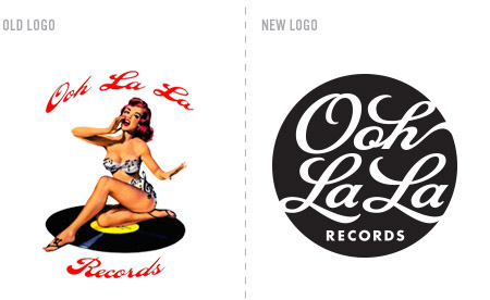
The studio just finished a new logo for Ooh La La Records. They are a boutique artist development company and independent label based in Brooklyn, NY. As you can see, their previous logo was quite provocative, but difficult to use due to it’s challenging typography and full color palette; not to mention, scalability issues. Our solution was to make an about face. We used only the tantalizing curves of script type to to create the allure of Ooh La La. The new mark is concise, flexible, scalable and looks sensually sharp when used as a one color.

Call me "Tear-ah" or "Tar-ah"

Hello there! My name is Tarah and I am super psyched to say that I am the newest intern here at Alphabet Arm. I am a somewhat recent graduate from Mass College of Art, where I studied Illustration. Illustration is awesome, but in my senior year I realized that what I really wanted to do was pursue a career in design. Luckily the guys here at Alphabet Arm were willing to take me on, which I will forever appreciate. Since I’ve been here I’ve already been working on a logo project, business cards and a bunch of other awesome stuff. Thanks to Aaron, Ryan, Nathan and Matt, I’ve already learned a ton of key commands, how to not be terrified of InDesign and what South End sandwich places will most tempt my vegetarianism (I’m looking at you Formaggio).
I’m currently living in Auburn, New Hampshire where I work as a freelance Illustrator/ substitute teacher. When I’m not illustrating or designing you can probably find me drinking coffee, reading Game of Thrones, or talking about how awesome dogs and cats are. Feel free to check out my work at tarahhursh.com, or say hi at tarah@alphabetarm.com.
[editor’s note: Tarah (actually pronounced “Tear-ah” allowed us to all call her “Tar-ah” (rhymes with Sarah) for an entire week before we realized we were mispronouncing her name.]
King of the Jingle Jangle Jungle
Featuring bouncing basslines, soulful vocals, lush production, and a definitive “from-across-the-pond” inspiration (it was partially recorded at Abbey Road!), here’s the cover for New Lion Terraces. As with any CD Art Direction project, it was a challenge to nail down a visual style for Corin Ashley’s new, full length album. After exploring a wide variety of designs, illustration styles, and photo manipulations, we landed on the simplest solution: draw a lion. Duh. Making use of a bright color palette, boatloads of custom typography, and a psychedelic-yet-refined visual style, we were able to achieve a vibe that was 1/2 throwback and 1/2 twentythirteen.

Here’s a peak behind the curtain of the rough sketch we later refined:

And the complimentary show poster, Grrrrrrrrrrrrrr:

Jump in, the water is fine…

The first edition of the Logopond Identity Inspiration book just arrived in the mail, and we are very excited to see a sample of our work strewn throughout. In addition to a sampling of our logos, they even asked as to design a page featuring our studio profile.
Thanks for the props Logopond!


Looking to get a copy of your own? Pick one up here.
Mx2 Cx1
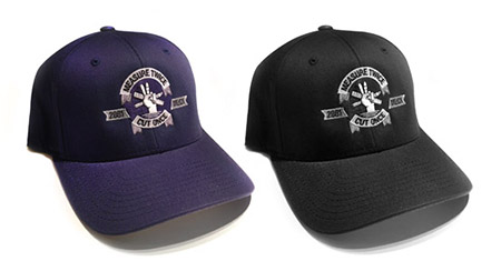 As a design studio, there are a couple key principles we live and breathe: “Happy clients make the world go ’round“, “Don’t fear the Pantone book“, “Not all typefaces are created equal“, “Never put your hand down a garbage disposal“, and “Measure twice, cut once“.

The last of which inspired us to embroider on these sweet Yupoong Flexfit Wooly Combed Twill Hats (in your choice of Navy Blue or Black). Now you can proudly share this rule with all you encounter. Designers, Contractors, Painters, Cabinet Makers and Mathematicians will undoubtably agree.
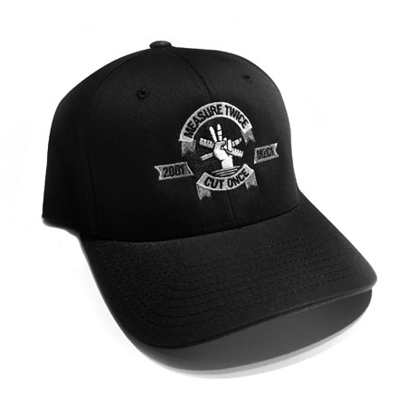
Grab your ruler, let’s do this thing! Order your’s here.
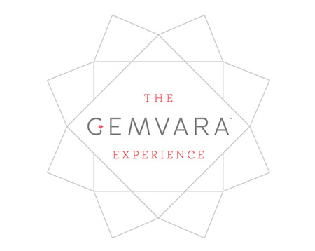
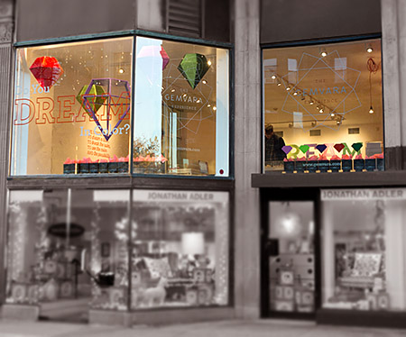
Shine On You Crazy Gem
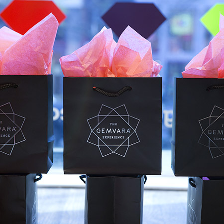
He went to Jared? We should hope not. We had the unique opportunity to work on The Gemvara Experience retail store with our key partners, Heart and Brandon Bird Design. Being a successful online, custom jewelry destination, the Newbury Street location is Gemvara’s initial foray into a brick and mortar storefront. We designed the logo and store branding and worked closely with Brandon Bird to develop the concepts – and ultimately – execution of the window displays, wall installations, signage, display cases and general aesthetic of the store. A multitude of partners, vendors, architects, electricians, carpenters, painters, former interns, friends of former interns, friends of intern’s friends formally known as friends, were all employed to help us realize the vision.
We introduced a cornucopia of mediums and fabrication techniques to the project. As a studio specializing in print design, we embraced the chance to really push ourselves as 3 dimensional, creative problem solvers. Look for a full blown case study on our portfolio soon, but for the time being, go create some custom jewelry and see the space for yourself!
just what's in the boxx you ask?
Building upon an established brand sensibility can be a challenge for a designer. Respecting the existing system while introducing a new aesthetic requires a delicate hand. As you might expect, we prefer to develop logo and branding elements ourselves, but there are times we are hired to work with an existing system. Take Promoboxx as an example. They have a unique approach helping companies work with retailers to market their products. Promoboxx hired Alphabet Arm to build a modular logo system for their Client Services offerings. Each service having it’s own messaging but serving the overarching brand as a whole.

As part of our creative process, we developed some recommended usages of the system. Signed, sealed and delivered!
Fox Got Your Tongue?
Recently, Alphabet Arm’s senior designer and resident beer snob, Ryan, tried his hand at a little brew-you-own-beer experiment. After much deliberation, a recipe for American Pale Ale was chosen. A bit hoppy, floral, citrusy and well balanced — it seemed like a great choice for drinking in the (hopefully) warmer months ahead. Of course, for a graphic designer, at least half of the fun of brewing your won beer is getting to name the product and design the brand in whichever way you choose, with no pesky clients to get in the way.
Pale Fox was the chosen name (pretty much, any excuse to spend some time drawing a fox) and the clean, modern take on a beer label followed suit. Pale Fox turned out to be a tasty brew. The process of brewing the ale, bottling, and design was good fun. Thanks to Hopsters for assisting in the brew process and all-around rad experience.


Topping Off the Week
Hi there, I’m Ivanna Lin, a current Youth Design intern at Alphabet Arm this Summer. I started interning two weeks ago, and everyday has been an exciting with a variety of cool, new projects. However, there was a morning that was kind of different from the others. Aaron (Alphabet Arm’s Art Director) and I stepped out of the studio and did some hands-on creative work with Youth Design.
On Tuesday, July 29th, we joined the Youth Design / Troy Boston Team. The team consisted of Youth Designers, mentors, volunteers, and YD staff. Troy Boston, a new, multi-building development in South End, was hosting their “Topping Off Ceremony”. As a part of the eventful morning, Gerding Edlen Developers invited us to paint one of the buildings ibeams. Our color palette was a combination of orange, white, black and gold, a mix of both Youth Design and Troy Boston’s brand colors. Our assignment was to create designs that were inspired by our city and the Troy Boston logotype. With a nudge from Aaron, I volunteered to work on the logo (my typography exercise of the day). Aaron developed on a design that symbolizes the positivity of Boston. Beside getting the opportunity to be creative, we also go to witness the incredible view of Boston on the 12th floor of larger of the two buildings. And finally, we saw our very own ibeam being placed on the top of the building. Now, if you find yourself on I-93 South, you just might see our dashing ibeam proudly placed on the 17th floor (but of course, keep your eyes focused on the road!). – Ivanna Lin // Design Intern
Stay tuned for these gems to soon join our fair skyline:

That's the spirit!


Fresh of the press, we are happy to share two t-shirt designs we created for Tuthilltown Spirits. Just like the distillery, these shirts celebrate their local ingredients — New York state’s grains and fruit. Today, Tuthilltown Spirits distills vodkas from apples grown at orchards less than 5 miles away from the distillery in the Hudson Valley.
Official Release : Day 5

It’s official, the new website countdown has begun! We know it can be difficult to wait, but there are just five days left. Stay tuned for the launch next Monday!
– Team Alphabet Arm
Official Release : Day 4

It’s official, the new website countdown continues! We know it can be difficult to wait, but there are just four days left. Stay tuned for the launch next Monday!
– Team Alphabet Arm
Official Release : Day 3

The fully official, officially licensed, completely official countdown continues for the launch of our new website! We appreciate your continued patience and enthusiasm, now just three days left. Stay tuned for the launch next Monday!
– Team Alphabet Arm
Official Release : Day 2

The weekend has come, but that does not stop our countdown, just two days left before our new website goes live. Stay tuned for the launch on Monday!
– Team Alphabet Arm
Official Release : Day 1

Sundays are magical for a number of reasons… sleeping in, glorious brunches, professional football tournaments, and of of course, just one day before the new and improved www.alphabetarm.com is released into the wild.
– Team Alphabet Arm
SOWA Open Market presents Baked Fresh
Come get some fresh air and check out live indie music and shopping for handmade DIY arts and crafts and indie designer wares from 140 established artisans… including Alphabet Arm.
If your in Boston stop by and say hey, especially since we’re sharing a booth with our friends at Print Brigade. We’ll be selling our line of shirts and other fun stuff. Hope to see you there.
South End Open Market
Sunday, October 5 from 10am to 5pm.
540 Harrison Avenue, Boston

Pork-a-licious
Although half of the Alphabet Arm team are proud vegetarians, the four of us are united in excitement for a recent BzzAgent project — the official Pork BzzGuide. Lots of nice bells and whistles help made this quite a fun piece to work on. The cover features a diecut pig diagram and the whole booklet is fully wrapped in butcher paper. Meaty!

Featured on Fab!

The fabulously curated site (of vintage goods, apparel, housewares, fine art and technology gadgets) fab.com is featuring our t-shirts on Sunday, August 19th! Sweet – right? We’ve been long time fans and shoppers on the site and we are very excited to be featured. We’ll be offering 24 unique t-shirts for sale, all at discounted prices. Shirts include some classic favorites and several brand new designs (not to mention, our very first glow-in-the-dark shirt). We hope you’ll get a chance to check out the sale — it’s for a limited time, so don’t dilly dally.
If you haven’t been an early adopter and need an invite to the site (all members are invite only), we’d be happy to do so for you. Just shoot an email to info@alphabetarm.com to request your invite to fab.com.
Here’s a sneak peek at some of the new designs:
Here’s a sneak peek at some of the new designs:

Old School Baking
The Ancient Bakers is a specialty baking company that focuses on ancient grains and medicinal plants as ingedients for cakes, cookies, muffins, breads, brownies and even bagels. The company enlisted Alphabet Arm to embark on a logo design project. Our creative process started with the name. Initially the company was called Vision’s Sown, an Ancient Baking Company. We suggested pairing the lengthy name down to its essence: The Ancient Bakers.
Original name and logo:

Creating a logo for The Ancient Bakers meant exploring type and imagery that expressed the tradition, sustainability and pureness of ancient baking practices. The stalk of wheat has remained the heart of natural baking techniques since the dawn of time. This — along with the addition of a nutrient-rich rose hip and a traditional serif typeface — tells The Ancient Bakers’ story: that the best, most wholesome ingredients will always withstand the test of time.
New name and logo:

knock knock, collateral knocking
There are few things we enjoy more than building a visual language inspired by one of our logos. Creating a cohesive branding system can be challenging endeavor, fortunately for the studio, we develop long-standing relationships with our clients. Which in turn, allows a great deal of trust and open discussions that enable us to extend their brand assets across a variety of mediums. Thus is the case with the innovative childproofing company, Rhoost.

This whimsical brochure and postcard set is our take on the typical – and somewhat uninspiring – trade show materials normally distributed.
The modular, oversized postcard system allows Rhoost to update the set whenever they add a new product. Now, play safe you kids!

M to the C

We recently had the dubious honor of working with long-time-friend-of-the-studio, Maggie Cavallo. Maggie is a proud bay state based curator who needed a bit of personal branding for her various endeavors. Maggie’s exhibitions are typically performance based and focus on elevating underground / alternative subject matter to a fine art atmosphere. When it came to designing her logo, we wanted to create a logo that had a refined feel with a definite edge. The custom “M” and “C” letterforms framed by a system of bars offer a decidedly alternative feel, and might relate to yet another one of her creative passions (stay tuned here for more regarding that). The black and white color scheme and Futura Condensed Bold elevate the logo for a gallery setting.

When it came to designing her business cards, we thought long and hard about incorporating a tertiary color. In the end, we decided that the strong contrast of the black and white had an elegance and punch that was appropriate for the fine art world. Word up.
Down the Hatch!
![]()
Our pals and collaborators at G2 Technology Group asked us to design a logo for their annual NOCtober Fest event. They were quick to educate us that NOC was an acronymn for Network Operations Center, used commonly among technology professionals. NOC + everybody’s favorite beer-centric german holiday = a bunch of tipsy geeks technology professionals (it sounds like a party to us). We started by designing a custom typeface based on german blackletter type for the word NOCtober. Legibility was a key factor, since the title is not an actual word and could be difficult to read. Our sketches lead us to experiment with combining elements from both traditional beer steins and computer circuitry to create a unique emblem. Can’t wait to see how this looks emblazoned onto a pint glass full of IPA.
Alphabet Arm on Fab.com: Sale Saturday, Oct 27th
That’s right, ladies and gentlemen, we’re very excited to announce another t-shirt sale on Fab.com. If you don’t already know, Fab is a curated online offering of all sorts of cool design goods. If you’re not a member and need an invite to the site (all members are invite only), we’d be happy to do so for you. Just shoot an email toinfo@alphabetarm.com to request your invite to fab.com.
Check out our sale on Saturday, October 27. Here are just a few of the sordid characters gracing our latest batch of t-shirts:

"Why I Otter…"
As a design studio, we appreciate puns almost as much as we appreciate cute, furry, aquatic creatures. Which made us the ideal designers to handle Otterter’s (pronounced Aud-it-ter) logo. Full disclosure, one of our t-shirt designs actually inspired the founders in their naming process for the company. It’s a service that helps businesses with management and auditing media for their organizations – clever, huh?

The Otterter logo and mascot had to, of course, be an otter, but figuring out how it would look was no easy feat. We took multiple approaches, from detailed and playful, to simple and geometric. The final design landed right in the middle of the two. We took our geometric concept and gave it some character, adding whiskers, waves, and of course a big smile. We paired that with a modified, lively script. In order to pull the otter away from the lockup, we took an extra step and built a full body off of our initial illustration of the face. Two webbed feet and one plump belly later, an Otterter was born!

Run, Test, Run, Test, Run,
Straight from the future the ’90s imagined, the second limited-edition launch of our New Balance <Test_Run> program is an ultra-modern mashup combining massive plushness with wild head-turning style. An ode to the next millennium, it shares the radically soft midsole of the Fresh Foam More running shoe, which features our most premium version of Fresh Foam cushioning to date. Meanwhile, the futuristic upper — with hypnotic accents including translucent material and bold arcade colors — is sure to warrant endless double-takes.
Custom logotypes, stencil typography, and badging by yours truly.
Run London Run
In the early stages of my design career (prior to being computer literate) I would draw + re-draw letterforms, photocopy type as small as possible (only to blow it back up), crumple paper, sponge water, tear + tape, use blender pens, etc. to replicate worn typography and illustrations I would find in archival books and vintage signage. In my own low-fi way, I was trying to age branding elements in the most honored and authentic way I could. Given that, it is pretty sweet when you can go back to your design roots and kick out a type treatment that feels just as relevant and appropriate now. Honoring the New Balance relationship with the London Marathon, we created a special branded RUN LDN pack, blimey!