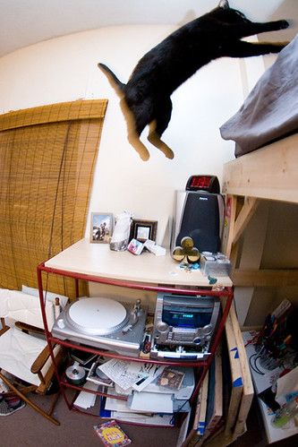
Check out Chris’ cat gettin’ crazy.
Branding
Sarah Borges' new tattoo
Anyone see the shot of Sarah Borges in the Phoenix last week? Can’t tell what was cooler, her cat’s puzzled expression or Sarah’s new tattoo (yes, it’s part of her new logo we designed). Photo by Kelly Davidson

Sounds We’re Digging: Chris v.3
• The Kills – Midnight Boom
• The Roots – Rising Down
• Cadence Weapon – Afterparty Babies
• The Dodos – Visitor
• MC Frontalot – Secrets From The Future
• Death Cab For Cutie – Narrow Stairs
“Game Over, Man. Game Over.”
Hi there. Limpy Justice here, and wouldn’t you believe that it’s my last day here at the ABC®? Well, my friends, believe it or not my time here has come to an end. But fret not! Instead, come with me on a trip in the Justice Retrospect Machine™.
In May of 2008, a scared, little baby fawn by the name of Josh LaFayette (whom didn’t even like coffee) packed up his Volkswagen Jetta in Auburn, Alabama and drove, along with his wife, the 20 hours to Boston, Massachusetts. On the morning of May 28th, he rode his bicycle (which was later stolen) to 500 Harrison Avenue, rode the elevator to 3R, and walked his shaky, little chicken legs down the long hall to Alphabet Arm Design. It was like a dream. He was actually inside all of the photographs that he had studied online. “OMG, there’s the round table!” he thought. “There’s an extra chair there for me! There’s the logo wall! I think I’m going to vomit!” His plan was to gain a plethora of skill, live up to his portfolio, and show the guys at Alphabet Arm Design that they had made the right decision in taking him on for the summer. But he wasn’t the most confident of fellas. He figured, “These guys are professionals, they’re actual designers and they are much too cool for you. Just do what they ask and don’t piss them off.” Well, little did he know what would ensue.
Day after day, our precious little fawn got more and more comfortable and confident, all the while picking up a million skills an hour. He really liked everyone at Alphabet Arm and it seemed that they really liked him back. These guys were professional designers and they were cool like he thought, but they were also glad to have a baby deer for an intern. They had actually become friends. Like, real friends. The kind of friends that you hang out with on the weekends, and pull practical jokes on. Our little baby was blissful. He stayed focused and continued to learn, help out, and share special YouTube videos that the others were unfamiliar with. To me, it looked like everything was working out, to me.
Now, after just ten short weeks, that little little fawn is a 15-point buck named Limpy Justice. LJ is headed back to The Plains with a whole new skill set, a brand new outlook on design, a love for coffee, an extensive list of nicknames, a satchel-full of new music, a new bike, and even new, vegetarian-inspired eating habits.
If you would like to keep up with your old pal LJ, you can visit joshlafayette.com. I would like to thank everyone for all of the fan mail that they sent and let you know the autographed portraits you requested are in the mail as we speak. If you’re in any state on the East Coast south of Mass and north of Florida, keep a look out for a Jetta with a bike rack and Alabama plates, we’ll be looking for a place to stay.
PEACE OUT!

ABC Photo-trivia!
![]()
Our good friend, photographer, Tony Luong came by last week to take some fresh new snaps of the studio. He also took a couple shots of us, which we won’t share cuz’ we’re shy. However, if you can correctly answer these 4 trivia questions, we’ll happily send you one of our new Skull Cahote shirts!
Answer each question with the corresponding “Designer Number” from the image above.
A. Which of us recently face-planted off their bike into a patch of poison ivy?
B. Who “saved” numerous bags of expired torteloni from the trash and ate them all?
C. Who is most likely to do battle with a skunk in their front yard?
D. Which of us would rather eat icy-cold corn than heat it up in a microwave?
Dudes 'n' Deeds
It’s that holiday time again and we continued our tradition of volunteering in the toy room at The Home for Little Wanderers in Boston. It’s a rather personal tradition for Aaron in particular because he was child care worker and assistant art teacher at The Home for Little Wanderers for 5 years. Normally our time volunteering there is chaotic and quick paced due to the large amount of donated toys. This year was a little different because donations are at a record low (obviously the troubled economy is having an impact). BUT there is still time! Head on over before it’s too late so you can help some kids have a good Christmas!
The Channel 5 News team was there doing a piece on the economy’s effect on donations. No, we didn’t have to wear make-up for our appearance.

Darth Intern

A long time ago, in a galaxy far far away…. four wild-eyed creators came together to bring to life an abomination to be their own personal purple monkey dishwasher as well as a protector from the evil space bots that threatened to steal their cookies and hoagies everyday between the hours of 9 and 5. For months they whipped out their test tubes, wore bras on their heads, told bad “that’s what she said” jokes and labored tirelessly calculating calculations that would bring life to their creature. With the calculating completed, the creators took all the nessecary componments and put them into the microwave for 3-4 minutes (or until hot). But then, only seconds into the cooking process, the microwave exploded sending shards of goo and plastic all over their la-bora-tory. The elder of the four creators stood up, pointed to the ceiling in protest and proclaimed “That is why I eat my lunches cold!” However, when the dust settled and the goo was gone, they noticed a large goofy mass with thick classes and torn up Vans sitting in their supply closet eating their cookies and scanning their images. “Its Alive!!!!!” celebrated the creators in unison, while also dancing in circles and handing out fives up high. No longer would the creators have to clean their own dishes and enter deadly four square battles with the evil space bots. Unfortunately for the creators, as time went by they began to notice that their creation was no purple monkey dishwater at all!!! He was nothing but ME, DARTH INTERN!!! a design loving, sci-fi moving watching, nacho munching creator similar to themselves, except with a lower skill-set of course. Despite their disappointment, the four creators vowed to take me in for the upcoming months with the hope of rearing my abilities and raising my creator status to a more professional level (while also scamming on some sweet free intern labor). So that is my story. I know it sounds ridiculous and very untrue (which it may very well be) and many of you will take me as a kook (which I may very well be), but at least take my advice: Never cook an abomination in the microwave on high in a non-microwave safe bowl or you’ll come face to face with the wrath of DARTH INTERN!!!!! MUAHAHAHAHAHA!!! MUAHAHAHA!!!!! MUAAHAHAHA!!!!!!….Oh! By the way, as for the space bots, the creators let them give me wedgies for a few hours during the day so they can eat their hoagies and cookies in peace.
until next time,
this is Darth Intern signing out.
Note: Darth Intern is really just Frank LeClair our newest intern from the New England School of Art and Design. The story above is entirely fictional and any resemblance to actual peoples is entirely coincidental and weird. To learn more of Darth Intern and his crackpot ideas visit his website at www.frankleclair.com. But don’t tell him we told you his secret identity.
A Face for Radio
Our fearless leader, Aaron Belyea was interviewed this morning by Jim Blasingame on his XM Radio show, Small Business Advocate. Want to check it out?
Command X, Command V

Our one and only, Chris Piascik, was selected to be one of the eight contestants in Cut & Paste’s Digital Design Tournament 2009! The premise is that eight designers will go head to head in series of advancing 15-minute elimination rounds until one is left. In the first round, the eight competitors will take the stage in two heats of four designers at a time. The two heats make up the first round. A panel of judges will score their work, and the top two competitors from each heat will advance to the final round. The winner of the final round will go on to compete against fifteen other city champions in the global championship.
The main event takes place on March 14th at The Cyclorama, Boston Center for the Arts. Until then we’ll have Chris locked in the closet—training day and night.
Sounds we're diggin': Ira v5
• Devo – Hardcore Vol. 1 + 2
• Franz Ferdinand – Tonight:Franz Ferdinand
• Fugazi – Steady Diet of Nothing
• Test Iscicles – For Screening Purposes Only
South By…
South By South West, as you probably know, is an unstoppable beast of music festival and a monster media event. Aaron and Chris are headed down to Austin, TX to represent Alphabet Arm. They’ll be shaking hands, making connections and rocking out with all sorts of big shots down in the Lone Star State. So if you happen to find yourself at SXSW and you see two tall New Englanders on bikes (pasty white from a long, cold winter) you should say hello. They’re nice dudes and they won’t bite — unless you have tacos.

Tie one on
In these tough economic times, when the Man’s trying to take the shirt off your back, we’ve got something to keep you covered. It also happens to be just the thing to wear on your next job interview. All you have to do is answer this simple trivia question:
Which of the logos/brands that we’ve designed also features a dapper gentleman, similarly dressed in a fetching bow-tie? Here’s a hint: take a look at our portfolio.
Whoever posts the correct answer first, via the comments on this post (e-mails don’t count, kids) will win themselves a fashionable ABC® Tuxedo shirt in the color of their choice*. Make sure you include your e-mail, so we know what to tell the Pony Express. And just so you know, this is the first in a series of give-away promotions, where we’ll be giving out a shirt each time we add one to the store. The Bloggery subscribers (join now) will get advance notice and details on each contest before it goes live.

* As long as it’s black.
Coffee?

For the first time since we started this blog we don’t have anything to show you… and we can’t even blame it on the economy! In fact, we’re insanely busy (which we’re quite thankful for)! At the moment we have 7 logo projects, 7 office systems, 8 collateral pieces and 2 album packages all in various forms of completion. Oh, and on top of that we are branding a super-hip music festival at Red Rocks. We are very excited about developing the visual compliment to the always stellar lineup at the Monolith Festival.
OurStage
Being big fans of independent music we like to give back to the indie music scene whenever we can. For example, we teamed up with OurStage to offer a free logo design to one of the top rated bands on their charts. OurStage users voted for their favorite musical acts within 50+ categories. It was our job to choose one of the top 25 (from any category) to bestow our gift upon. It was not an easy task to say the least. In the end we chose a band from Stillwater, Oklahoma called Other Lives. OurStage just posted the news on their site, which included an interview with Aaron. Check it out [here].

Flexing our artsy B(oNE)
We’re in the midst of a really fun project for AIGA Boston’s upcoming BoNE Show. It’s a bit out of the scope of the average design project, but the idea is to create one character in the “AIGA B(oNE) SHOW” title, which will eventually become the signage for the exhibit. Our assigned character is an “i,” and we’re taking somewhat of a sculptural, assemblage approach to it. We’re bringing disparate elements from the aspects of our lives, and creating a unified whole. Also, there will be electricity.
 SHOW character")
New Intern

Sup, web friends? My name is Michael Deal and I’m the new intern around here. Born and raised in Seattle, a magical sanctuary tucked between mountains and bays, I’m here to bring a little Northwest flavor to the office.
We played football outside on my first day, which conditioned me into subconsciously expecting it the next day. That might be analogous to how my career is kicking off, because this internship might spoil me into measuring all my future opportunities against Alphabet Arm. That could be trouble, because there can’t be too many places out there like this. These guys are talented, fun, and sharp, and I can’t imagine a better place to intern.
I think my official intern nickname is Sherbie Lou. Aaron mentioned the initial nick of Sherbet Hat after reading an entirely unrelated upside-down scheduling note about my interview. That evolved to Sherbie Lou before my first day even started. I’ll be broadcasting live from the studio’s Twitter account, so follow AlphabetArm to catch a bit of the day-to-day action. Don’t be a stranger now.
Just Like a Rolling Stone
Things are moving quickly with the character for the B(oNE) Show. As you can see, we’ve got a pretty good collection going of materials with which to assemble the letter. We couldn’t help ourselves, though, and just had to follow Mick’s advice…

Shiver me Twitters!
Well, we’re a little bit late to the party—but you can now follow Alphabet Arm on twitter! Our all-star-intern Mike has been manning the controls. So if you’re on twitter—let’s be friends!

None More Black
After countless man hours, numerous trips to the hardware store, and and the sacrificing of several plastic toys, we’re finally done. Last week we put the finishing touches on our character for the B(oNE) Show’s signage, and we’re pretty happy with it. We’re going to keep the final assemblage under wraps, though, until the actual show. You’ll have to turn up to see it in all its glory. See you Thursday.
 Show character detail shot 1")
 Show character detail shot 2")
 Show character detail shot 3")
The Big Reveal
For those who’ve been keeping track, we were asked by Brandon Bird, of the AIGA B(oNE) Show and Brandon Bird Design, to create one character in the title’s signage for the B(oNE) Show. We’ve been teasing the final design here, here, and here. Hopefully, some of you got to see the final piece in all its glory, but for those who didn’t, here a couple shots of the “i” in place. Each of the thirteen characters were auctioned of to benefit AIGA:Boston, with the one prize being bragging rights. We’re not usually ones to brag, but in this case we might make an exception.
 Show signage")

What's going on AFTA work next week?

We’re hosting an AIGA event, that’s what. AIGA:Boston AFTA events are agenda-less, free-form gatherings of area creative folk. Each month a different firm gets to pick the place and play host for the evening. For July, it’s ABC’s turn, and we’re going to do it right by hosting the shindig at ROCCA, just down-stairs from our studio. The event is going down July 16th, with the fun starting at 6pm and going until 9pm. Drop in, meet the crew, talk shop and have a good time. For those anxious types who just can’t wait until next week, we suggest thinking about what your favorite album of all time is. It just might come in handy…
For more info, check out the official even page here. A not-required-but-much-appreciated RSVP and more info here.
Winner, Winner, Walkie-Talkie!
We’ll keep this contest simple, answer the following question. How many of our logos have been tattood on clients? Now take that number and add it to the number of Alphabet Arm’rs who have tattoos themselves. Show your work for credit. One lucky winner will be the owner of a new “Communication is Key” shirt.
Previous winners, employees of the State of Ohio, Contest sponsors, Digimondo, Baby Kitty Advertising, Telepathic USA, and Mediocre Lakes Publishing, and their respective affiliates and members of the immediate families of any employees of those organizations are not eligible to enter or win the Contest. This Contest is void where prohibited by law.
Signing out
Well, my time here as summer intern is finally up, and thank goodness for that. It’s been terrible.
I came here because I quite enjoy the therapeutic acts of filing papers, scanning stuff, taking phone calls, getting coffee, and reformatting images for the web, but I I’ve had almost zero of that. It’s like they’ve been giving me the tasks of a fifth employee, but with the zero-accountability of an innocent naive intern in case I screw up–How dare they assume I enjoy things that are the best of both worlds?
I quickly realized the hell I had gotten myself into, but it was too late. It’s been one agonizing day after another of new experiences, working on too many projects to count for a sickeningly eclectic mix of clients, breaking out into random toy ball throwing wars inside the office, then throwing the effing football around outside in the afternoons, and a whole bunch of making friends for life and bonding and all that poppycock. That might be the worst part: knowing I’m going to be in contact with these fun and talented jerks for years to come. It’s just too much.
And they won’t leave me alone either. What’s with all the personal attention and teaching and helping? I didn’t ask for all this new knowledge. I’ve learned more about graphic design this summer than I did during my entire four years in college. I can’t handle such a productive pace. The only thing that’s gotten me through these final grueling weeks have been the warm prospect of getting back to having no job at all. All of the non-stop laughter and friendship is exhausting.
Oh yeah, and thanks a lot ABC for screwing up my portfolio. Now I have to go back in and replace all those student projects with all this real work for interesting clients. Here’s a bunch of bull**** logos I did during my stint here:

I’m sweating with frustration, so I gotta sign off for good now and drag myself over to the round table to have another long leisurely group lunch where I have to constantly worry about carefully timing my sips between the barrage of jokes and fun. No man should have to eat in fear like that.
Freedom from this place is only a few hours away, but I’ll never be able to forget this experience.
PS: Hit me up at mikemake.com
The One and Only… Patti Fine
Our friend Patti Fine is a Real Estate Consultant. Sound kinda boring? Well, Patti is not boring in the least. In fact, she is clever, spunky and even a bit edgy. She insisted that her card should reflect her personality and asked us to design her a business card that would stand out among the often drab print materials that populate the majority of the Real Estate biz. We had a quite a bit of fun designing this simple little card. Its only 2 colors, but the metallic silver and dark brown inks on green paper stock (French Pop-tone) really help to give this card some punch. In the end, we think think any prospective client will see that Patti’s personable approach really comes through in her new identity.

The Bear Necessities
One of our designers, Ira F. Cummings, was invited by the art director of Select Design to participate in a show of custom-painted Qee figures. The show is part of Select Design’s South End Art Hop festivities, and features Qees painted by Dalek, Gary Baseman and other big names from the art world. Check out his finished bear:


Brand New Intern

Hello everyone, my name is Donovan Brien. I just started working here at Alphabet Arm as the new intern. I currently am attending Boston University majoring in Graphic Design, but I am originally from New Orleans, Louisiana.
Over the first week, I have been surprised at the attitude and style of Alphabet Arm. It’s unlike any other studio I have worked for. Everyone here has an excellent sense of humor, and being here is always extremely interesting. We have discussed everything from mega shark’s size in comparison to the golden gate bridge to the theory of relativity. Needless to say, the great atmosphere is definitely something I look forward to when coming to work.
Despite the colorful conversations and fun environment though, I have been given a lot of cool design stuff to do, and have already been working hard on a huge variety of different projects. It’s been really awesome so far, so I’m really looking forward to the rest of my time here.
Don’t forget to follow us on twitter at twitter.com/alphabetarm. I will be posting frequently, so if you want to know what everyone is working on, or what bizarre animal related topic we are discussing that day, you will most likely be able to find it there.
-Donovan
Win a shirt, you turkey!
You may have noticed that we have a new shirt design, dubbed “Music Connects Us”. We’re pretty psyched about it, so we want to give one away to a lucky blog reader. All you have to do is answer this simple trivia question:
Over the years, we’ve done a lot of work for great bands. Still, there are a bunch of bands that we haven’t worked with (yet). Which of these bands have we worked with?
A. The Pixies
B. NOFX
C. The Mighty Mighty Bosstones
D. Flogging Molly
E. Less Than Jake
Easy as pie (which Donovan hates). Just leave us the answer in the comments, first one to get it right wins.
Previous Contest winners, employees of the State of Nebraska, White Sauce Inc., Dr. Pancakes 24-HR Diner, Drive-Through Hoagies, Babies With Sunglasses Games, and their respective affiliates and members of the immediate families of any employees of those organizations are not eligible to enter or win the Contest. This Contest is void where prohibited by law. Former interns: don’t even think about it.
Czars of Sneakers DAY 01
From time to time we’ve mentioned that we are collectively “t-shirts and jeans” kind of studio. Nothing goes hand in hand with that brand of informal wear than a fresh pair of kicks. One might even consider us sneaker collectors. Although we’re not in the “buy-them-and-keep-them-pristine-in-a-box-in-the-closet,” type of collectors. We’d like to think of ourselves more along the lines of “sneaker advocates.”
To prove our point, we have committed to documenting our footwear for a week. Every day. Yes, it’s that serious.

Czars of Sneakers DAY 02
As promised, more shoes for you!

Czars of Sneakers DAY 03
And they say girls are all about the shoes…

Czars of Sneakers DAY 04
Must be Vans day somewhere – two old schools, two slip-ons (and peep those socks!)

Czars of Sneakers DAY 05
We’ve already heard from a couple loyal followers that this little series of ours has pressured them into updating their own collection. In honor of those folks…here are four more fresh pairs!

Czars of Sneakers DAY 06
Today is a somewhat sad day in the studio, not just due to the torrential downpours we’re experiencing, but because we wrap up our daily shoe shot series today. The response has been rather amazing, thanks for sharing thoughts, sneaker obessions and images with us. Perhaps we’ll do this again sometime.

Attention Fellow Type Geeks!
It’s time for another contest. Typophiles, this one is for you. Take a good close look at the freshly released “Alphabetical” t-shirt and do your best to identify the typeface used on all of the numerals. The first blog reader to identify it wins a free shirt. Leave your answer in the comments and be as specific as possible. (Those of you reading this on The Facebook or The Twitter, make sure you enter your answers on our blog).
Previous Contest winners, as well as employees of the Province of Saskatchewan, Sherby Lou’s FroYo, bands who insist on stretching (or squishing) typefaces, representatives of DJ Cry Baby LTD, Pumpkin Bandage Co. and their respective affiliates and members of the immediate families of any employees of those organizations are not eligible to enter or win the Contest. This Contest is void where prohibited by law. Former interns: don’t even think about it.

In Case You Didn't Know
Well now you know. We’ve posted a pretty substantial update to the portfolio site, including new featured projects for the fall. As always, exceptional photography by Tony Luong.

Sounds We’re Digging: Ryan v.5
Teenage Bottlerocket – They Came From the Shadows
Hot Water Music – Caution
Murder by Death – Red of Tooth and Claw
Banner Pilot – Collapser
Pinhead Gunpowder – Kick Over the Traces
Sci-fi, Low-fi
Check out the 2 color linocut print Ryan recently cranked out of a familiar face at Alphabet Arm. This piece attempts to answer the age old question: what would you see if you looked at a robot while wearing a pair of x-ray glasses? It’s proof, once again that there is still something very gratifying about getting ink under his fingernails and making artwork that is tactile and smells like solvents.

Open Office Hours with Alphabet Arm
Open Office Hours with Alphabet Arm Design: How does effective identity and branding help to quickly establish your start-up or new company? How can rebranding your company reposition you as a leader in your respective industry? Gather unique insight from the award-winning studio that has built their reputation on developing bold, creative and distinctive design solutions for their clients.
10 minute slots available from 9:30am to 11:30am on Tuesday, December 15th.
See available slots below.
Contact: openofficehours@alphabetarm.com / 617-451-9990 to reserve your spot.
Open Office Hours are your opportunity to receive targeted input and advice from industry professionals, without the pressure of cost or obligation. In the provided 10 minute slot, attendees are given an open forum to discuss anything related to identity and branding.
Alphabet Arm – 500 Harrison Avenue, Studio 3R, Boston
New Intern: Mona

I have come to the realization that I’m not sure of many things in life. The one thing I am certain about, is that I want to design. I have a deep passion for it, it’s a feeling that is hard to explain. When I am immersed in a world of art and design. I feel comfortable and happy I am certain this is where I need to be. My name is Maria del Carmen Perez people call me Mona. I’m from Ecuador, a small and beautiful country in South America (you should come and visit!). Considering I go to school in Boston—specifically New England School of Art & Design—having a fear of flying is rather inconvenient. I obviously need to fly a lot. More importantly, I really do love traveling.
Regarding my passion for design: it can be very challenging to relate to my friends who don’t share the same obsession. 99% of my friends have no idea about the design world, so this must mean I need new friends (clearly, my social life is not a priority). Dear friends, if you read this don’t get mad! I love you. Now that you know this about me, and you know Alphabet Arm, don’t you agree it’s the perfect place for me to intern? The team here is awesome. Its only been a week and I already have learned some amazing things. For example: Chris suffers from a crippling addiction to potato chips. Ryan’s grandma is apparently better at technology than he is. Ira has a tendency to use weird passwords on the computers and Aaron eats something called Tofurky. Hopefully, by the end of my internship I’m not a veggie. To be honest though, that Tofurky sandwich looked pretty delicious!
Seriously though, I have already learned a lot. I’m very excited to be here. I’ve had the opportunity to help prep logo files for a couple new books (publishers based in China and Barcelona) that have requested to include Alphabet Arm’s work in them. I may have even renamed one of the books! I’ll confirm that later. I’m currently flowing in new content for a marketing brochure, helping the team with a monthly mailing and about to work on my first logo project.
Hit me with any questions or just say Hola: mona@alphabetarm.com.
Don’t forget to follow us on twitter at twitter.com/alphabetarm. I will be posting frequently, so follow us if you want to keep tabs on what everbody is working on.
New Intern 2.0 -Bianca

It’s true: there are two of us. I am also a new intern at Alphabet Arm and a full-time student at the New England School of Art and Design at Suffolk University. I have ventured down this long road to make it to where I am sitting right now, in my cute office on the 3rd Floor in a hipped out building in the South End. Although I may have doubted myself at times, I’m happy to say that I will be graduating in May with a BFA in Graphic Design.
Alphabet Arm seems to be the perfect cup of tea—or coffee depending on the amount of sleep from the night before—for me. After I graduate, I want to be in the print design field and work with a small group of people who share the same creative goals as myself. Seriously this couldn’t have been a more perfect place for me to intern, with comfy clothes, logo projects, music, sweet treats, sticker cutting and of course great company. Love it. All four guys are great. Aaron’s height makes him move like a gazelle and it scares me at times. Ryan will someday get a dog, have to pick up its poop and probably email me about it. Ira is the smiliest person I have ever met, and Chris seems to share a love of purple with me. All in all, I am more than content here.
The guys have pretty much convinced me to adopt a cat, despite my allergies and dislike of the seemingly cute creatures. I have an issue of waking up in the middle of the night with a nice Charles River rat chilling on my pillow next to me (yes alive and yes I did freak out). So the question they seem to keep asking is, “Really, why don’t you just get a cat?” Cat allergies versus bed rats. What’s a girl to do? I am on my way tomorrow to go adopt one!
-Bianca Pettinicchi
Email me with ideas for cat names, or any other trick to keeps rats out of a bed: bianca@alphabetarm.com
And I am becoming savvy with this thing called twitter 🙂 twitter.com/alphabetarm
Site Update: Winter Projects
We know that regular readers of The Bloggery are exceptionally intelligent people who are always up to date on the most current news. However, should somebody stumble across this blog while looking for design goodness, we feel it is our duty to let them know that we have updated our portfolio site with new projects. Fresh for winter oh-ten.
In addition to the usual new Featured projects, you may notice other new work and more projects throughout the site. Check it out here.

Mona Out!
Eeeeem… (I say that a lot, and have been teased endlessly), bye bye time for me. I don’t feel quite ready to leave.
Just had déjà vu about writing this entry, I guess it means it’s meant to happen. It’s been awful here (not really). The guys are great, I was happy to walk into Alphabet Arm everyday and see what the day had in store for me. I want to say that I’ve never met nicer, and more talented people than this team. Mr. Tofurky you’re the man! Ryan, Ira and Chris, thank you guys for everything. You taught me more than I’ve learned in my last 4 years of college. I’m going to miss you guys a lot! I wonder if you’ll miss my Spanish accent? Time for me to go and look for some jobs and keep doing what I love to do.
I’m a dream machine! Hakuna matata. Mona

April: Hidden Messages
Sure, we’ll admit we’re slaves to our computers and fancy-pants design applications, but we consider them just another tool we use within our creative process. Back in the early stages of our collective careers, a number of us cut our teeth using pencils, Letraset, transparencies, and copy machines. We genuinely enjoy the process of rolling up our sleeves and getting our hands dirty in honor of creating honest design. It allows us to feel less confined by perfect alignment and precise registration and actually embrace all the imperfect little characteristics that often occur. Not to mention that we really dig apes, cats and old school hip hop. Given that, we decided to put our spin on an advent calendar and offer some thoughts or activities to make each day of April a little more fun. By printing all the type as an offline, tinted varnish utilizing Pantone 8340 (10% to be precise), we achieved a slightly “hidden message” vibe to the piece.

Newest member of the intern army

“Be daring, be different, be impractical, be anything that will assert integrity of purpose and imaginative vision against the play-it-safers, the creatures of the commonplace, the slaves of the ordinary.”
– Cecil Beaton
Designing is a major part of my life and I have a great passion for what I want to do. I love what I do and that gives me the drive to work hard and submerge myself in anything and everything design. I’ve been interested in the arts and design since I was young.
So I’ve got a little nerdy side… I taught myself HTML code when I was 11 and used to make websites using the good old notepad on my Windows 2000. That’s what pretty much started the idea of what I wanted to do in my future. My name is Nicole and I’m known as NickyGee here with the guys. I’m from Canton, Mass and I go to Ringling College of Art + Design in Sarasota, Florida for Graphic Design. I am truly a Boston girl and I definitely miss the cold weather and city life when I’m down south. At Alphabet Arm, I’m here to learn more about design, grow through skills I am starting to develop, and be introduced to all different perspectives of design. This is my second week here and I have already learned so much! The guys have been more than welcoming and I’ve been loving everyday in the studio. They might make fun of me from time to time because I’m not a big fan of the look and smell of ketchup with (scrambled) eggs or the fact that I think I’m telling this great story and it turns out to be a big fail on my part; but I love how comfortable it is to work and have fun here. I love Star Wars, digital collaging, checking out design blogs 24/7, and music. I love pretty much all kinds of music. Currently my playlists are focused around: experimental, alternative, folk, indie, hardcore, and DJ/electro/techno/house (my friends are DJ’s). I also minoring in photography which is a huge asset to my work. I am mostly into portrait and beauty/fashion photography. I am working at infusing the two skills to enhance my work and train my eye to view art in different perspectives.
I’m working on a number of different projects thus far; logos, business cards, retail coupons, and marketing materials to name a few. I’m excited for what will come and how much I am going to learn and grown from this experience.
Hit me up an email if you’d like! nicole@alphabetarm.com
If you want to read all about what’s going on everyday, check us out on twitter: twitter.com/alphabetarm
I’ll end this with some inspirational words from master Yoda: “Try not. Do or do not…there is no try. Always in motion is the future.”
Tables for Ladies: NickyGee™ Signing off.

Wow…did this summer fly by or what? I remember my first day here at Alphabet Arm, I was nervous as ever. The guys made me feel like I was apart of the design family in no time. This internship at Alphabet Arm has had a big impact on my life. My perspective on design has strengthened. Even in the first couple weeks I learned more than I thought I would. I am so thankful for Aaron and Ryan to give me the opportunity to intern for them. Being able to experience how a design studio works and actually take on projects for clients was awesome for me to be apart of. Being able to use my photography skills this summer was a big plus. The quality and attention to detail throughout my images look stronger and well-polished. What I will be taking away from Alphabet Arm are my newly improved prepping designs for print skills, my newly installed logo generating techniques, my expertise at designing albums, and many more.
I’m going to miss all the laughs and lunch breaks that made everyday such a fun atmosphere to be apart of. I will miss our breaks to watch Dr. Steve Brule inform us with his rules(…For Your Health), myself and Ryan’s deep conversations on what should have not been changed in the special edition versions of Star Wars Episodes 1-3, Jerry and his usage of ketchup, Aaron’s quick statements about how close of a relationship twitter and I should have, and many many many more. Even though I was quite known to space out during conversations and eventually enter my way back in by thinking I knew what they were talking about (yeah…fail on my part), I was always prone to have funny jokes make about me. Getting to work along side intern #2, JerryChant, was the best. We’ve become great friends through this experience and I know that we’ll definitely stay in touch, life after Alphabet Arm.
“Note to self lessons” and goals accomplished here:
1. Apple + y (in illustrator) = very, very, VERY important when designing.
2. Open files FROM the application, DO NOT drag files to icon. CAUTION: will cause computer to take a while to load and Aaron will make fun of you.
3. Become a mastered Sushee-lady…check.
4. Pencil sharpeners must always work effectively.
5. Add more key commands to my memory…check.
6. Rubber Bands create excellent and efficient weapons on defeating enormous flies.
7. Do not leave the table when eating lunch because your food could be tampered with.
8. Take a picture of Ryan without him knowing…CHECK! (See below)
So my fall semester starts early for me and I’m heading down south to Ringling soon. If anyone wants to stay in touch feel free to email me at ngavrilles@gmail.com
Stay fancy Alphabet Arm fans,
-Nicole / cargocollective.com/nicolegavrilles

Jerry Gots to Go.

Holy guacamole-musk-melons-Batman, eat it with your Nose!
I want to recap my summer internship in full, complete with too many PB & Jerry’s and all the hot and heavy short trips to Foodies for chips and food-snob drinks and do it in style like the hip, skinny jean wearing smuck I’m supposed to be here at Alphabet Arm. But I’m not sure I have the creative juices left to do so.
I would also love to go down in studio history as another intern to leave a sarcastic fair-well about how I learned nothing but how my boss takes his four dollar coffee, but I just ain’t got the heart. I haven’t one negative thing to say about this design studio.
Aaron, Ryan and NickyGee made my summer killer. Spending mostly every Monday thru Friday with these three, I curated a bundle of music and design training camp-worthy knowledge. Now I can feel a little more like a food snob too with my wonderful Trader Joe’s “in” status. (TJ’s if you’re in the know.)
I’m damn proud to say that I played a small role in this studio. Besides being the coolest people I know with great taste in music, Aaron, Ryan and Nicky are the nicest, funniest, most ethical, well-mannered people I know. It’s an honor and a pleasure to have been associated with such knowledgeable & polite folks for the summer. Being invited to their annual summer Birdbath Invitational cookout meant more to me than they probably know. (Although Chris, you didn’t have to take it out on my finger, that shiz was swollen for about a week after that pigskin catch – sheesh!)
I’m going to miss being called Jerry, and shocking everyone with my lunchtime genius food inventions and justifying random ketchup usage. I’ve taken a lot from this internship including a ton of Alphabet Arm stickers that I’m going to continue sticking on street corners wherever I go like a punk rock mofo they taught me to be.
Thanks Guys, you’re all alright.
Jerry
www.jeremiahlouf.com
Choke on this!

While working on the promotional poster for an appearance by the infamous Stevie Starr aka “The Regurgitator,” we caught ourselves thinking, “are we really working on a poster for a gentleman who has made a living by eating and regurgitating that which should not pass one’s lips in the first place?” The Nobles and Greenough School challenged us with the task of working up an old school, horror inspired poster that utilized images of specific faculty and alumni members—around 30 to be precise. Intern extraordinaire, Jeremiah Louf, spent quite a few days clipping out the people that populate the bottom of this image. The build-out was rather time consuming, with a great many elements to prepare before developing the various type treatments and lovingly setting the poster with a delicious halftone pattern.

D new addition to ABC!
That’s right! This is D joining the ABC team (Alphabet Arm) as an intern for the next few months. I’m a Designer to be and Rocker to the Co?e.
Full name is Diego Tang. I’m a bit of a cultural mix, and I’d like to share it with all of you: I was born in Medellín, Colombia (as some people like to call it, the city of “eternal spring”) however, my parents are both chinese. So basically I’m a Colombian with a chinese heritage. It’s been 4 years now, and ever since I moved to the States I started an affair with design, which I’m developing more and more the through studies at MassArt and in my work at internships and whatnot. The time I have spent here at Alphabet Arm has been amazing. It’s more of the environment I like and the guys here are just super chill. I like the office, I like the work, and most of all, the jokes and talks with the folks. It’s only the third week and I already have been exposed to some great design work. Now I’m working on a logo for a record label (how cool is that!). I’m looking forward to learning tons of new things on design, especially more “vector wizardry & knowledge”
I’m interested in very broad sorts of music, as some of you might tell. Rock and Acoustic music are on the top of my list, especially Spanish and Japanese, but I enjoy American music more and more as I discover new feels and vibes here at the office. If you want to chit-chat, discuss, or drop me a joke or a line, but all means shoot me a e-mail to Diego@AlphabetArm.com and remember, stay tuned through twitter to see what’s up http://twitter.com/alphabetarm

tune in, turn on and win this
 It’s pretty obvious that we here at Alphabet Arm love music, and that’s why our latest shirt “Stereo Schematic“, is an homage to the equipment that brings the celebrated sounds to our ears. To share our enthusiasm for the recording process itself, and to make sure you are looking fresh this Fall, we are giving away a shirt to the first person to answers the following questions correctly. That’s right – it’s a three-parter:
A. How may Flux Capacitors are pictured?
B. What is the typeface used in this design? (HINT: it’s our studio standard)
C. How many speakers are included in the schematic?
Bonin' in the Boneyard*

“Hi”. This is John “Johnny Bones” Boilard. It’s nice to meet you, and it’s a pleasure to be here. Very strange but awesome timing brought me to Alphabet Arm. This past Summer I was a day away from writing Aaron about an internship in the Spring, when a message popped up in my inbox titled “Internship”, and it happened to be from Alphabet Arm. It turns out a very kind, very talented Mass Art alum had recommended that Aaron and co. get in touch with some of the rising seniors at Mass Art. I feel pretty fortunate to have gotten the gig and I’m really loving my time here. And as if the deal weren’t sweet enough, I get to work alongside my good bud Diego, the other Fall intern for 2010. How I got into graphic design was not so much about strange or awesome timing, rather it sort of happened out of necessity. Collectively, a group of friends and myself have been setting up arts / music events in Western Mass (and more recently in Boston as well) since May of 1998. It was through the need to promote these events, that I discovered my love for type, design, and screen printing. 12 years later I’m still enthusiastic about making posters and setting up shows, and it’s something I hope to always have a hand in. With less than a year left of school, I’m getting ready for the working world, and although I’ll miss being at such a rad place like Mass Art, I’m pumped to be working soon, and look forward to putting all that I’ve taken in from places like school and Alphabet Arm to good use.If you’d like to say hi, or have a band that would like to play Boston or Western Massachusetts, feel free to get in touch.Thanks and have a cool day!-
J.P. Boneyard
dontkillanything@yahoo.com
*STUDIO DISCLAIMER: “Bonin’ in the Boneyard” is a track by the legendary band Fishbone (see the 1988 release, Truth and Soul)
a fevered fest for the fall
 The Mercury Brewing Company hired us to design the poster for their annual Ipswich Ale “Fall Fest.” We were immediately excited to hear the day’s events included a vintage baseball game played with historically inspired uniforms and mustaches to boot! Alphabet Arm’s pal and all around master illustrator, Alan Pearsall, worked up the image we based the design around. Integrating color and texture to his pencil drawing was an honor. With hopes of perfectly imperfect registration, we lovingly weathering the image. We were also rather inspired by the notion of printing on a wooden crate, hopefully these visual strategies helped knock this one outta the park.
¡Viva Lucha Cubby!
Not to toot our own tacos, but we have a sweet new piece o’ artwork in the studio we thought we would share. We hired the vinyl wizardry of Bob Shane / Vinyl Countdown to assist us with 40+ inches of lucha love we developed. He labored over the placement and multitude of individual pieces until the 2 color imperfect off-registration was perfect. Bob is the man, interested in seeing some of his other work?

D-Rock

Team Alphabet Arm, D-Rock is out!
Oh boy, this is it. My internship at Alphabet Arm has come to an end, and man it flew by! But that’s what happens when you’re having a good time – right? I have to say I learned so much during my time here at the studio. From new skills and strategies in design (both conceptual and technical) to even American culture and jokes too (not to mention that I expanded my vocabulary quite a lot). I will definitely miss all the good times we had, like the trips to Food Nation, the Bean Show on lunch, Football breaks, music lessons, and the overall cool vibe of the work environment. Thanks to you guys I’m a little more into the sport, broaden my views in design and you made me love pencils again. I can’t express enough my gratitude for everything I have experienced.
I stand proud to have interned here. Keep rocking it dudes!
Love, Diego
The Bone Machine is no more.

Alright! It’s about that time. 22 projects, 35 lunches, 4 football breaks, and 12,621 jokes* later, I am hanging up my intern gloves here at Alphabet Arm. In an effort not to gush about how appreciative I am about my time here, I won’t go on about how awesome it was to work with Diego, how Aaron and Ryan were completely willing to help us learn the ropes, or how I feel like this experience has been one that has helped me grow in quite a few ways, both as a person and as a designer. I almost can’t believe how much we were able to fit in during 16 weeks (bobo). Instead, I’d just like to say that I’ve had a fantastic time here at Alphabet Arm, and I’m glad to have been apart of the team. Thanks for everything guys!
– John
*Edit – Ryan just told another joke while I was typing this. 12,622 Jokes to date.
"Twelve Calendar Inserts and a Partridge in a…"

‘Tis the season. The snow is beginning to fall. The stars are shining brightly. But which is this you might ask? We’d like to think the image suggests a likeness to both. As this calendar collection began in January, we kicked it off with some composited images from the Mars HiRISE project. This month, we’ve come full circle with an equally ambiguous and dreamy image. Is it a blustery evening snow shower or blurred photograph of a telescope view? We’ll never say. What we would like to say is that we thoroughly hope you have enjoyed these monthly calendar installments designed by your friends at Alphabet Arm and majestically printed by Flagship Press.
We utilized a spot UV coating on the front of this December calendar. It’s a great way to subtly highlight specific elements within a composition. By using this print technique, one can add a level of information or visual interest without obstructing detailed imagery. Printing on a coated paper stock gives the maximum result of glossy contrast. Similar to the January calendar, we paired the spot UV with the flexibility and precision of 4 color process printing. That said, Happy Winter!
“Pahkah” Puffin Spirit Month!
 I have to say it – Alphabet Arm is an awesome studio. I have officially decided that Aaron and Ryan are probably the coolest bosses I could have hoped for, and while they primarily focus their daytime lives on kerning type and debating Pantone colors, they also enjoy other interesting activities such as listening to a variety of good music, eating lamb shank (Ryan) and tofu (Aaron), cracking jokes left and right, scaling the walls of tall buildings, and shopping for bidets. This is all very entertaining for me!
But seriously, it’s been about a month at the studio for me, and they are great people to be interning for not only because they are genuine guys, but they kick butt at designing and they provide a great learning environment for me to grow as a young designer. The efficient work pace and high quality of design Alphabet Arm delivers time and time again is positively influential. And so far I am having a blast!
The design tasks I have been given so far include developing concepts for logos, designing business cards, laying our marketing collateral, and prepping files for print. So far I have learned some handy shortcuts, new tools in the programs, and fun terms such as “indicia,” “bug,” “antiquated,” and “lock-up.” Oh Education, how you follow me in even the most entertaining of places!
I am looking forward to my last semester of school and continuing intern duties at Alphabet Arm. I expect to design some fun pieces (already 99% of my projects have been fun), learn more about design, the programs, and myself as a designer. I especially expect to have a great time doing it. I am very lucky to have been given this opportunity and discover design in new ways.
I was asked to think of a spirit animal that would represent me, because the guys have all thought about their own animal metaphors before. Boneyard offered his suggestion of a puffin because I love orange and yellow, and I believe the puffin aesthetic relates because I am a fairly small person (puffins stand less than a foot tall). Puffins are definitely cool birds because they fly with their awkwardly shaped wings, but they also have the ability to dive into icy depths of salt water with their water-proof black feathers. So these little birds are adventurous, colorful, and have a fun attitude, which describes me! Now the studio is filled with the spirits of a dog, a puffin, a meerkat, and a cat!
Signing off, Amy “Pahkah”
All about the Acronym
We recently re-branded an apparel company who has made their name largely due to the meaning of that very name. If you don’t know what Dilligaf stands for, you probably know someone who does. It’s an acronym that ends with a question. That was one of the visual cues we wanted to address while developing their new logo. Their rabidly loyal fans wear Dilligaf apparel like a shield of honor – you guessed it – visual cue #2. Lastly, we wanted their brand + line to soar above the typical graphic solutions (skulls, gothic type, snakes, dark tones, skulls, splattered blood, skulls, etc.) that seems to dominate their customers’ culture. During our initial meeting, there was a very frank discussion as to whether Alphabet Arm was actually the appropriate studio for this project or not. To their credit, the team at Dilligaf convinced us that we were. We’re happy they were so persistent. They too seem to be happy, which might be why they wrote this kind review on Yelp, “The folks at Alphabet Arm have enabled us to elevate our line to a totally higher level. They have inspired and amazed us both with their professionalism and their incredible understanding of our product.” TFTKW*

*Thanks For The Kind Words
put a lid on it…

Being a design studio who is often hired to design logos + develop identity systems that can fluidly apply to a variety of mediums, it’s always a hoot to use our logo much the same way. To that point, we like hats. Baseball hats in particular. Branded baseball hats to be very specific. Now we finally have our own. You can have your own too! Hit up the store. These will most likely go quickly, so get yours now or forever hold your hat. These are Yupoong Flexfit Wooly Combed Twill Caps available in S-M + L-XL.
Good Call!

If you are at all familiar with our studio’s work (which seems silly to state if you’re reading our blog), you might recognize one of our beloved mascots, The Design-Bot, aka el Cahote. Over the years, he has appeared on Alphabet Arm merch, marketing materials, ads, and various promotions. He can now be seen on our Art Director’s iPhone case, expertly laser-engraved on bamboo courtesy of Grove. Check out this bad ass Portland based shop and see what they can make for you.

STUDIO DISCLAIMER: THESE EL CAHOTE IPHONE CASES ARE NOT FOR SALE OR AVAILABLE IN THE ALPHABET ARM STORE, SORRY POPS.
Goin' Big / Part 01

We recently did a little merchandise testing with a new print technique our homies at Jakprints are perfecting. It’s a process implementing full color, high resolution dye sublimation. So, creating unique, one-off shirts is very simple. As a busy design studio, there are plenty of bits and pieces of ideas or treatments we’ve amassed over the years that haunt us. Even if a client didn’t deem them worthy, this is a fun way to get them a second chance at a little exposure. We have a couple different shirts we’ll share with The Bloggery over the next few weeks. This piece, in particular, features one of the many studio mascots (The Football’r) set against some leftover photo elements from a design installation (Graphic Takeover) we tackled back in ’06. Old school baby!
Goin' Big / Part 02

Hi there, as previously promised, we have some more merchandise testing examples with our home skillets Jakprints. It’s a relatively new process implementing full color, high resolution dye sublimation. This old chestnut, in particular, revives a previous t-shirt design we sold out of a few years back. “Giant Squid Attack” was limited to three colors in it’s previous incarnation. With dye sub printing, both numbers of colors and the imprint size are no longer an issue. Ink on!!!
Winter Solstice Design Sprite!
You know when you think about that job you had way back when, and you just smile because it was a great time in your life? Years from now, I will remember working at Alphabet Arm with Aaron and Ryan, and how it was one of the best experiences I could have asked for. I learned how to work more efficiently, look at work with a more critical eye, and have fun while doing it! These guys are masters in practicing – not only kickin’ design – but masters in professionalism, patience, and all at the same time, take any opportunity to laugh. They are rather hilarious, and obviously love what they do here in the studio!
With that said, some of the challenges I personally faced as their intern was 1. keeping up with their drinking (coffee that is!) 2. understanding obscure jokes from the 80’s (Who knew who the heck H.R. Pufnstuf was) 3. working on what seemed like an endless flow of projects day to day (which they do all the time, and then some) 4. commuting to the studio (I had to climb mountains of snow on the sidewalks of Boston) 5. educating and being patient with clients.
Everything I did here was great practice, helping with both production and creative work. In a nutshell, I was able to work on projects where I designed logos, t-shirts, beer labels, business cards, marketing guides for larger companies (like Dove, Multibionta, Braun/Venus, & Scott’s) and I even had a chance to help with some CD packaging. I discovered the process of working with a spectrum of clients, and how there are degrees of difficulty and new challenges with each project. With this enlightenment, I look forward to doing work in the future where I am able to make clients happy with the work I produce! I’m sure both of the “Misters” agree, it is rather rewarding to be a designer.
As my last day in the studio, I can say I am sad to leave, but I am leaving satisfied with the great experiences I have encountered during the last six months. The work I made, and the friendship I have gained with Ryan and Aaron has been absolutely wonderful. Thank you guys for the laughs and mind power!
Signing off, Amy
DISCLAIMER: The following image of Amy is not to scale.

Goin' Big / Part 03

Howdy folks, here’s another in the series of one-off, full color, high resolution dye sublimation t-shirt tests courtesy of Jakprints. This composite design was largely inspired by some found textures, an old schematic and the Handyman’s Book (published in 1951) that was discarded and subsequently found in a one of our basements. Note the left shoulder supporting the illustration of the handyman expertly using a handheld drill (also his left shoulder). This shirt looks even better on, we’ve already had three offers to buy it on the spot.
PLEASE NOTE: ALPHABET ARM NO LONGER OFFERS TOOL SHARPENING AS A SERVICE.
Goin' Big / Part 04

All good things must come to an end. Here is the last of the one-off, full color, high resolution dye sublimation t-shirt series all lovingly printed by Jakprints. This design is a graphic, cautionary tale inspired by the dangers of keeping wild animals as household pets. Oh, and also because we heavily dig wood cut type.
NO WOMEN, TIGERS OR TYPE WERE INJURED DURING THE MAKING OF THIS T-SHIRT.
Rasta-rific


At Alphabet Arm, we dig sweet, illustration-heavy design, we also dig music…oh, and we dig t-shirts too. With Summer at our doorstep, we decided it was the proper time to unveil this shirt and add it to our store. This design was unabashedly inspired by the Jamaican sound systems made popular in the 50’s + 60’s and was expertly illustrated by Alphabet Arm alum Ira F. Cummings. Heck, you can even win one if you act quickly and head over to our facebook page! No pressure, no problem man.
I ate a gyro for lunch yesterday.

Whatup blog readers! The name’s Matt Kaiser, and I’m a new summer intern here at Alphabet Arm. It’s only been a week and I’m already way too excited, so I’ll reel it in just do what I do best: talk about myself. I was born and raised in Baltimore, Maryland where I never really left my bubble. I was just a nerd who also played soccer, ran track and got into art and digital media (through Pokémon, actually, but that’s a story for another day). When college rolled around, I only knew two things: I wanted to study graphic design, and I wanted to get the hell out of Baltimore. Now I’m a rising third year graphic design major at MassArt and I’m loving every moment of it.
I have a real passion for branding/identity design and typography, and would probably have an alphabet half sleeve if that was an original idea… Alphabet Arm was foreign to me until the end of my freshman year when Aaron and Ryan held a presentation at my school, showing off their rather incredible branding projects and CD art direction. I was impressed. When the time came this year to find a summer internship, former intern Jeremiah mentioned the work he did here and how talented yet laid back the guys were, so I drafted an email and gave it a shot. As a younger designer I feel very fortunate to have secured this position and to have the opportunity to work with a studio that follows my exact plan for the future. Just a few days in I’ve already been included in apparel design projects for multiple clients. And I’ve acquired an awesome hat.
This will be quite a summer working alongside Aaron, Ryan, and Silvi – the other 2011 summer intern who does a great job keeping us laughing (unintentionally) – I’m psyched!
Feel free to get in touch with me at matt@alphabetarm.com and keep an eye on our gradual loss of sanity at http://twitter.com/alphabetarm
P.s. I hope you like the design above. See if you can catch the viking hat I subtly integrated into the logo.
Peacocks, 45"s, Robots, Seeds + Squids.
Let’s face it, most Americans struggle with lackluster zipper experiences everyday. What could be worse than being completely uninspired when securing a bag shut or zipping up a jacket? Statistics show that adults spent approximately 11.5 hours a week wrestling with faulty zipper products* and many instances result in serious bodily injuries**. That’s no way to live. Well – fret no more friends – Alphabet Arm has a solution.

And in 5 friendly flavors.

That’s right, you guessed it, we have some new zipperpulls, courtesy of our friends at Pure Buttons. Want to snag a set of your own? That’s easy, head to our store!

*Give or take 11.0 hours – Source : Dr. Steve Brule **Source : Dr. Who (Classic)
en contacto con nuestro lado femenino…

We recently completed a BzzAgent project for a Covergirl product, LipPerfection. It’s a 6.25″ saddle-stitched, square booklet. It happens to feature a perfectly executed, sculptured emboss cover (courtesy of Flagship Press) as well as a selectively placed UV varnish. Not only is the lovely Drew Barrymore the spokesmodel, but the booklet is bilingual. We opted to use a “flip book” layout to accomplish this. Depending on which side you open, the content reads in either English or Spanish. ¡Es hermoso!

Ice Cream & Tears

I recall wanting to be a part of Alphabet Arm for three years, when I got this amazing opportunity to Intern this Summer with Aaron and Ryan, I was so thrilled. Today is my last day here at Alphabet Arm and as my last hours pass by with tears as I think that this has been one of the best experiences & times of my life. What more can you ask for when you get to spend your day with two incredible human beings, artists and inspirational people that push you to be better and help you grow in many areas of your life as possible. I must say that Aaron Belyea and Ryan Frease have been not only great inspiration and motivation for me and the other interns here this summer, but great friends. From helping me grow as a designer to being part of a show I curated this summer (Human Powered Works) to BBQs and ball games at lunch, I know these guys will always be a part of my life. I am very sad to go but am also excited to use all the things I’ve learned here in future projects. I’m sure I’ll always refer and remember the little tricks Ryan taught me and the process that Aaron helped me develop.
YOU GUYS ROCK!!! I hope that every Intern from now on has just as great of a time here as Matt, Flo and I shared.
Thank you Alphabet Arm for everything you’ve taught me and all the laughs we’ve shared. See you all on the flip side, Silvi signing off.
It's Nice to Splice.

Whether you are serious about the process of recording, the history of all things audio, or simply a music enthusiast – we feel you. And YOU will feel this shirt that proudly honors the aesthetic of music’s past. With this three color, screen-printed American Apparel T, now you can finally look as good as you sound!

Snag your own at our store while they last.
Alfred & Apollo
Hello all you type and design groupies…

My name is Ryan Severance and I am the most recent intern for Alphabet Arm. This is my first installment of bloggery goodness. Due to a certain Senior Designer here at Alphabet Arm, I am banished from the privilege of using my given birth name. Subsequently, I have already accumulated a plethora of nicknames, none of which we will delve into at this juncture. I have achieved most of my schooling in the oh-so-corrupt city of Chicago. I have a great love for typography and the individual form of letters, but interesting ligatures seriously launch my Apollo. I stumbled across the work of Alphabet Arm, by chance, and inquired of an opportunity such as the one I am in.
But, you know what they say, ’til next time, Alfred signing out.
Laurie Boire Alice
Hello there! My name is Laurie Rane Mildenhall and I am a newly enlisted member of Alphabet Arm’s intern army. I can’t believe I get to work here. I hail from San Diego-Encinitas if you want to get technical-where I learned to love the beaches, cheap Mexican food, traveling and music.

It was not a struggle. I’ve always loved drawing, but I suppose my passion for typography began in middle school when I started making these elaborate hand-lettered doodles in my school notebooks, often to the chagrin of my teachers. However, it was many years, two unfinished majors, and three years in college before I met with the head of graphic design at BYU and asked, “What exactly is graphic design?” Instead of throwing my ignorant behind out of his office, he explained that graphic design is about solving problems and communicating through type and images. He also said that if I wasn’t committed to excellence I should find a different major. Sold. It has been about a year and a half since then and my life has been a giant design explosion. I graduated a couple of months ago and then moved to Boston which, it turns out, is just about the best place ever. Some other fun facts: I love black liquorice, I’ve fractured and sprained both of my arms, and I’m married to a guy named Nick.
To wrap things up, I can’t think of a better place to be learning the ropes than Alphabet Arm. Aaron, Ryan, and my fellow interns are quite simply the cat’s pajamas, and I’m lucky to work with them.
Feel free to say hello! laurie@alphabetarm.com or check out some of my work:http://cargocollective.com/laurierane
O U SK8 1 2?

Not long ago, artist, former intern, and curator extraordinaire, Silver Oris, assembled a gallery show aptly titled, Human Powered Works.
She asked Alphabet Arm to design a few new pieces for the show and we collectively agreed skate decks would be the ideal medium. Not only do we appreciate skate culture, the decks themselves allow a great deal of creative leeway. Whether it be conceptual, playful, ironic or topical, we embrace the fact boards have become a medium for fine art. The format itself allows us to break out of the typical rectangular framework we find ourselves often working with. We’ll be post some new deck designs over the next few months, here the first installment of the series.
As one of us here at the studio has become somewhat consumed with the social-media-image-driven-craze of Instagram, it made perfect sense to design a board using some of our favorite shots. The idea of having a print medium for these images was rather exciting as we’re usually held to the confides of the interwebs. Ride on.

Merch Media Mania
 All around bad-ass MC, Mr. Lif, just hipped us to the fact that he is repping Alphabet Arm in a new Thievery Corporation video for “Culture of Fear” in which he is featured. Rocking a classic El Cahote / Designbot t-shirt, he’s looking fresh as ever. Although the original El Cahote shirt is sold out, these two complementary counterparts are available and in stock (for the time being at least).
 Longtime friend of the studio, Fred Eltringham, is also looking razor sharp in one of our Reel Audiofiles Unite shirts for is recent Vater Percussion profile. Fred is currently touring with K.D. Lang, but has played with a who’s who list of artists: Dixie Chicks, The Wallflowers, Ben Kweller, Tears for Fears, etc. since playing with the former Boston quartet, Gigolo Aunts.
Now you can look as hip as these two cats!
Masked!

This masked lucha head came about while we were designing a marketing piece for the studio (it’s since appeared in a number of applications).
It was only after each person who received the piece stated, “this would make a really sweet t-shirt,” did we think to ourselves, “this would make a really sweet t-shirt”. Not only are they offered in the glorious blue + heather red option, there is an equally kick-ass gray on gray version available! Both are screen-printed on American Apparel – and wouldn’t you know – make a joyous holiday gift (sorry, tacos no longer included)!

For your viewing pleasure > various uses of the famed lucha libre character.
Rainy Day Deck

If you are a frequent reader of The Bloggery, you might recall the previous decks we designed for the gallery show Human Powered Works, here’s another one in the set. This piece is appropriately titled Rainy Day Deck. It features a little character we illustrated for a skateboard shop in Austin 5 or 6 years ago. They skipped out on the balance of their invoice and this fella (“Harry Knees”) was archived, never to see the light of day. We finally brushed him off and gave him some shine (not literally – mind you – he’s attempting to outrun a lightening storm). For the record, this design was printed courtesy of BoardPusher.


For the record, it’s raw and rainy here in Boston today, how is that for keeping it real?
Comfort For Less

Here is the latest segment of our ongoing series of skate decks as fine art. This one just fell into place and it didn’t even seem like we were trying — a rare (but highly coveted) project where there is very little artistic struggle and it just feels right. It started as a loose pen and ink drawing (see process photo below) and finished with a quick brayer of yellow ink, some zipatone dots and a bit of photoshop. Done and done. Expertly printed by BoardPusher.

say hi to pete…
Sad to say, but this post concludes our series of skate decks as fine art.

This decks was inspired by a book of soundtrack artwork from the 60’s we have in the studio.

After acquiring a couple new typefaces we were all geared up to use, and wanting to work up a whimsical deck to offset some of the slightly more serious directions already completed, this one came about. We also like the play of “for Pete’s sake” to “for Pete’s skate.” We’re just hoping Mr. Sellers would approve. Expertly printed by BoardPusher.

Calamari with attitude

We came up with this squid illustration a few years back in honor of our shared affinity for anything inky. He hadn’t seen the light of day for quite some time, so we thought we’d bring him out of the deep to live on your very own desktop.
What are you waiting for? Get started downloading! You can either right click and then “Download linked file” or control-click to do the same.
Download the squid. You’ll receive a zip file containing the following desktop resolutions:
2560 x 1440
1920 x 1080
1280 x 720
1280 x 800
No Assembly Required

A short time ago, one of our existing clients — who shall remain nameless at this time — asked us to create a mascot to use as a secondary branding tool for their I.T. company. We proposed a short list of possible directions that included an otter, a mongoose, a robot, a crime fighter and several other quirky choices. Of course, the robot was the winner (because robots are the best… duh). We wanted to make her a lady robot (or “Shebot” as we’ve been calling her around the studio) to give a twist to the typical notion of a retro tin robot. She’s smart, a bit sassy and she’ll fix your computer in the blink of an eye.
Here is a quick look at the process that made her the robot she is today. As you can see, the smirk gives her just the right bit of attitude.

Through the process, we also developed this crime fighting super hero. She didn’t make the final cut, but we were really excited with how she turned out. In other words, we couldn’t bear to see her fade away into the logo graveyard without showing her to the world.

Recent Records Rocking the Studio 2012 / PT. 01
As a musical public service blog-a-nnouncement, we wanted to share some recently released records that are gaining serious play in the studio (and since people always seem to ask what we are listening to at the moment).

Young Knives > Ornaments From the Silver Arcade // rev’d up, Brit rock featuring hooky tracks, snarky vocals and gorgeously obsolete synth patches // HIGHLIGHT “Love My Name”
Cloud Control > Bliss Release > trippy, super creative, spaced-out indie melodic rock heaven // HIGHLIGHT “There’s Nothing In The Water We Can’t Fight”
Plants and Animals > The End of That // surprisingly catchy, laid back, organic rock with killer dynamics // HIGHLIGHT “Crisis!”
Yellow Ostrich > Strange Land // jaring dissonance pared with pop sensibilities and much in the way of percussion // HIGHLIGHT “Marathon Runner”
Ben Kweller > Go Fly a Kite // sing-a-long 70’s songwriter sensibilities crowbar’d into a contemporary slant HIGHLIGHT “Gossip”
Good Old War > Come Back As Rain // subdued acoustic rock sounding both vaguely familiar and brand new with more hooks than a bait shop // HIGHLIGHT “Calling Me Names”
22-20’s > Shake/Shiver/Moan // epic guitars and sparkling harmonies make for an intriguing intersection of British Invasion inspired Arena Rock. HIGHLIGHT “96 to 4”
Jack Peñate > Everything is New // imagine Robert Smith sounding 64% less annoying while fully embracing a quintessential UK pop aesthetic // HIGHLIGHT “Pull My Heart Away”
Thomas Dolby > The Golden Age of Wireless // okay, busted, this is not a new record. but, it’s a brilliant collection of cinematic synth tracks circa 1982…don’t hate // HIGHLIGHT “Europa And The Pirate Twins”
How about You?
Recent Records Rocking the Studio 2012 / PT. 02
The second installment of what is currently spinning in the studio. This time a not-so-subtle punk rock thread carries through our featured favorites.

Sharks > No Gods // English punk rock band that are often compared to The Clash… there could be worse things. However, they’ve definitely put their own youthful spin on genre // HIGHLIGHT “Arcane Effigies”
The Underground Railroad to Candyland > Knows Your Sins // Quirky, dark, jangley, surfy, DIY, indie rock. Yes, this was realeased last year, but it’s new to us! // HIGHLIGHT “Jimmy V”
Classis of Love > Classics of Love // Energetic and angry. The classic voice of Jesse Michaels from Operation Ivy returns with fury // HIGHLIGHT “What a Shame”
The Menzingers > On the Impossible Past // Quality songwriting on this mature sounding take on singalong anthems and self-deprication// HIGHLIGHT “The Obituaries”
The Men > Open Your Heart // Garage rock meets 80’s hardcore with great riffs throughout // HIGHLIGHT “Turn It Around”
Apologies, I Have None > London // Emotionally charged, heart-on-your-sleeve debut from the English four piece // HIGHLIGHT “Clapton Pond”
Lawrence Nightingale

Dearest friends of the Bloggery:
It is my last day interning at Alphabet Arm! It has been a pleasure to work at this studio alongside Aaron, Ryan, Matt, and Fredo. The guys at Alphabet Arm are outrageously talented, always willing to help, and as an added bonus, they are pretty brilliant in the humor department. If you get the chance to work here, you will learn from the best. If you become a client, Aaron and Ryan will set you up with a logo, branding system and or, a design solution that will knock your socks off. Seriously, I can’t speak highly enough of these people, they are the best.
Until next time,
– Laurie / Lawrence / LawR / Lory Borry Alice
I recently lost 645 pounds!

Hello all. My name is Nathan Hass, and I am proud to say that I am the newest member of the Alphabet Arm family (although rumor has it there are a few more on the way). I’ve been interning here for about a week now and the gang already has me problem solving and pixel pushing. Things have been great thus far, and I can’t wait to see what is still on the horizon.
I hail from Andover, MA where I have developed a reputation for being a bit of an art nerd. My love of art, design, and creative problem solving has lead me to MassArt where I have just finished my junior year studying Graphic Design and Art History. I have been a huge fan of The Arm for a few years now, so I’m super excited to learn all of the tricks and tips that Aaron, Ryan, and Matt are willing to teach me. I love branding, typography, and logotypes that are both beautiful and conceptually compelling. Alphabet Arm will be a wonderful studio for me to grow, learn, and have a lot of fun.
If you want to get to know me a little better or just say hi, shoot me an email at nathan@alphabetarm.com or check at my portfolio at NathanHass.com. Incidentally, the subject line / joke line, was just that.
A Few Thoughts Regarding Logo Life Span.

How long should a logo last? It’s a question most business owners, universities, corporations and entities wrestle with. The answer justifies the time, effort and cost of developing a logo that should stand the test of time. Consider that the iconic Coca-Cola logotype script was developed in 1941, the fact that Paul Rand’s restrained television network identity for ABC from 1962 still rings true, and the legendary Saul Bass designed the original Lawry’s brand mark in 1959. Of course these may be extreme instances, but its safe to say the companies “got their money’s worth”. Most agencies, art directors and designers attest: a well considered, thoughtfully executed logo should last 10 to 15 years. As a studio, we can only hope to have an identity stand as long as some of our design heroes.
As we were writing this post, we decided it might be more powerful to ask a couple clients to share their thoughts on their logo:

“Almost as soon as Fenway Recordings had a name, it had a logo. Neither decision was complicated. The logo is, and will remain timeless, looks great any size, and recently had a bit of a renaissance as we just celebrated the 10th anniversary of it’s creation. Alphabet Arm knew how to make our identity graphic and iconic, and as far as I am concerned, it will last forever, and may be the most reasonable investment that we have made.”
Mark Kates / Fenway Recordings

“We never seem to tire looking at the Harlem Vintage logo, even after the eight years of our wine store’s existence. It was important for us to have a graphic representation reminiscent of the renaissance in Harlem juxtaposed with “newness” of the wine experience we were creating in this neighborhood. Alphabet Arm exercised patience and perseverance in creating just that perfect balance to convey who we were…even as we were trying to figure it out ourselves.”
Jai Jai Greenfield / Harlem Vintage

“Ten years ago I had a meeting with the team at Alphabet Arm and proposed the name and concept behind BzzAgent, which was a task in and of itself . No one had a clue what Word-of-Mouth was at the time, and what it would become. Before I knew it, a brilliantly simple solution was proposed and we quickly had the logo that still stands and represents our social marketing company perfectly. A lot has been made of the “angry bee” which we have embraced and used as a talking point about the logo, “he’s not angry you see, he’s determined.” The logo has been the visual cornerstone of our marketing strategy. It’s been imprinted on hundreds of thousands of our BzzGuides, carved into a conference table and its likeness cast in 3D sculptures. The logo and branding remains front and center, even after our acquiring by Tesco.”
Dave Balter / BzzAgent, Inc.

the long goodbye
Whatup blogonauts! Matt / Matty K. / Matty Nice / MATTress here. I’m sadly reporting to let you all know that my time at Alphabet Arm has come to an end. For the past year, I have seen more, done more, and learned more than I could ever have dreamed. I have added countless designs and illustrations to my portfolio, but even more importantly I have added a whole new group of people to my family. Aaron and Ryan, along with Silvi, Flo, Laurie, Alfred, Jeru and Nate (and everyone else I met along the way) have helped make my first true foray into the design profession one that I will never forget. I am grateful for everything that they have done for me, and for teaching me that going to work can sometimes be more like going to your cool uncle’s annual memorial day barbecue. Good luck to all future interns, and hopefully this won’t be the last time you here from me (especially if you keep tabs at mattkaiserdesign.com cough cough). Cheers!
 Oh, this screenshot you ask? It’s a long story, but this link might help shed a little insight!
I lost 646 pounds using these SpaghettiPants!

Hi everyone! I’m Robin Hayashi, latest intern addition to the Alphabet Arm crew. I’m one week in and knee-deep in projects. Aaron, Ryan and Nathan have already provided lots of insight, many tips, coffee and tons of music. In searching for a studio to intern with, I found Alphabet Arm, and was immediately drawn to their playful attitude and impressive portfolio. They’re committed to great design…and great jokes.
Throughout my younger years (in Newton, Mass.), I always knew that I’d pursue in a visual career. However, it wasn’t until my freshman year at the Rhode Island School of Design that I stumbled upon Graphic Design. Through my sophomore and junior years in the Graphic Design department, my affinity for form and communication (and desserts) has only grown, and I now consider typography and color (and ice cream) great loves of my life. I’m so excited about Fluffernutter and the weeks to come here at the studio!
Check out my website, robinhayashi.com, for some of my work, and drop me a line at robin@alphabetarm.com I’d love to hear from you.
I Can't Quit You

I never knew that the summer months could feel so short! I’m super sad to say that my summer at ABC is ending. My brotato chips Aaron, Ryan and Nathan made my internship here wonderful with their extensive tips, suggestions, and great sense of humor. I can’t thank the studio enough for all that they’ve given me (including, but not limited to: buckets of caffeinated beverages, frisbee tips, lots of laughter, experience, a fondness for illustrator…) Thanks to everyone who took part in this great experience! Hopefully we will meet again soon; I’ll be tearin’ up Providence (and buckets of cotton candy) until then.
Robin
Turn it Up! Our Best Albums of 2012

Being huge fans of music (and some of us being musicians, ourselves) we thought that we would share our favorites of 2012. Enjoy.
Aaron
1. White Rabbit / Milk Famous
Got two drummers and a piano player? This record offers up the perfect blend of quirky accessibility, crafty songwriting and unexpected instrumental.
2. OFF! / self titled
A perfectly executed hardcore classic channeling records from the heyday of 1983.
3. Soft Pack / Strapped
Although this record doesn’t completely follow up on the promise of the self titled ’10 debut, it’s a solid set of fuzzy, post punk gems.
4. Plants and Animals / The End of That
This record completely took me off guard, then again, I wasn’t sure what kind of expectations to set. A rocking folk masterwork? A touch of Canadian Americana? An unexpected collection of lyrically heartfelt indie pop tracks? I offer all of the above.
5. Tame Impala / Lonerism
Trippy psychedelic Australian fuzz no doubtably recorded on all analog gear. An otherworld of surprisingly catchy psych rock.
Ryan
1. The Menzingers / On The Impossible Past
How could one record sound so melancholy, yet so hopeful? I can’t help, but to sing along.
2. Japandroids / Celebration Rock
This record sounds like a party. Try not to stomp your feet to “Fire’s Highway” Play this loud.
3. Jimmy Cliff / Rebirth
An amazing comeback record by an absolute icon who defined roots reggae.
4. Luther / Let’s Get You Somewhere Else
Big vocals and full of hooks. This record is poppier than I usually like, but the attitude from these boys from Philly make it work.
5. Apologies, I Have None / London
Emotionally charged, heart-on-your-sleeve debut from the English four piece. I can’t believe this is a debut album.
Honorable Mentions: Classics of Love, The Men, Morning Glory
Nathan
1. Earl Sweatshirt / Chum
Okay, I know I’m kicking it off a with a single, but I don’t care. This song rules and I cant wait to hear the rest of his tracks off his upcoming album Doris. Also props to Hiro Murai for the dope video.
2. Japandroids / Celebration Rock
The title says it all. Fun, energetic, Celebratory rock.
3. Beach House / Trouble Maker
I was almost afraid to listen to this after loving their previous album Teen Dream so much. As anyone else who has given this a listen knows, I need not be afraid.
4. Son Lux / We Are Rising
Okay, I know cheating by using an album from 2011, but I just heard about this one a few months ago and it has been in heavy rotation since. If your behind the times like me and haven’t heard it yet, do your self a favor and give it a listen.
5. Grizzly Bear / Shields
It seems that anything these guys have touched is gold, and this album is no exception.
Tarah
1. Grizzly Bear / Shields
It took a few listens for this album to resonate with me, but now it’s playing non-stop. It sounds like classic Grizzly Bear, just pushed a little further. This album is by far my favorite album of the year, I highly recommend it.
2. Sufjan Stevens / Silver & Gold
Three hours of Christmas music that is actually good!
3. Daniel Rossen / Silent Hour / Golden Mile
Rossen is one of the most talented song writers around, and probably my favorite member of Grizzly Bear. He never dissapoints.
4. Justin Bieber / Believe
I’ll totally own the fact that I listen to this album all the time. It’s super catchy and features artists like Drake and Nicki Minaj. They make listening to the Biebs cool right?
5. Family of the Year / Loma Vista
Just a nice relaxing listen.
Nice as Ice

Being a studio that prides itself on having a wide array of design experience, we can now cross Design Graphics for a Curling Rink off the list! That is correct, one of our longtime clients and colleagues, G2 Technology Group, employed Alphabet Arm to design their very own, private, super exclusive, curling and hockey rink. Utilizing a number of design elements from their visual language and embellishing upon that for the rink, we developed a system that would make the 1924 Winter Olympics Curling Team proud.

They even requested we have a credit within the design which marked another first for us, we had never frozen our logo before. Pass the hot coca.
Clean the Heads

Mixcard.me is a new service born out of the simple idea of keeping digital music tangible. By sending a postcard with a link to a custom playlist, the good people at Mixcard have given new life to the mix tape of yesteryear. The service works by choosing art for the front and creating a customized play list on the back. Once your friend receives the postcard they can follow the link to a digital version of your play list. Keeping this in mind, we went back to the roots of sharable music, the mix tape. Working with the key elements of the tape, we created a logo that is recognizable and slightly nostalgic while also looking clean and updated. Keep your ears perked for more on this one, as these guys are on the verge or taking there site live.
Lion(ess) Tamers
As much as we love to obsess over typography, that doesn’t mean we can’t get down with a pure illustration gig from time to time. Due the über, stealth nature of this particular project (sorry, you simply don’t have Clearance Level Mach 9), we need to be careful with how much we can share. What we can say is that this illustration was developed for an elementary school in a suburb of the great city of Boston, and it is indeed a lion. A lioness, actually. A lioness wearing a checkered bandana – there, we did it – we already shared too much! Sheesh. Don’t tell them we told ya.

Nathan > Out
Greetings to all those out there on the blogocube. I come to you today with a sad bit of news. After an incredible summer internship and an even more incredible 9 months of freelancing, my time at Alphabet Arm has come to a close. It has been an amazing experience working here over the past year. Aaron, Ryan, Robin, Matt, and Tarah have all helped me grow as a designer, and moreover, have become some really great friends! For the foreseeable future, I’ll still be pushing pixels in Boston, which means I’ll definitely be stopping back at the office for some lunch-time wall-ball. Feel free to check up on me at nathanhass.com or send me an email at nathanhass@me.com. Thanks for everything guys, it’s been great. – Nathan
It Ain't Easy Bein' Cheesy.
Today marks the third time I say goodbye to Alphabet Arm, and each time it’s harder to do. But it also marks two years on and off of doing what I love with a group of people that have truly become my family. I came to Boston for school, clueless as to just how many great colleagues I would meet and how many great opportunities would come my way. I consider myself extremely lucky to have picked up a position at this studio, especially one that had such an important role in shaping who I am. Who knew that being a designer could be as much talking about music and throwing a pinky ball as it is making a logo? This experience has opened up to me the idea that designing isn’t a job, it’s a way of seeing and interacting with the world around us. Every small chat we had, every joke, every game, it was all inadvertently teaching me who I was and what being a designer could mean.

Now I’m graduating, moving out of the city, and taking my career in new directions that would never have been possible without first following my path through Alphabet Arm. I am grateful for all that Aaron, Ryan, and the rest of those who came and went have given me, and it’s an appreciation that will remain with me throughout my life. I couldn’t have asked for a better job, and I wish everyone the best! – Matthew Kaiser
sad kitten / shed a branded tear
Well, I’m sad to say that my time here at Alphabet Arm is coming to a close. Within these past few months I have learned more than I ever could have imagined, and I am extremely grateful to Aaron, Ryan, Matt & Nathan for their willingness to help me along the way. I’m so proud that I had an opportunity to be part of this amazing team, and can’t even begin to explain how valuable this experience has been for me. There are so many things about working at Alphabet Arm that I’m going to miss; the projects, the gallons of coffee, and the pleasure of working with such fun & talented people, just to name a few. Thanks for everything guys, I truly appreciate it. I’ll definitely be back sometime for another game of four square soon! // Tarah Hursh
no moles were harmed…
This just in, new Alphabet Arm branded Moleskine notebooks! And just who doesn’t need a rockin’ pocket notebook handy at all times? Whether you are taking field notes, sketching future facial hair options or scrawling a shopping list, this little fella will ensure you look crazy stylish doing it. This 3.5″ x 5.5″ features graph paper pages and a sweet laser-cut Alphabet Arm logo on it’s cover. Nab one here.
As a added incentive, any t-shirt or baseball hat purchases in the month of August will earn you a free Moleskine, how-you-like-them-apples? Get to it > http://alphabetarm.bigcartel.com
Get Your Learn On.
Our very own Art Director, Aaron Belyea, has been asked to teach another class at intelligent.ly this week. He will be joined by Kimberly Rose, the CEO and Founder of the apply named, NameGirl. The class, “How to Name Your Company & Design a Knockout Logo“, will be held on Wednesday, August 7th. If you a Bostonian entrepreneur, a start-up savant, or a local business owner, this could prove to be a highly beneficial class reinforcing the importance of your brand positioning and visual identity.
Moleskines, Ball Caps, Shirts + Mistletoe
Everyone is doing it, so why can’t we? All month we are offering a 25% on all sales > http://alphabetarm.bigcartel.com
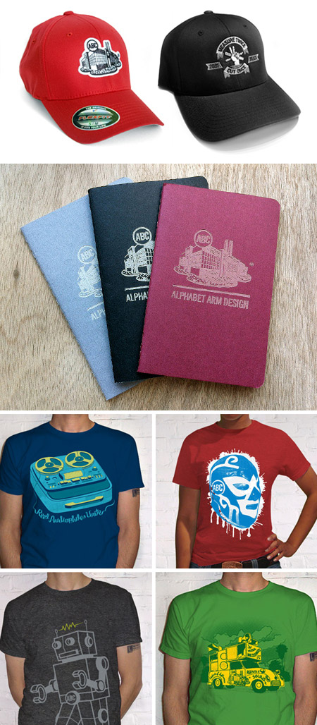
Happy Holidays from us to you. Use discount code > Holiday13 during check out.
'tis the season
In this season of giving, may we be the first to offer you and yours the gift of five magical days of blogging?
That’s right, we’ll be posting a new blog entry every day this week. It truly is a holiday miracle. A Cheerful Merry Happy Happy to you.
Fox Got Your Tongue?
Recently, Alphabet Arm’s senior designer and resident beer snob, Ryan, tried his hand at a little brew-you-own-beer experiment. After much deliberation, a recipe for American Pale Ale was chosen. A bit hoppy, floral, citrusy and well balanced — it seemed like a great choice for drinking in the (hopefully) warmer months ahead. Of course, for a graphic designer, at least half of the fun of brewing your won beer is getting to name the product and design the brand in whichever way you choose, with no pesky clients to get in the way.
Pale Fox was the chosen name (pretty much, any excuse to spend some time drawing a fox) and the clean, modern take on a beer label followed suit. Pale Fox turned out to be a tasty brew. The process of brewing the ale, bottling, and design was good fun. Thanks to Hopsters for assisting in the brew process and all-around rad experience.


get up and glo…
Glomag is the name, funky fashion is the game. Gloria Magale recently took her fun, personal, fashion project to a new level with an official brand: Glomag. Alphabet Arm worked with Gloria to refine the company name, and create a unique, cost effective, branding system. We developed hang tags, rubber stamps, apparel hem tags and a beefy set of 34pt. business cards which feature edge painting.
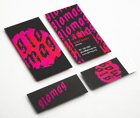
When tasked with creating a mark that captured the edgy nature of Gloria’s clothing, we pulled inspiration from the clothes themselves. After a review of the line, we picked up on the common use of oversized flowers which felt like a bold differentiator to our eyes. We embraced the vibrance and overall shape of the flower when creating the logo, and developing the Glomag color palate. The type treatment was inspired by graffiti and black letter letterforms. The sum of the parts harmoniously create a beautiful, feminine, and edgy brand system.
Here are a few of our favorite additional Glomag logo treatments that didn’t not make the final cut:

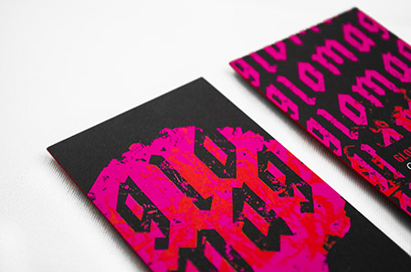
The Dot Coms
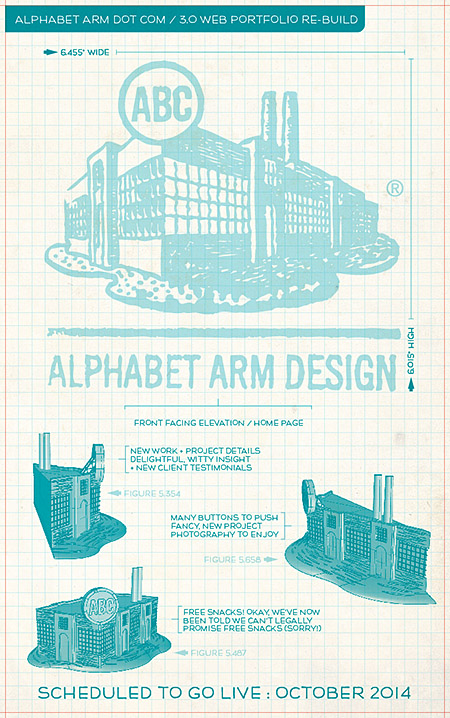
That’s right friends, we have exciting news to report, Alphabet Arm is merely days away from launching our brand new web portfolio. It’s been completely re-engineered, re-built and re-loved. Fear not, The Bloggery will also have it’s share of upgrades shortly! Stay tuned for the full launch announcement!
Official Release : Day 5

It’s official, the new website countdown has begun! We know it can be difficult to wait, but there are just five days left. Stay tuned for the launch next Monday!
– Team Alphabet Arm
Official Release : Day 4

It’s official, the new website countdown continues! We know it can be difficult to wait, but there are just four days left. Stay tuned for the launch next Monday!
– Team Alphabet Arm
Official Release : Day 3

The fully official, officially licensed, completely official countdown continues for the launch of our new website! We appreciate your continued patience and enthusiasm, now just three days left. Stay tuned for the launch next Monday!
– Team Alphabet Arm
Official Release : Day 2

The weekend has come, but that does not stop our countdown, just two days left before our new website goes live. Stay tuned for the launch on Monday!
– Team Alphabet Arm
Official Release : Day 1

Sundays are magical for a number of reasons… sleeping in, glorious brunches, professional football tournaments, and of of course, just one day before the new and improved www.alphabetarm.com is released into the wild.
– Team Alphabet Arm
Lucky (for you) 13
That’s right, all schwag in our Big Cartel store is marked down to just $13.00 (+shipping). Alphabet Arm has been kicking it for thirteen years, and on this fine day of March 13th, it makes perfect sense to celebrate and offer you the deal of a lifetime (okay, maybe the deal of a lunchtime). Check it out!
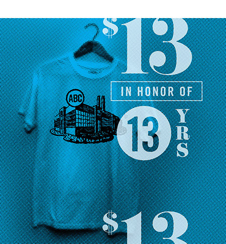
T-Shirt Factory flash game
Last year BzzAgent launched a new site called FrogPond. The site features companies that users can review and rate, the premise is that consumer opinions can help you cut through the clutter online. We were one of the early companies profiled on FrogPond. We decided to make a special, little flash game for our new visitors to play with before checking out our site. Now that time has passed we have this game sitting around not getting any love… so we decided to put it up here for you call to enjoy!
T-Shirt Factory Game!

Meet Limpy Justice
We have a new intern joining us all the way from Bama! (that’s Alabama for those not in the know) Josh, or Limpy Justice—as we like to call him, is a talented, young designer finishing up his undergrad at Auburn University. As some of you may know, our intern program has been on “hiatus-status,” for a bit. We were so impressed by the portfolio and charm Josh brought to the table that we decided to get things going again (if only for the summer). Josh deserves extra props for this, as we receive an average of at least 5 internship/employment requests each week. Say Hi!

Web 2.Awesome

We are in the midst of completely overhauling our website. The new design will be quite a bit simpler and more focused on individual projects. To present our work in the best possible light we have hired our good friend and photographer Tony Luong to shoot all of the pieces we will be featuring (using his best possible light). If you can guess our nickname for Tony we’ll send you a wonderful gift (no, it’s not Tony Photo…but close).
Prize-winning hog
Here at Alphabet Arm, we’re not glory seekers. We no narcissists, always looking for the limelight. Although, when we do get some props, it is freakin’ sweet.
As we write this, Communication Arts has a feature in their exhibit section on the BzzGuide that we recently did for the The National Pork Board. It was a fun guide to work on, and we don’t think it’s too boastful to say that it turned out rather well.

Hometown Pride
As a long time New England Patriots fan, I supported my team + favorite players like Stanley Morgan, Russ Francis, Mike Haynes and Steve Grogan through countless loosing seasons. So that fact New England is now the preeminent football franchise in the NFL, and the envy of all other football fans around the league, is A-OK with this fella. In honor of this momentous, 6th World Championship, I gave myself a little design assignment and through the on-demand magic of the good people @cottonbureau you can order your own (and for just $22!).
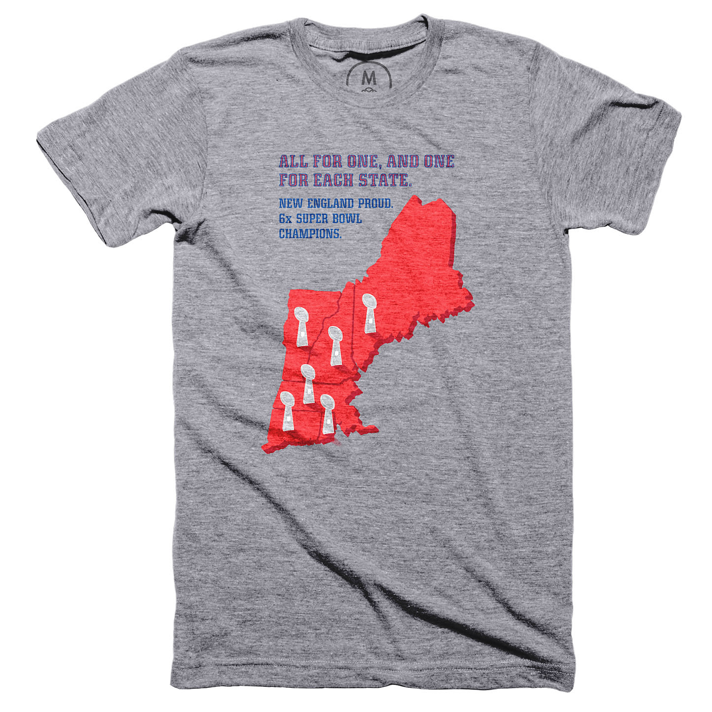
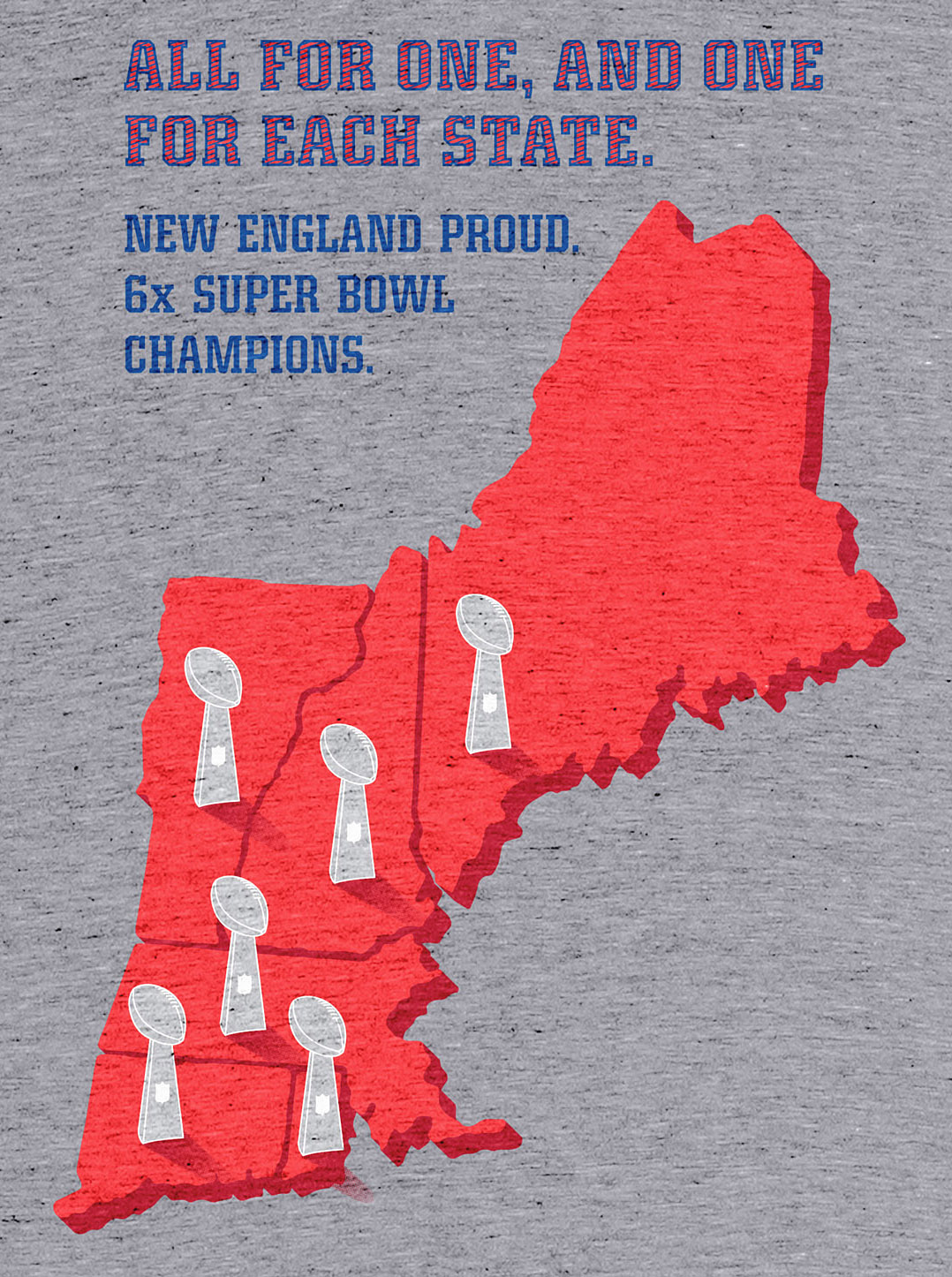
BAD LOGO, BAD! (Part 1.)
Over my 20+ years of creating visual identities, logos and branding systems, I’ve always taken the “high road” when it comes to being overly critical of fellow creatives. That said, within this new blog series, I intend to shine a light and call out identities that are poorly constructed, feature crap typography, do not seem to leverage any kind of conceptual thinking, and are just bad science.
Today, I saw a commercial for the branded wearable company, 4 Imprint. There is a lot to unpack here, not just that they are in the business of promoting brands primarily through a company logo, and this is what 4 Imprint comes to the table with?
No bueno.
Typographically, it appears like they have taken the antiquated typeface and further squashed the “imprint” type to be condensed (see distorted dots over i’s). Apparently, they determined the number 4 didn’t deserve the same punishment. Then, time traveled back to 1957 and borrowed the – 100% stylistically different – Newport Cigarette swoosh. Unlike the oval shaped dotted i’s, they opted to include a perfect circle to be a… dot or some sort representing some high ideal? An oversized period sitting above the baseline? A point to the exclamation swoosh? Dunnoh, but it saddens me.
![]()