David Lockwood’s new LP, titled “Lucky Me”, stirred up a lot of ideas about traditions based around luck. In the end, we came to the conclusion of using a lucky rabbit’s foot. It took Aaron on an adventure to actually find an actual rabbit’s foot. He got lucky while stumbling into a wig shop. Why a wig shop? Well, Newbury Comics didn’t have any, of course. We took the rabbit’s foot idea into our own hands by setting up our own photoshoot. We ended up photographing David holding the rabbit’s foot. The idea was to create a warm, emotive image that portrayed luck. We applied textures to make it look old and worn, giving the viewer the feeling of an antique photograph. The final cover has a rich, tactile quality of that relates directly to David’s music.
Art Direction
Sign of the times

If you’re a regular reader of our blog, you may have read an entry or two about our old friend Kay Hanley. In fact, we’ve been art directing/designing albums together since 1997. Her latest project, Palmdale is a collaboration with multi-instrumentalist/producer, Linus Of Hollywood. It’s a tour de force of rockin’ pop hooks. How to Be Mean is their second EP. After talking to the band and hearing the rough tracks from the EP, we opted to take a literal approach to the cover and digital booklet. Palmdale is actually named for a city in southern California. Palmdale sounds picturesque, lush and pristine — over time, it may have fallen short of the promise the romantic name portrays. Kay and Linus felt the music should complement both sides of that coin. This photo was taken in California a dozen years ago and seemed like the perfect starting point for the cover. We labored over distressing the image and type and added a warm color palette to mimic the intense heat in the vast concrete landscapes of SoCal.
Now Hear This!

Have we mentioned – as a studio – how much we enjoy the process of developing the visual counterpart to music? Well, we do. It’s even more liberating when a client trusts us to do so. Thus was the case with Jason Young and his recording project, heartour. We’ve worked with Jason and his previous band, The Ruse, as well as his debut release of heartour. Part of the reason he has faith in us, is our constant effort to make his albums look as interesting as it sounds. We couldn’t help but be inspired by the album title, Submarine Sounds, and layers of sonic treats he folds into his songs. Adding levels of imagery, both overt and abstract, seems to gives the final package the depth we were hoping to achieve. The type treatment we developed for the cover now serves as the new identity for the project. Dive! Dive!
April in May
 April Verch and her band play an energetic style of blue grass, blues and pop (among other styles) deeply rooted in the Ottawa Valley musical tradition. Not only is April an highly accomplished fiddler, singer and songwriter, but she’s also a pretty amazing step dancer. Seriously, she’s s super talented. Recently, we finished up the design for April’s forthcoming CD. From a design standpoint, April basically asked us to do what we do. In this case, that included hand drawn typography and rustic canvas texture.
Opportune Time.

Kairos, translated in Spanish, means opportune time. Apparently, it was the opportune time for this recording project rooted in R&B, positivity, pop and the band member’s faith. Alphabet Arm was hired to art direct their debut release, Corro A Ti. We augmented their travel-themed photos and developed a textured, bold layout to compliment their music and its complex influences.

Old Lucky 13

Richard Shindell is an expatriate New Yorker currently living in Buenos Aires, Argentina. Richard is a craftsman of folk songs that are often laden with rich storytelling. Thirteen Songs You May or May Not Have Heard Before is “a relatively spare, no-frills revisit of some of the songs from his catalogue.” To compliment his rustic sound, we designed his upcoming CD package with a hands-on approach. We stamped each letter of the title by hand and made sure to retain the beautifully imperfect character of the type. An archival scan of wood type (which had definitely seen better days) was incorporated to reinforce the unrefined quality of the cover. Props to Richard for embracing the stark, bold, type-only design that we think is quite eye-catching.
Katrin Came Calling…
…looking for art direction, and we were happy to oblige. Boston-based acoustic rock siren Katrin had a handful of striking images courtesy of Dion Ogust and (long-time friend of the studio) Liz Linder but was struggling to tie it all together. Our initial step was to develop a custom logotype for her.

Former Alphabet Arm intern Florencia Tasso rendered a simple yet stylish type treatment that was introduced to Katrin’s photos. It soon became an essential branding tool for Katrin and her management. As a designer, it often becomes our job to show restraint and not overwork a design or add elements not crucial to a specific piece. Sticking with a clean layout and letting the images lead the way, we did work in a number of hand written lyric selections from Katrin which added some depth and visual interest.

King of the Jingle Jangle Jungle
Featuring bouncing basslines, soulful vocals, lush production, and a definitive “from-across-the-pond” inspiration (it was partially recorded at Abbey Road!), here’s the cover for New Lion Terraces. As with any CD Art Direction project, it was a challenge to nail down a visual style for Corin Ashley’s new, full length album. After exploring a wide variety of designs, illustration styles, and photo manipulations, we landed on the simplest solution: draw a lion. Duh. Making use of a bright color palette, boatloads of custom typography, and a psychedelic-yet-refined visual style, we were able to achieve a vibe that was 1/2 throwback and 1/2 twentythirteen.

Here’s a peak behind the curtain of the rough sketch we later refined:

And the complimentary show poster, Grrrrrrrrrrrrrr:

Honesty, is always the best policy (Bob).
“The CDs are now in hand, and look really awesome! Everyone we’ve shown them to is really impressed. Thanks a ton for your fine work once again.”
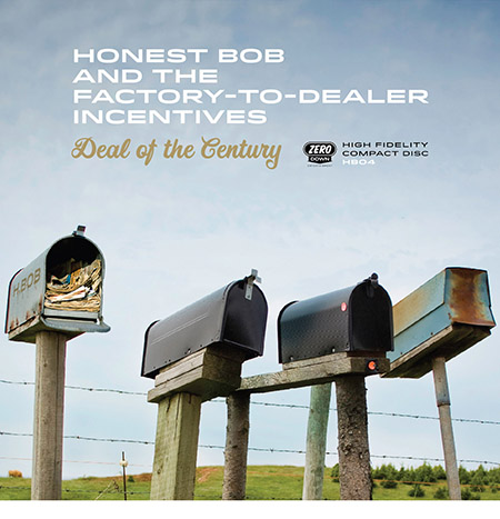 Happy clients, well… make us happy. Honest Bob and the Factory to Dealer Incentives enlisted the studio to develop the art direction for their latest musical offering, Deal of the Century. We had previously worked with the band and appreciated their faith in our ability to develop the visual complement to their music again. We assembled a visual narrative to the album’s title and riffed on the idea of four bandmates being represented by four mailboxes. Clearly, not a group of guys who get caught up taking themselves too seriously.
Contemporary Affection
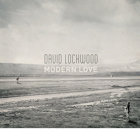
May we present David Lockwood’s latest release, Modern Love. Our art direction was inspired by the sweeping, cinematic concept of the album. We also drew largely from the lyrical content (which itself was inspired by a famed, recurring article in the New York Times). This cover image was quite a labor of love itself. Partially sourced from royalty-free Library of Congress images, we assembled a composite image based on a narrative of the two people, and a dwelling in the distance. Our intent is to allow the viewer to determine the dialog between the characters – one of everlasting love, a pending break-up, the challenge of a long distance relationship or perhaps they simply enamored by the different perspectives of hovering typography in the sky?
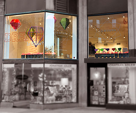
Shine On You Crazy Gem
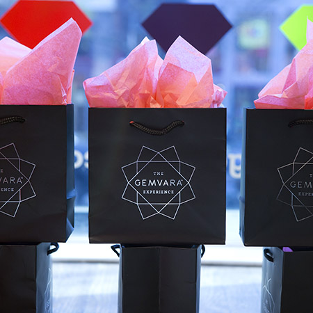
He went to Jared? We should hope not. We had the unique opportunity to work on The Gemvara Experience retail store with our key partners, Heart and Brandon Bird Design. Being a successful online, custom jewelry destination, the Newbury Street location is Gemvara’s initial foray into a brick and mortar storefront. We designed the logo and store branding and worked closely with Brandon Bird to develop the concepts – and ultimately – execution of the window displays, wall installations, signage, display cases and general aesthetic of the store. A multitude of partners, vendors, architects, electricians, carpenters, painters, former interns, friends of former interns, friends of intern’s friends formally known as friends, were all employed to help us realize the vision.
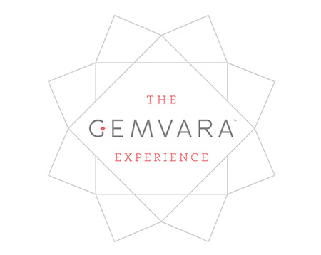
We introduced a cornucopia of mediums and fabrication techniques to the project. As a studio specializing in print design, we embraced the chance to really push ourselves as 3 dimensional, creative problem solvers. Look for a full blown case study on our portfolio soon, but for the time being, go create some custom jewelry and see the space for yourself!
Radio-oh-oh!
 We’ve worked with Sarah Borges and The Broken Singles on several projects in the past, so we were quite enthusiastic to work on her brand new, solo record. Radio Sweetheart was crowd-funded by her loyal fan base, its chock full of what Sarah does best: well crafted old rock n’ roll with a country twang thrown in to keep things interesting. Sarah got dressed up all-fancy-like and had a photo shoot with her dad’s classic Thunderbird. She turned the photos over to us and it was our job to create a album cover that looked timeless and exuded cool (which Sarah has in spades). We were especially pleased to find a light-hearted image of Sarah behind the wheel with a candid laugh, it took some doing to convince her that was the way to go, but we were glad she trusted our instincts. Do yourself a favor, and turn this one up!
A House of a Different Color.
Not long ago, we branded Stillwater Unlimited – a division of the Ferree Group, Inc. Stillwater Unlimited is an all inclusive, concierge level service that delivers best-in-class home services to their client’s doorstep. In laymen’s terms, high level property & lifestyle management. Once their logo, branding elements and marketing collateral were solidified, we were tasked with developing a website that spoke to the level of thoughtful and unique service Stillwater Unlimited offers its clients.
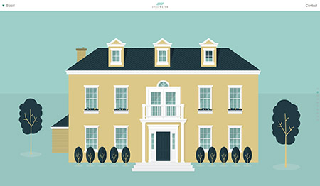
We immediately felt a parallax scrolling site with a boatload of custom illustration would be a wonderful way for potential customers to be educated about the services. The site’s platform also felt like a great way to set Stillwater Unlimited apart from the competition – which felt a bit antiquated and too hoity toity (in our humble opinion). So, are you ready to get your property & lifestyle management kicked into high gear? Look no further > Stillwater Unlimited.
Fox Got Your Tongue?
Recently, Alphabet Arm’s senior designer and resident beer snob, Ryan, tried his hand at a little brew-you-own-beer experiment. After much deliberation, a recipe for American Pale Ale was chosen. A bit hoppy, floral, citrusy and well balanced — it seemed like a great choice for drinking in the (hopefully) warmer months ahead. Of course, for a graphic designer, at least half of the fun of brewing your won beer is getting to name the product and design the brand in whichever way you choose, with no pesky clients to get in the way.
Pale Fox was the chosen name (pretty much, any excuse to spend some time drawing a fox) and the clean, modern take on a beer label followed suit. Pale Fox turned out to be a tasty brew. The process of brewing the ale, bottling, and design was good fun. Thanks to Hopsters for assisting in the brew process and all-around rad experience.


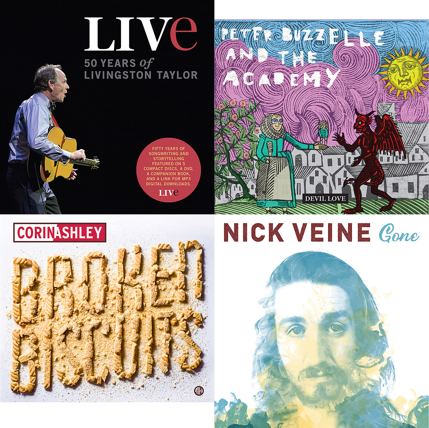
Music Matters
If I can lament for a moment, back in the early days of the design studio (2002 – 2007 gulp), the primary workload was creating visual identities (logos) for bands, music management companies, record labels and radio stations. Beyond that, we would art direct a lot of albums, up to 75 CDs (see Compact Disc) a year. For designer – and recovering musician – this was very coveted work. A lot if designers were interested in working at Alphabet Arm specifically because of our reputation as specializing in “music-based-design”.
As the music industry struggled to embrace a new digital medium, new modes of listening, and changing consumer trends, many record labels were forced to close. As a studio, we had to make some hard decisions and shift our business model. That said, I still have opportunities to design and art direct albums. Here are a couple recent covers.
I will will share some process work, package photos and design details on another post, but thought it might be fun to share the cross section of cover treatments sooner than later.