We recently designed the packaging for the WellDiggers Banquet CD. They are an alt-country band out of Los Angeles. They were quite easy to work with throughout the entire process, which was really refreshing.
Whoever can guess where we shot the tanks used in the packaging will get a shiny new Alphabet Arm pin!


Branding
Misty Fjords Lodge
Every once in a while we break free of our “less is more, simple + bold” logo protocol, we designed a super complex vector logo for Misty Fjords Lodge, in Alaska. That’s right kids, 100% vector! We keep hoping to be invited up to the lodge but thus far the phone hasn’t rung.

Big Head Todd and the Monsters
We’ve been designing just about everything for Big Head Todd and the Monsters new release “All The Love You Need”, from the band’s new logo, promo CDs, admats, tour merch, posters, the whole shebang.

We’ve been using a ton of our photography for the packaging which always makes us incredibly happy.

Empire Attire
Free-skier Simon DuMont started his own apparel company, we developed an entire logo family for him, here’s our favorite aspect:

Our pals at Fort Point Design developed a sweet, blinged-out site for Empire.

SlingBeat
In the market for a hip new social polling site? Have a look-see at the logo we developed for SlingBeat.

The Butman Company Incorporated
We recently designed this logo for our pal John Butman (author and advisor). John wanted the logo to be elegant and inspired by elements from antique books.

Zox your sox off
Zox released their 3rd full-length “Line In The Sand” on Side One Dummy. These dudes from Providence, Rhode Island have crafted quite the album of indie rock joy. We designed the CD packaging as well as a new type-driven logo.

Jill Sobule and the Provocateurs
When Jill Sobule isn’t writing pop nuggets and kissing girls (yikes—did we really say that? Sorry Jill!), she’s probably updating her killer blog. In honor of both we designed this logo for her:

The Get You
Aaron’s favorite drummer in the world (okay, and tight friend) has a sweet new side project. When Fred Eltringham in’s beating the skins for likes of The Wallflowers and The Dixie Chicks, he’s kicking out quirky noisy catchy sounds with The Get You, we knocked out this logo (and few others) for him.

ReMod Media
ReMod Media is a production company focusing on online TV content and the like. The concept for the logo was to create a character who was quirky, yet sophisticated with a nod to history. It was a lot of fun fusing together the helmet of bizarre contraptions, not to mention, when animated he looks amazing. The ReMod’ers lovingly named him “Barneby.”

Sarah Borges' new tattoo
Anyone see the shot of Sarah Borges in the Phoenix last week? Can’t tell what was cooler, her cat’s puzzled expression or Sarah’s new tattoo (yes, it’s part of her new logo we designed). Photo by Kelly Davidson

Christ Church Cambridge
Sure, we do the Rock, as well as the Roll, kinda design. That doesn’t mean we can’t handle designing a logo for a house of worship, here’s the new identity for Christ Church Cambridge.

The Savant Project
We recently developed the identity for the hippest new lounge in Boston, The Savant Project. Check out their sweet logo and signage we created for them:


We're Huge in Buenos Aires
That’s right, when Aaron’s wife was in Buenos Aires for work recently, she stepped into a book store and being the loyal designer’s wife she is, looked through the Graphic Design section. She was drawn to the metallic silver of Diseño de Logotipos 4 only to be even more excited to find one of our Counting Crows designs smack-dab on the cover. Thanks Vianka!

Logo Lounge 4
If you haven’t heard of the Logo Lounge website and book series you are missing out. The 4th edition was recently published. We were honored to have 5 of our logos selected for this book.


Killer 'stache
Often times, the most fun logo projects are the ones that don’t take themselves too seriously. Whether the client has a great sense of humor or just a quirky name, it’s great to flex our funny bones. Such was the case with the logo for Moustache Sally, a humor/blog/video site. We definitely enjoyed ourselves and created some magnificent ‘staches. The final logo is a humorous take on 50’s illustration with some of our trademark wit.![]()
The Head Set
We were instant fans of catchy tunes and garage-ish rock of The Head Set from NYC. We designed their new logo utilizing an interchangeable system of colors and textures that will allow for multiple variations to keep it looking fresh and ever evolving.

…the water is fine
Sure, it’s sad when bands break up or can get tricky when they change their name. Unless you’re us. We’ve known more than one band that splintered apart and when members started new projects, they all came calling…we like that. We’ve also designed a ton of logos for bands that found the need to change their name for one reason or another. Which is true for The Wild Sea, who were was once known as RUTH. We were asked to work up some new logo treatments for them. After the initial round of options they determined the wave was the winning direction. They requested we present a number of type lock-ups to pick and choose from. We’ve included a few of them underneath the approved logo.

Mediadonis
We recently designed this logo for Mediadonis, the CEO of german based SEO (Search Engine Optimization) Company CIA – Creativity in Action. The logo will be used for his blog, Mediadonis.net, which he describes as “the diary of a compulsive search engine marketer and internet entrepreneur.” He wanted to keep things light-hearted and definitely not too serious—we think this superhero pulls that off quite well!

Harlembird?
We recently finished work on a new identity for a swanky new wine bar in Harlem. We’re quite pleased with the fact that it is a rather versatile system. It works simple + clean as a standalone mark while holding it’s own in the more ornate branding banner. Our intent with the brand colors was to utilize a two color system that would work equally well on both light and dark backgrounds without sacrificing the logo’s integrity.
As the story goes, we made a cheeky little joke with our client when they asked what kind of bird we modeled for the logo, “a harlembird of course.” That turned out to be the element that sealed the deal on that treatment, you can never underestimate the power of quick wit.

Can't make a CD without breaking some eggs
Sometimes, it’s the simple idea that makes the cut. That was the case with our design for the latest release from Honest Bob and the Factory-to-Dealer Incentives. Without much more than the album title to work with, we pitched this concept to them which utilized our own photography and tongue-in-cheek sense of humor. Fortunately for us, the guys in the band can take a joke, and the theme was continued throughout the entire package. We’ll do a full reveal once we have the CD in hand, but in the meantime, we’d also like to draw your attention to the “Zero Down Entertainment” logo that we also designed for the record label.


A Grommet a Day
It’s our pleasure to again be partnering with Pod Design to develop and launch a new brand: Daily Grommet. Looking to fill an untapped niche, Daily Grommet is aiming to bust open the social commerce scene. Living as both a website and web widget, Daily Grommet will showcase a wide range of products that are sure to be the objects of desire for hip moms worldwide.
Our role in the project is identity designers and brand stewards. While the official roll-out is still a little ways off, we’re proud to reveal the final logo (there are a few select sites and blogs that are unveiling it as well). The design process explored several initial directions, but the final version highlights an actual “hero” grommet with secondary hand-drawn elements. As part of the process, we created a custom logotype, as well as secondary lock-ups and are developing the brand standards. Stay tuned for the full brand launch later this year.
![]()
This is no hoax!
“We’re not sure what kind of imagery we want, but we know it should be unexpected and fun.” We couldn’t have been more enthusiastic to hear that from the founders of Proof Wine Marketing. The final design solution makes use of a rotating logo family that is comprised of 3 different characters, each with its own corresponding color. The system remains cohesive by using a consistent type treatment… its a bit hard to put into words, but you can see what we mean. Besides, what’s better than big foot with a bottle of his favorite red?

Cable Car Cinema & Cafe logo
Already established in the art-house movie scene, a pair of cinemateurs recently relocated to Providence, RI, to breathe life into an existing theater. They commissioned our services to differentiate themselves from the other area theaters with a first-class identity. After extensive research and sketching, we crafted a logo that references Providence’s rich history, as well as the fact that the theater used to house a cable car garage. Iconic and bold, the logo has a extensive branding options and we look forward to designing the entire office system, as well as helping to help brand cafe and theater. Stay tuned for a full reveal.
![]()
Logo for Laura
We just finished designing a logo as well as some marketing pieces for Laura Barisonzi, a photographer out of New York. You can check out her work [here].

All Wrapped Up
Breaking new ground in the sphere of virtual gifts, Viximo is already one of the leaders in the field. We helped them to establish their brand with a new logotype. Through several rounds of iteration, they chose a bespoke typeface whose simplicity allows for clear reading.
The goals and direction for this project were a bit different from many of the identity projects that we work on in that it focused on a logotype without an icon. Since we did a lot of type creation from the ground up, we thought we’d give everybody a peek at some of the other directions that we presented to the client.


Eat Healthy Live Healthy
In an increasingly crowded market, NRG BAR differentiates its product by using only all-natural ingredients to create a snack that’s good for you and also really tasty. Definitely not mono-glycero whatsits or yellow #47 in these bad boys, and any samples that get left around the studio disappear quickly. They also stand out in part due to a powerful logo that we designed for them.
![]()
We also designed the packaging for the individual bars and the display box. Our friend Tony Luong helped us out by shooting the packaged bars, along with some of the ingredients that are in each flavor. These shots will get used in some promotional materials and on the client’s website.


Raising the stakes
Poker Affiliate Programs is a company that helps to market, draw traffic, and increase revenue to other online gambling sites. They are in the process of a rebrand, and brought us on board to help with their identity. Inspired by the ornamentation on the backs of cards, their new identity is rather removed both from the world of typical gambling site and web 2.0 logos. As with all of the identities that we create, this identity is multifaceted. The system is comprised of a main logo, a type-only version, and a logo bug that is displayed on affiliated sites.


ArtsBoston
We recently finalized the redesign of the ArtsBoston logo. The objective of the project was to give a unique identity to a “robust, online calendar featuring information about theatre, music, dance, visual arts, opera, arts classes, comedy, film, programming for kids, lectures, readings, and free events across Greater Boston.” From the project’s onset, we were careful to choose a form that wasn’t specific to one single type of performing art, yet referenced them all. The concept chosen was inspired by the forms of stage spotlights. In the end, the mark itself is quite abstract — a quality we thought worked well with the broad range of ArtsBoston.

Safety for your nest
While a myriad of products exist to help parents ensure the safety of their children, many are only marginally functional and most are visually unappealing. Enter Rhoost: an inventive start-up, who have developed a line of furniture safety accessories that are functional while being complimentary to the urban household.
Our take on their identity was to echo the company’s mindset and keep it simple, yet stylish. We opted to develop a logotype from the ground up and integrated a Swiss-inspired stencil set (if you will). Now for some design lingo + insight: while we were exploring the stencil counter option, we kept the base letters in purple (randomly) to keep track of each letter’s progress. When the heavy lifting was finished, the final form of the logo in purple felt like a perfect match. Fortunately, both of the Rhoost co-founders agreed. If only color selection was always this effortless.
We thought lovely letterpress business cards would compliment the logotype perfectly. Our friends at The Mandate Press did them justice!
![]()

June Bloom
Are you aware of the fact that we update our website with new, featured projects every month? (This month’s featured projects include: Monolith Festival branding + collateral, Flock logo design, Lisa Rigby Photography logo design, Daily Grommet branding + collateral, Style Boston logo design, and a Canadian Pork BzzGuide)
If you have a moment, we’d dig it if you dug them: Go [here].

In good company
A new article just went up on boston.com that discusses some of the more publicised identity revamps of the past year or so. We’ve always maintained that a fresh identity can be a great way to stay relevant. It can often be the best course of action when a business has changed its course or had a leadership shift.
There are certainly some big brands showcased, and we’re proud to have a few identities that we’ve designed in the mix. The logos that we did for our friends at Cable Car Cinema & Cafe and The Wine Bottega wrap up the gallery. Take a look at the article and see the comparison of the old and new identities.

Intern Logo 001: Project T.E.A.C.H.
Right out of the gates in my first days here I began work on logos for a couple of different clients. It was exciting to jump into real work, and it was immediately clear that my role as an intern here wouldn’t be that of an office servant.
The logo I’m sharing today is for Project T.E.A.C.H. (Teen Education About Careers in Health), a comprehensive summer program for 10th graders at Brigham and Women’s Hospital, which includes paid summer employment, seminars, math and science courses, and opportunities to shadow health care professionals in the emergency department, operating room, and on patient rounds. Sounds pretty sweet to me.
In the first round of sketches, I couldn’t get away from the symbol of the medical cross because it just conveyed that side of Project T.E.A.C.H. so quickly and clearly. Here are a few of the initial sketches:

Here are the three refined versions sent off to the client for consideration:

Here is the final logo along with a 1-color alternative mark:

Everyone seemed happy going with the less conservative of the three options, the one I affectionately call TeachBob SquareBulb. Or maybe it was LearnBulb SquareTeach. Something like that.
Logo Lounge 5
As promised, check out the details on Logo Lounge 5 book. We’re honored to have our logos published in the latest book of this top-quality series. If you’re interested, you check see more about the book and buy it here.
(Also note that nobody has won the shirt contest from last week. Is it really so hard to just guess a number?)


Anita Logo
Anita Quinto is the moniker of this Venezuelan percussionist, composer and arranger. She attended Berklee College of Music and has performed on National Public Radio and Public Television. She has toured across the globe including stops in New York City, Las Vegas, Miami, Caracas, Bogota and Copenhagen. When we first met with Anita she told us that she was seduced by our work. That may be our biggest compliment yet!
Anita liked the idea of a graphic element working subtly into her logo. She often plays the Conga (otherwise known as a Quinto) and thought it would be beneficial to incorporate that into her identity. She also mentioned that it would be nice to reference her Venezuelan background—we worked that in with the color scheme (taken from the Venezuelan flag—of course!) In the end this logo represents Anita perfectly, it’s as bright and lively as she is.

Monolith Recap (Top 10 List and iPod Winners)
This past weekend we flew out to Colorado for the Monolith Music Festival. (For those of you that don’t remember, we branded and designed nearly all of this year’s campaign). We had an amazing time—going into great detail would be too difficult—so we decided to break it down into a simple, concise list of our favorite moments/things.

Our Monolith Top 10 List
10. The epic landscape
9. Boston band, Passion Pit, causing Red Rocks to bounce. Literally.
8. Being on the verge of sickness from endless honey-roasted peanuts courtesy of the SouthWest Airlines booth
7. Riding in Method Man’s van (you’ll have to ask us for the sorted details)
6. Watching M. Ward at arm’s length
5. Experiencing The Mars Volta experience from back stage
4. MF Doom performing 20 feet from our booth
3. Being on stage while Rahzel KILLED IT and then getting high-fives from the legend-himself.
2. WaterCourse Foods – epic vegetarian dining
1. Cross-promoting our services, cavorting and sharing a booth with our pals at Jakprints!

Speaking of Jakprints, we teamed up with them to give away an iPod Touch on both Saturday and Sunday. The contest consisted of a festival-photo-scavenger-hunt. In true-fashion we branded the giveaway, designing hand-out cards, a horde of banners and some insanely sick, dye-sublimation t-shirts—all beautifully printed by Jakprints (of course!)
In order to be entered into the drawing one would need to shoot photos of the 5 items on our list before the last band went on (each day). We were really pleased with the amount of people that participated. We received some fantastic images to put it mildly. In the end there could only be one winner each day—so big congrats to our winners!:

Jenna Spencer and April Ramquist

Jenna’s photos from the Saturday contest:
1. The Jakprints/Alphabet Arm booth 2. The Monolith Logo 3. Someone with a band tattoo 4. A white dude with dreads 5. Someone wearing fresh, green sneakers

April’s photos from Sunday contest:
1. Someone doing a handstand 2. The Esurance logo 3. Someone with a completely righteous tie dye shirt 4. A radical mullet 5. A recycling bin
Happy Body Food
We recently wrapped up a new identity for Noshies. Fortunately for us, the Brooklyn-based protein snack company kept us well fed. Noshies are organic, nutritionally balanced, whole foods protein snacks, that taste great! Free of soy, wheat, egg, transfats, artificial sugar, artificial colors, artificial flavors and preservatives. The inspiration was the hand-crafted aspect of these little treats, think cozy, country kitchen with an urban, hipster attitude.
Monolithic Pile
Between our blog posts and tweets you’ve probably heard us mention the Monolith Music Festival on a number of occasions. We posted the logo and the festival director’s business card on our site but thought it would be beneficial to show how we branded the entire festival. People often ask what branding entails—so while we had our photographer shooting a bunch of new projects to be featured on our website we had him shoot a pile of collateral left over from Monolith. Here you can see a range of items from VIP passes to ads to schedules. We actually have another package of samples on the way as we type this, including merchandise and other print samples. Keep an eye on the website to see the rest!


Hollywood Squares
Sure, it’s a bit of a shameless plug—but we still get a kick out of seeing our (we mean their) branding being used on a regular basis. In this instance as Twitter icons. We decided to gather a list for you.

Empire Attire / Moustache Sally / New Collisions / Rhoost / Arts Boston / Mediadonis / Plus1tv / BzzAgent / Monolith Festival / Harlem Vintage / Sarah Borges / Schranghamer Design Group / Viximo / Boston Phoenix / Fenway Recordings / GoGaga / Clarias / Daily Grommet / Well Rounded Radio / Open Bicycle
A Logo for Clarias
Not too long ago, the manager the Boston-based band Clarias got in touch with us. She was shepherding the band—who have opened for names such as Bon Jovi, Barenaked Ladies, and Kanye West—in a new, more focused direction. With her help, they would put out a new release, fine-tune their image and organize an ambitious tour. As part of this new momentum, we were pulled in to create a logo for the band. Given only four days from concept to completion, this was no small challenge.
The band was presented with several directions, but final decision was made to go with a design that would act as a neutral canvas of sorts. Providing a solid back-bone with which to begin, the logo could be adapted and expanded upon through the course of multiple releases or different styles of merch pieces. It is an example of the type of logo which has a character all its own, but with the flexibility to work in a wide range of contexts.
![]()
When constructing a good logo…
The greatest challenge we encountered when developing the visual identity for the Ferree Group, Inc. was the being constantly aware of the two distinct demographics that the company is balanced between: new clients and trade professionals. The Principal of the Boston based general construction company was very conscious of the importance of having a strong, professional brand he would present to new and potential clients. At the same time, he was also very concerned about the trade professionals and B2B vendors he worked with on daily basis and didn’t want his company’s new identity to feel too “design-y.” Taking this into account, we developed a classically simple, bold type treatment to complement the “F column” icon. The column itself was born from the group’s dependability and commitment to quality work.
Typically, we are hired to design business cards once a logo project is completed. This is ideal for us as it’s typically our first opportunity to take a logo and start crafting a bit of a brand around it. Here are the Ferree Group business cards.


If This Van's a Rocking
Here is the newly completed logo for an independent concert promoter based in Barcelona, Spain. Music Van Promotions specializes in booking contemporary bands that are in part influenced by the late 60’s- early 70’s Folk, Garage, Psychedelia, Prog and Hard-Rock which ultimately gives them a timeless feel. Our goal with the logo was to honor the company’s affinity for both classic and current music while focusing on a contemporary look + feel with the identity’s execution. The real challenge was to simplify the complex form of a van stuffed full of musical instruments into a clean, easy to read logo.

Powa to the People
If you are in the Boston area there is a good chance you recently read about Powahouse on the cover of the Boston Globe. A Powahouse is a small apartment building that packs a big punch. It’s also a Boston-based project, currently incubating, that’s scheduled to hatch first thing in 2010.
The basis for the name “Powahouse” comes from the fact that this project is a way for homeowners to make their apartment a renewable energy power plant as well as the idea of setting a powerful example in efficient design and construction. When we first met to discuss their new identity the client expressed their desire to balance the playful take on the word Power with a more serious mark.
The concept for the winning logo stems from the idea of a carbon footprint, or better yet, the lack there of. The focal point is the stark, white house-shape formed in the negative (or positive if you will) space between the dirty, inefficient homes. The type is clean and modern reflecting the ideals of Powahouse.

Designin' for a Rockin' Cause!
In our effort to assist with worthy causes, we answered the call from a long time friend and client involved with the site Target Cancer. The site promotes targeted research into curing cancers lacking treatment protocols, supporting the development and codification of cutting edge and life saving protocols, and funding research into alternative treatment options and drugs.
There will soon be a component on their website that will offer music downloads from artists like Juliana Hatfield, They Might Be Giants, Ween, The Donnas and Buffalo Tom. Rockin’ for a ’cause!

Logo Graveyard: Base Camp Communications
One thing we’ve learned over the years is that things rarely ever work out the way that we plan. Case in point: a recent logo project for Base Camp Communications. When we got the call from the company’s founder and director, we were definitely excited. It was obvious that they were serious about brand communications and cared passionately about the industries that their clients supported. With all of this in mind, we began the process and created several concepts—a few of which are showcased below—that embodied the client’s independent, outdoorsy philosophy. Of the presented directions, the one that really struck the client was a yak. The yak, or course, is a hardy animal. A workhorse that isn’t afraid of any peak; it is equally at home both on a rocky slope and a wintery plain.

Once the yak direction was chosen, the client asked us to explore some different ways to represent the yak. What began as a rather geometric and angular interpretation of a yak, became a bit softer and more shaggy.

In the end, we hit it on the head—not literally—with a stylized yak that was forceful and energetic without being sharp and unapproachable.

Though the client was happy and really liked the yak, Base Camp was acquired by another company, leaving the yak out to pasture. We decided to share it with you all here, just give the guy a chance to run free.
Looking Güd!
A logo that has lightning bolts and an umlaut? It has to be a metal band, right? Think again. ÜberGeekGirl offers professional IT services to an exclusive and ultra-secret client base including many well known individuals and celebrities in and around Los Angeles. ÜberGeekGirl serves their clients by bringing order to their complex world of electronics and by helping them stay connected. Rather than referencing one specific kind of technology, we focused on broad, overarching concepts that could encompass all the services offered by our client. The final logo features ÜGG as the nucleus bringing order to the erratic particles in orbit.

The Ripple Effect
With a service as niche as “Asian fabrics for the home,” it would seem natural to have very specific direction when beginning an identity for The Barii Group. In fact, the business’ owner had a very specific image in mind: a serene pond, surrounded by bamboo with a picturesque tea house sitting on its shore. While this may indeed be a beautiful image, it seemed a bit more complicated than the clean and modern tone that the client wanted to project. During our research and concepting process, we isolated the image of ripples in a pond as the most important. We focused on these overlapping ripples, and they became the central mark of the brand. The type solution revolves around a sophisticated but unpretentious serif face, featuring an “r-i” ligature that we created and paired with a clean sans.

Testing, Testing… 1… 2… 3
ProctorCam is a virtual proctoring service offered to test takers and organizations that administers tests online. We were recently approached by the CEO to update their brand. The prior logo felt a bit too obvious, dated and fluorescent in our opinion. Staying true to our logo process, our goal was to keep things simple but present ProctorCam with a more sophisticated identity. The new icon within the lock-up stands on it’s own and reads initially as a “P” until the color break reveals a seamlessly integrated “C.” We presented quite a few color options once the basic composition of the logo was approved. Getting buy-in to veer away from the old color scheme proved to be the biggest stumbling block, all credit to our client for trusting us enough to make the leap. The new logo feels more legitimate, trustworthy, and a lot less web 2.0.

Stick to the Plan(ner)!
Events on a Mission is a New York based event planning service. What makes them so unique is that they incorporate charitable giving within an event. From intimate, private parties, to formal, ballroom galas, Events on a Mission allows their clients to relax and leave all the planning to them, while giving to a cause that is near and dear to their client’s hearts.
The logo itself was inspired by the owner’s innovative approach to business. In a market that is inundated with competition, she thought (and we always agree) that the logo should stand apart from what’s commonly used within the industry. We split the different between a formal affair and an assertive mission stamp. It’s buttoned up enough to appeal to her female demographic, while not alienating the dudes. Party on people—and feel good about it!

Get Your Wiggle On!
Our friends at Zero Age Media hired us to develop an identity for Wiggle Nation — a social network dedicated to the discovery and promotion of new and emerging kids’ music. This project was a bit tricky because it needed to portray kids’ music while appealing to parents. We settled on a playful, hand-rendered type treatment anchored by a bold sans-serif typeface.
![]()
A Literary Magazine For Your Ears

The Drum is a new online literary magazine. They publish short fiction, essays, and author interviews in audio form. Here is the age old project description: honor the history and create classic look, while evoking a modern sensibility. Although literature can be serious business, we wanted the mark to convey The Drum as approachable and unpretentious. A unique, decidedly modern interpretation on graphic elements typical of vintage book design gives this identity a voice of contemporary sophistication. We also did a business card design and the lovely bright white Via felt textured paper does a great job of echoing that point.
What seemed like a really fun and interesting identity project turned out to be just that. It’s nice to know our client also enjoyed the process. Henriette, the magazine’s editor had this to say:
“Alphabet Arm did a wonderful job of explaining the logic behind the team’s decisions as they created my logo through various drafts. It was clear that every element they put into the design came out of considerable thought—about how the logo would work in different environments or media…. The whole process was very smooth, efficient, and quite fascinating. I ended up with a logo I really like and that people really respond to.”
Brought to you by the letter A
The A is for Amory Group. The founder, Tim Linberg is a long-time friend of Alphabet Arm. You could call them experts in the field of Strategic Social Marketing. Consequently, the logo needed to have a strong presence for all of the various sizes and formats of the many social media outlets. Our goal was to create a simple, striking mark with plenty of flexibility. The role of color, in this case, was to help differentiate Amory Group’s voice from the multitude of other companies vying for attention.

Bringing Down the Hammer
Friends of the studio, Joy and Jeff Shranghamer are creators of the non-profit organization, The Hammer Fund. The focus of the group is to raise awareness and funds to benefit the Crohn’s and Colitis Foundation of America. With such a noble cause, we were more than happy to help them out with a new logo they could be proud of. We designed the new identity to represent the strength and resolve of those people afflicted with Crohn’s. There’s also a new website on the way (rumors of sweet branded buttons and t-shirts as well, hope we get our hands on some!) for The Hammer Fund, but for now, click here for details.

The New Old City
We just wrapped up a new logo for Old City Restoration Company based in Williamsport, PA. You could say this one was in our wheel-house and it proved to be a fun process and great new client. From the start, we knew that we wanted the cornerstone of the new logo to be historical typography indicative of early 2oth century American design. We experimented with mixing several decorative typefaces and fancy ornaments, but in the end, a more restrained approach won out. We also wanted to reference the buildings that they specialize in and ended up illustrating a number of their finished projects. We’re currently working on some letterpress business cards and we’ll soon be illuminating the company vehicle with the new logo.

It All Adds Up
Although we get plenty of chances to design robots and monsters, we also embrace the opportunity to design an identity with a more formal, classic aesthetic. We wanted the new logo to represent Lindsay CPA LLC as well-respected and established, but without looking stodgy. The solution was a simple and beautiful Baskerville “L” with an accompanying laurel branch to signify excellence. And for an extra punch, the printed materials will utilize a metallic silver spot color.

Pull Up a Chair.

New England Lifestyles Management (a division of one of our loyal clients, the Ferree Group, Inc.) is an all inclusive, concierge level service that delivers across-the-board home services to their client’s doorstep. New England Lifestyles Management will sit down and draw up a customized suite of services to ensure that all their client’s needs are covered throughout the year. As the logo designers, we felt the brand should resonate with accessibility, top-notch service, trust and sense of ease that you have finally found a lifestyles management company you can completely depend upon. Go ahead, sit back and relax.
Johnny was a good man…

Johnny Foresight is a prolific, up and coming DJ, producer, songwriter and engineer. He is a production juggernaut who combines elements of electro, glitch, and hip hop to form a new innovative genre. Johnny asked us to draw inspiration from 90’s video games and masked vigilantes from another dimension. Sounds like fun, right? We definitely enjoyed the low-fi process of hand drawing the expressive, three-dimensional type that would is the visual representation of the epic persona, Johnny Foresight.
AM&CO
![]()
Andrew Mitchell & Company, LLC is a residential real estate brokerage headquartered in Concord, MA that provides smart and innovative real estate services for today’s evolving market. We just completed the design of their snazzy new logo. The name of the company itself comes from the middle names of the two founders — an energetic and fun duo, for sure. Although we wanted the logo to have a classic look, we also felt it was important to capture their fresh approach to real estate. In other words, classic but not pretentious.
We spent more time than we’d like to admit customizing and tweaking the bespoke typography to create an elegant, interlocking A and M. One of the most challenging aspects to the design brief was to create a logo that was flexible enough to work in horizontal, vertical and even square formats. New AM&CO lawn signs coming to a neighbor’s yard near you.

Logo tune-up

Check out the brand spankin’ new logo we just designed for Joe Wallace Photography. Joe is a charmingly off-centered, quirky, fun guy… but he’s still a pro and shoots a hell of a nice photo. We all agreed it makes perfect sense to have his logo be unique and unexpected in order to compliment his personality.
Joe actually owns and drives a 1957 Dodge M37. In our first meeting we casually through out the idea of the truck itself being Joe’s new logo. It was sort of a joke at first, but Joe really liked the concept and so did we. One of our favorite qualities of this logo is that it seems to tell a story about Joe Wallace Photography. It suggests a sense of adventure and a roll-your -sleeves-up-and-get-to-work kind of attitude. Not to mention, it’s kind of like driving your logo around town… a thought that we can definitely relate to at the studio.
Wax Facts
Have a look at the brand new logo we designed for the indie label, Lost Wax Records. During the sketching and ideation process, we asked the owner if wax was a reference to vinyl LPs. His answer: “Yes. It’s a dual meaning. About vinyl records, and also about the lost-wax casting process. I see writing music as similar to that process.” So in our minds, it only made sense to create a logo that could reference both sides of the double meaning.

Out of the Vault / Onto the Streets!

Nothing kicks off a New Year like a new logo! We recently designed the identity for Tape Vault, a one stop, all-in-one hip-hop record label, apparel line, and recording studio. It was suggested by Tape Vault that the new identity be wide reaching and aesthetically in line with some of the vintage logos of yesteryear. Since the company is ever expanding from their roots as an independent label, we thought it was only fitting to represent them as the worldly entrepreneurs that they are. Black and Cyan offer a bold contrast that speaks to the attitude of the brand, but the identity holds it’s own when a one color application as needed. Now that the logo is complete, we are currently hard at work on the office system for the brand.
Now Hear This!

Have we mentioned – as a studio – how much we enjoy the process of developing the visual counterpart to music? Well, we do. It’s even more liberating when a client trusts us to do so. Thus was the case with Jason Young and his recording project, heartour. We’ve worked with Jason and his previous band, The Ruse, as well as his debut release of heartour. Part of the reason he has faith in us, is our constant effort to make his albums look as interesting as it sounds. We couldn’t help but be inspired by the album title, Submarine Sounds, and layers of sonic treats he folds into his songs. Adding levels of imagery, both overt and abstract, seems to gives the final package the depth we were hoping to achieve. The type treatment we developed for the cover now serves as the new identity for the project. Dive! Dive!
All about the Acronym
We recently re-branded an apparel company who has made their name largely due to the meaning of that very name. If you don’t know what Dilligaf stands for, you probably know someone who does. It’s an acronym that ends with a question. That was one of the visual cues we wanted to address while developing their new logo. Their rabidly loyal fans wear Dilligaf apparel like a shield of honor – you guessed it – visual cue #2. Lastly, we wanted their brand + line to soar above the typical graphic solutions (skulls, gothic type, snakes, dark tones, skulls, splattered blood, skulls, etc.) that seems to dominate their customers’ culture. During our initial meeting, there was a very frank discussion as to whether Alphabet Arm was actually the appropriate studio for this project or not. To their credit, the team at Dilligaf convinced us that we were. We’re happy they were so persistent. They too seem to be happy, which might be why they wrote this kind review on Yelp, “The folks at Alphabet Arm have enabled us to elevate our line to a totally higher level. They have inspired and amazed us both with their professionalism and their incredible understanding of our product.” TFTKW*

*Thanks For The Kind Words
spin it!

SpinTally is a unique mobile app. created to help people connect and share information about the sports they, their friends and family love to play. With SpinTally, users can create a Team, Player, or League for almost any type of sport. Users can invite or allow others to “Fan” them and leverage the service to easily “push” content and share information via text message, email, Facebook or Twitter to fans and friends who don’t yet have the application.
Alphabet Arm was hired to design a logo for the application. One of the creative challenges was to develop a versatile, sport-inspired logo that was not specific to one sport in particular. We were also asked to incorporate a sense of community and social media into the icon. The end result is a bright, dynamic icon that feels sturdy and engaging. The depth of the graphic beneath the custom rendered S implies a virtual conversation. Go Team!

A Shared Vision

Whenever we have the bandwidth to do so, we like to give back to worthy causes and support our respective communities. Quite often it takes the form of pro-bono design work. We recently wrapped up a logo project perfectly managed by former intern, John Boilard. But, enough from us, we’ll let the client share some thoughts:
“Alphabet Arm generously provided pro-bono design services for our Roxbury-based volunteer neighborhood group – Highland Vision. Thanks in part for the nifty new logo which was used in flyers and emails, our recent neighborhood planning meeting brought in 4 times as many attendees as expected (a crowd of 60). In contrast – our pre-branding meeting, some six months ago, attracted only 15 drowsy neighbors. This is my second encounter with the team at Alphabet Arm in their skateboard decked conference room. First time was for a for-profit project my design/build company is pursuing (Powahouse).”
– Simon Hare
We couldn’t have said it any better ourselves!
We couldn’t have said it any better ourselves!
Keeping it O.G.(2)
![]()
Rather than starting form square one, G2 Technology Group asked us to refresh their brand with a new logo that stayed true to the concept of their original logo. They specified that the mark should represent ever evolving technology as well as suggest the company’s ethos on “Green IT.” It was important to us that the logo to sit comfortably within the realm of technology companies, without the crutches of glossy, beveled, dropshadowed logos that seem to be the latest trend with many of their peers. We proposed a simple, clean type treatment with a modular leaf form the contains a bolt of energy. Did we mention G2 are also collaborators and our chosen technical service providers? We have first hand experience that these peeps know their way around a computer. As their trusted brand consultants, we’re also advising G2 on how to integrate their new brand into their new office space. Stay tuned…
New Growth

It’s spring time — 45 degrees, windy and raining. One project that has helped brighten things up around the studio is the new logo we just finished up for a landscape design business. Evangeline & Co came to us looking to refresh their existing business cards. As is often the case, we explained that simply tweaking their existing materials could lead to an underwhelming result. We suggested starting from scratch with a new logo and accompanying office systems. After sharing the initial iterations of the logo, she told us this was the winning direction, largely due to the fact that “it makes me smile every time I look at it.” We can’t argue with that. The resulting mark is lively and refined, perfect for the new voice of Evangeline & Co.
Sun is shining, the weather is sweet…

Invisible Sun is a soon-to-be a surf-inspired apparel company on a mission to spread positivity. You see, the ethos of the brand is inspired by surfing, but the concept encompasses more than that — it’s about people doing what they love. Call it beach culture with a optimistic twist, which includes music, spirituality and living in the moment. We wanted to take a strong, decorative typeface and give it a slightly organic feel that could suggest the motion of the sea. The process involved printing out an existing typeface and then heading to the light table. We sketched dozens of flourishes and used drawing as a means of finding smooth, organic ways of implementing the ornamentation into the type treatment. After a quick scan, we translated the sketch into vector art by lots of pushing and pulling of bezier curves in illustrator. The resulting mark is a unique logo that will hopefully resonate to their audience of soul searchers near the sea.
Save me a seat

Our client, RSmeP, has created a web-based application/tool used to add online interaction to event planning. Essentially, the tool allows users to create interactive seating charts specific to their event. When the partners asked us to create a new identity for the company, we knew it would be a challenge. The name, RSmeP plays on the well known acronym R.S.V.P. — with the “V” replaced by “me” to emphasize the fact that the application empowers the user or attendee. So… if the logo itself doesn’t hint at the missing “V” then essentially, we’ve missed the clever wordplay that is the title of the company. You follow?
Along with the logo, we also designed a set of nine icons that will be used as navigation on the app. Obviously, the icons had to be quite small, yet communicate clearly and be visually compliment the logo. Check, check, and check.
Let the Looting Begin…

Alphabet Arm just wrapped up a logo project for a new retail shop in Turners Falls, MA. The owners came to us with a cool concept and a great name. Loot, the shop, will feature found, archival goodies ranging from large scale industrial pieces to smalls. During our initial meeting with the owners the idea of a mascot was proposed and one of them shared the idea of a raccoon. We argued (respectfully – mind you) as to which of us would tackle the mascot illustration. Although this final solution was proposed along four different logo treatments, the owners felt he spoke to them. He, whom we have affectionately named Leo, was initially sketched in a tiny Moleskin and redrawn in Illustrator.

The type treatment was born from simple geometric shapes which seemed to compliment the playful character of Leo without being redundant.
 We are currently designing die-cut business cards, overarching branding, signage and consulting on the exterior of the shop front. Stay tuned to www.loottheshop.com for it’s anticipated opening. Stop by and see Leo if you find yourselves in Turners Falls.
The Man known as Pan.
Another superlative day, another superlative logo…

Pan the Man (PtM) is a Boston based wholesale, retail and lifestyle brand of apparel built around a social network for those who Live Superlative™. PtM has planted its flag in the ground, claiming as its constituents all who are entrepreneurial, driven, open-minded, creative and young at heart.
During our initial meeting with the PtM team, there was some discussion of the word Pan (within the logo) taking on some human characteristics. Once we better understood the philosophy behind the brand, the idea of buttoning up the logo with a classic fedora and an all-knowing smirk, made perfect sense. This logo, in particular, was developed to be atomized down to a simple, one color Fedora + Smirk that can be used to brand the apparel line.

While the formal site is being built, you can find PtM elsewhere on the interwebs, friend them on the Facebooks.
Sing along with Ollie

Singer-songwriter, Ollie Childs, asked us to design a new logo for his fourthcoming album (coming soon) and other related materials. We opted to create a original type treatment crafted from the ground up. The mark itself draws influence from the pop sensibilities inherent in the music as well as Ollie’s British background — both of which comes through in this “Mod” inspired logo. Our goal was to create a treatment that was unique and memorable enough to be used on it’s own, but subtle enough it could take a back seat when used with photography. We also designed a new logo for Ollie’s independent record label. Non-Drip Gloss Records is a reference to Ollie’s blue collar roots.

Pretty Green*
![]()
Ecologically responsible gardening and landscaping is the focus of our new client, Mow Rake Sow. The company’s mission includes using all electric equipment for landscape services — something we can certainly support. The aim of designing a new logo was to emphasize the eco-friendly aspect of the business as well as create a unique aesthetic which would set them apart from other landscapers. We found the company name, Mow Rake Sow, particularly inspiring. Our approach was to design a logo that literally illustrated each of the three services in the name. We agreed the mark should have a clean, modern look while avoiding the visual clichés that seem to grow like weeds in this industry.
*The headline is a reference to an amazing song by The Jam. If you don’t know it, you should.
No Bumping!

We can’t think of a project much more awesome than branding a new go kart track for the summer. The Salisbury Speedway is soon to be opening in (you guessed it) Salisbury, Massachusetts in the very near future. You could say we are super excited to be in the driver’s seat for this type of project. Both the design team here at Alphabet Arm and the owners of the track agreed we would draw on old filling stations of the 1950’s as inspiration for the new logo and branding. For this particular project, we want to hand-draw a classic looking script to contrast the blocky “speedway” typeface. We’ve dabbled in creating custom scripts in the past, but this was a chance to really immerse ourselves in the tedious process of drawing the thick and thin strokes, as well as the hours of pulling points and finessing the bezier curves. Here are some process images.


Initially, we were very pleased with how the the “Si” ligature worked out. But, unfortunately we had to lose it and the swoopy “y” which just didn’t fit into this particular lock-up. We added some speed lines onto the “S” and “l’s” in order to give the type an extra bit of flare. Here is a larger image of the final script:

We’re currently working on a signage system, stickers, t-shirts and a custom paint job for the ticket booth and shop on site. We’ll post more images once it all comes together. Buckle up!
Onwards and Upwards

We worked closely with recent intern, Matt Kaiser, to develop the new logo for Amalgamated Balladry, an independent, musician-owned record label. The founder of the label, Richard Shindell, asked us to draw our inspiration from the iconography of Industry. We particularly liked the idea of contrasting the imagery associated with WPA posters of the 1930’s with an overt musical reference. Hence, the our friendly factory worker with a guitar — his tool of choice — slung over his shoulder.
No Zaboobs Allowed*

After designing the identity system for the surf-inspired apparel company, Invisible Sun, Alphabet Arm was hired to develop a number of merchandise designs for the company’s launch. The entire studio team jumped into the deep end to generate a cross section of styles, phrases and illustrations. Big props to Silvi Naci + Matt Kaiser for their great work. Surf around and let us know if you like what you sea.

*Completely wacked out surfer who never touches the water.
TEDx Cambridge > Thrive

Alphabet Arm recently collaborated with our good friends at Brandon Bird Design to design the branding elements for the latest TEDx Cambridge event: Thrive. The one-day event went over fantastically and we are proud to have been a part of this gathering of regional intellectuals and innovators. The talks, demonstrations and performances focused on an exploration of our brains and bodies, questioned the relationship between nature and nurture, and examined the different understandings of the good life — in essence, how do we thrive?
Brandon Bird Design, a multi-disciplinary design firm specializing in exhibit design, approached Alphabet Arm to contribute by designing the Thrive logo, printed collateral and consult on the signage and multimedia displays. Together, we created a logo that would literally represent the idea of a thriving organism. A logo that could show growth, progress, and vigorously flourish. The final logo solution was a mark that had several stages of growth and expansion that would reveal itself over the event.

Special thanks to Justin Ide for the stellar photography : http://www.justinide.com/
Two Little Birds

Nathan Fried-Lipski is a professional photographer here in Boston. Nate’s portfolio includes news, events, corporate and even wedding photography. That’s why we wouldn’t pigeon hole him as just a “wedding photographer” — rather a photographer who happens to shoot weddings. And if that wasn’t creative enough, on his down time he builds hand crafted birdhouses made of recycled antique wood and found objects.
We thought that using iconic birds in Nate’s logo was a perfect fit. The birds both metaphorically represent his wedding audience and literally portray his passion for wildlife photography and handmade birdhouses. We also made use of the birds to create a pull away icon that Nate can use as a watermark.
Tastes Like Medicine

Here is a first look at a branding project we are currently finishing up. “Know the Signs, Know Sepsis” is a campaign for the Boston Medical Center to increase awareness of the life threatening condition of severe sepsis. As a studio, we embrace the opportunity to take on different types of design work and show our range — and who knows, we might even learn something in the process. In addition to the logo design, we also named this campaign. We’ll post a more comprehensive look at the project once all of the posters, pens, pocket cards, notepads and buttons are back from production. Now go eat your veggies.
Their Legend Continues…

Houghton Mifflin Harcourt contacted Alphabet Arm to design a simple, yet flexible logo to be consistently used for their series of books, Good Sports (not to be confused with Good Sport).
Prolific sports writer Glent Stout’s new series for middle-grade readers focuses on the careers of trailblazing ballplayers, professional athletes who serve in the military, and female sport pioneers.
Special props to the talented Laurie Mildenhall for shooting these for us.

Marketing is for the Fleas…

We had the dubious privilege of working with the team at Flea Marketing before re-branding them. So, we had a solidified sense of what they would respond to visually. The Brooklyn based company makes it impossible for indie retail to not pay attention to new releases. Their clients include legendary labels such as Dangerbird, Barsuk, Warner Bros. + Vapor. Two of Alphabet Arm’s intern army (Matt Kaiser + Laurie Mildenhall) expertly crafted the new logo and business cards. The new branding features some severely compromised typography, a (bit-too-life-like) flea and some custom illustration tying the system together.
Check Flea Marketing out on the Facebooks and follow their Tweetifications.

No Assembly Required

A short time ago, one of our existing clients — who shall remain nameless at this time — asked us to create a mascot to use as a secondary branding tool for their I.T. company. We proposed a short list of possible directions that included an otter, a mongoose, a robot, a crime fighter and several other quirky choices. Of course, the robot was the winner (because robots are the best… duh). We wanted to make her a lady robot (or “Shebot” as we’ve been calling her around the studio) to give a twist to the typical notion of a retro tin robot. She’s smart, a bit sassy and she’ll fix your computer in the blink of an eye.
Here is a quick look at the process that made her the robot she is today. As you can see, the smirk gives her just the right bit of attitude.

Through the process, we also developed this crime fighting super hero. She didn’t make the final cut, but we were really excited with how she turned out. In other words, we couldn’t bear to see her fade away into the logo graveyard without showing her to the world.

Masters of the Logoverse – The Return
 The Logolounge Master Library Vol.4 (Type + Calligraphy) was just released and we’re incredibly proud to announce the esteemed editors (Ken Barber, Bill Gardner, Jessica Hische + Miles Newlyn) included a boatload of our logo designs in the book. Don’t believe us? See the index image below! We are always honored to have our work included in any volume of a Logolounge collection, but the Master Library book series feels extra special! It’s a great resource and form of inspiration for any designer, order one for yourself.
Katrin Came Calling…
…looking for art direction, and we were happy to oblige. Boston-based acoustic rock siren Katrin had a handful of striking images courtesy of Dion Ogust and (long-time friend of the studio) Liz Linder but was struggling to tie it all together. Our initial step was to develop a custom logotype for her.

Former Alphabet Arm intern Florencia Tasso rendered a simple yet stylish type treatment that was introduced to Katrin’s photos. It soon became an essential branding tool for Katrin and her management. As a designer, it often becomes our job to show restraint and not overwork a design or add elements not crucial to a specific piece. Sticking with a clean layout and letting the images lead the way, we did work in a number of hand written lyric selections from Katrin which added some depth and visual interest.

Worthy of Hype
BzzAgent, one of our long-standing clients, recently came to us with a unique design challenge: create an award identity honoring the best new consumer products of the year. Often, our job is to create logos, collateral, etc. for existing companies, but occasionally we are asked to take part in choosing the name itself. As you may or may not know, naming an identity is a fun and challenging process, so we were happy to oblige. Plus, with a savvy client like BzzAgent, we were able to fully remove our pun-filters! Here are a few of our finalists: The Nextagons, Remarkabees, The Counter Top, The Hypeworthies and Jabber-talkies. In the end “The Hypeworthies” was chosen, and step two began, brainstorming and sketching:

From there, we scanned and stream-lined our favorite concepts. Here are a few of our finalists:

To see the final logo in all its glory, head to hypeworthies.com. Cast your vote for the most hypeworthy product of 2012!
Chad Z

We jumped at the chance to design the visual identity for San Francisco Bay Area photographer, Chad Ziemendorf. Although he specializes in architectural photography, Chad also shoots portraits, landscapes, food and sports — basically anything with an interesting visual story to be told. Chad also happens to be a former professional baseball player. Our concept for designing his new logo was to hint at the timeless aesthetic of baseball, without overtly referencing the sport. We borrowed the style of old fashion uniform patches and modernized them by using a heavier line weight and complimenting them with simple, sans serif typography. After a thorough color study, both Chad and the team at Alphabet Arm felt like the monochromatic solution was the way to go. Nothing says timeless like black and white.
get schooled!

Alphabet Arm recently finished creating the logo for intelligent.ly and is well underway crafting the overarching brand for the smart, new learning environment. Intelligent.ly helps entrepreneurs and business owners learn what they need to know to win, from people who’ve done it before. A wide array of engaging classes from some of the most respected thought leaders in the Boston startup ecosystem are being offered. We wanted the logo to feel as dynamic and exciting as the teaching concept itself. With that in mind, we felt it was important that the identity’s icon take on a structured and dimensional form playing off the physical space of the campus. Extra Credit: Our very own Art Director will be offering a series of need-to-know design classes as well, sign up for the initial course, “The Importance of Design & Branding” on May 21st.

Go BiG or Go Home
We recently had the privilege of branding Black is Global, an organization dedicated to a worldwide cultural connection. The founder has big plans on how to build awareness for charitable organizations and businesses that draw all black people together through their roots.

The logo we developed speaks to a shared identity. Although all people are unique, everyone of African descent can identify by embracing their history. Within the process, we were definitely not afraid of getting our hands messy, making good old fashioned handprints with speedball ink. After a bit of scrubbing and rinsing, we pieced the elements together digitally to build the final icon and paired it with a contrasting type solution.

Because, The Early Bird Tricycle of Extreme Espresso Glory, would be a mouthful…
 Over the past month, we have been fortunate enough to develop a logo / branding system for the The Coffee Trike. Founder, owner, and barista extraordinaire Alessandro “San” Bellino is changing the coffee game in Boston by bringing the first espresso tricycle to the States. By combining his love for cycling with his passion for great coffee, he has spawned a truly unique and exciting business. Here at the studio, coffee and bikes are some of our favorite things, so we were very excited to get involved with this project. In developing the logo system, we wanted to highlight the timelessness modernity of San’s idea. The type treatment is stylish, understated, and references old world typography without being dated. The icon set clean, direct, and emphasizes the two most important parts of the business. Keep up with San on Twitter @thecoffeetrike to find out when he’ll be pulling espresso in your neighborhood.
These Are Not You Mother's Rebates…
…not that we want to be talking about your mothers, but the new direction of the site + service is quite unlike what you have become accustom to. Redeeming product rebates has long been an imperfect science and certainly less then convenient, not to mention leaning heavily on snail mail. Rebates.com will harness the power of the interwebs, making the process easy, and offering recommendations for relevant rebates. With a company name and an exclusive domain such as Rebates.com, we knew their logotype should justify that concise URL clout. Within the initial options proposed was a curvaceous, custom script we rendered. It seemed to achieve the balance of consumer familiarity and bold, new direction. We worked exclusively with the President and CTO – both being quite visually savvy – and we got right down to brass tacks with very specific kerning and letter scale requests to finesse the final solution.
As we know you enjoy seeing process images, here is the sketch and a few of the initial iterations:

And, well, their previous logo:

And of course, the final logotype:

Log on now and become an early adopter. Tell them who sent you, maybe they’ll be a rebate in it for us both!
Look at Those (Bezier) Curves
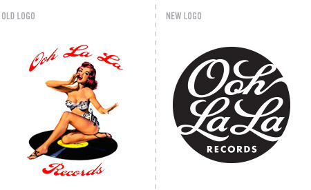
The studio just finished a new logo for Ooh La La Records. They are a boutique artist development company and independent label based in Brooklyn, NY. As you can see, their previous logo was quite provocative, but difficult to use due to it’s challenging typography and full color palette; not to mention, scalability issues. Our solution was to make an about face. We used only the tantalizing curves of script type to to create the allure of Ooh La La. The new mark is concise, flexible, scalable and looks sensually sharp when used as a one color.

Road to Recovery
Over the past few months, we have had the privilege of working with the team at New Road Fitness. Their newly founded fitness enterprise is not your average gym. By forming partnerships with health facilities around the country, they are able to provide specialized fitness regiments for individuals with unique health constraints.

When developing concepts for their logo, we wanted to create a visual language that emphasized the close association that New Road Fitness shares with the medical community. By combining a traditional medical icon and an imagery of a crossroad, we identify the gym as a place where people can turn a corner and make choices to better their health. The asymmetric typography offsets the strict symmetry of the icon, giving it a unique and modern sensibility. We are currently working on floor graphics, exterior signage, office systems, marketing materials, wayfinding, consulting on interior design elements and designing all internal signage. Stay tuned for a full portfolio unveiling, but for now, grab a towel and start stretchin’.
Clean the Heads

Mixcard.me is a new service born out of the simple idea of keeping digital music tangible. By sending a postcard with a link to a custom playlist, the good people at Mixcard have given new life to the mix tape of yesteryear. The service works by choosing art for the front and creating a customized play list on the back. Once your friend receives the postcard they can follow the link to a digital version of your play list. Keeping this in mind, we went back to the roots of sharable music, the mix tape. Working with the key elements of the tape, we created a logo that is recognizable and slightly nostalgic while also looking clean and updated. Keep your ears perked for more on this one, as these guys are on the verge or taking there site live.
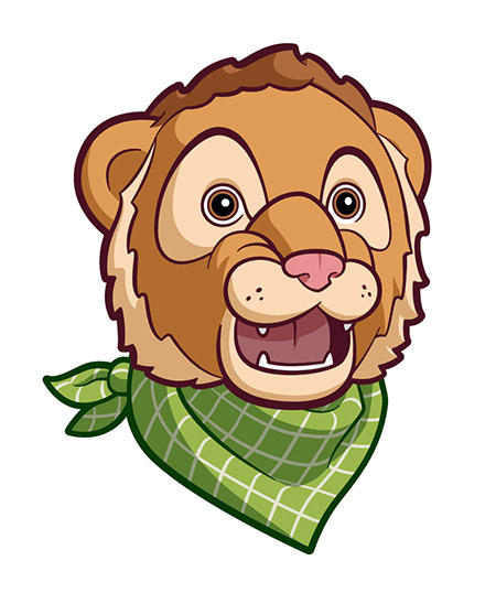
Lion(ess) Tamers
As much as we love to obsess over typography, that doesn’t mean we can’t get down with a pure illustration gig from time to time. Due the über, stealth nature of this particular project (sorry, you simply don’t have Clearance Level Mach 9), we need to be careful with how much we can share. What we can say is that this illustration was developed for an elementary school in a suburb of the great city of Boston, and it is indeed a lion. A lioness, actually. A lioness wearing a checkered bandana – there, we did it – we already shared too much! Sheesh. Don’t tell them we told ya.
We {Heart} Designing for Fellow Creatives
As a design studio, we have had the dubious honor of branding / re-branding a number of talented photographers. Such is the case with Brian Hodges, an award winning photographer who’s work has been featured in magazines such as GEO and Conde Nast Traveler. After an initial discussion regarding his desired logo aesthetic, he left us to our work and trusted in our creative process. The end result is a restrained composition driven by a contemporary, minimal monogram that is paired with a simple, stylized type treatment. The mark is intended to compliment the photography without demanding the spotlight.

sit boy, sit!

As a design studio, it is always liberating when a client comes to us who would like to ignore current design trends. Embracing the idea of being original and irreverent while still addressing their target audience is truly music to our ears.
RightPet has cultivated a loyal community of like-minded pet owners who “Share the good, bad and smelly on the animals who’ve owned them. From dogs and cats to insects and livestock, RightPet has owner reviews of them all.”
We entertained a number of design directions for this logo; a rotating cast of pets, typographic options, a magnifying glass wielding canine, fur-covered-fonts, a check box system of appropriate pets… Part of the challenge of rebranding the site was to address all potential pet categories without making one more important than another (the last thing you want is a slighted Coral Snake owner!).
The final solution embraces the ridiculous and unexpected notion of a girl walking her pet elephant – possibly the right pet for her, possibly not for all. Especially if you’ve recently moved into that 7th floor walk up apartment.
Before our re-brand:

Time To Clean It Up
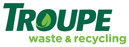
Troupe Waste Services, Inc. came to us with a new vision for the future of their brand: Troupe Waste & Recycling. It was important to emphasize their new outlook on sustainability and the environment while maintaining the existing typography that trusting clients have come to recognize for nearly a decade. In order to both modernize and reinvigorate the logo, we tracked out the name and meticulously kerned the letters, elevating the presence of the word mark, and then introduced a single leaf, which along with the complimentary “fresh” green makes it unmistakable that Troupe is looking toward the future. Keep your eyes peeled for beautifully branded barrels, dumpsters and trucks coming to a neighborhood near you!
Prior to our re-brand:

The Tasking of Elasticity.
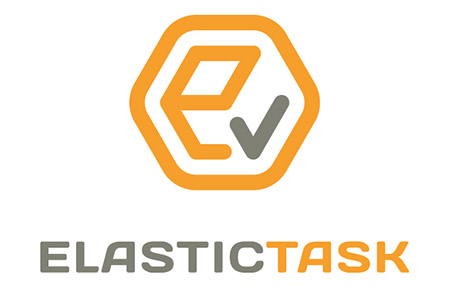
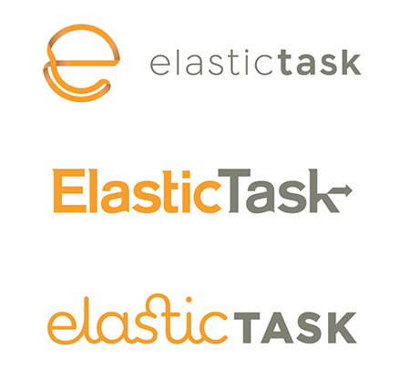
We were recently tasked with developing a logo for ElasticTask, a digital application built for technology professionals. To encompass all that the software has to offer, we built a mark that combines a variety of visual concepts into one sleek, modern, and flexible (wink) form. Within the lock-up, we included a three-dimensional box to represent cloud storage, a check mark to emphasize task completion, a hexagonal container to suggest seamless integration, and of course, an “e” initial. Paired with a powerful sans serif, this logo is ready to take on even the most rigid of tasks. Oh – you are interested in seeing some of the other proposed directions – by all means. Do you think ElasticTask chose wisely?
Breathe Deep…
Alphabet Arm recently had the pleasure of working with Sage Tonic, an innovative, natural treatment system focused on adolescents. The practice features alternative and complementary treatments for some of the most common day-to-day medical conditions. Sage Tonic identifies each condition and provides remedies based on each of the five senses. They have designed an easy-to-use sensory platform that includes integrative medicine therapies supported by research and clinical data. We were asked to develop a logo that reflected their company’s modern methods, while still alluding to the ancient techniques from which their healing practices are inspired.

After proposing a variety of directions, the logo that Sage Tonic decided most resonated with their vision was an “ST” monogram inspired by ancient East-Asian name seals. The winding form is meant to feel ethereal and calming. It locks cleanly into the symmetrical geometry of a diamond. To contrast this rigidity, we introduced a slightly textured quality. The final color palette makes use of earthy (and sage-y) tones to speak to its antique influences. Stay tuned for business cards, packaging and a set of info cards!
Blast Off School
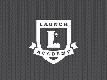
Our clients at LaunchWare contacted us recently to refresh the Launch Academy logo. Launch Academy offers a 10 week intensive program, transforming 30 eager learners into rising stars within the Boston web development community.
Oddly enough, another designer had repurposed the original LaunchWare rocket to connect the two entities, which made good sense to us. Unfortunately, the execution featured a number of tricks-of-the-design-trade that – as a studio – we don’t typically embrace. We will always advocate for the timeless, 2- D, restrained approach – versus slick beveling, super gradient, solar glare and webtastical sheen – but that’s just us. Within our logo design work, we avoid getting too caught up in current trends, which can eventually make a logo feel dated and require costly re-brands.
After the form and type treatment of the updated logo was approved, we presented a color study for the final logo system, only to have the Launch Academy team embrace the idea of sticking with a simple, one color mark. Classic Black and White.
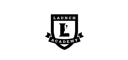
Previous Logo:

Updated and approved for take-off!
This Triangle is Impossible

JPRiZM is an up and coming producer, emcee, DJ and singer. It’s a top secret project we can’t really talk about. What we can tell you is that we just put the finishing touches on his new logo. The artist pulls inspiration from sci-fi, comic books, video games and urban culture. Our aim was to create a mark that is hip and youthful, while still maintaning three vital design principals: simplicity, geometry and usability. One might think we were tempted to use the full spectrum of color to illustrate the use of a prism. But in the end, a limited color palette created a sense of clarity and restraint. It also proves easier (and more cost effective) to reproduce across various media and merchandise.
Here are several other proposed designs that show the range of options we strive to present for any given logo project:

It's That Time Again…

We’re happy to announce that we’ve just updated our website with the latest round of featured projects. Head on over to alphabetarm.com to get the details on the very newest of new projects we’ve been working on.
Hey, What's the Big IDEA?
![]()
Alphabet Arm and our partners: G2 Technology Group and Amazon Web Services are calling all Entrepreneurs & Start-ups for a new competition.
There is a local scene of innovation here in Boston’s Innovation District, and we want to show future generations of entrepreneurs that their ‘Big IDEA’ means something to all of us here in the Boston community.
You could win $10,000 in cash and more than $30,000 in prizes for your innovative business idea. It’s easy, all you have to do is provide links, upload a document, or fill out the online form with an Executive Summary of your Business Proposition and a short “Elevator Pitch.” Find out more here>
And, yes, of course we designed the logo and collateral.
Workin' Some Magic…

Let’s face it, some clients are just more bad ass than others. Such is the case with the talented Sarah Borges. As we are knee deep developing the Art Direction for her new release, Radio Sweetheart, it was determined she needed an identity for her new imprint, Modern Trick. Having the opportunity to work with Sarah for several years now, there is wonderfully liberating mutual respect and trust we share. We know she will record a killer collection of well-crafted roots rock pop gems, and she allows us complete freedom to create the visual counterpoint to her songs. Stay tuned for the Radio Sweetheart, but in the meantime, have a look-see at this little logo.
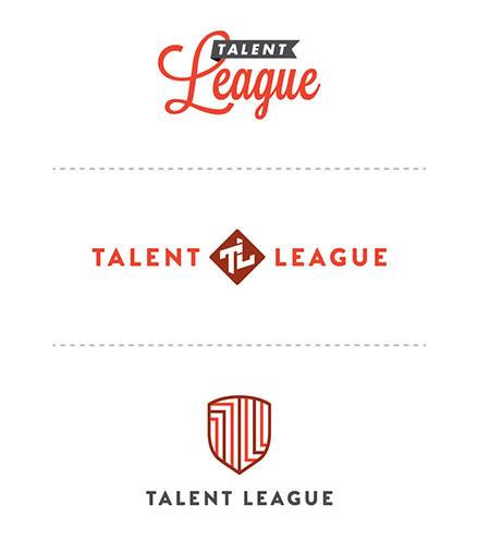
this here league is rich with talent.
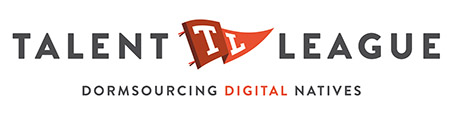
Talent League is an online marketplace that matches curated pre-professional student talent with companies facing evolving business and resourcing challenges. Re-imagining traditional student engagements, Talent League enables companies to enhance their workforces by leveraging an underutilized pool of qualified, affordable and flexible labor, either remotely or on-site. Creating the visual identity for such a complex business model and service offering was a daunting challenge. We tackled it head on, being the gamers that we are. In the end, we victoriously waved our flag (ummmm, pennant, that is) in triumph. Above is the final Talent League logo lock-up, below are some of the other directions we developed along the way. Go team!
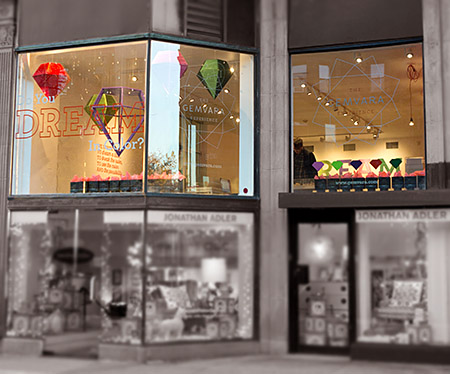
Shine On You Crazy Gem
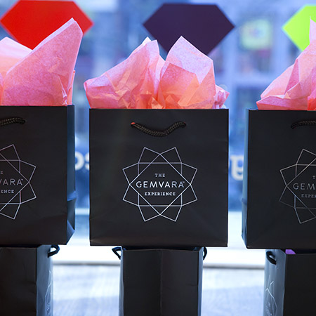
He went to Jared? We should hope not. We had the unique opportunity to work on The Gemvara Experience retail store with our key partners, Heart and Brandon Bird Design. Being a successful online, custom jewelry destination, the Newbury Street location is Gemvara’s initial foray into a brick and mortar storefront. We designed the logo and store branding and worked closely with Brandon Bird to develop the concepts – and ultimately – execution of the window displays, wall installations, signage, display cases and general aesthetic of the store. A multitude of partners, vendors, architects, electricians, carpenters, painters, former interns, friends of former interns, friends of intern’s friends formally known as friends, were all employed to help us realize the vision.
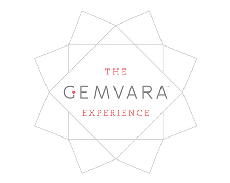
We introduced a cornucopia of mediums and fabrication techniques to the project. As a studio specializing in print design, we embraced the chance to really push ourselves as 3 dimensional, creative problem solvers. Look for a full blown case study on our portfolio soon, but for the time being, go create some custom jewelry and see the space for yourself!
just what's in the boxx you ask?
Building upon an established brand sensibility can be a challenge for a designer. Respecting the existing system while introducing a new aesthetic requires a delicate hand. As you might expect, we prefer to develop logo and branding elements ourselves, but there are times we are hired to work with an existing system. Take Promoboxx as an example. They have a unique approach helping companies work with retailers to market their products. Promoboxx hired Alphabet Arm to build a modular logo system for their Client Services offerings. Each service having it’s own messaging but serving the overarching brand as a whole.

As part of our creative process, we developed some recommended usages of the system. Signed, sealed and delivered!
Raisin' Up

Looking for a great job in the Boston area? Raisr may be the answer. You see, Raisr is a new online platform that utilizes complex algorithms to streamline your experience of locating, and applying for your ideal employment. It’s all about finding the right job for you, efficiently. The name Raisr is meant to suggest raising your career status, profile, and pay grade. Alphabet Arm was employed to create a new logotype for the company. Our approach was to craft a custom type treatment that could be uniquely theirs. Both the full logo and the pull-away R icon are an exercise in simplicity with a decidedly modern sensibility. It’s all buttoned up (like you should be for that job interview).
Much Respect for the Musk Ox.
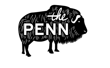
Well Hello there friendly Bloggery enthusiasts. For this blog entry, we can’t think of a better solution than to simply have a recent client share their experience of working with us.
“As an educator who is trying to change the way that people view education with a brand new (and very different) program, the first impression that I make, and the program makes, matters a great deal. When I approached Alphabet Arm to inquire about whether or not they’d be able to help me come up with a logo that appropriately represented the program I am starting. Not only was my contact (Aaron) more than happy to help out, he employed Alphabet Arm’s group of incredibly skilled designers to come up with a number of absolutely beautiful logo designs for The Penn.
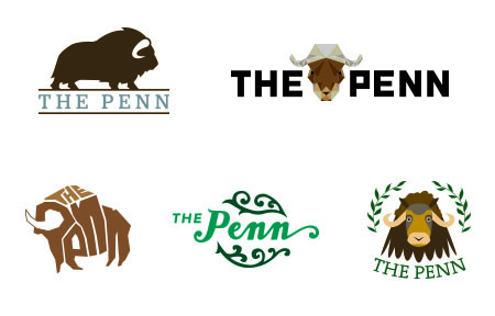
Every single one of these designs was original and all are more eye-catching than almost any logo I see in my daily life – it seems kind of crazy that those companies wouldn’t have already been in touch with Alphabet Arm to have him help them. Out of the choices presented, there were two that I felt fit the personality of The Penn the best, and after all their hard work and ingenuity, it was now my turn to work. Although I wish I could choose all of the logo treatments as the final design, I feel that the final logo that I settled upon could not possibly better represent the program. Aaron and the team at Alphabet Arm were able to give me a visual representation of the thing that I’ve spent years pouring my heart into and for that, I am unbelievably grateful.”
– Andrew Lapham Fersch / The Penn thepennprogram.com
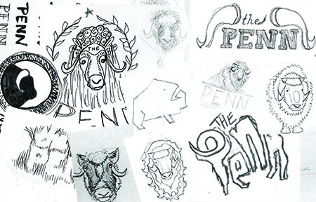
Fox Got Your Tongue?
Recently, Alphabet Arm’s senior designer and resident beer snob, Ryan, tried his hand at a little brew-you-own-beer experiment. After much deliberation, a recipe for American Pale Ale was chosen. A bit hoppy, floral, citrusy and well balanced — it seemed like a great choice for drinking in the (hopefully) warmer months ahead. Of course, for a graphic designer, at least half of the fun of brewing your won beer is getting to name the product and design the brand in whichever way you choose, with no pesky clients to get in the way.
Pale Fox was the chosen name (pretty much, any excuse to spend some time drawing a fox) and the clean, modern take on a beer label followed suit. Pale Fox turned out to be a tasty brew. The process of brewing the ale, bottling, and design was good fun. Thanks to Hopsters for assisting in the brew process and all-around rad experience.


Grace(note) Under Pressure
“Alphabet Arm has been great to work with. They’re professional, human, creative, and in touch. All of these attributes made re-branding with Alphabet Arm an enjoyable and valuable undertaking.”
– Patrick Barter, Founder, Director – Gracenote Coffee Roasters

If you know anything about Alphabet Arm, you know we are almost as passionate about coffee as we are about branding. So, when these worlds collide, we are happy designers. Initially, Gracenote reached out to us to develop some branded merchandise for them. After discussing the state of their current identity and it’s inherent challenges, it was determined a re-brand was in order. Beyond the new typographic updates and streamlining the color palette, we also finessed the graphic elements themselves, creating a kinder balance between the lock-up elements. The next step was to propose new business card layouts. Given their aesthetic, utilizing a robust chipboard stock and a new graphic language to contain and organize information seemed to serve their needs.
Next, we updated the retail bag labels, utilizing the established framework developed for the business cards.
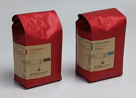
Now, we are receiving all kinds of fun images from the founder sharing his various applications as he is exploring branding opportunities with the new logo. He seems as inspired as we did (not to mention, he fueled our creativity with several bags of his spectacular product!)
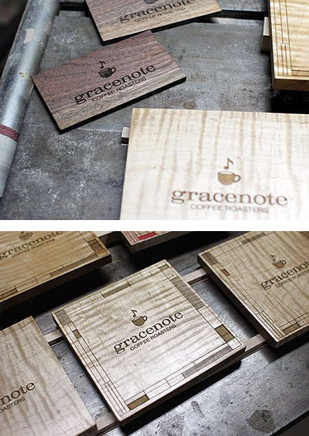
…Over Troubled Water
 Better transit. For everyone. We can definitely get behind the tagline of our newest client, Bridj. In their words, “Bridj is the world’s first smart transit system which uses big data and awesome shuttles (WiFi!) to adjust to your individual commuting needs.” Our primary intent, when starting the design process for the Bridj logo, was to create a mark that read cleanly and distinctly at both very small sizes (on a smart phone) and very large sizes (on the side of a bus). We feel the logo achieves this legibility with a bold sensibility and clean lines that suggest a sense of classic modernity. Not to suggest that the design was easy, but the final mark looks remarkably like the very first sketch we did. Throughout the entire process, this mark seemed to lead the pack and just simply felt “right.”
Keep an eye out for Bridj, they are poised to do some really exciting things in the near future. The app is nearly ready for release and we’re currently in talks to design bus wraps, signage, off systems and more.
An Artistic Ecosystem Aesthetic
Alphabet Arm recently finished a branding project for a new home-grown arts organization.
Alter Projects is dedicated to fostering social innovation with and for the arts. Built on the core ideology that a healthy arts ecosystem has a direct effect on the social, cultural and economic viability of our community, they design custom experiences with contemporary art and artists. Ensuring their clients with a new era of access, appreciation and support for the arts in Greater Boston and beyond.
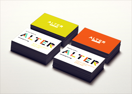
Expressing connection and customization in a static mark is an exciting challenge. The very literal name of the organization led the process in the creative direction; an alteration of letterforms. By leveraging the Gotham typeface, and it’s inheirant geometric qualities, it streamlined the dissection of its form. We painstakingly segmented the typeface in order to show its structure in an architectural way, alluding to the tailored and connected nature of Alter’s community. The logo can be used simply as a one color, in a multi-colored form (preferred) or in a dynamic state with integrated photography revealing the many faceted sides of the organization.
If you see Harold, simply say "Hey".
Alphabet Arm was tasked with developing an identity for an original web series featuring the legendary Judge and Analyst, Harold Lederman. Harold joined HBO World Championship Boxing broadcasts in 1986, and now has his own series discussing the sweet science and fight match-ups. Harold often refers to classic bouts when analyzing boxers and breaking down boxing styles. We were well aware of his great reverence for the rich history of the sport and used that as inspiration for the series logo. Like a left hook to the chin, it’s to the straight to the point and makes an impact.
Need to get schooled in the art of boxing? Check out Hey Harold! This World Boxing Hall of Fame member knows!
Get it Straight.
Our clients, Promoboxx, just launched an event to empower retail companies with robust brand strategies. The event, named Aligned, is an invite-only event for manufacturing brand marketers, digital retailer marketers and sales managers who are looking to help make their retailers better marketers. Aligned attendees will collaborate with like-minded peers from the world’s top brands for a lively three day event, and leave with real tactics to assist retailers.
Naturally, they hired Alphabet Arm to develop an identity for the event (naturally – right?). Playing off the name and concept, we leveraged a simple, yet dynamic typographic mark to anchor the identity system. One of the key considerations of the logo was that it needed to complement the overarching branding of Promoboxx. In other words, the aesthetic, color palette and typography treatment needed to be carefully “aligned”.
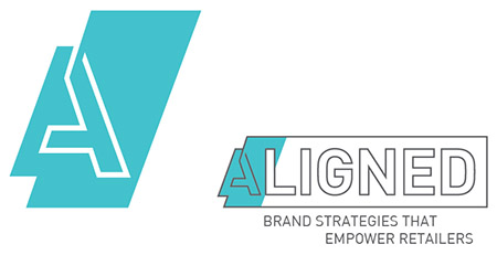
get up and glo…
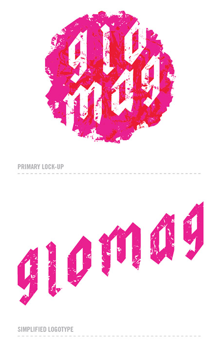
Glomag is the name, funky fashion is the game. Gloria Magale recently took her fun, personal, fashion project to a new level with an official brand: Glomag. Alphabet Arm worked with Gloria to refine the company name, and create a unique, cost effective, branding system. We developed hang tags, rubber stamps, apparel hem tags and a beefy set of 34pt. business cards which feature edge painting.
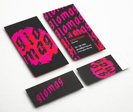
When tasked with creating a mark that captured the edgy nature of Gloria’s clothing, we pulled inspiration from the clothes themselves. After a review of the line, we picked up on the common use of oversized flowers which felt like a bold differentiator to our eyes. We embraced the vibrance and overall shape of the flower when creating the logo, and developing the Glomag color palate. The type treatment was inspired by graffiti and black letter letterforms. The sum of the parts harmoniously create a beautiful, feminine, and edgy brand system.
Here are a few of our favorite additional Glomag logo treatments that didn’t not make the final cut:

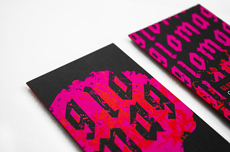
Alphabet Animal Farm, Part 01
Friends of The Bloggery, we hope this post finds you well. We are kicking off a series of recent logo projects that feature animals. Whether they are simple and iconic, or stylized brand mascots, an animal can often function as an ideal visual for a brand or service.
 The Scout Tint Meter is an innovative, handheld, new tint reading device developed by a State Trooper.
Alphabet Arm was hired to conduct a Naming Exercise and create the initial step of the brand voice. We typically begin the process of name development by defining the audience the brand must speak to. We take a broad look at the competing brands (if they exist) and we define the characteristics and key brand attributes. Then we brainstorm, create word lists, free associations, brainstorm, mind map, and brainstorm some more. Generally, the sessions generate a furious list of hundreds of names. We dissect them, deconstruct and recombine. A significant part of the vetting process is rooted in online research to ensure none of the proposed names are being used verbatim. Ultimately, we look for simple answers to complex ideas.
In the case of Scout, avoiding the commonly used technical naming strategy (most often initial and number combinations) and utilizing a familiar pet name was the ideal solution. To offset the product name, we introduced a concrete, descriptive tagline. Pairing the new name with a focused, trustworthy, shepard illustration has already set Scout apart from the pack and reinforces their primary demographic of law enforcement professionals who will be using this device.
Due to the nature of the mediums that will be branded (molded plastic tint meter shell, carrying case, operating instructions, etc.) the Scout logo system utilizes a number of lock-up options and a simple atomized version of the mark.
Alphabet Animal Farm, Part 02
Vista Clothing Company is among the new breed of conscious-minded apparel companies that have a charitable giving commitment integrated within their business model.
Drawing influence from classic and iconic brands like Izod and Penguin, the Vista bird mascot will carry the lions share (no pun intended) of the branding responsibility. At it’s root, it is a simple and graphic form that is easily removed from the typographic lock-up. It features a subtle V form across it’s chest – honoring the company name. 
The flexibility of the simple mark, not only allows the color palette to constantly evolve, but will make embroidery and skill-screening both cost effective and very clean.
Geometry in the Geology

GeoOptics specializes in fiber optic sensors used to peer deep inside the earth for energy resources. Our goal in creating the new logo was the same as most any logo we design: distill the main idea of the company down to a simple, striking mark. Rather than getting overly complex with the fiber optic technology, we focused on a simple geometric approach that could depict the idea of seeing inside the earth — which is the broad concept that lies within the name: Geo (earth) + Optics (see). Our sketches capitalized on the fact that the initial G is based on a circle, so we iterated from there. It was important that the globe and the G have the same line weight to create unity. The placement of the bar of the G also suggests direction to the earth’s core.
This report, just in…
It is the duty of the court reporter to record spoken word in the form of written language. This documentation process is invaluable in a courtroom setting, as well as for live captioning for broadcast television. Reporting companies – more often than not – bare rather lackluster branding, but Jones & Fuller Reporting decided that it was time for Alphabet Arm to give them a new look to stand out from the pack. The process began with a conversation regarding the company name itself.
In order to depict the note-taking nature of Jones & Fuller’s business, it was important that the mark featured both the appearance of a “verbal” graphic element to imply speech as well as an element based in writing. By dividing the form of a speech bubble in two and making one half representative of a transcript, we create an opportunity to visually explain the responsibilities of court reporting itself. Once the logo re-brand was complete, Alphabet Arm developed the system of office materials and marketing collateral.
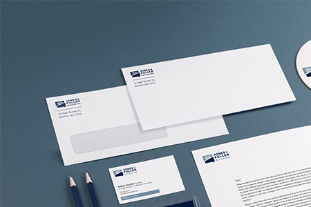
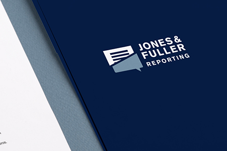
Logotype + naming prior to Alphabet Arm’s re-branding:
Get Your Bath On
Family owned and operated for over 50 years, the Murray Design showroom showcases a variety of bath and kitchen appliances from top industry brands. The Murray Design marketing team felt the previous identity and branding were no longer representative of the products they offer. Furthermore, they were concerned the branding didn’t connect with their changing demographic.

Alphabet Arm set out to create a clean, sleek identity to reflect the beauty of Murray Design’s product collection and honor their talented team of designers. Drawing inspiration from the curvature of the many fixtures and appliances found in the showroom, we rendered a mark that embodies both a faucet and an M that embraces a sophisticatedly, minimal aesthetic. For the color system, we utilized a calming blue and a metallic silver, naturally representing both water and the reflective finish found on many of Murray’s products.

Previous logo before Alphabet Arm got our hands on it:

Geometrically Speaking
Another notch in the logo belt… presenting the new mark and business card we designed for Curl Simitis Architecture + Design. From their website: “With a deep appreciation for New England’s long tradition of craftsmanship and a love of contemporary design, Curl Simitis Architecture + Design’s work is unapologetically eclectic.” This brand identity was a great chance to revisit our roots of strong geometric design principals. The underlying grid structure is composed of 4 modular squares. At first glance the rectangular forms are a beautifully balanced abstract design. However, upon further investigation, the rectangular shapes reveal the negative spaces of the initials of C and S.
We Made it Awesome
Let’s Make It Awesome (one of the best company names we’ve heard in a long time) hired us to design an identity of awesomeness for their newly founded Search Engine Optimization/ Marketing Firm.

LA Ink
Do you watch La Ink? Of course you do—silly—but did you happen to catch Cat visiting her local Dr. TATTOFF for some tattoo removal work? (okay we admit it, we designed their logo).

Harlem Vintage on CNN
Our long time clients Jai Jai Greenfield + Eric Woods from Harlem Vintage received some pretty heavy duty props from CNN on the wine boutique’s success, not to mention the fact their logo + branding were specifically mentioned as well (we like that!).

Message in a Bottle
The Wine Bottega is a swanky, upscale wine shop in Boston’s North End. We just finished a logo for the new owner, check it out. We also included some sketches to give a bit of insight on our process. And yes, we actually draw this stuff!

Channing Johnson
Channing Johnson is a photographer out of Boston, he is widely known as a wedding photographer, but also works as a photojournalist. He came to us a few weeks ago for a new logo design. We worked on a number of treatments for him that each tried to suggest photography without falling into the usual trappings.
Lucky for us, Channing was pleased with all of the logos we created for him and was able to narrow them down to two. The first option strikes a balance between something that would work for a wedding photographer, but also have some grit and edge—speaking to the “bearing witness” style of a photojournalist. Letting our imagination get ahead of ourselves, we imagined this being something that was found stamped onto some documents or photographs. The second option was the slightly safer solution. It expresses the idea of photography though the beams of light and also is reminiscent of an eye.
In the end, we let Channing think about it over the last week. He went with his gut feeling and chose option 1.

Wave Hello!

We just wrapped up a new branding project for a long-standing client of the studio. Stillwater Unlimited – a division of the Ferree Group, Inc. – is an all inclusive, concierge level service that delivers best-in-class home services to their client’s doorstep. What does all this mean? High level property & lifestyle management, silly! Given their white glove service and discerning clientele, we felt the need to have the identity share the same sophisticated and stylish attributes. The final logo features a rendered, monogram waveform set which was inspired both by the location of their clients homes (ocean front, lake side, etc.) and the luxury brands they have come accustom to. We paired that with trusty, typographical foundation, keeping the mark fully accessible.
Here is where some of the initial sketches took us:

And a sneak peep at their business cards:

Old School Baking
The Ancient Bakers is a specialty baking company that focuses on ancient grains and medicinal plants as ingedients for cakes, cookies, muffins, breads, brownies and even bagels. The company enlisted Alphabet Arm to embark on a logo design project. Our creative process started with the name. Initially the company was called Vision’s Sown, an Ancient Baking Company. We suggested pairing the lengthy name down to its essence: The Ancient Bakers.
Original name and logo:

Creating a logo for The Ancient Bakers meant exploring type and imagery that expressed the tradition, sustainability and pureness of ancient baking practices. The stalk of wheat has remained the heart of natural baking techniques since the dawn of time. This — along with the addition of a nutrient-rich rose hip and a traditional serif typeface — tells The Ancient Bakers’ story: that the best, most wholesome ingredients will always withstand the test of time.
New name and logo:

M to the C

We recently had the dubious honor of working with long-time-friend-of-the-studio, Maggie Cavallo. Maggie is a proud bay state based curator who needed a bit of personal branding for her various endeavors. Maggie’s exhibitions are typically performance based and focus on elevating underground / alternative subject matter to a fine art atmosphere. When it came to designing her logo, we wanted to create a logo that had a refined feel with a definite edge. The custom “M” and “C” letterforms framed by a system of bars offer a decidedly alternative feel, and might relate to yet another one of her creative passions (stay tuned here for more regarding that). The black and white color scheme and Futura Condensed Bold elevate the logo for a gallery setting.

When it came to designing her business cards, we thought long and hard about incorporating a tertiary color. In the end, we decided that the strong contrast of the black and white had an elegance and punch that was appropriate for the fine art world. Word up.
Get Some Shut Eye

Recently launched by Rest Devices, Peeko is an awesome new product for the parents of infants. We were excited to design the logo, packaging and branding, which was just unveiled and this year’s ABC Kids Expo. Peeko monitors a baby’s respiration, room temperature, and body positioning by wearing a cotton bodysuit. The device transmits the information to the cloud so that it is available to your smartphone or tablet from anywhere in the world. Our goal was to create a brand that was warm and approachable to new parents, while still feeling modern and technology based. We felt it was crucial to retain the simplicity and sophistication of our iconic character in order to help it stand apart from the vast sea of cute and cuddly mascots used in the baby product industry. In other words, our aim was to create plenty of personality, whimsy and adorable-ness without entering the forbidden territory of fuzzy ducks and pastel bunnies.
S + D = Happy

As a studio that makes a concerted effort to develop trusting relationships with our clients, it’s quite reaffirming when individuals continue looping us into their newest venture or introduce us to their new employer. This was the case with Smith + Davis Group; one of the founders had hired us to brand her previous business. Smith + Davis Group specializes in event management & production, coupled with event marketing & publicity. Much of their focus will center around working with non-profit organizations and corporate entities in community outreach and specific target marketing to capture and engage audience attendance. Understanding that, and knowing the visually savvy partners that make up S+D, we knew they would respond to a restrained, simple, yet impactful monogram set. Plus, any chance we get to interlock letterforms and combine a slab serif with an extended sans typefaces, we are happy. A few days after receiving the approval on the final logo iteration, we received this unsolicited email from one of the partners, “This logo makes me happy!” That seems like an ideal equation to us.
"Why I Otter…"
As a design studio, we appreciate puns almost as much as we appreciate cute, furry, aquatic creatures. Which made us the ideal designers to handle Otterter’s (pronounced Aud-it-ter) logo. Full disclosure, one of our t-shirt designs actually inspired the founders in their naming process for the company. It’s a service that helps businesses with management and auditing media for their organizations – clever, huh?

The Otterter logo and mascot had to, of course, be an otter, but figuring out how it would look was no easy feat. We took multiple approaches, from detailed and playful, to simple and geometric. The final design landed right in the middle of the two. We took our geometric concept and gave it some character, adding whiskers, waves, and of course a big smile. We paired that with a modified, lively script. In order to pull the otter away from the lockup, we took an extra step and built a full body off of our initial illustration of the face. Two webbed feet and one plump belly later, an Otterter was born!

Set. Brand. Love.
One of my first design initiatives when joining the creative leadership team at New Balance was to update the antiquated and counterintuitive (in my humble opinion) logotype that was being used for one of the brand’s biggest and most successful collections; Fresh Foam. Check this IG post for more.
The hexagon form itself is a key visual for the technology of the collection, so I opted to build a logotype utilizing the hex to define the character terminals (see process image). The final result is a distinctive, bold – if not somewhat subtle – logotype that features a great deal of flexibly. Due to the fact the logotype is used on product, as well as our print, digital, in-store marketing efforts, it was important to have a variety of lock-up options within the branding family. For context, note the before and after.
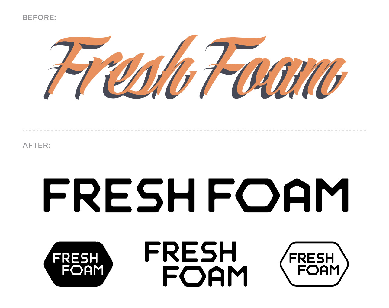
This branding system is featured on the new Fresh Foam Lav men’s tennis shoe.
We teamed up with professional tennis player Milos Raonic to develop this dynamic model. It features a Fresh Foam cushioned midsole, external heel counter and Kinetic Stitch to ensure lockdown stability.
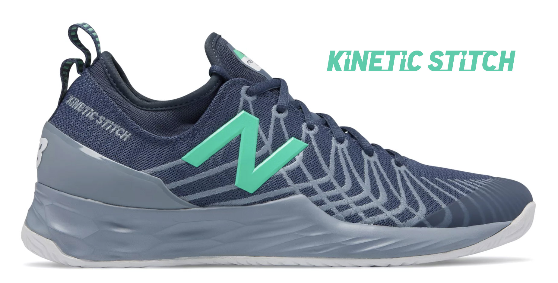
Like the Fresh Foam visual identity, Kinetic Stitch is another example of a custom logotype created for New Balance. Kinetic Stitch is an upper technology that helps athletes lock in their feet during lateral cuts on court.
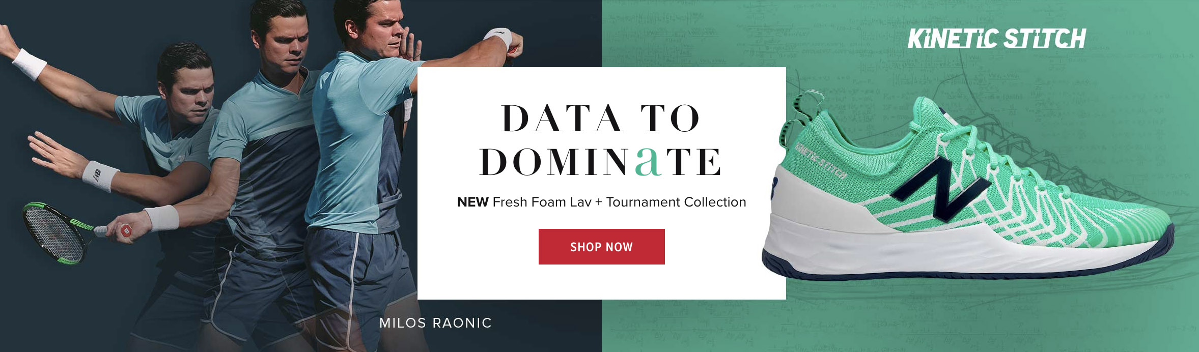
Run, Test, Run, Test, Run,
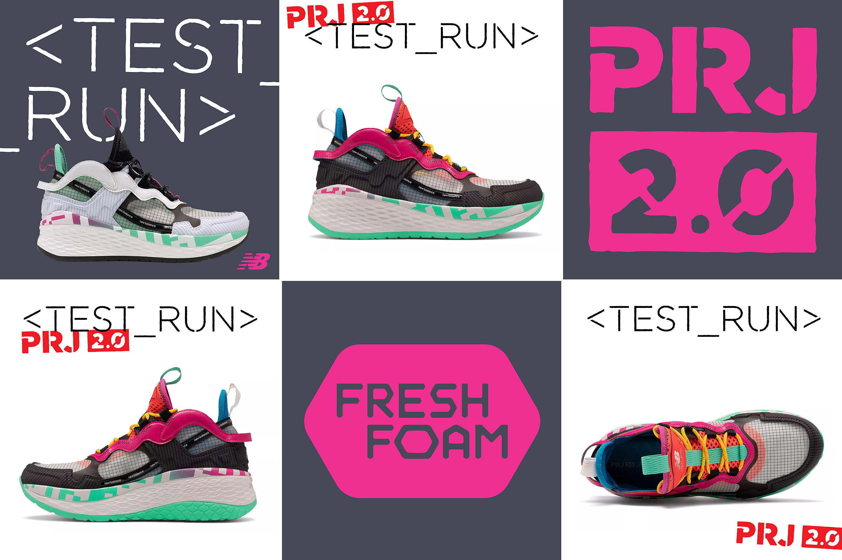
Straight from the future the ’90s imagined, the second limited-edition launch of our New Balance <Test_Run> program is an ultra-modern mashup combining massive plushness with wild head-turning style. An ode to the next millennium, it shares the radically soft midsole of the Fresh Foam More running shoe, which features our most premium version of Fresh Foam cushioning to date. Meanwhile, the futuristic upper — with hypnotic accents including translucent material and bold arcade colors — is sure to warrant endless double-takes.
Custom logotypes, stencil typography, and badging by yours truly.
Run London Run
In the early stages of my design career (prior to being computer literate) I would draw + re-draw letterforms, photocopy type as small as possible (only to blow it back up), crumple paper, sponge water, tear + tape, use blender pens, etc. to replicate worn typography and illustrations I would find in archival books and vintage signage. In my own low-fi way, I was trying to age branding elements in the most honored and authentic way I could. Given that, it is pretty sweet when you can go back to your design roots and kick out a type treatment that feels just as relevant and appropriate now. Honoring the New Balance relationship with the London Marathon, we created a special branded RUN LDN pack, blimey!