Featuring bouncing basslines, soulful vocals, lush production, and a definitive “from-across-the-pond” inspiration (it was partially recorded at Abbey Road!), here’s the cover for New Lion Terraces. As with any CD Art Direction project, it was a challenge to nail down a visual style for Corin Ashley’s new, full length album. After exploring a wide variety of designs, illustration styles, and photo manipulations, we landed on the simplest solution: draw a lion. Duh. Making use of a bright color palette, boatloads of custom typography, and a psychedelic-yet-refined visual style, we were able to achieve a vibe that was 1/2 throwback and 1/2 twentythirteen.

Here’s a peak behind the curtain of the rough sketch we later refined:

And the complimentary show poster, Grrrrrrrrrrrrrr:

Art Direction
Sign of the times

If you’re a regular reader of our blog, you may have read an entry or two about our old friend Kay Hanley. In fact, we’ve been art directing/designing albums together since 1997. Her latest project, Palmdale is a collaboration with multi-instrumentalist/producer, Linus Of Hollywood. It’s a tour de force of rockin’ pop hooks. How to Be Mean is their second EP. After talking to the band and hearing the rough tracks from the EP, we opted to take a literal approach to the cover and digital booklet. Palmdale is actually named for a city in southern California. Palmdale sounds picturesque, lush and pristine — over time, it may have fallen short of the promise the romantic name portrays. Kay and Linus felt the music should complement both sides of that coin. This photo was taken in California a dozen years ago and seemed like the perfect starting point for the cover. We labored over distressing the image and type and added a warm color palette to mimic the intense heat in the vast concrete landscapes of SoCal.
Now Hear This!

Have we mentioned – as a studio – how much we enjoy the process of developing the visual counterpart to music? Well, we do. It’s even more liberating when a client trusts us to do so. Thus was the case with Jason Young and his recording project, heartour. We’ve worked with Jason and his previous band, The Ruse, as well as his debut release of heartour. Part of the reason he has faith in us, is our constant effort to make his albums look as interesting as it sounds. We couldn’t help but be inspired by the album title, Submarine Sounds, and layers of sonic treats he folds into his songs. Adding levels of imagery, both overt and abstract, seems to gives the final package the depth we were hoping to achieve. The type treatment we developed for the cover now serves as the new identity for the project. Dive! Dive!
Anatomically Correct

Adam Levy is a singer-songwriter and guitar player residing in New York. We recently finalized the art direction and design for his latest solo album, The Heart Collector. Adam pretty much left the door wide open for our creative interpretation on his record. We used the lyrics and dark mood of the title track for inspiration which was full of interesting descriptions and metaphors — perfect for creating visuals. Vintage anatomy text books quickly became the device we used to structure a diverse sampling of textures and imagery we associated with the themes of The Heart Collector. Look close and you can even see how we were able to tuck some of Adam’s lyrics and a map of his NYC stomping grounds cover collage itself.
April in May
 April Verch and her band play an energetic style of blue grass, blues and pop (among other styles) deeply rooted in the Ottawa Valley musical tradition. Not only is April an highly accomplished fiddler, singer and songwriter, but she’s also a pretty amazing step dancer. Seriously, she’s s super talented. Recently, we finished up the design for April’s forthcoming CD. From a design standpoint, April basically asked us to do what we do. In this case, that included hand drawn typography and rustic canvas texture.
As American as Ollie
Actually, Ollie Childs is not American at all, the singer / songwriter was born in England, but he has written a stellar track celebrating the states. Non-Drip Gloss Records was savvy enough to coincide its release with Independence Day. Here is the cover for the single (available on iTunes):

Being a studio with an extensive record collection of our own, we are never satisfied to stick with the expected singer / songwriter “glamour shot” album motif. Much credit goes to Ollie and his management to allow us much visual leeway. In this instance, we also didn’t want to be overly nationalistic, but liked the idea of introducing something as iconic as the American flag into the layout. We used a great deal of layered Photoshop images and textures (close to 30) to achieve the final cover treatment. We were greatly inspired by the depth, tone and lyrical content of Ollie’s songs. Here are a couple detailed views to wave your flag to:

Opportune Time.

Kairos, translated in Spanish, means opportune time. Apparently, it was the opportune time for this recording project rooted in R&B, positivity, pop and the band member’s faith. Alphabet Arm was hired to art direct their debut release, Corro A Ti. We augmented their travel-themed photos and developed a textured, bold layout to compliment their music and its complex influences.

Old Lucky 13

Richard Shindell is an expatriate New Yorker currently living in Buenos Aires, Argentina. Richard is a craftsman of folk songs that are often laden with rich storytelling. Thirteen Songs You May or May Not Have Heard Before is “a relatively spare, no-frills revisit of some of the songs from his catalogue.” To compliment his rustic sound, we designed his upcoming CD package with a hands-on approach. We stamped each letter of the title by hand and made sure to retain the beautifully imperfect character of the type. An archival scan of wood type (which had definitely seen better days) was incorporated to reinforce the unrefined quality of the cover. Props to Richard for embracing the stark, bold, type-only design that we think is quite eye-catching.
Katrin Came Calling…
…looking for art direction, and we were happy to oblige. Boston-based acoustic rock siren Katrin had a handful of striking images courtesy of Dion Ogust and (long-time friend of the studio) Liz Linder but was struggling to tie it all together. Our initial step was to develop a custom logotype for her.

Former Alphabet Arm intern Florencia Tasso rendered a simple yet stylish type treatment that was introduced to Katrin’s photos. It soon became an essential branding tool for Katrin and her management. As a designer, it often becomes our job to show restraint and not overwork a design or add elements not crucial to a specific piece. Sticking with a clean layout and letting the images lead the way, we did work in a number of hand written lyric selections from Katrin which added some depth and visual interest.

Lucky Who? Lucky you!

David Lockwood’s new LP, titled “Lucky Me”, stirred up a lot of ideas about traditions based around luck. In the end, we came to the conclusion of using a lucky rabbit’s foot. It took Aaron on an adventure to actually find an actual rabbit’s foot. He got lucky while stumbling into a wig shop. Why a wig shop? Well, Newbury Comics didn’t have any, of course. We took the rabbit’s foot idea into our own hands by setting up our own photoshoot. We ended up photographing David holding the rabbit’s foot. The idea was to create a warm, emotive image that portrayed luck. We applied textures to make it look old and worn, giving the viewer the feeling of an antique photograph. The final cover has a rich, tactile quality of that relates directly to David’s music.
It's That Time Again…

We’re happy to announce that we’ve just updated our website with the latest round of featured projects. Head on over to alphabetarm.com to get the details on the very newest of new projects we’ve been working on.
Honesty, is always the best policy (Bob).
“The CDs are now in hand, and look really awesome! Everyone we’ve shown them to is really impressed. Thanks a ton for your fine work once again.”
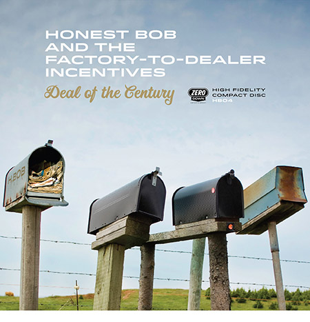 Happy clients, well… make us happy. Honest Bob and the Factory to Dealer Incentives enlisted the studio to develop the art direction for their latest musical offering, Deal of the Century. We had previously worked with the band and appreciated their faith in our ability to develop the visual complement to their music again. We assembled a visual narrative to the album’s title and riffed on the idea of four bandmates being represented by four mailboxes. Clearly, not a group of guys who get caught up taking themselves too seriously.
Contemporary Affection
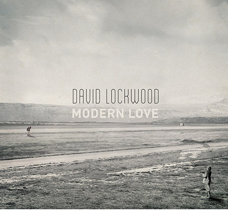
May we present David Lockwood’s latest release, Modern Love. Our art direction was inspired by the sweeping, cinematic concept of the album. We also drew largely from the lyrical content (which itself was inspired by a famed, recurring article in the New York Times). This cover image was quite a labor of love itself. Partially sourced from royalty-free Library of Congress images, we assembled a composite image based on a narrative of the two people, and a dwelling in the distance. Our intent is to allow the viewer to determine the dialog between the characters – one of everlasting love, a pending break-up, the challenge of a long distance relationship or perhaps they simply enamored by the different perspectives of hovering typography in the sky?
Radio-oh-oh!
 We’ve worked with Sarah Borges and The Broken Singles on several projects in the past, so we were quite enthusiastic to work on her brand new, solo record. Radio Sweetheart was crowd-funded by her loyal fan base, its chock full of what Sarah does best: well crafted old rock n’ roll with a country twang thrown in to keep things interesting. Sarah got dressed up all-fancy-like and had a photo shoot with her dad’s classic Thunderbird. She turned the photos over to us and it was our job to create a album cover that looked timeless and exuded cool (which Sarah has in spades). We were especially pleased to find a light-hearted image of Sarah behind the wheel with a candid laugh, it took some doing to convince her that was the way to go, but we were glad she trusted our instincts. Do yourself a favor, and turn this one up!
Township
This year’s WBCN Rumble winners, Township, cashed in on their coveted Alphabet Arm prize and had their new record, “Coming Home”, designed “on the house”, even nabbed a brand spankin’ new logo out of the deal. Thin Lizzy would be proud:

Akrobatik's new album arrived
We just received samples of Ak’s new album that dropped this week. Did we mention we designed the 12in as well as the CD? We were enthusiastic about seeing the artwork on the matte finished goodness of the LP sleeve—have to say it looks pretty sweet!

Are you old school (relatively speaking)?
We are, and have to say we’re pretty stoked to work up the art direction for this Letters to Cleo b-sides collection to compliment their reunion tour. The Cleos and the extended band family have always been a very loyal lot, we couldn’t be more appreciative. We were given the very daunting task of pulling this artwork together within a weeks notice. Lots of scanning, hand writing, weathering, image chopping and duct taping was necessary. Full props must go to USA Michael Eisenstein for the initial concept which honors the rough and ready, cut and paste, design aesthetic of the 1990’s indie rock packaging. We had the luxury of using a bunch really great photos taken by Steve Latham. If you don’t know him – you should!


Scotty, We did.
We just finished up this digipak design for Scotty Don’t, a band out of Providence, RI. Don’t tell anyone, but the guys in Scotty Don’t are members of the well-known, Badfish: A Tribute to Sublime. We had a lot of fun working on this project—collaging photos and hand-drawing type.

Stars & Curses
Here is a sneak preview of the new full length release we just finished up for our friend Coby Brown. A Boston native who now resides in LA, Coby is a singer-songwriter making soulful indie-pop music. The artwork explores the ideas of fate, randomness, destiny and triumph. Although the digipak is still in production, but we’re so excited, we just had to blog about it.

Big Head Todd and the Monsters
We’ve been designing just about everything for Big Head Todd and the Monsters new release “All The Love You Need”, from the band’s new logo, promo CDs, admats, tour merch, posters, the whole shebang.

We’ve been using a ton of our photography for the packaging which always makes us incredibly happy.

Fisticuffs
Need some CD or DVD manufacturing? Look no more my friend, our pals + partners, Icon Omnimedia can do it all, and with stellar customer service to boot! Heck, we even just designed a swanky new split promo with them, ourselves and Eulogy Records. It’s cleverly titled “Fisticuffs”. Check out the dope foil stamp + embossed digipak, mmmmmmmm:

Absolute Value
Boston hip hop legend, Akrobatik, hired us to art direct his anxiously awaited new album, “Absolute Value,” featuring the likes of Talib Kweli, Chuck D. of Public Enemy, Mr. Lif, Bumpy Knuckles, and Little Brother.. Perhaps you’ve heard him on the new NFL / Diet Pepsi TV spots, nice work Ak.

Tim McCoy
Tim McCoy is a helluva guy. We’ve had the pleasure of working with Tim and his many bands for years. Check out his solo record “Late Nights On Washington,” you’ll love it!

Zox your sox off
Zox released their 3rd full-length “Line In The Sand” on Side One Dummy. These dudes from Providence, Rhode Island have crafted quite the album of indie rock joy. We designed the CD packaging as well as a new type-driven logo.

Flogging Molly
Our homies at Side One Dummy hired us to art direct the new Flogging Molly album. Here’s the final cover:

Along the way we developed a number of cover treatments, some that we may or may not have been more enthusiastic about, here’s a sampling:

Bringing the weaponery
If you’re from Boston, you know Kay—or at least, the legend that is. If you don’t know who Kay Hanley is, you need to. She is a supremely talented songwriter / singer / guitarist, this record kills it. One of our first high-profile CDs we art directed was for her former band, Letters to Cleo (GO! – Warner Bros Records). Kay is one of our favorite and most loyal clients. Check out what she wrote about us on her blog.

Check your Fakts
We’re happy to report that a record we designed about 5 years ago has finally been manufactured and about to hit the streets. For those of you who don’t know Fakts One, he’s 1/3 of the Perceptionists (Mr. Lif and Akrobatik) and one hell of a DJ. We hadn’t heard a bunch of these tracks until recently, but it was well worth the wait!

WellDiggers Banquet
We recently designed the packaging for the WellDiggers Banquet CD. They are an alt-country band out of Los Angeles. They were quite easy to work with throughout the entire process, which was really refreshing.
Whoever can guess where we shot the tanks used in the packaging will get a shiny new Alphabet Arm pin!


Can't make a CD without breaking some eggs
Sometimes, it’s the simple idea that makes the cut. That was the case with our design for the latest release from Honest Bob and the Factory-to-Dealer Incentives. Without much more than the album title to work with, we pitched this concept to them which utilized our own photography and tongue-in-cheek sense of humor. Fortunately for us, the guys in the band can take a joke, and the theme was continued throughout the entire package. We’ll do a full reveal once we have the CD in hand, but in the meantime, we’d also like to draw your attention to the “Zero Down Entertainment” logo that we also designed for the record label.


The Stars Are Out
After having worked with Sarah on her previous release, Diamonds in the Dark, we discovered we work very well together. It’s always quite liberating to have a client really trust your judgement and reasoning for specific design choices. When we began working on concepts for, The Stars Are Out, we decided to take a relatively literal approach to this record allowing the logo to live on the cover but in more of a constellation inspired form. Lacking a great image to use as a base, we stepped out the studio’s back door and took a quick shot of the neighboring buildings for comp purposes. Sarah ended up loving the tone of the photograph and felt it complimented the sound of the record perfectly. We ended up shooting quite a few more images of our neighborhood for the interior booklet after hearing Sarah’s enthusiastic response. Sarah had a number of paintings we integrated into the packaging as well, all in all it was quite a team effort (you’ll have to buy a copy of the record yourself when it’s released on March 24th).
In the meantime you can check out their badass new video here [Do It For Free].
")
Hat Trick?
We’ve spent the last few months designing two EPs and the full length release for Will Dailey (CBS Records). Will is an impressive, award-winning Boston singer/songwriter. He was joined by some very high-profile musicians during the recording of Torrents 1 & 2, including Roger McGuinn, Kay Hanley, Tanya Donelly, Elliott Easton, Tim Brennan and Duke Levine. One of the coolest aspects of the release is that they are presented in CODE, a high-resolution audio standard pioneered by T Bone Burnett.
It was rather liberating for us to develop a specific visual vibe for each release while retaining a continuety throughout all three. We were also fortunate enough to work with the ever talented photographer Liz Linder who supplied us with great visuals to work with.

Pack Your Bags
We just wrapped up the art direction for G&F Records‘ newest project titled, “Our Musical Journey.” We decided to take a semi-literal approach to the “journey” theme starting with a beat-up, vintage suitcase. Using the track titles as inspiration we designed some travel-inspired tickets and stickers to decorate the suitcase and use throughout the packaging. If you didn’t notice, we also designed their logo several years ago.

The Newest Deal
We’re currently wrapping up the art direction for the packaging of the new album by WPA. The band came to us with the idea of referencing vintage posters of the Works Progress Administration of the late 1930’s as a concept for the cover. So far it has been good fun to research and draw inspiration directly from such well done historical designs. And of course, we always relish the chance to add some vintage paper and distress the art in order to add to the authenticity. WPA consists of Glen Phillips (Toad The Wet Sprocket), Sean Watkins (Nickel Creek), And Luke Bulla (Lyle Lovett) along with Sara Watkins (Nickel Creek), Greg Leisz (Joni Mitchell, Bill Frisell), Benmont Tench (Tom Petty And The Heartbreakers), Pete Thomas And Davey Faragher (Elvis Costello And The Imposters). Check out the freshly approved cover.

The New Collisions
It may seem like we missed Blog Day Wednesday®, but it only seems that way. You see, we’re just so crazy busy, that we’re operating on our own time-line. One of the projects that’s keeping us moving is the debut EP from The New Collisions, titled “Invisible Embraces.” They’re based out of Boston, but poised to break out in a big way, if a recent tour opening for Blondie and The B-52’s is any indication. They have an extremely well refined New Wave sound, and it was a lot of fun to work on a project with a bit of a different aesthetic. It also helped to have fantastic photography to work with from studio favorite Liz Linder.


The Skyler's the Limit

How do you present a new artist to the world without succumbing to the typical, silly headshot-on-the-cover of an album or EP? By making everyone (read: Artist, Management, Label, etc.) happy by fusing said artist or band into a slightly more engaging setting. Obviously we wish we could report that we had the budget + time to hire a muralist to paint Skyler’s new logo 15′ wide on a beatifuly weathered wall then call on savvy, local photographer, Tony Luong, to capture it all. Not the case my friends, this cover became a labor of love in Photoshop. Peep the details.