ProctorCam is a virtual proctoring service offered to test takers and organizations that administers tests online. We were recently approached by the CEO to update their brand. The prior logo felt a bit too obvious, dated and fluorescent in our opinion. Staying true to our logo process, our goal was to keep things simple but present ProctorCam with a more sophisticated identity. The new icon within the lock-up stands on it’s own and reads initially as a “P” until the color break reveals a seamlessly integrated “C.” We presented quite a few color options once the basic composition of the logo was approved. Getting buy-in to veer away from the old color scheme proved to be the biggest stumbling block, all credit to our client for trusting us enough to make the leap. The new logo feels more legitimate, trustworthy, and a lot less web 2.0.

Before + After
These Are Not You Mother's Rebates…
…not that we want to be talking about your mothers, but the new direction of the site + service is quite unlike what you have become accustom to. Redeeming product rebates has long been an imperfect science and certainly less then convenient, not to mention leaning heavily on snail mail. Rebates.com will harness the power of the interwebs, making the process easy, and offering recommendations for relevant rebates. With a company name and an exclusive domain such as Rebates.com, we knew their logotype should justify that concise URL clout. Within the initial options proposed was a curvaceous, custom script we rendered. It seemed to achieve the balance of consumer familiarity and bold, new direction. We worked exclusively with the President and CTO – both being quite visually savvy – and we got right down to brass tacks with very specific kerning and letter scale requests to finesse the final solution.
As we know you enjoy seeing process images, here is the sketch and a few of the initial iterations:

And, well, their previous logo:

And of course, the final logotype:

Log on now and become an early adopter. Tell them who sent you, maybe they’ll be a rebate in it for us both!
sit boy, sit!

As a design studio, it is always liberating when a client comes to us who would like to ignore current design trends. Embracing the idea of being original and irreverent while still addressing their target audience is truly music to our ears.
RightPet has cultivated a loyal community of like-minded pet owners who “Share the good, bad and smelly on the animals who’ve owned them. From dogs and cats to insects and livestock, RightPet has owner reviews of them all.”
We entertained a number of design directions for this logo; a rotating cast of pets, typographic options, a magnifying glass wielding canine, fur-covered-fonts, a check box system of appropriate pets… Part of the challenge of rebranding the site was to address all potential pet categories without making one more important than another (the last thing you want is a slighted Coral Snake owner!).
The final solution embraces the ridiculous and unexpected notion of a girl walking her pet elephant – possibly the right pet for her, possibly not for all. Especially if you’ve recently moved into that 7th floor walk up apartment.
Before our re-brand:

Time To Clean It Up
Troupe Waste Services, Inc. came to us with a new vision for the future of their brand: Troupe Waste & Recycling. It was important to emphasize their new outlook on sustainability and the environment while maintaining the existing typography that trusting clients have come to recognize for nearly a decade. In order to both modernize and reinvigorate the logo, we tracked out the name and meticulously kerned the letters, elevating the presence of the word mark, and then introduced a single leaf, which along with the complimentary “fresh” green makes it unmistakable that Troupe is looking toward the future. Keep your eyes peeled for beautifully branded barrels, dumpsters and trucks coming to a neighborhood near you!
Prior to our re-brand:

Blast Off School
Our clients at LaunchWare contacted us recently to refresh the Launch Academy logo. Launch Academy offers a 10 week intensive program, transforming 30 eager learners into rising stars within the Boston web development community.
Oddly enough, another designer had repurposed the original LaunchWare rocket to connect the two entities, which made good sense to us. Unfortunately, the execution featured a number of tricks-of-the-design-trade that – as a studio – we don’t typically embrace. We will always advocate for the timeless, 2- D, restrained approach – versus slick beveling, super gradient, solar glare and webtastical sheen – but that’s just us. Within our logo design work, we avoid getting too caught up in current trends, which can eventually make a logo feel dated and require costly re-brands.
After the form and type treatment of the updated logo was approved, we presented a color study for the final logo system, only to have the Launch Academy team embrace the idea of sticking with a simple, one color mark. Classic Black and White.
Previous Logo:

Updated and approved for take-off!
Grace(note) Under Pressure
“Alphabet Arm has been great to work with. They’re professional, human, creative, and in touch. All of these attributes made re-branding with Alphabet Arm an enjoyable and valuable undertaking.”
– Patrick Barter, Founder, Director – Gracenote Coffee Roasters

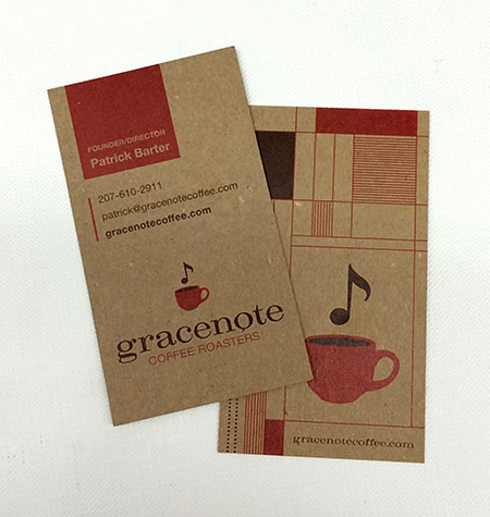
If you know anything about Alphabet Arm, you know we are almost as passionate about coffee as we are about branding. So, when these worlds collide, we are happy designers. Initially, Gracenote reached out to us to develop some branded merchandise for them. After discussing the state of their current identity and it’s inherent challenges, it was determined a re-brand was in order. Beyond the new typographic updates and streamlining the color palette, we also finessed the graphic elements themselves, creating a kinder balance between the lock-up elements. The next step was to propose new business card layouts. Given their aesthetic, utilizing a robust chipboard stock and a new graphic language to contain and organize information seemed to serve their needs.
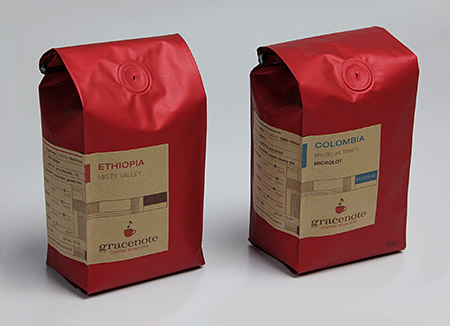
Next, we updated the retail bag labels, utilizing the established framework developed for the business cards.
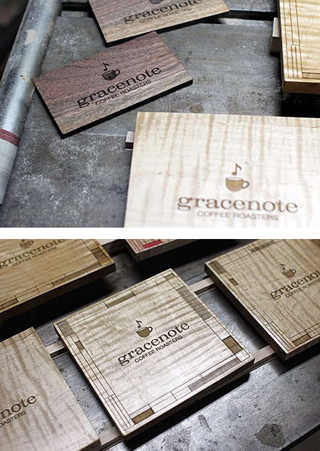
Now, we are receiving all kinds of fun images from the founder sharing his various applications as he is exploring branding opportunities with the new logo. He seems as inspired as we did (not to mention, he fueled our creativity with several bags of his spectacular product!)
This report, just in…
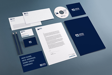
It is the duty of the court reporter to record spoken word in the form of written language. This documentation process is invaluable in a courtroom setting, as well as for live captioning for broadcast television. Reporting companies – more often than not – bare rather lackluster branding, but Jones & Fuller Reporting decided that it was time for Alphabet Arm to give them a new look to stand out from the pack. The process began with a conversation regarding the company name itself.
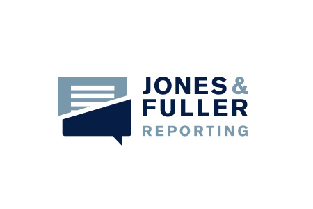
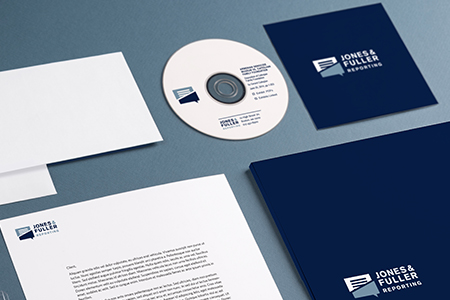
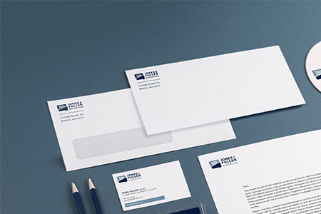
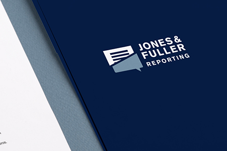
In order to depict the note-taking nature of Jones & Fuller’s business, it was important that the mark featured both the appearance of a “verbal” graphic element to imply speech as well as an element based in writing. By dividing the form of a speech bubble in two and making one half representative of a transcript, we create an opportunity to visually explain the responsibilities of court reporting itself. Once the logo re-brand was complete, Alphabet Arm developed the system of office materials and marketing collateral.
Logotype + naming prior to Alphabet Arm’s re-branding:

Get Your Bath On
Family owned and operated for over 50 years, the Murray Design showroom showcases a variety of bath and kitchen appliances from top industry brands. The Murray Design marketing team felt the previous identity and branding were no longer representative of the products they offer. Furthermore, they were concerned the branding didn’t connect with their changing demographic.

Alphabet Arm set out to create a clean, sleek identity to reflect the beauty of Murray Design’s product collection and honor their talented team of designers. Drawing inspiration from the curvature of the many fixtures and appliances found in the showroom, we rendered a mark that embodies both a faucet and an M that embraces a sophisticatedly, minimal aesthetic. For the color system, we utilized a calming blue and a metallic silver, naturally representing both water and the reflective finish found on many of Murray’s products.

Previous logo before Alphabet Arm got our hands on it:

Old School Baking
The Ancient Bakers is a specialty baking company that focuses on ancient grains and medicinal plants as ingedients for cakes, cookies, muffins, breads, brownies and even bagels. The company enlisted Alphabet Arm to embark on a logo design project. Our creative process started with the name. Initially the company was called Vision’s Sown, an Ancient Baking Company. We suggested pairing the lengthy name down to its essence: The Ancient Bakers.
Original name and logo:

Creating a logo for The Ancient Bakers meant exploring type and imagery that expressed the tradition, sustainability and pureness of ancient baking practices. The stalk of wheat has remained the heart of natural baking techniques since the dawn of time. This — along with the addition of a nutrient-rich rose hip and a traditional serif typeface — tells The Ancient Bakers’ story: that the best, most wholesome ingredients will always withstand the test of time.
New name and logo:

Set. Brand. Love.
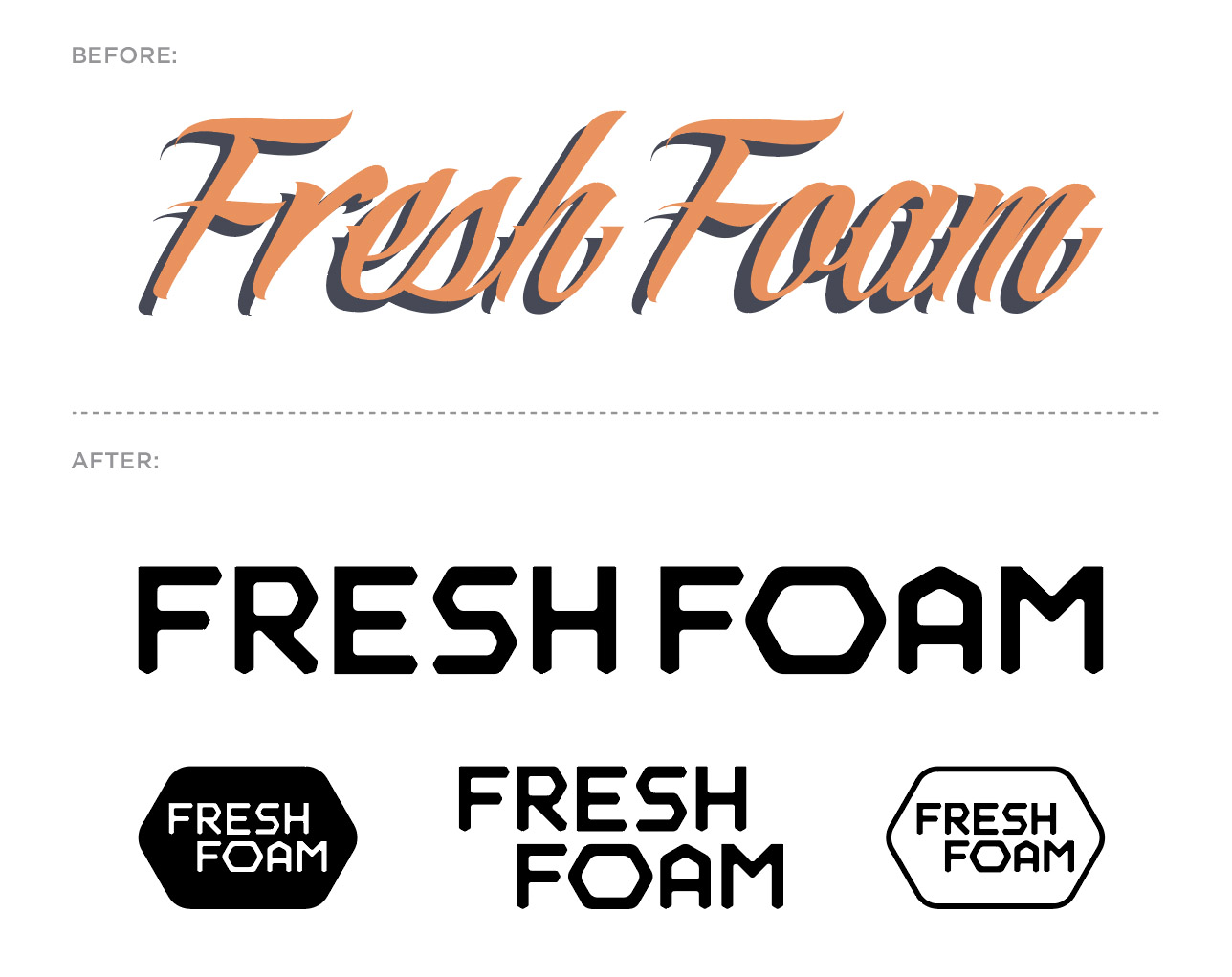
One of my first design initiatives when joining the creative leadership team at New Balance was to update the antiquated and counterintuitive (in my humble opinion) logotype that was being used for one of the brand’s biggest and most successful collections; Fresh Foam. Check this IG post for more.
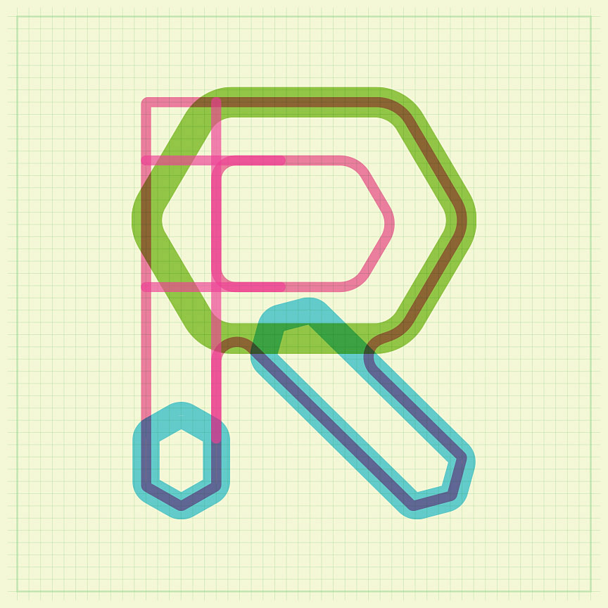
The hexagon form itself is a key visual for the technology of the collection, so I opted to build a logotype utilizing the hex to define the character terminals (see process image). The final result is a distinctive, bold – if not somewhat subtle – logotype that features a great deal of flexibly. Due to the fact the logotype is used on product, as well as our print, digital, in-store marketing efforts, it was important to have a variety of lock-up options within the branding family. For context, note the before and after.
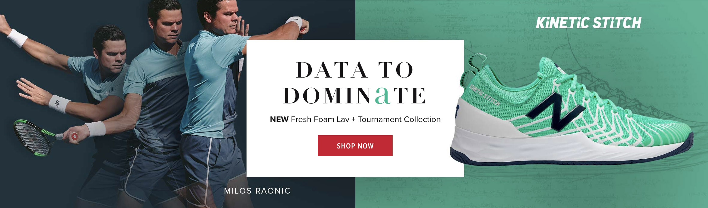
This branding system is featured on the new Fresh Foam Lav men’s tennis shoe.
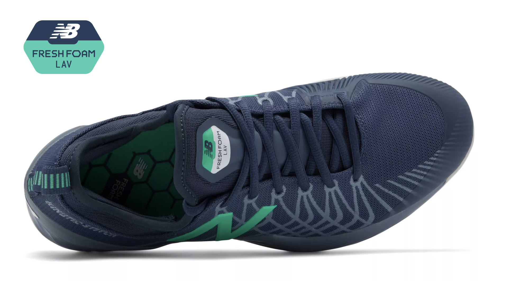
We teamed up with professional tennis player Milos Raonic to develop this dynamic model. It features a Fresh Foam cushioned midsole, external heel counter and Kinetic Stitch to ensure lockdown stability.
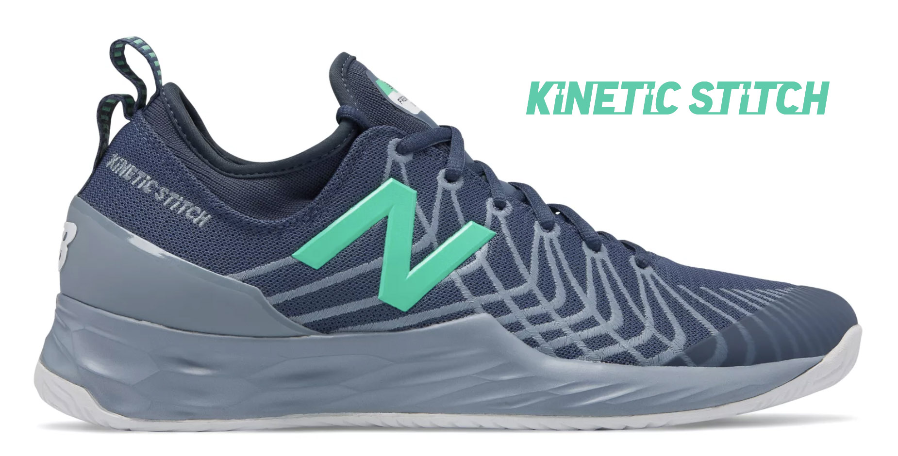
Like the Fresh Foam visual identity, Kinetic Stitch is another example of a custom logotype created for New Balance. Kinetic Stitch is an upper technology that helps athletes lock in their feet during lateral cuts on court.