Before + After

The toughest clients in the world

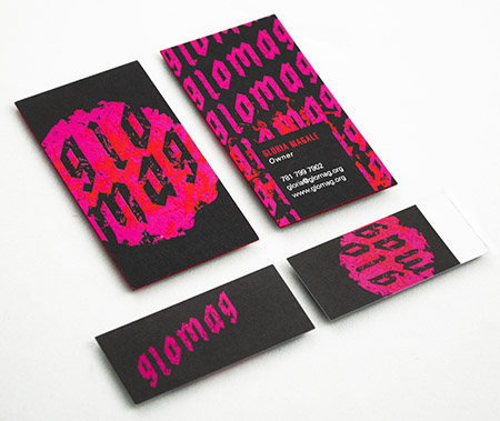
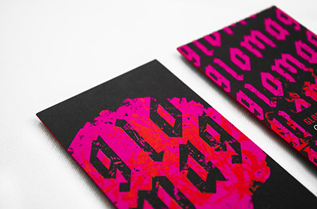
As a design studio, one of the greatest challenges can be designing for yourself. The flip side of that coin is that the process can also be extremely liberating. Being free to explore solutions, finishing options and stock that clients may ultimately shoot down. Such was the case with the new Alphabet Arm business cards.We utilized three separate vendors to complete these bad boys: Letterpress cards (220# Cranes Lettra featuring magenta edging) – Mandate Press / themandatepress.com Wrap-around Die-Cut Labels (with metallic ink) – Flagship Press / flagshippress.com Custom-tooled arrow hole punch – Hole Punch World / holepunchworld.com Our loyal army of interns have been champions of assembly! And a special thank you to our friendly neighborhood photog Tony Luong tonyluong.com for the killer macro shots!

Good Morning, Indeed

We were enthusiastic to see some of our business card designs among those featured on CBS Sunday Morning. We’ve been long-time fans of the show and it was awesome to see our designs on screen along with the iconic Sunday Morning sun logo. See the video here.
Here are some screenshots…

Check out the highlighted business cards we’ve designed over the years.

Grace(note) Under Pressure

“Alphabet Arm has been great to work with. They’re professional, human, creative, and in touch. All of these attributes made re-branding with Alphabet Arm an enjoyable and valuable undertaking.”
– Patrick Barter, Founder, Director – Gracenote Coffee Roasters
GracenoteBefore+After
If you know anything about Alphabet Arm, you know we are almost as passionate about coffee as we are about branding. So, when these worlds collide, we are happy designers. Initially, Gracenote reached out to us to develop some branded merchandise for them. After discussing the state of their current identity and it’s inherent challenges, it was determined a re-brand was in order. Beyond the new typographic updates and streamlining the color palette, we also finessed the graphic elements themselves, creating a kinder balance between the lock-up elements. The next step was to propose new business card layouts. Given their aesthetic, utilizing a robust chipboard stock and a new graphic language to contain and organize information seemed to serve their needs.

 
GracenoteBCards
 
Next, we updated the retail bag labels, utilizing the established framework developed for the business cards.
 
GracenoteBags
 
Now, we are receiving all kinds of fun images from the founder sharing his various applications as he is exploring branding opportunities with the new logo. He seems as inspired as we did (not to mention, he fueled our creativity with several bags of his spectacular product!)
 
GracenoteSignage01


get up and glo…

glomagLogos
Glomag is the name, funky fashion is the game. Gloria Magale recently took her fun, personal, fashion project to a new level with an official brand: Glomag. Alphabet Arm worked with Gloria to refine the company name, and create a unique, cost effective, branding system. We developed hang tags, rubber stamps, apparel hem tags and a beefy set of 34pt. business cards which feature edge painting.
 
glomagBCards01
 
When tasked with creating a mark that captured the edgy nature of Gloria’s clothing, we pulled inspiration from the clothes themselves. After a review of the line, we picked up on the common use of oversized flowers which felt like a bold differentiator to our eyes. We embraced the vibrance and overall shape of the flower when creating the logo, and developing the Glomag color palate. The type treatment was inspired by graffiti and black letter letterforms. The sum of the parts harmoniously create a beautiful, feminine, and edgy brand system.
Here are a few of our favorite additional Glomag logo treatments that didn’t not make the final cut:
 
glomagAltLogos
 
glomagBCards02
 

This report, just in…

Branding identity
It is the duty of the court reporter to record spoken word in the form of written language. This documentation process is invaluable in a courtroom setting, as well as for live captioning for broadcast television. Reporting companies – more often than not – bare rather lackluster branding, but Jones & Fuller Reporting decided that it was time for Alphabet Arm to give them a new look to stand out from the pack. The process began with a conversation regarding the company name itself.
J&Fbloggery
In order to depict the note-taking nature of Jones & Fuller’s business, it was important that the mark featured both the appearance of a “verbal” graphic element to imply speech as well as an element based in writing. By dividing the form of a speech bubble in two and making one half representative of a transcript, we create an opportunity to visually explain the responsibilities of court reporting itself. Once the logo re-brand was complete, Alphabet Arm developed the system of office materials and marketing collateral.

Branding identity

Branding identity

Branding identity
Logotype + naming prior to Alphabet Arm’s re-branding:
J&Fpriorlogotype

Get Your Bath On

Family owned and operated for over 50 years, the Murray Design showroom showcases a variety of bath and kitchen appliances from top industry brands. The Murray Design marketing team felt the previous identity and branding were no longer representative of the products they offer. Furthermore, they were concerned the branding didn’t connect with their changing demographic.
MurrayDesignLogo
Alphabet Arm set out to create a clean, sleek identity to reflect the beauty of Murray Design’s product collection and honor their talented team of designers. Drawing inspiration from the curvature of the many fixtures and appliances found in the showroom, we rendered a mark that embodies both a faucet and an M that embraces a sophisticatedly, minimal aesthetic. For the color system, we utilized a calming blue and a metallic silver, naturally representing both water and the reflective finish found on many of Murray’s products.
MurrayDesignBCards
Previous logo before Alphabet Arm got our hands on it:
MurrayDesignLogoBefore

Wave Hello!


We just wrapped up a new branding project for a long-standing client of the studio. Stillwater Unlimited  –  a division of the Ferree Group, Inc. –  is an all inclusive, concierge level service that delivers best-in-class home services to their client’s doorstep. What does all this mean? High level property & lifestyle management, silly!  Given their white glove service and discerning clientele, we felt the need to have the identity share the same sophisticated and stylish attributes. The final logo features a rendered, monogram waveform set which was inspired both by the location of their clients homes (ocean front, lake side, etc.) and the luxury brands they have come accustom to. We paired that with trusty, typographical foundation, keeping the mark fully accessible.
Here is where some of the initial sketches took us:

And a sneak peep at their business cards:
 

M to the C


We recently had the dubious honor of working with long-time-friend-of-the-studio, Maggie Cavallo. Maggie is a proud bay state based curator who needed a bit of personal branding for her various endeavors. Maggie’s exhibitions are typically performance based and focus on elevating underground / alternative subject matter to a fine art atmosphere. When it came to designing her logo, we wanted to create a logo that had a refined feel with a definite edge. The custom “M” and “C” letterforms framed by a system of bars offer a decidedly alternative feel, and might relate to yet another one of her creative passions (stay tuned here for more regarding that). The black and white color scheme and Futura Condensed Bold elevate the logo for a gallery setting.

 
When it came to designing her business cards, we thought long and hard about incorporating a tertiary color. In the end, we decided that the strong contrast of the black and white had an elegance and punch that was appropriate for the fine art world. Word up.