Branding

The Blog is Back in Town!

Hello there friends, after a few years off (and the site being hacked by some ding dong located in an army base in Texas), The Bloggery is back for your entertainment, information, eye candy, and enjoyment.

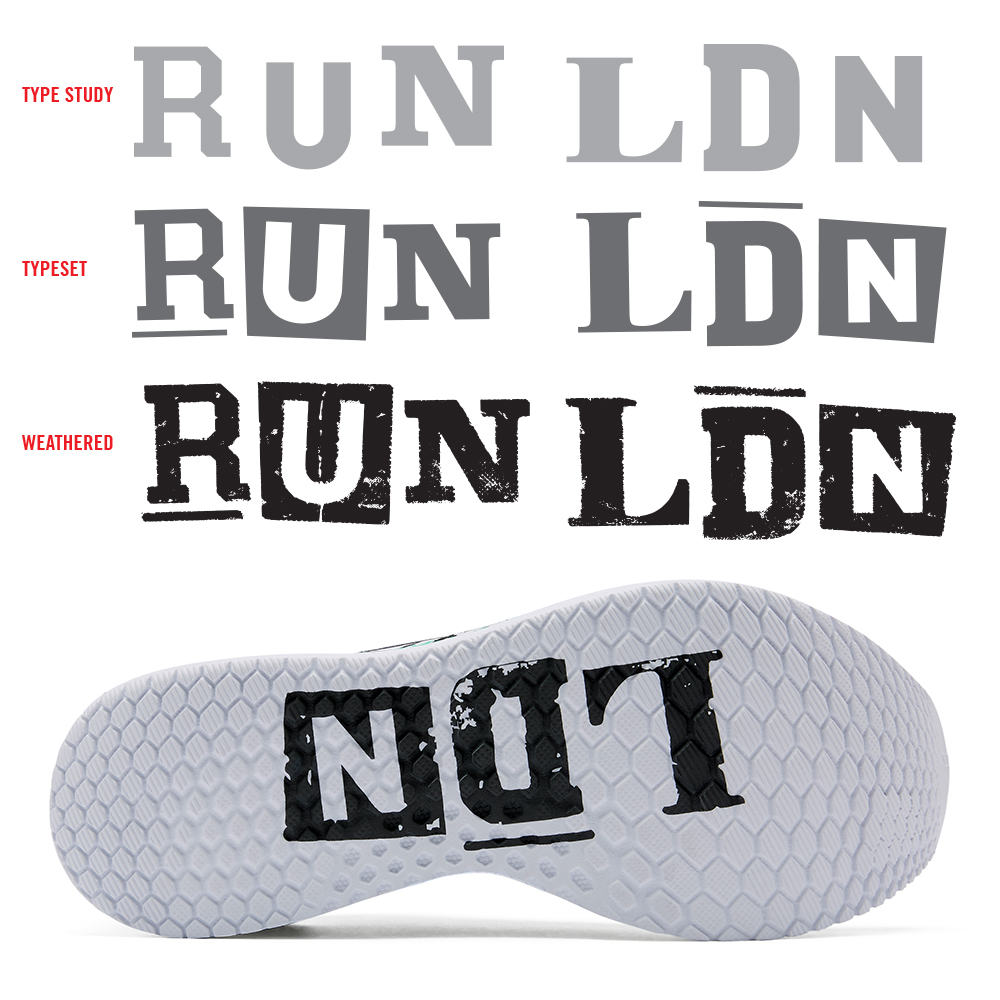
Let’s begin with a little context first, after running the formal design studio for 15 years (featuring a bevy of talented designers, illustrators, typographical ninjas, bad-ass interns, and all around good folks), I accepted a full time position (Creative Design Manager : Brand + Visual) at New Balance in 2016. I plan to share a number of visual identities, branding systems, re-brands, and sweet, sweet New Balance work here as well as many new Alphabet Arm projects.

Stay tuned, welcome back, and crank up some Think Lizzy.

Set. Brand. Love.

One of my first design initiatives when joining the creative leadership team at New Balance was to update the antiquated and counterintuitive (in my humble opinion) logotype that was being used for one of the brand’s biggest and most successful collections; Fresh Foam. Check this IG post for more.

The hexagon form itself is a key visual for the technology of the collection, so I opted to build a logotype utilizing the hex to define the character terminals (see process image). The final result is a distinctive, bold – if not somewhat subtle – logotype that features a great deal of flexibly. Due to the fact the logotype is used on product, as well as our print, digital, in-store marketing efforts, it was important to have a variety of lock-up options within the branding family. For context, note the before and after.

This branding system is featured on the new Fresh Foam Lav men’s tennis shoe.

We teamed up with professional tennis player Milos Raonic to develop this dynamic model. It features a Fresh Foam cushioned midsole, external heel counter and Kinetic Stitch to ensure lockdown stability.

Like the Fresh Foam visual identity, Kinetic Stitch is another example of a custom logotype created for New Balance. Kinetic Stitch is an upper technology that helps athletes lock in their feet during lateral cuts on court.

Run, Test, Run, Test, Run,


Straight from the future the ’90s imagined, the second limited-edition launch of our New Balance <Test_Run> program is an ultra-modern mashup combining massive plushness with wild head-turning style. An ode to the next millennium, it shares the radically soft midsole of the Fresh Foam More running shoe, which features our most premium version of Fresh Foam cushioning to date. Meanwhile, the futuristic upper — with hypnotic accents including translucent material and bold arcade colors — is sure to warrant endless double-takes.
Custom logotypes, stencil typography, and badging by yours truly.

Run London Run

In the early stages of my design career (prior to being computer literate) I would draw + re-draw letterforms, photocopy type as small as possible (only to blow it back up), crumple paper, sponge water, tear + tape, use blender pens, etc. to replicate worn typography and illustrations I would find in archival books and vintage signage. In my own low-fi way, I was trying to age branding elements in the most honored and authentic way I could. Given that, it is pretty sweet when you can go back to your design roots and kick out a type treatment that feels just as relevant and appropriate now. Honoring the New Balance relationship with the London Marathon, we created a special branded RUN LDN pack, blimey!