Not long ago, artist, former intern, and curator extraordinaire, Silver Oris, assembled a gallery show aptly titled, Human Powered Works.
She asked Alphabet Arm to design a few new pieces for the show and we collectively agreed skate decks would be the ideal medium. Not only do we appreciate skate culture, the decks themselves allow a great deal of creative leeway. Whether it be conceptual, playful, ironic or topical, we embrace the fact boards have become a medium for fine art. The format itself allows us to break out of the typical rectangular framework we find ourselves often working with. We’ll be post some new deck designs over the next few months, here the first installment of the series.
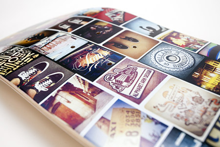
As one of us here at the studio has become somewhat consumed with the social-media-image-driven-craze of Instagram, it made perfect sense to design a board using some of our favorite shots. The idea of having a print medium for these images was rather exciting as we’re usually held to the confides of the interwebs. Ride on.

Don't Take This Too Seriously
Look Sharp

As you might recall (if you’re a frequent reader of our blog) we recently designed several art pieces in the form of skate decks. They were exhibited in the gallery show, Human Powered Works, curated by Silver Oris. Look Sharp is an homage to The Outsiders, Johnny Cash, Arthur Fonzarelli, James Dean, Marlin Brando, and rebellious, greasy-haired tough guys everywhere. Props to James T. Edmondson for designing the boss typeface Wisdom Script available at the Lost Type Co-op. Now, who want’s a knuckle sandwich?

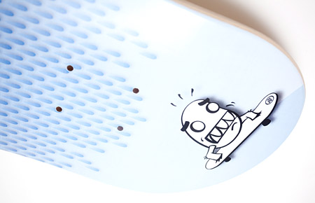
Rainy Day Deck

If you are a frequent reader of The Bloggery, you might recall the previous decks we designed for the gallery show Human Powered Works, here’s another one in the set. This piece is appropriately titled Rainy Day Deck. It features a little character we illustrated for a skateboard shop in Austin 5 or 6 years ago. They skipped out on the balance of their invoice and this fella (“Harry Knees”) was archived, never to see the light of day. We finally brushed him off and gave him some shine (not literally – mind you – he’s attempting to outrun a lightening storm). For the record, this design was printed courtesy of BoardPusher.


For the record, it’s raw and rainy here in Boston today, how is that for keeping it real?
Comfort For Less

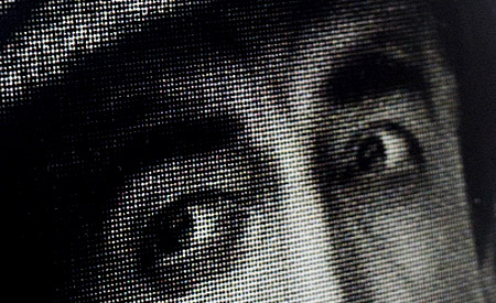
Here is the latest segment of our ongoing series of skate decks as fine art. This one just fell into place and it didn’t even seem like we were trying — a rare (but highly coveted) project where there is very little artistic struggle and it just feels right. It started as a loose pen and ink drawing (see process photo below) and finished with a quick brayer of yellow ink, some zipatone dots and a bit of photoshop. Done and done. Expertly printed by BoardPusher.

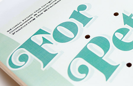
say hi to pete…
Sad to say, but this post concludes our series of skate decks as fine art.

This decks was inspired by a book of soundtrack artwork from the 60’s we have in the studio.

After acquiring a couple new typefaces we were all geared up to use, and wanting to work up a whimsical deck to offset some of the slightly more serious directions already completed, this one came about. We also like the play of “for Pete’s sake” to “for Pete’s skate.” We’re just hoping Mr. Sellers would approve. Expertly printed by BoardPusher.
