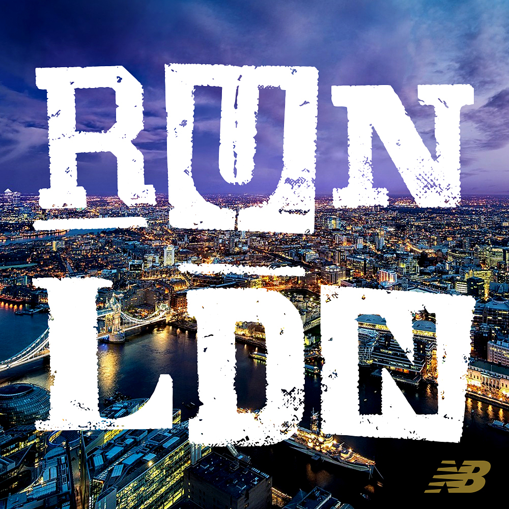
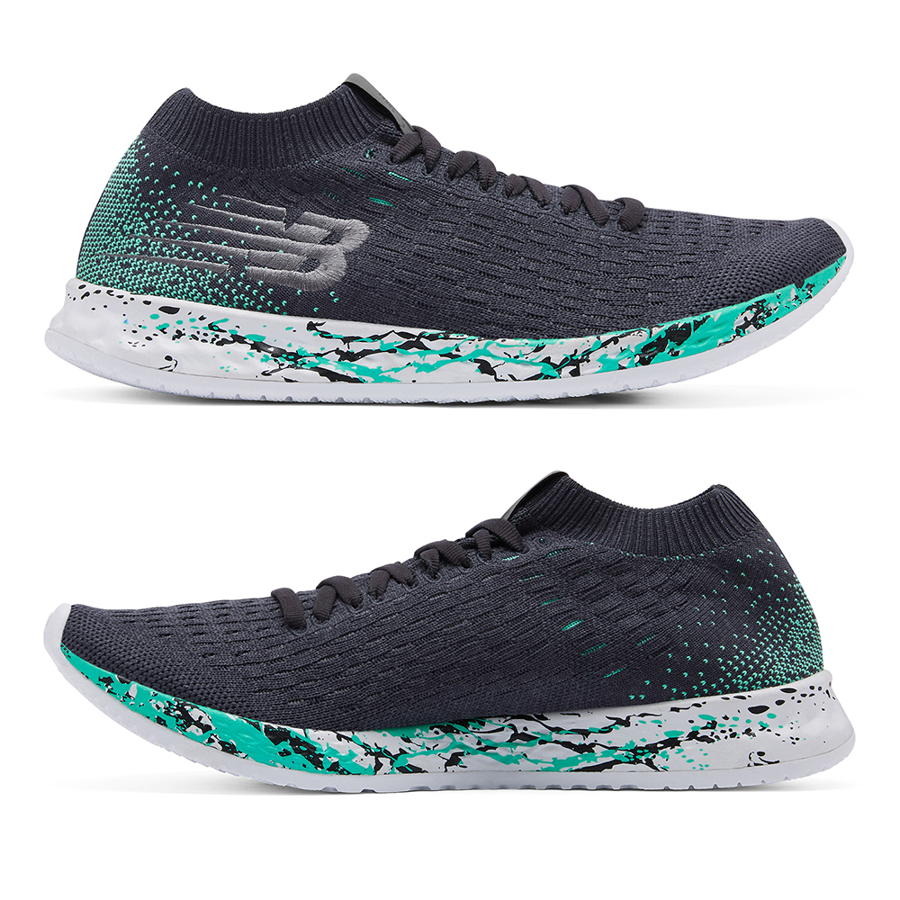
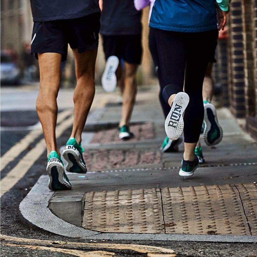
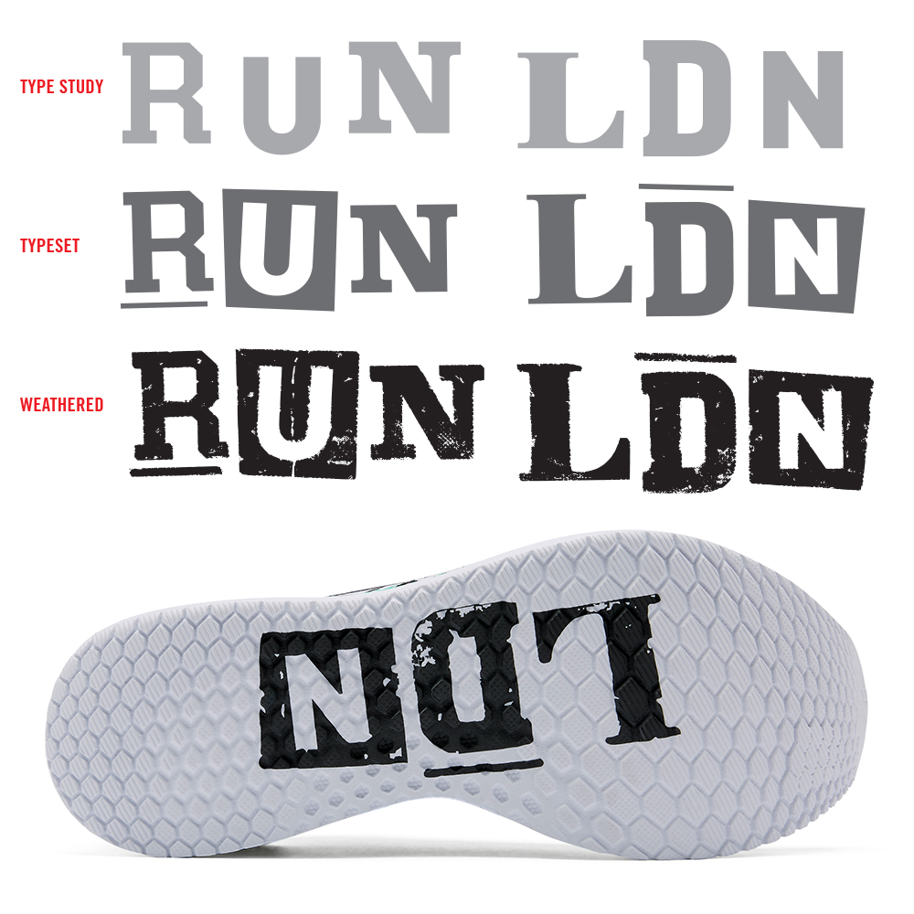
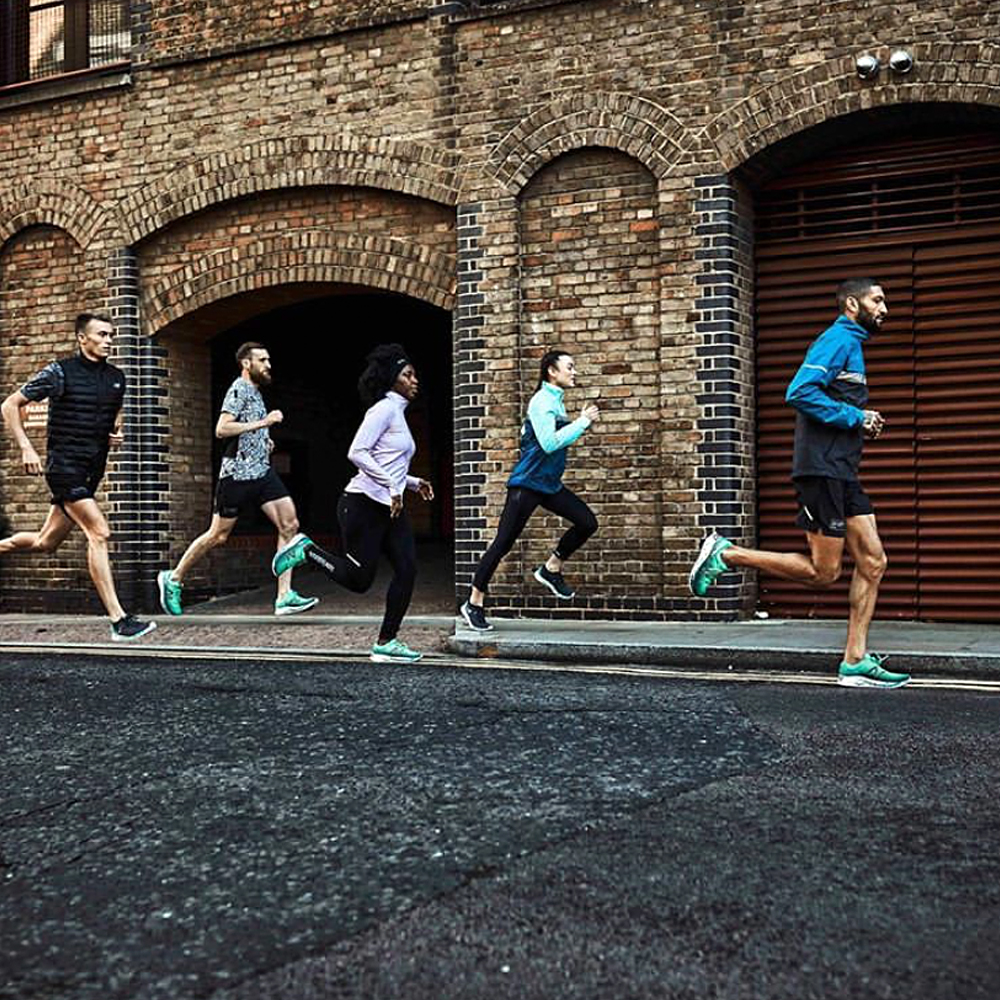
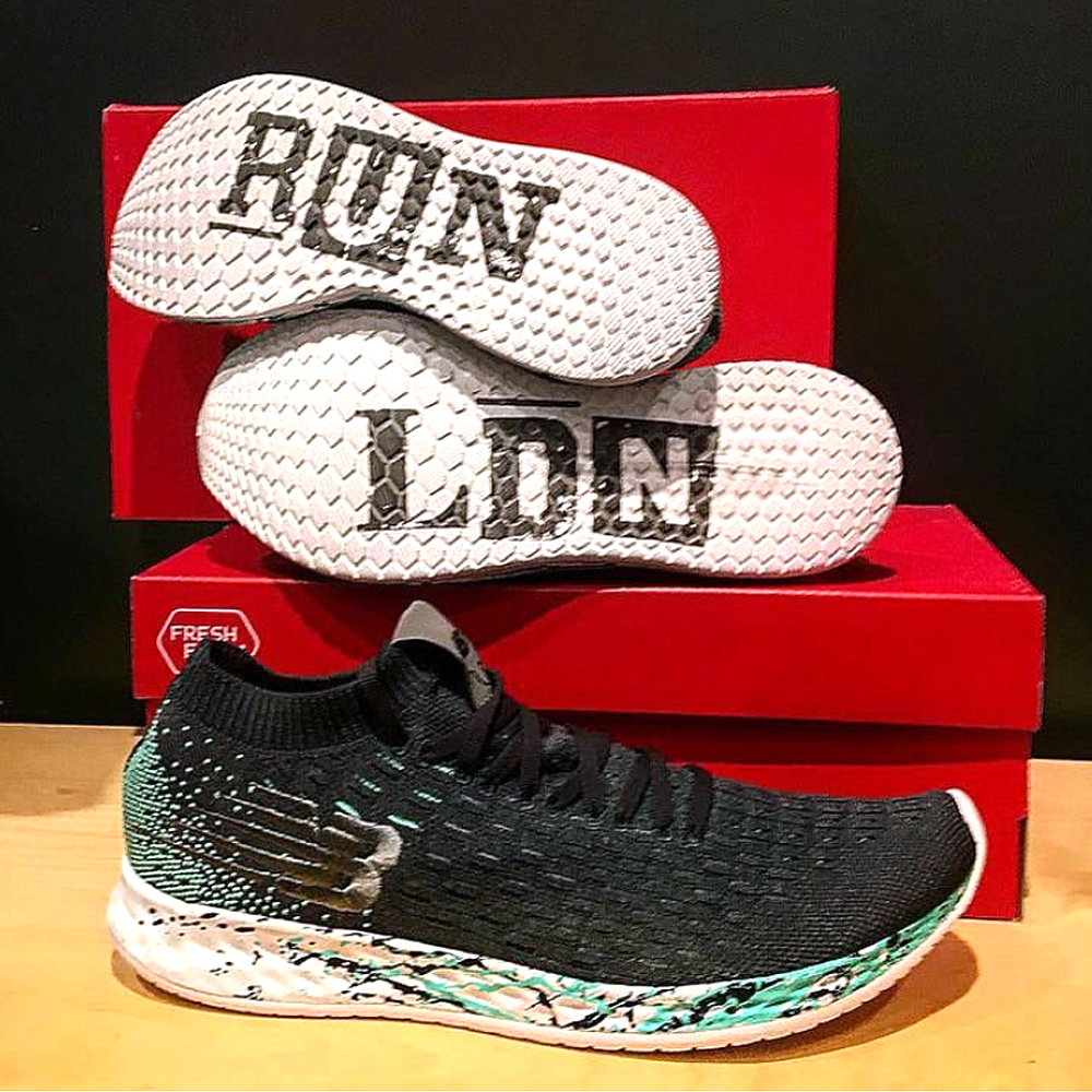
In the early stages of my design career (prior to being computer literate) I would draw + re-draw letterforms, photocopy type as small as possible (only to blow it back up), crumple paper, sponge water, tear + tape, use blender pens, etc. to replicate worn typography and illustrations I would find in archival books and vintage signage. In my own low-fi way, I was trying to age branding elements in the most honored and authentic way I could. Given that, it is pretty sweet when you can go back to your design roots and kick out a type treatment that feels just as relevant and appropriate now. Honoring the New Balance relationship with the London Marathon, we created a special branded RUN LDN pack, blimey!
