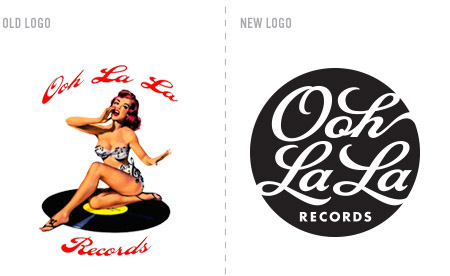
The studio just finished a new logo for Ooh La La Records. They are a boutique artist development company and independent label based in Brooklyn, NY. As you can see, their previous logo was quite provocative, but difficult to use due to it’s challenging typography and full color palette; not to mention, scalability issues. Our solution was to make an about face. We used only the tantalizing curves of script type to to create the allure of Ooh La La. The new mark is concise, flexible, scalable and looks sensually sharp when used as a one color.
