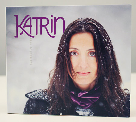
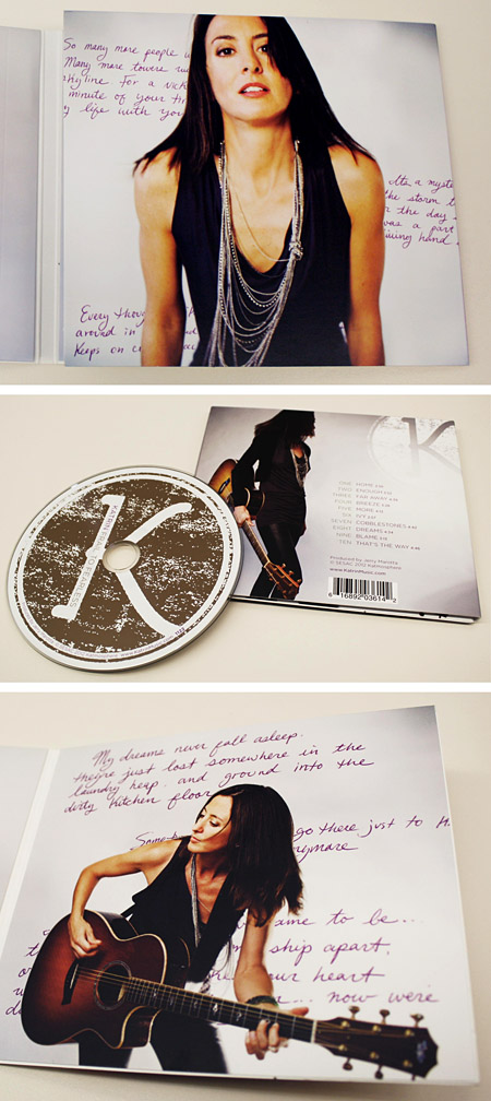
…looking for art direction, and we were happy to oblige. Boston-based acoustic rock siren Katrin had a handful of striking images courtesy of Dion Ogust and (long-time friend of the studio) Liz Linder but was struggling to tie it all together. Our initial step was to develop a custom logotype for her.

Former Alphabet Arm intern Florencia Tasso rendered a simple yet stylish type treatment that was introduced to Katrin’s photos. It soon became an essential branding tool for Katrin and her management. As a designer, it often becomes our job to show restraint and not overwork a design or add elements not crucial to a specific piece. Sticking with a clean layout and letting the images lead the way, we did work in a number of hand written lyric selections from Katrin which added some depth and visual interest.
