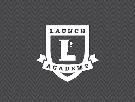
Our clients at LaunchWare contacted us recently to refresh the Launch Academy logo. Launch Academy offers a 10 week intensive program, transforming 30 eager learners into rising stars within the Boston web development community.
Oddly enough, another designer had repurposed the original LaunchWare rocket to connect the two entities, which made good sense to us. Unfortunately, the execution featured a number of tricks-of-the-design-trade that – as a studio – we don’t typically embrace. We will always advocate for the timeless, 2- D, restrained approach – versus slick beveling, super gradient, solar glare and webtastical sheen – but that’s just us. Within our logo design work, we avoid getting too caught up in current trends, which can eventually make a logo feel dated and require costly re-brands.
After the form and type treatment of the updated logo was approved, we presented a color study for the final logo system, only to have the Launch Academy team embrace the idea of sticking with a simple, one color mark. Classic Black and White.
Previous Logo:

Updated and approved for take-off!
