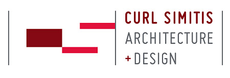
Another notch in the logo belt… presenting the new mark and business card we designed for Curl Simitis Architecture + Design. From their website: “With a deep appreciation for New England’s long tradition of craftsmanship and a love of contemporary design, Curl Simitis Architecture + Design’s work is unapologetically eclectic.” This brand identity was a great chance to revisit our roots of strong geometric design principals. The underlying grid structure is composed of 4 modular squares. At first glance the rectangular forms are a beautifully balanced abstract design. However, upon further investigation, the rectangular shapes reveal the negative spaces of the initials of C and S.