“Alphabet Arm has been great to work with. They’re professional, human, creative, and in touch. All of these attributes made re-branding with Alphabet Arm an enjoyable and valuable undertaking.”
– Patrick Barter, Founder, Director – Gracenote Coffee Roasters

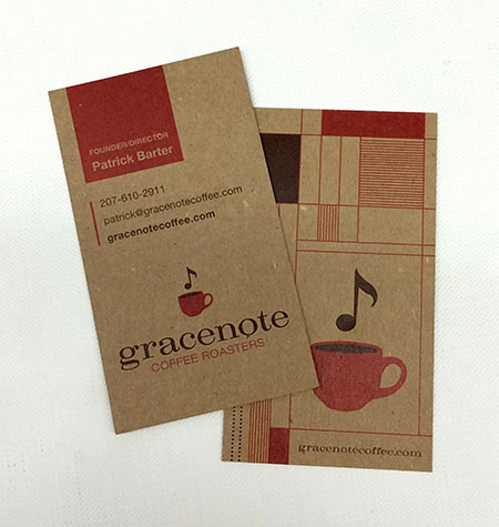
If you know anything about Alphabet Arm, you know we are almost as passionate about coffee as we are about branding. So, when these worlds collide, we are happy designers. Initially, Gracenote reached out to us to develop some branded merchandise for them. After discussing the state of their current identity and it’s inherent challenges, it was determined a re-brand was in order. Beyond the new typographic updates and streamlining the color palette, we also finessed the graphic elements themselves, creating a kinder balance between the lock-up elements. The next step was to propose new business card layouts. Given their aesthetic, utilizing a robust chipboard stock and a new graphic language to contain and organize information seemed to serve their needs.

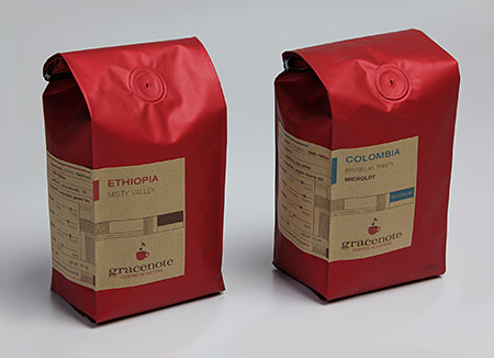
Next, we updated the retail bag labels, utilizing the established framework developed for the business cards.

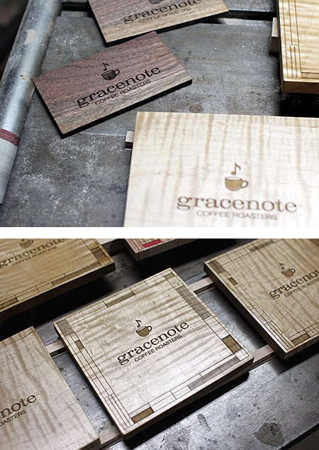
Now, we are receiving all kinds of fun images from the founder sharing his various applications as he is exploring branding opportunities with the new logo. He seems as inspired as we did (not to mention, he fueled our creativity with several bags of his spectacular product!)
