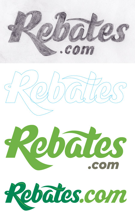
…not that we want to be talking about your mothers, but the new direction of the site + service is quite unlike what you have become accustom to. Redeeming product rebates has long been an imperfect science and certainly less then convenient, not to mention leaning heavily on snail mail. Rebates.com will harness the power of the interwebs, making the process easy, and offering recommendations for relevant rebates. With a company name and an exclusive domain such as Rebates.com, we knew their logotype should justify that concise URL clout. Within the initial options proposed was a curvaceous, custom script we rendered. It seemed to achieve the balance of consumer familiarity and bold, new direction. We worked exclusively with the President and CTO – both being quite visually savvy – and we got right down to brass tacks with very specific kerning and letter scale requests to finesse the final solution.
As we know you enjoy seeing process images, here is the sketch and a few of the initial iterations:

And, well, their previous logo:

And of course, the final logotype:

Log on now and become an early adopter. Tell them who sent you, maybe they’ll be a rebate in it for us both!