Over the past few months, we have had the privilege of working with the team at New Road Fitness. Their newly founded fitness enterprise is not your average gym. By forming partnerships with health facilities around the country, they are able to provide specialized fitness regiments for individuals with unique health constraints.

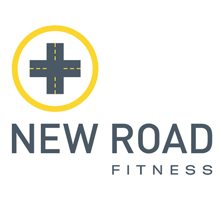
When developing concepts for their logo, we wanted to create a visual language that emphasized the close association that New Road Fitness shares with the medical community. By combining a traditional medical icon and an imagery of a crossroad, we identify the gym as a place where people can turn a corner and make choices to better their health. The asymmetric typography offsets the strict symmetry of the icon, giving it a unique and modern sensibility. We are currently working on floor graphics, exterior signage, office systems, marketing materials, wayfinding, consulting on interior design elements and designing all internal signage. Stay tuned for a full portfolio unveiling, but for now, grab a towel and start stretchin’.