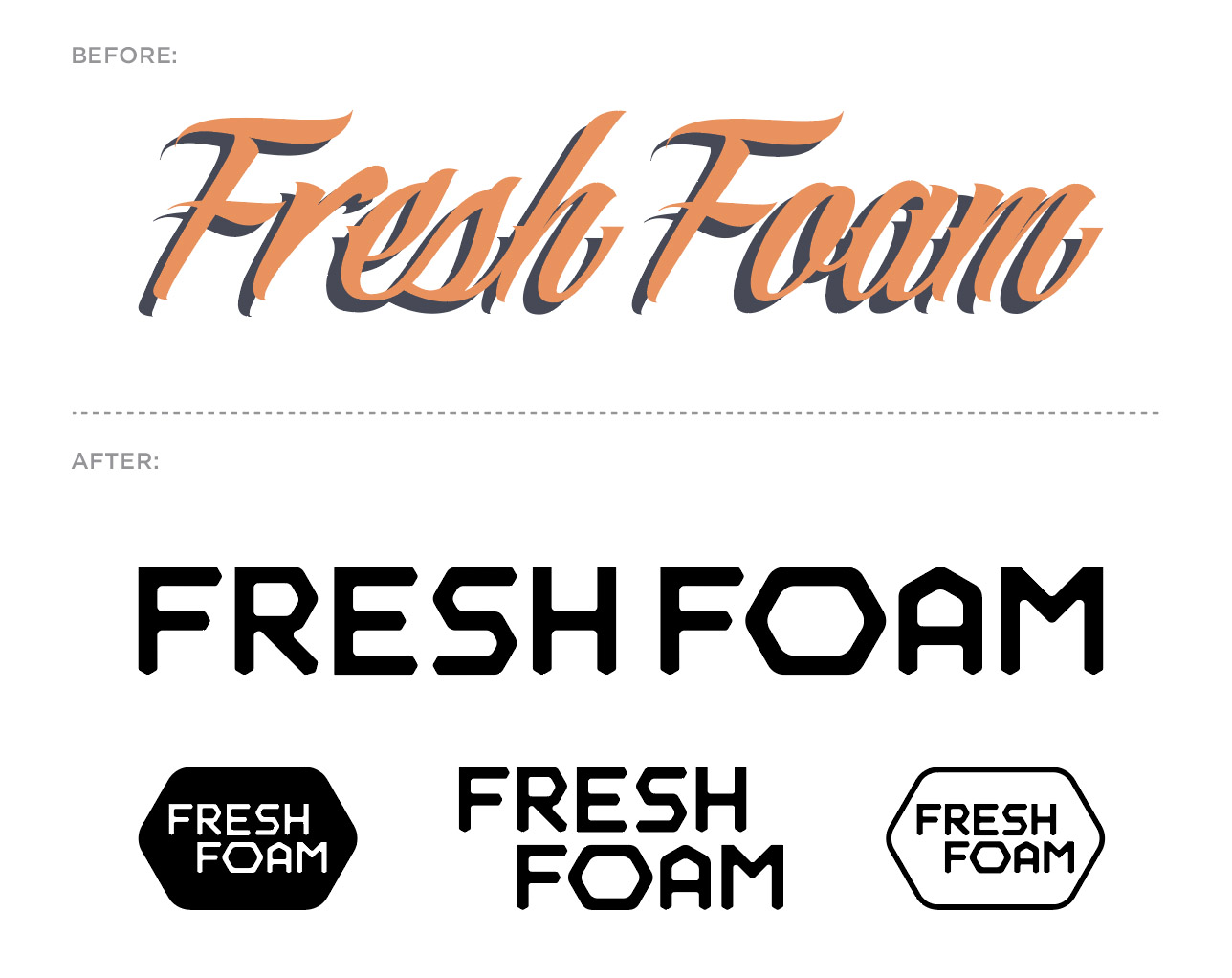
One of my first design initiatives when joining the creative leadership team at New Balance was to update the antiquated and counterintuitive (in my humble opinion) logotype that was being used for one of the brand’s biggest and most successful collections; Fresh Foam. Check this IG post for more.
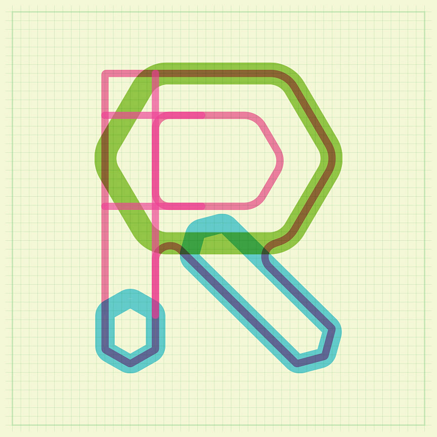
The hexagon form itself is a key visual for the technology of the collection, so I opted to build a logotype utilizing the hex to define the character terminals (see process image). The final result is a distinctive, bold – if not somewhat subtle – logotype that features a great deal of flexibly. Due to the fact the logotype is used on product, as well as our print, digital, in-store marketing efforts, it was important to have a variety of lock-up options within the branding family. For context, note the before and after.
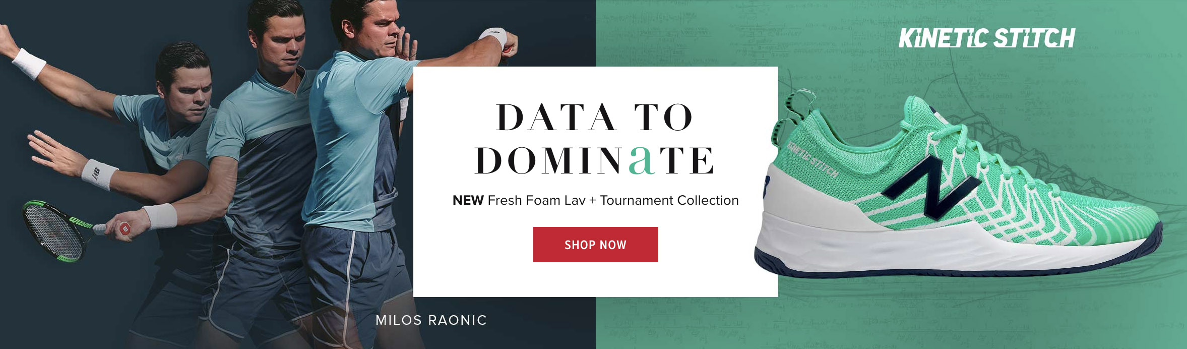
This branding system is featured on the new Fresh Foam Lav men’s tennis shoe.
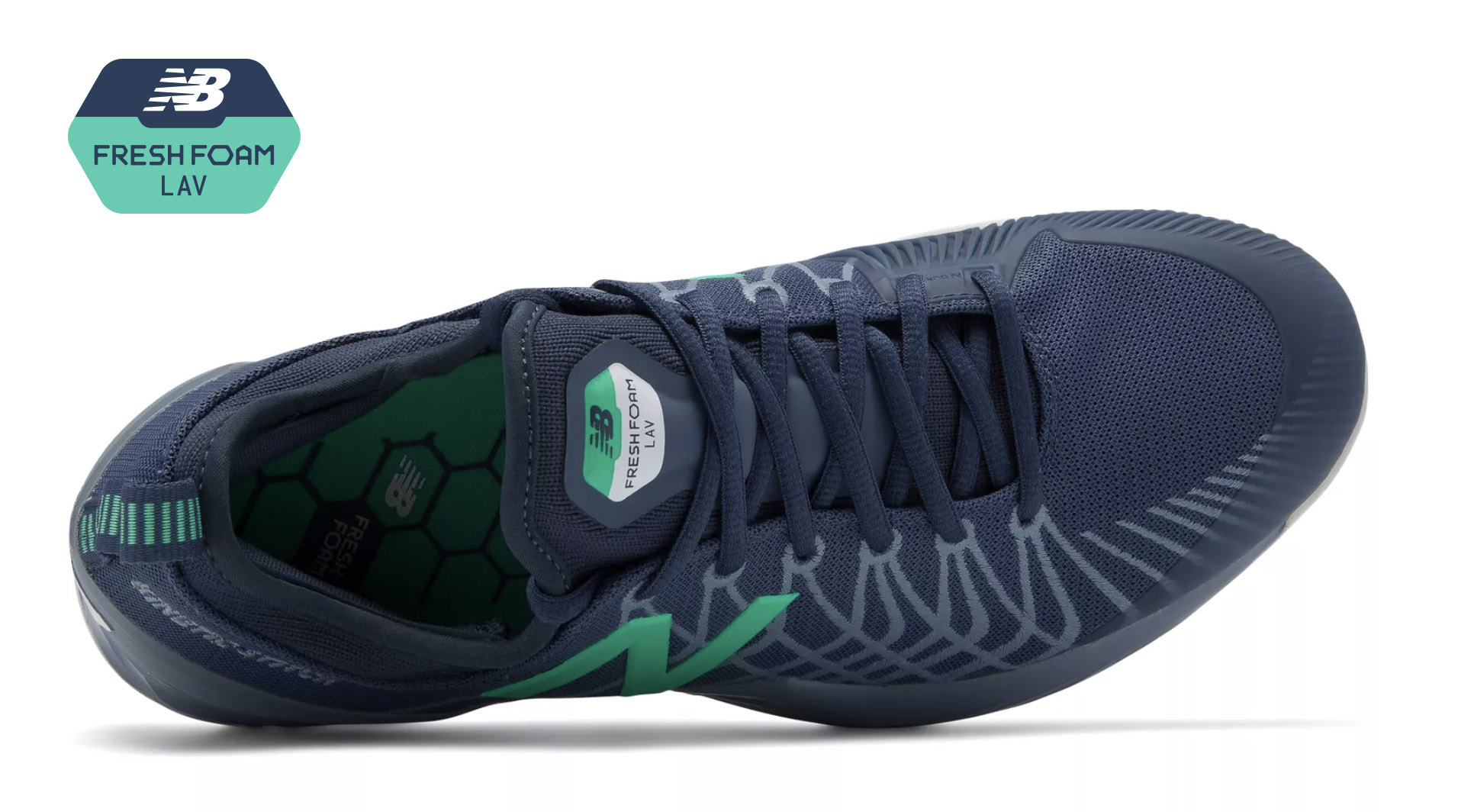
We teamed up with professional tennis player Milos Raonic to develop this dynamic model. It features a Fresh Foam cushioned midsole, external heel counter and Kinetic Stitch to ensure lockdown stability.
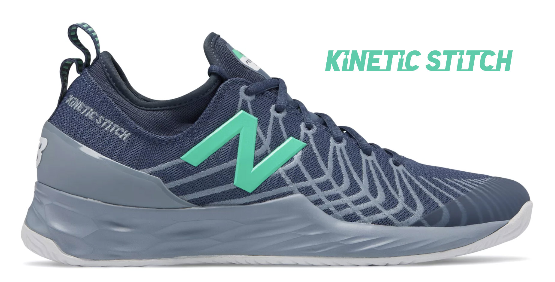
Like the Fresh Foam visual identity, Kinetic Stitch is another example of a custom logotype created for New Balance. Kinetic Stitch is an upper technology that helps athletes lock in their feet during lateral cuts on court.