Good Sport
All Natural Sports Drink
Packaging & Design
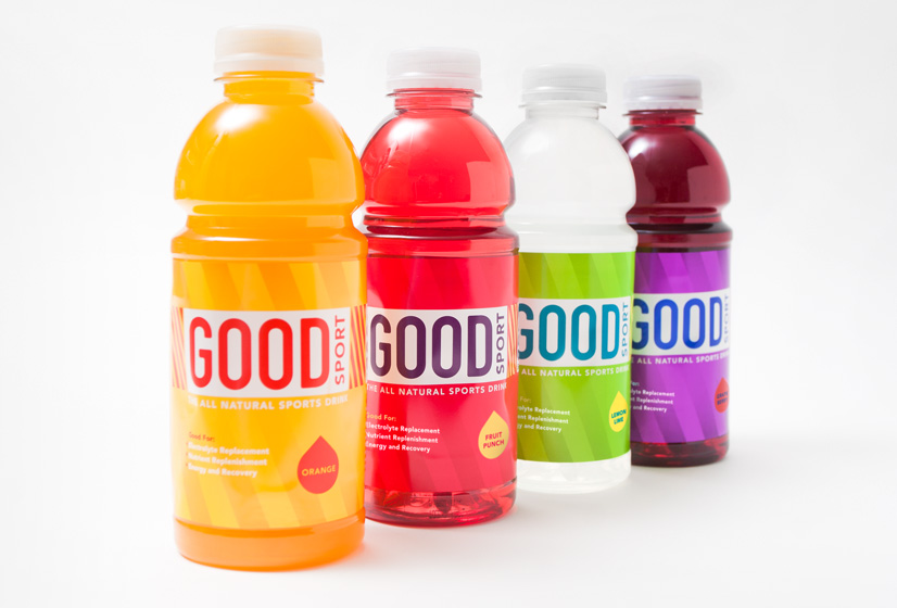
OWATER hired Alphabet Arm to assist in the naming process and design the identity and packaging for a new product added to their line of electrolyte-enhanced waters.
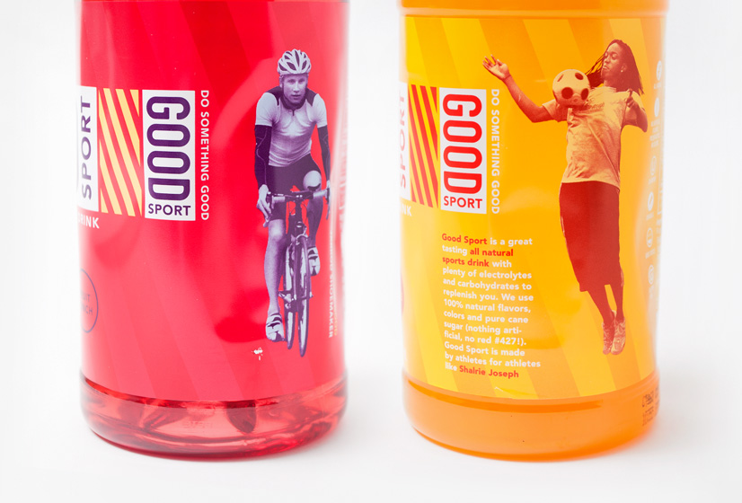
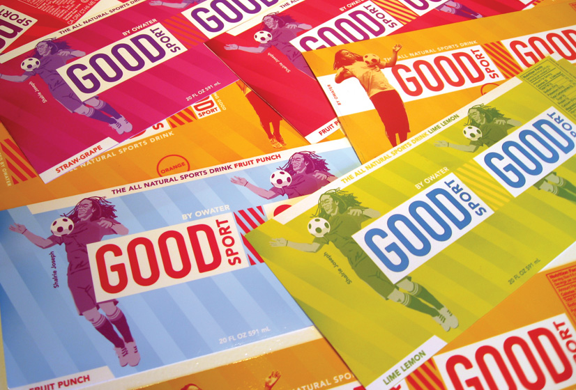
We intentionally wanted to avoid the current trend in consumer packaging, which seems to pull from web 2.0 inspired shiny buttons, unnecessary drop shadows, and beveling. We felt the packaging should be minimal and clean, yet retain a level of sporty sophistication. The visual strategy was overtly inspired by the all naturally flavored and colored sport beverage itself. Each flavor has a unique color palette and featured athlete.
backI hired Alphabet Arm to design packaging for a new beverage product. When I met the team and described our needs, I was impressed with Alphabet Arm’s ability to understand and focus the needs of the project. We were not only designing a product, but naming it as well. My experience with Alphabet Arm ended up being nothing short of fantastic. Aaron and the group worked tirelessly (with me) to develop a naming strategy and then to design what is now brilliant packaging. The process was iterative, with several collaborative, thoughtful phases of evolution. Alphabet Arm’s attention to detail is unmatched. I was impressed with their knowledge and their design conviction. The team has a willingness to discuss options and present choices, but stood firm on certain design elements or solutions; this conviction displayed to me the knowledge and sophistication that I had been looking for in my search for a talented design group. Alphabet Arm is a hands-on, highly talented design firm that does outstanding work. They are also an absolute pleasure to work with. I would highly recommend them to anyone.
Tom First
Founder Nantucket Nectars / OWATER
