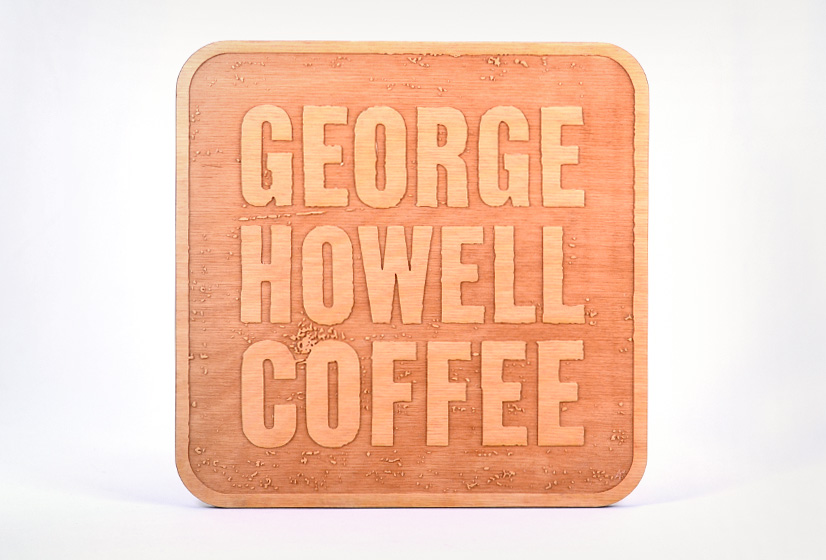

George Howell Coffee
Coffee Roaster
Print & Logo Design
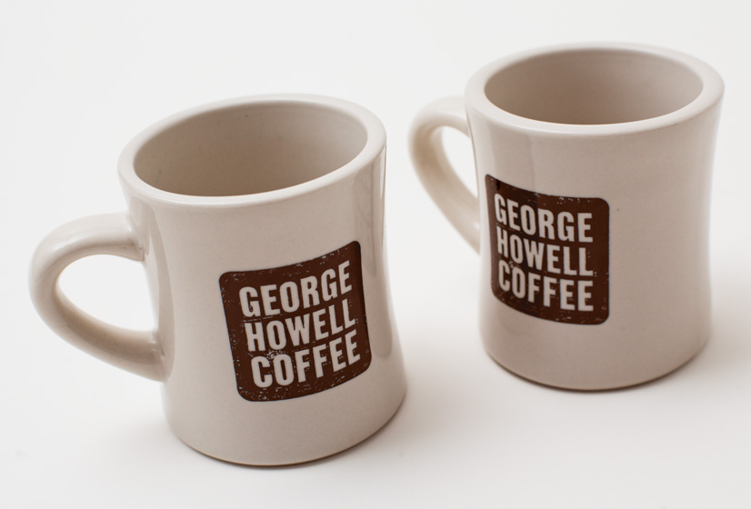
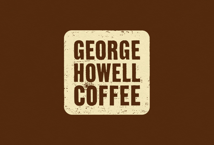
Alphabet Arm was tasked with developing a new, unified branding system for George Howell Coffee.
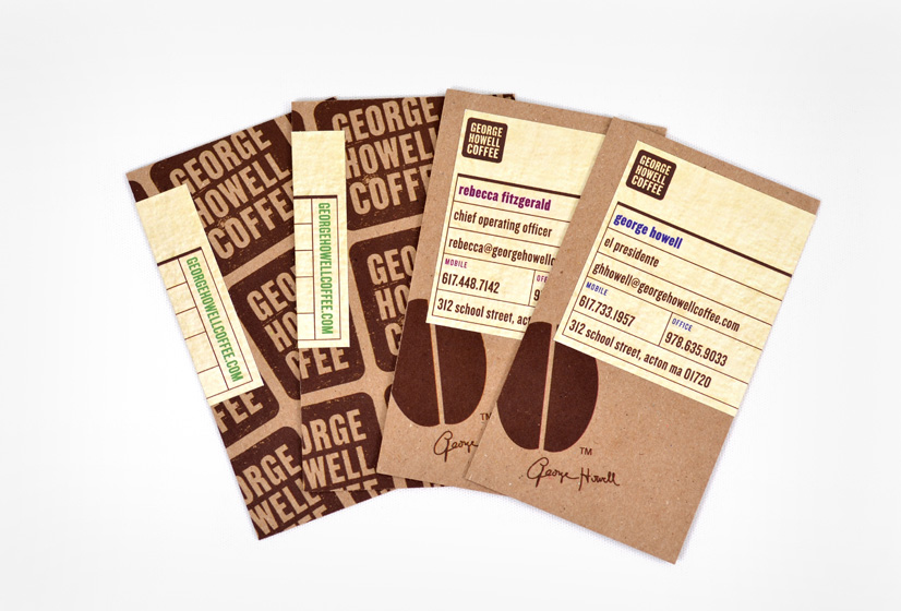
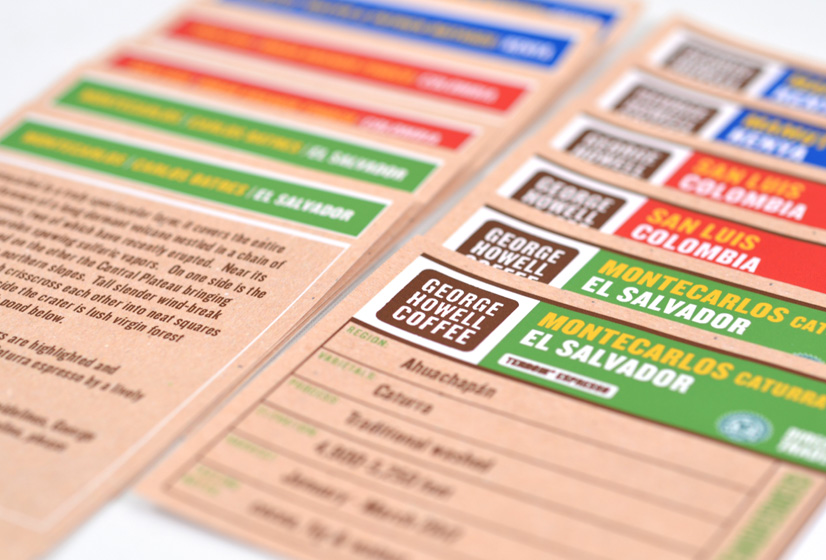
The inherent challenge was to design a new logotype that worked seamlessly with branding elements used on their existing retail coffee bag packaging, specifically a signature and a coffee bean icon. After executing ornate logotypes and stylish design elements, we determined the most effective and seamless approach was to strip the mark down to a simple, textured type treatment and an equally simple shape. With this strategy in mind, both the signature and bean can lock-up to the logotype and preserve the synergy of the system. After developing business cards, loyalty cards for their cafe and a series of shelf talkers, we proposed laser-cut wood retail signage. Note to future clients: free coffee samples only enhance our creative process.
back