Sarah Borges
CD Packaging
Radio Sweetheart
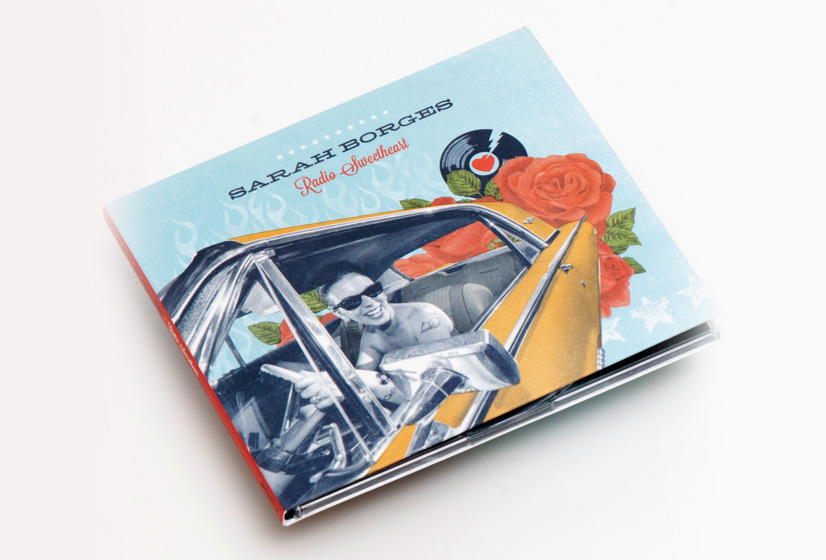
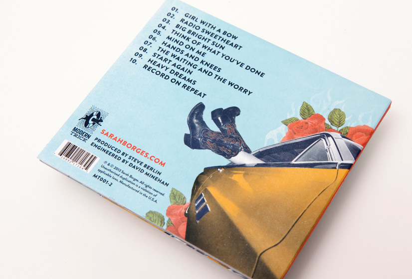
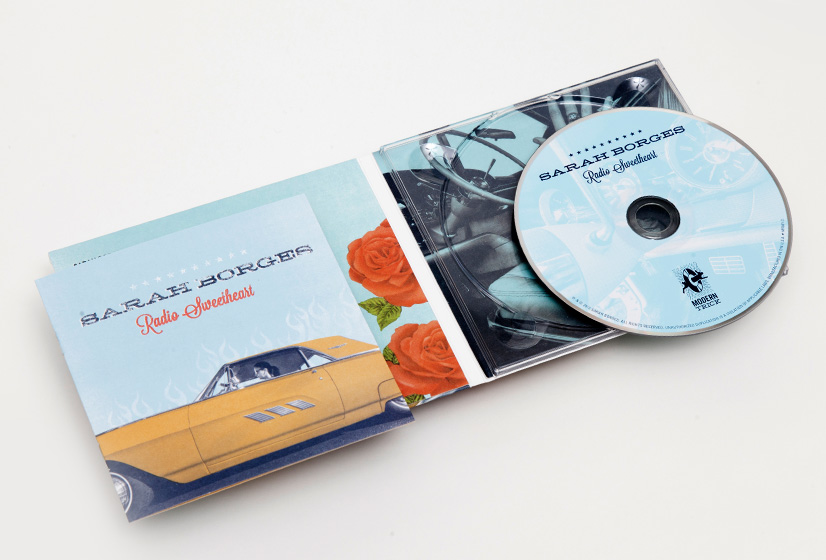
Radio Sweetheart was crowd-funded by her loyal fan base, it's chock full of what Sarah does best: well-crafted old rock n’ roll with a country twang thrown in to keep things interesting. Sarah got dressed up all-fancy-like and had a photo shoot with her dad’s classic Thunderbird. She turned the photos over to us and it was our job to create a album cover that looked timeless and exuded cool (which Sarah has in spades). We were especially pleased to find a light-hearted image of Sarah behind the wheel with a candid laugh. It took some doing to convince her that was the way to go, but we were glad she trusted our instincts. Do yourself a favor, and turn this one up!Diamonds in the Dark
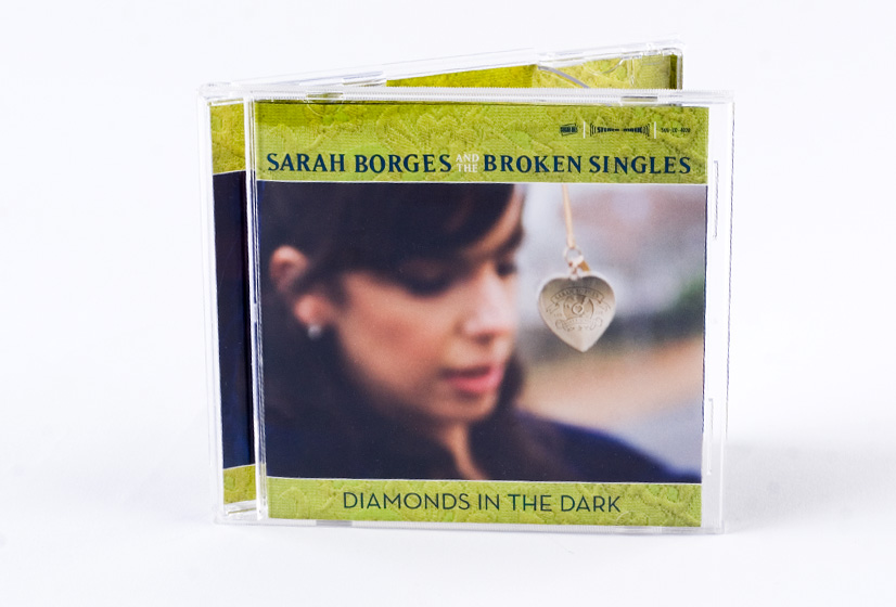
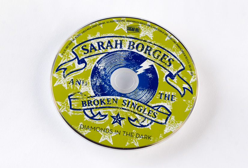
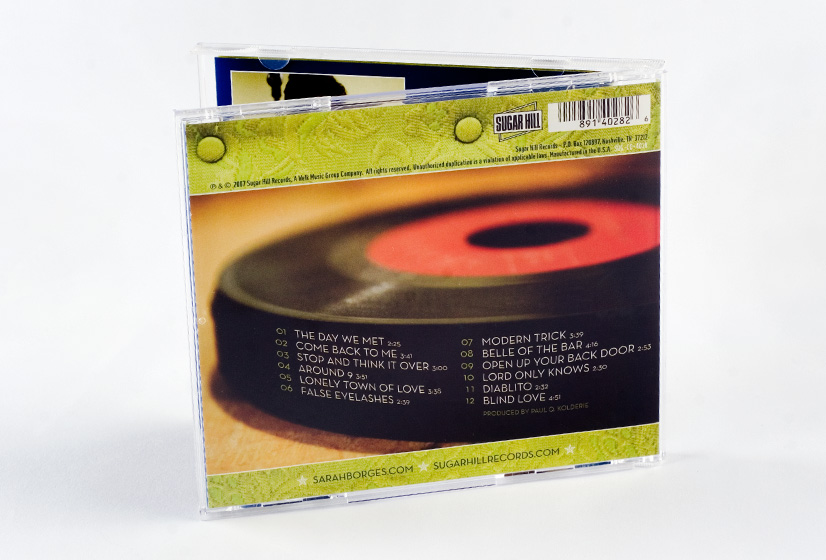
The label requested we use Sarah’s new logo on the cover but we felt a little confined and really wanted to incorporate it in a creative, somewhat subtler way. Ultimately, by branding her necklace pendant with it the logo it opened up quite a few layout possibilities. The overall vibe of the art direction is decidedly old school, complimenting the band’s musical leanings.
The Stars are Out
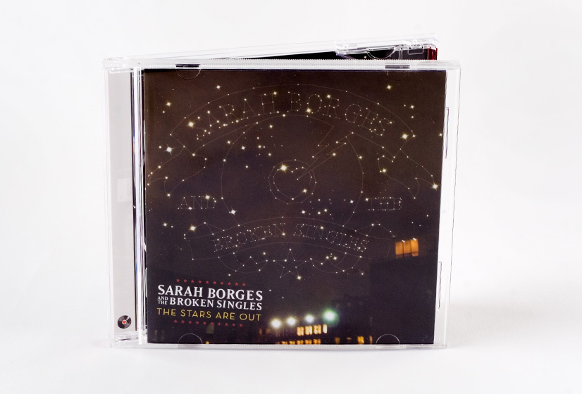
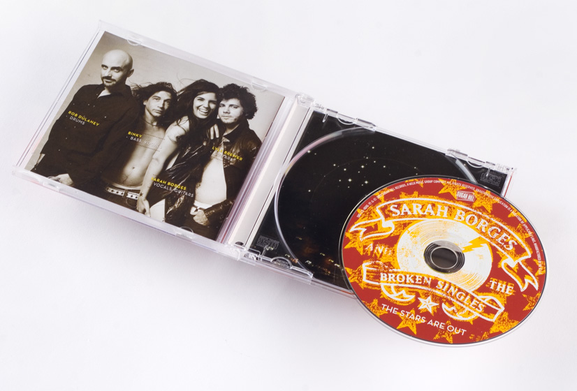
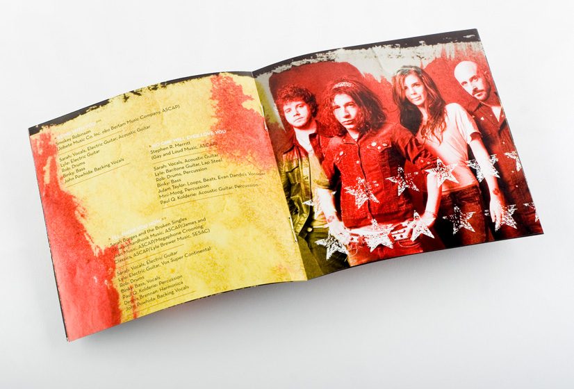
When we began working on concepts for The Stars Are Out we decided to take a relatively literal approach to this record, allowing the logo to live on the cover, but in more of a constellation inspired form. Lacking a great image to use as a base, we stepped out the studio’s back door and took a quick shot of the neighboring buildings for comp purposes. Sarah ended up loving the tone of the photograph and felt it complimented the sound of the record perfectly. We ended up shooting quite a few more images of our neighborhood—Boston’s lovely South End—for the interior booklet, after hearing Sarah’s enthusiastic response. Sarah had a number of paintings we seamlessly integrated into the packaging as well. All in all it was quite a team effort.
back