Rhoost
Stylish Child-proofing and
Infant Accessories
Logo & Brand Design
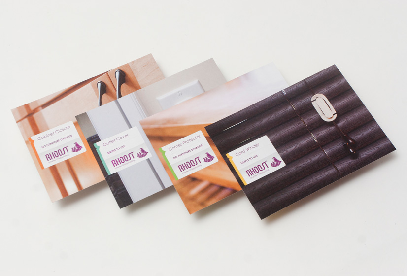
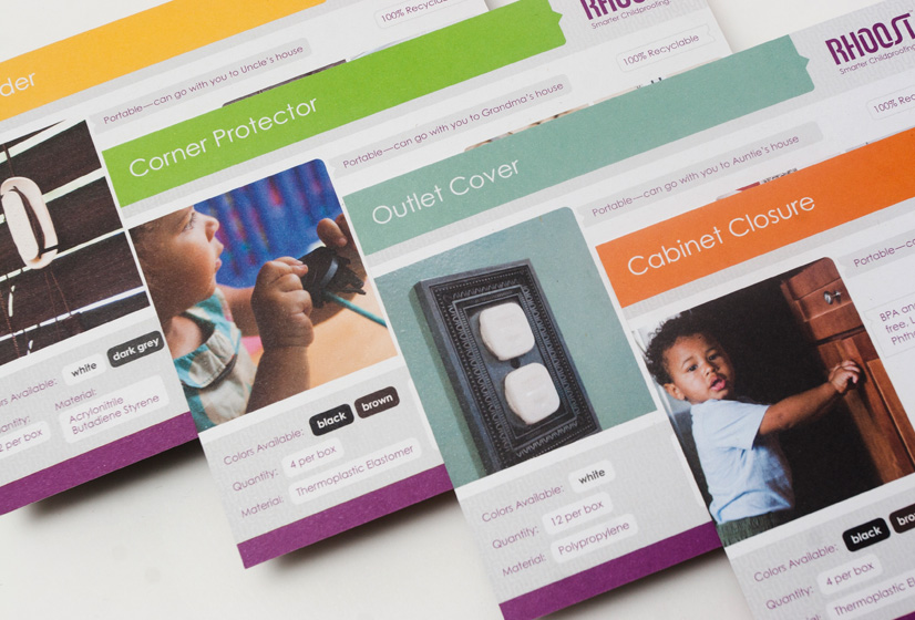
While a myriad of products exist to help parents ensure the safety of their children, many are only marginally functional and most are visually unappealing.
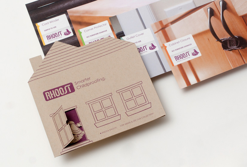
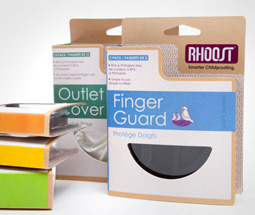
Enter Rhoost: an inventive start-up, that has developed a line of furniture safety accessories that are functional, while being complimentary to the urban household. Our take on their identity was to echo the company’s mindset and keep it simple, yet stylish. We opted to develop a logotype from the ground up and integrated a Swiss-inspired stencil set. Now for some design lingo & insight: while we were exploring the stencil counter option, we kept the base letters in a randomly selected purple to keep track of each letter’s progress. When the heavy lifting was finished, the final form of the logo in purple felt like a perfect match. Fortunately, both of the Rhoost co-founders agreed. If only color selection was always this effortless.
Back