Sage Tonic
Holistic Natural Treatments
Logo & Brand Design
Sage Tonic is an innovative, natural treatment focused on adolescents. The methodology features alternative and complementary treatments for some of the most common day-to-day medical conditions.
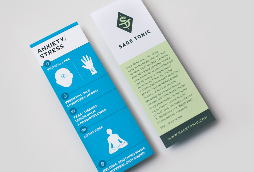
Sage Tonic identifies conditions and provides remedies based on each of the five senses. They have designed an easy-to-use sensory platform that includes integrative medicine therapies supported by research and clinical data.
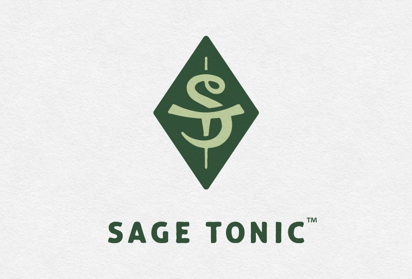
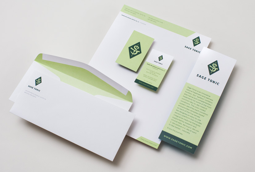
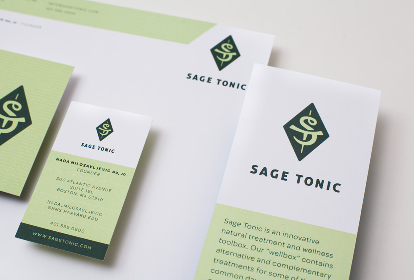
Alphabet Arm was asked to develop a logo that reflected their modern methods, while still alluding to the ancient techniques from which their healing practices are inspired. After proposing a variety of directions, the chosen logo was an “ST” monogram inspired by ancient East-Asian name seals. The winding form is meant to feel ethereal and calming. It locks cleanly into the symmetrical geometry of a diamond. To contrast this rigidity, we introduced a slightly textured quality. The final color palette makes use of earthy (and sage-y) tones to speak to its antique influences.
BackFantastic…that’s how I would best describe working with Alphabet Arm. Their creativity, insight, and deep understanding of design made the entire process a pleasure and extremely gratifying. They were keenly attuned to every aspect of my logo, branding, and product design. Their comments and perceptions throughout were incredibly valuable. I would emphatically recommend them to anyone in search of an extremely talented design group that will take your concept to a stunning reality. This is one of the best business decisions you can make.
Nada Milosavljevic
Founder, Sage Tonic


