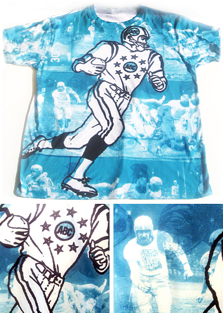
We recently did a little merchandise testing with a new print technique our homies at Jakprints are perfecting. It’s a process implementing full color, high resolution dye sublimation. So, creating unique, one-off shirts is very simple. As a busy design studio, there are plenty of bits and pieces of ideas or treatments we’ve amassed over the years that haunt us. Even if a client didn’t deem them worthy, this is a fun way to get them a second chance at a little exposure. We have a couple different shirts we’ll share with The Bloggery over the next few weeks. This piece, in particular, features one of the many studio mascots (The Football’r) set against some leftover photo elements from a design installation (Graphic Takeover) we tackled back in ’06. Old school baby!
Art Direction
Goin' Big / Part 03
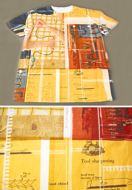
Howdy folks, here’s another in the series of one-off, full color, high resolution dye sublimation t-shirt tests courtesy of Jakprints. This composite design was largely inspired by some found textures, an old schematic and the Handyman’s Book (published in 1951) that was discarded and subsequently found in a one of our basements. Note the left shoulder supporting the illustration of the handyman expertly using a handheld drill (also his left shoulder). This shirt looks even better on, we’ve already had three offers to buy it on the spot.
PLEASE NOTE: ALPHABET ARM NO LONGER OFFERS TOOL SHARPENING AS A SERVICE.
O U SK8 1 2?
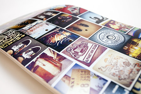
Not long ago, artist, former intern, and curator extraordinaire, Silver Oris, assembled a gallery show aptly titled, Human Powered Works.
She asked Alphabet Arm to design a few new pieces for the show and we collectively agreed skate decks would be the ideal medium. Not only do we appreciate skate culture, the decks themselves allow a great deal of creative leeway. Whether it be conceptual, playful, ironic or topical, we embrace the fact boards have become a medium for fine art. The format itself allows us to break out of the typical rectangular framework we find ourselves often working with. We’ll be post some new deck designs over the next few months, here the first installment of the series.
As one of us here at the studio has become somewhat consumed with the social-media-image-driven-craze of Instagram, it made perfect sense to design a board using some of our favorite shots. The idea of having a print medium for these images was rather exciting as we’re usually held to the confides of the interwebs. Ride on.

Comfort For Less

Here is the latest segment of our ongoing series of skate decks as fine art. This one just fell into place and it didn’t even seem like we were trying — a rare (but highly coveted) project where there is very little artistic struggle and it just feels right. It started as a loose pen and ink drawing (see process photo below) and finished with a quick brayer of yellow ink, some zipatone dots and a bit of photoshop. Done and done. Expertly printed by BoardPusher.

say hi to pete…
Sad to say, but this post concludes our series of skate decks as fine art.

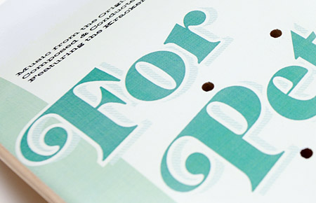
This decks was inspired by a book of soundtrack artwork from the 60’s we have in the studio.
After acquiring a couple new typefaces we were all geared up to use, and wanting to work up a whimsical deck to offset some of the slightly more serious directions already completed, this one came about. We also like the play of “for Pete’s sake” to “for Pete’s skate.” We’re just hoping Mr. Sellers would approve. Expertly printed by BoardPusher.
Everybody Loves Raygun

We recently tried our hand at some traditional screen printing. It had been a long time since we’d tried pulling prints by hand and there was quite a learning curve. The strategy was to do ourselves a favor by designing a piece with overprinting that did not require tight registration. After overexposing the screen 3 times, we finally got it right. We learned a lot in the process, although we got neon green fingerprints on everything.
Why did we spend our time getting covered in ink, spilling emulsion and inventing new swear words, you may ask? The answer is two-fold. We wanted to promote our recent public artist talk at Montserrat Collage of Art. And we’re psyched to report that our piece will be hanging among amazing creative company at The National Poster Retrospecticus. “Lincoln Arts Project presents The National Poster Retrospecticus, a collection of hand-printed posters from over 50 local, regional, and national artists.” Not to mention, the show is curated by none other than JP Boneyard, friend of the studio and former intern. Check out the list of participating artist for a seriously impressive list of poster creatives.


I Can't Quit You

Fox Got Your Tongue?
Recently, Alphabet Arm’s senior designer and resident beer snob, Ryan, tried his hand at a little brew-you-own-beer experiment. After much deliberation, a recipe for American Pale Ale was chosen. A bit hoppy, floral, citrusy and well balanced — it seemed like a great choice for drinking in the (hopefully) warmer months ahead. Of course, for a graphic designer, at least half of the fun of brewing your won beer is getting to name the product and design the brand in whichever way you choose, with no pesky clients to get in the way.
Pale Fox was the chosen name (pretty much, any excuse to spend some time drawing a fox) and the clean, modern take on a beer label followed suit. Pale Fox turned out to be a tasty brew. The process of brewing the ale, bottling, and design was good fun. Thanks to Hopsters for assisting in the brew process and all-around rad experience.

