
Rather than starting form square one, G2 Technology Group asked us to refresh their brand with a new logo that stayed true to the concept of their original logo. They specified that the mark should represent ever evolving technology as well as suggest the company’s ethos on “Green IT.” It was important to us that the logo to sit comfortably within the realm of technology companies, without the crutches of glossy, beveled, dropshadowed logos that seem to be the latest trend with many of their peers. We proposed a simple, clean type treatment with a modular leaf form the contains a bolt of energy. Did we mention G2 are also collaborators and our chosen technical service providers? We have first hand experience that these peeps know their way around a computer. As their trusted brand consultants, we’re also advising G2 on how to integrate their new brand into their new office space. Stay tuned…
Branding
See you at Heartbreak Hill
We are super excited to share with you the new t-shirts we recently designed for Saucony. The limited edition tees will be available at their Boston Marathon Expo booth and select retail stores. The folks at Saucony were particularly great to work with and we are enthusiastic to be a part of the project. Get yours for Marathon Monday!


None of Your Bees Wax
 We worked with word-of-mouth marketing experts, BzzAgent, to create a new piece for the for Burt’s Bees Natural Skin Solutions BzzCampaign. It was great to work with such a recognizable brand, not to mention the fact that we happen to be devoted users of several Burt’s Bees products. The cover was printed and embossed on a lovely recycled, felt textured paper. Our objective was to design an approachable feeling brochure with a sophisticated look that suggested the natural ingredients used in the products themselves. We hope those bees are hard at work, this stuff doesn’t grow on trees.
TEDx Cambridge > Thrive
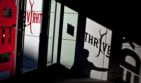
Alphabet Arm recently collaborated with our good friends at Brandon Bird Design to design the branding elements for the latest TEDx Cambridge event: Thrive. The one-day event went over fantastically and we are proud to have been a part of this gathering of regional intellectuals and innovators. The talks, demonstrations and performances focused on an exploration of our brains and bodies, questioned the relationship between nature and nurture, and examined the different understandings of the good life — in essence, how do we thrive?
Brandon Bird Design, a multi-disciplinary design firm specializing in exhibit design, approached Alphabet Arm to contribute by designing the Thrive logo, printed collateral and consult on the signage and multimedia displays. Together, we created a logo that would literally represent the idea of a thriving organism. A logo that could show growth, progress, and vigorously flourish. The final logo solution was a mark that had several stages of growth and expansion that would reveal itself over the event.
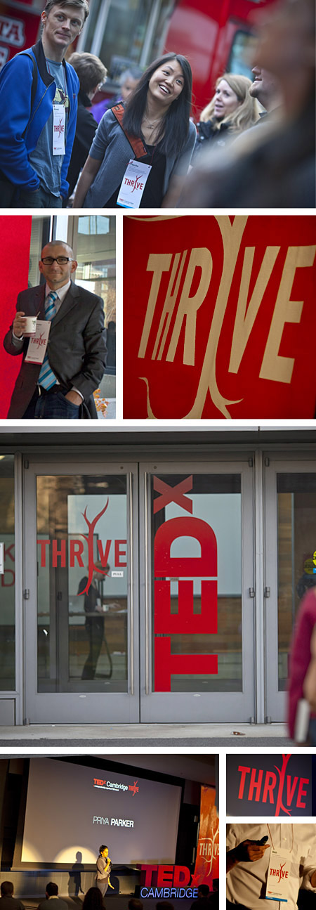
Special thanks to Justin Ide for the stellar photography : http://www.justinide.com/
Amory Man

Our friends at Amory Group (a marketing agency specializing in social, digital and inbound marketing services) asked us to create an illustration incorporating their logo (which we happened to design a couple years back). Tim Linberg, the founder, described his vision as an old school superhero ripping away his dress shirt to reveal the Amory Group insignia emblazoned across his crime fighting costume. Of course, we covet any project that draws on vintage printed material (especially of the comic book or sci-fi genre) as inspiration. Below is a detail image that depicts the distressing and the mottled texture we developed to create a vintage, golden age look. Also, check out the original pencil sketch we presented before fully rendering the final illustration. This was a fun one to work on and Amory Group seems to think it’s just super.

The Coolest Geeks We Know

G2 Technology Group is an information technology consulting firm focusing on ongoing support, technology consulting, and information technology project management. In other words, “High tech solutions from down to earth people.” They do an outstanding job of taking care of all of the technological mumbo-jumbo and explain it in simple terms that anyone can understand. If you’re in search of an awesome team of geeks (we mean that in the best way possible) to act as your outsourced IT department, we highly recommend them.
We’ve collaborated with these fine folks on several projects over the past few years, including rebranding G2 from the logo up. So, when they asked us to design their new website, we were quite enthusiastic to get started. Usually — if anyone asks us about designing websites — we run for the hills screaming in fear. You see, designing websites isn’t really our bag. Why, you say?… the simple answer is that we just don’t enjoy the process anywhere near as much as we enjoy designing for print. It has to be a pretty special project with amazing people for us to bend our rule. In the case of G2, it was a no-brainer.

We kicked off the project by organizing a photo shoot of the G2 team. Based on their unequalled customer service and emphasis on the human side of IT we understood the importance of showcasing the people behind the scenes.The photographic theme was continued throughout the site by featuring images of the Fort Point Channel area of South Boston (where G2 proudly calls home). We also introduced a system of simple icons to help users understand the complex offerings described on the site.

All of this web design talk is given us a headache; we’re spending the rest of the afternoon with a pencil and a sketchbook.
On The Mark…

We were hired by our long-time collaborators, BzzAgent, to design a print piece for the Draftmark tap system. Draftmark enables customers to have draught beer straight from the tap, right in the comfort of their own home.
The collateral utilizes a gloss foil stamp contrasted against a sleeve of uncoated, felt textured, cover stock (sorry to get all print-nerd on you). We were able to harness of an already nicely designed brand and tailor it toward the specific audience of BzzAgent.

Shine On You Crazy Gem
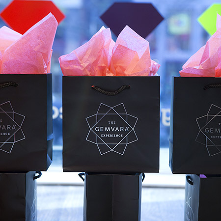
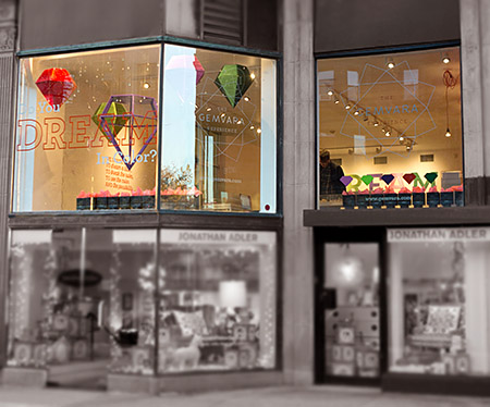
He went to Jared? We should hope not. We had the unique opportunity to work on The Gemvara Experience retail store with our key partners, Heart and Brandon Bird Design. Being a successful online, custom jewelry destination, the Newbury Street location is Gemvara’s initial foray into a brick and mortar storefront. We designed the logo and store branding and worked closely with Brandon Bird to develop the concepts – and ultimately – execution of the window displays, wall installations, signage, display cases and general aesthetic of the store. A multitude of partners, vendors, architects, electricians, carpenters, painters, former interns, friends of former interns, friends of intern’s friends formally known as friends, were all employed to help us realize the vision.
We introduced a cornucopia of mediums and fabrication techniques to the project. As a studio specializing in print design, we embraced the chance to really push ourselves as 3 dimensional, creative problem solvers. Look for a full blown case study on our portfolio soon, but for the time being, go create some custom jewelry and see the space for yourself!
The Golden Rule in your Cotton Bureau
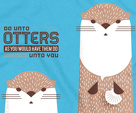
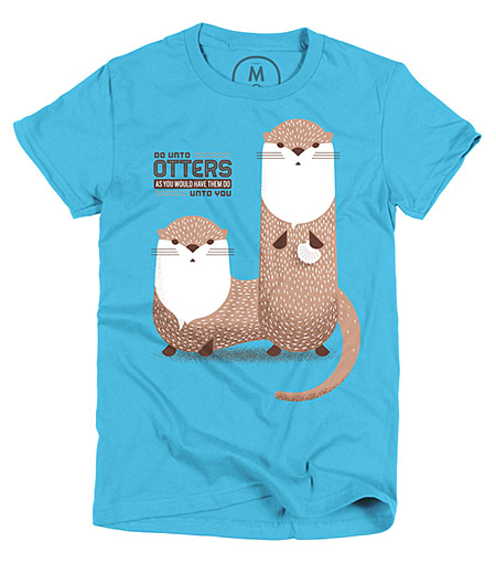
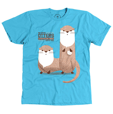
That’s right, our shirt The (wearable) Golden Rule is being featured on a fantastically radical store. Cotton Bureau is a curated online community for design and tech-focused t-shirts.
Why The Golden Rule you ask? What better way to remind ourselves to be good human beings, and treat our fellow man with respect and honor? And if a sweet set of otters, and a little pun re-mix helps us do that, well…then we all win.
The catch is, you only have a couple days to order your own as the production window is quickly closing, get to it!
Hers:
His:
You just might be our Type.
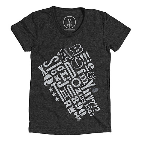
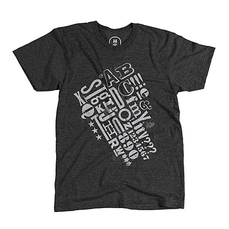
Lovers of Typography, we come to you bearing good tidings. Our previously-sold-out, ode to archival typography t-shirt, is now available again. Christmas miracle? Perhaps. Only available for a limited time – most definitely.
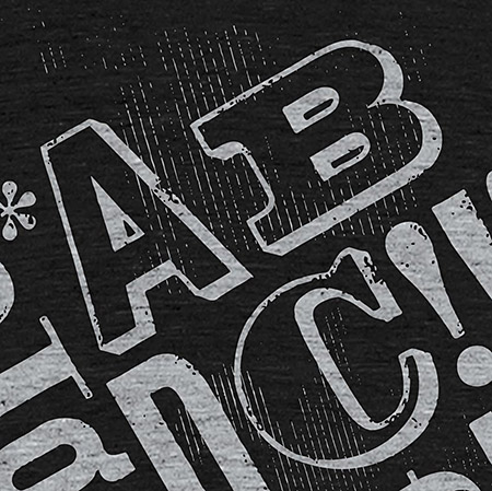
Our “Awesomely Alphabetical” t-shirt is now being featured on a fantastically brilliant, radical online shop > Cotton Bureau. It features a two color imprint on a luxurious, American Apparel tri-blend, heather black tee. The hitch is, you only have a couple days to order yours as the production window will be quickly closing, grab your here. Happy Kwanzaa!
Hers:
His:
We H E A R T Coffee
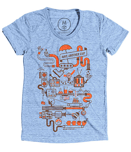
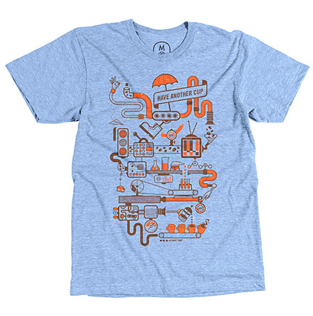
It’s no secret, at Alphabet Arm, we love coffee. In fact, we think it’s the most important meal of any given day. Simply follow our proprietary brewing system for a perfect cup!
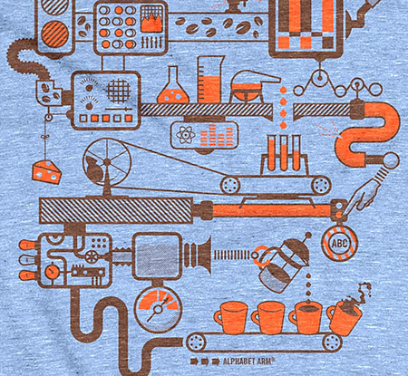
Our “Coffee Contraption” t-shirt is now being featured on a fantastically cool online shop, Cotton Bureau. Cotton Bureau is a curated online community for design and tech-focused t-shirts. These are ultra-soft, Athletic Blue, Tri-Blend American Apparel shirts. That all sounds like the perfect cup – right? There is a catch – you only have a couple days to order your own as the production window is quickly closing, grab your here.
Hers:
His:
Ivanna > Out
Hello again! You know that cliche saying, “time flies?” Well, it is overused for a reason, it is the truth.
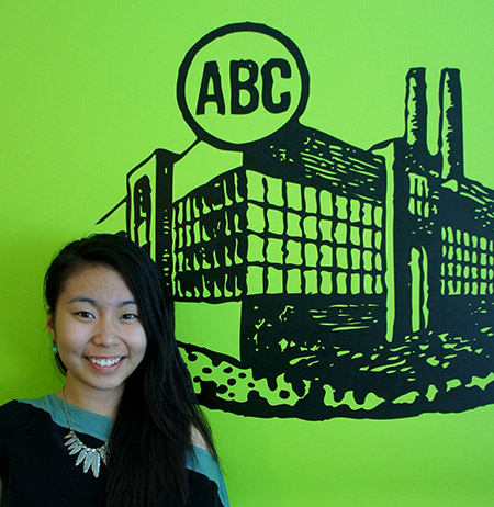
This summer has gone by faster than I imagined. To be honest, I don’t know if I am quite ready to start college this fall, graduate from Youth Design, and leave Alphabet Arm. Why do all good things have to end so quickly? What I love about being a Youth Designer is that every summer is a whole new experience. And thanks to Alphabet Arm, my final summer as a Youth Designer is more than what I could’ve asked for. As an up and coming graphic design college student, I was uncertain that I made the right decision with my major. I’ve never really done graphic design other than creating school flyers here and there. Not only did the team at Alphabet Arm exposed me to this new world, they made me love it.
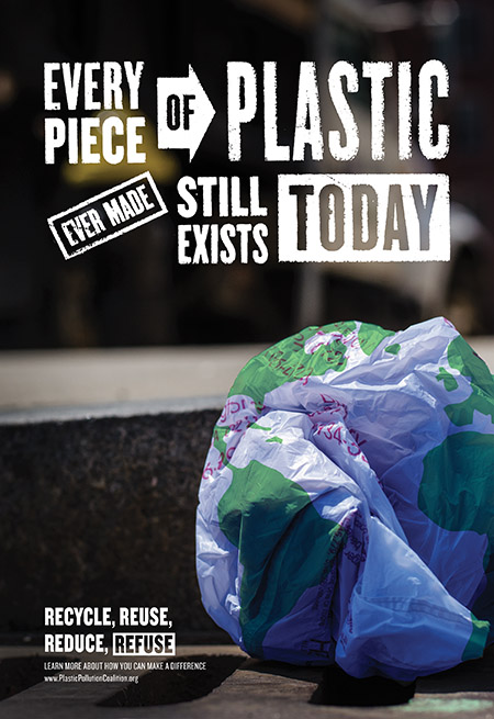
Beside the client projects I had the opportunity to work on, I’ve been designing a poster for the past few weeks. This is my submission to Youth Design’s annual Take Action competition. The mission is to design a campaign poster that raises awareness for a cause, or social issue we are passionate about. With the help of my Alphabet Arm peers – I developed the concept, art directed the photography and customized some typography for this poster – that I’m really proud of. Wish me luck on the competition!
I’ve gained so much from just working on a few projects and observing how the other designers work. Although, I’m still not an amazing designer (just yet), I’m definitely a better one thanks to the incredible Alphabet Arm team!
Weighing in on the ‘Grams
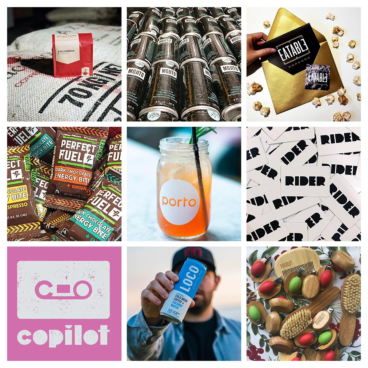
Marketing your service, product or business has changed forever. It is remarkable how differently (and successfully) savvy companies use social media to promote their brand. The power of platforms like Instagram to use imagery and video content to create awareness and engage with new consumers is by far my preferred medium.
Its always inspiring to see companies I brand pop up in my feed, here are a select few doing it right:
Gracenote
Altatude Beverage Company
Eatable Popcorn
Perfect Fuel
Porto
Rider
Copilot
Loco Coffee
Rhoost
P.S. you can always find me at @alphabetarm