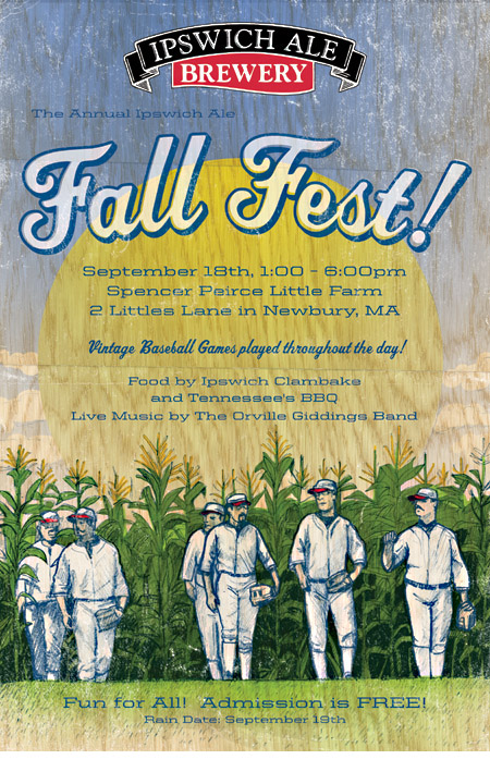
 The Mercury Brewing Company hired us to design the poster for their annual Ipswich Ale “Fall Fest.” We were immediately excited to hear the day’s events included a vintage baseball game played with historically inspired uniforms and mustaches to boot! Alphabet Arm’s pal and all around master illustrator, Alan Pearsall, worked up the image we based the design around. Integrating color and texture to his pencil drawing was an honor. With hopes of perfectly imperfect registration, we lovingly weathering the image. We were also rather inspired by the notion of printing on a wooden crate, hopefully these visual strategies helped knock this one outta the park.
Alphabet Arm Intern Army
Just a little off the top…

We often work closely with The Boston Conservatory to design posters for their stage productions. This time, the Halloween inspired show is Sweeney Todd, The Demon Barber of Fleet Street. We were going for simple and striking with a bit of victorian elegance. The bloody barber pole seems like a perfect metaphor for the main character of the musical… besides, we never miss an opportunity to make a drippy mess of ink on paper. And while the barber pole is the “punch line” for the poster, creating the ornate framework for the type treatment turned out to be just as creatively satisfying.
Embracing Individuality

If you’re a regular reader of the bloggery, you may know we do quite a bit of design work for BzzAgent and their word-of-mouth marketing clients. From time to time we’re asked to design various projects for their internal use. In this case, as BzzAgent was reassessing their company values, they asked to us to create a piece showcasing each of their affirmations. Although we were quite temped to design an inspirational poster involving a majestic bald eagle, we opted for a expressive typography approach. The project took shape of a poster that could be perforated into six core values for display around the office. Employing a vivid, but limited color palette allowed us to create unity from one statement to the next. The end result is a striking new poster for BzzAgent and it doesn’t hurt that we created a design using multiple arrows and lightning bolts — a win-win in our book.
Geared up!

Once again, we have designed a poster to promote the latest production from The Boston Conservatory.
“Factory Girls tells the story of best friends Sarah Bagley and Harriet Farley, factory operatives in Lowell, Massachusetts in 1844. High wages and a chance to improve their family’s lives draws Yankee farm girls to the “City of Spindles” by the thousands. Even after laboring for up to fourteen hours a day, the girls write and publish their own company-sponsored publication, The Lowell Offering, which becomes a worldwide literary phenomenon. When working conditions deteriorate due to competition and economic hardship, Sarah speaks out against the corporation; Harriet, as editor of the Offering, refuses to sacrifice the gains the women have made. The resulting battle rips their friendship apart and alters the course of the American worker.”
Our intent was to create a poster with a dark, ominous feel to reflect the struggles and harsh working conditions of the characters. We were especially excited to find scans of the antique newspapers that inspired the production… which we quickly incorporated into the design itself.
These Boots Were Made For Walkin'

We just put the finishing touches on the poster design for “The Balcony” — the latest production presented by The Boston Conservatory. The setting of the play is a brothel in the midst of revolution. Thus, the director asked us to combine the aesthetic of propaganda posters with provocative imagery (but not too suggestive, of course). The idea was to portray the strange mixture of sex and politics that runs through the play. Design inspired by propaganda posters has been quite popular of late, so we pushed ourselves to put our own personal interpretation on the style.
Amory Man

Our friends at Amory Group (a marketing agency specializing in social, digital and inbound marketing services) asked us to create an illustration incorporating their logo (which we happened to design a couple years back). Tim Linberg, the founder, described his vision as an old school superhero ripping away his dress shirt to reveal the Amory Group insignia emblazoned across his crime fighting costume. Of course, we covet any project that draws on vintage printed material (especially of the comic book or sci-fi genre) as inspiration. Below is a detail image that depicts the distressing and the mottled texture we developed to create a vintage, golden age look. Also, check out the original pencil sketch we presented before fully rendering the final illustration. This was a fun one to work on and Amory Group seems to think it’s just super.

Tastes Like Medicine

Here is a first look at a branding project we are currently finishing up. “Know the Signs, Know Sepsis” is a campaign for the Boston Medical Center to increase awareness of the life threatening condition of severe sepsis. As a studio, we embrace the opportunity to take on different types of design work and show our range — and who knows, we might even learn something in the process. In addition to the logo design, we also named this campaign. We’ll post a more comprehensive look at the project once all of the posters, pens, pocket cards, notepads and buttons are back from production. Now go eat your veggies.
King of the Jingle Jangle Jungle
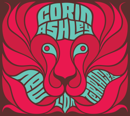
Featuring bouncing basslines, soulful vocals, lush production, and a definitive “from-across-the-pond” inspiration (it was partially recorded at Abbey Road!), here’s the cover for New Lion Terraces. As with any CD Art Direction project, it was a challenge to nail down a visual style for Corin Ashley’s new, full length album. After exploring a wide variety of designs, illustration styles, and photo manipulations, we landed on the simplest solution: draw a lion. Duh. Making use of a bright color palette, boatloads of custom typography, and a psychedelic-yet-refined visual style, we were able to achieve a vibe that was 1/2 throwback and 1/2 twentythirteen.
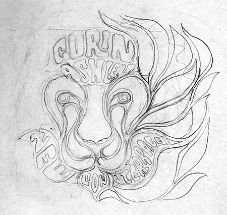
Here’s a peak behind the curtain of the rough sketch we later refined:
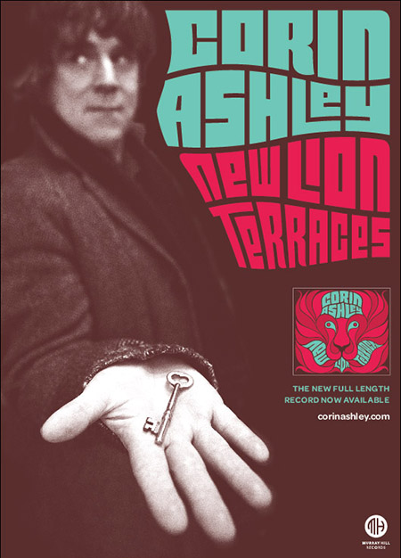
And the complimentary show poster, Grrrrrrrrrrrrrr:
Ivanna > Out
Hello again! You know that cliche saying, “time flies?” Well, it is overused for a reason, it is the truth.
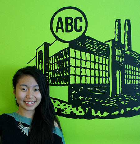
This summer has gone by faster than I imagined. To be honest, I don’t know if I am quite ready to start college this fall, graduate from Youth Design, and leave Alphabet Arm. Why do all good things have to end so quickly? What I love about being a Youth Designer is that every summer is a whole new experience. And thanks to Alphabet Arm, my final summer as a Youth Designer is more than what I could’ve asked for. As an up and coming graphic design college student, I was uncertain that I made the right decision with my major. I’ve never really done graphic design other than creating school flyers here and there. Not only did the team at Alphabet Arm exposed me to this new world, they made me love it.
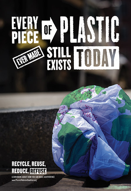
Beside the client projects I had the opportunity to work on, I’ve been designing a poster for the past few weeks. This is my submission to Youth Design’s annual Take Action competition. The mission is to design a campaign poster that raises awareness for a cause, or social issue we are passionate about. With the help of my Alphabet Arm peers – I developed the concept, art directed the photography and customized some typography for this poster – that I’m really proud of. Wish me luck on the competition!
I’ve gained so much from just working on a few projects and observing how the other designers work. Although, I’m still not an amazing designer (just yet), I’m definitely a better one thanks to the incredible Alphabet Arm team!