In order to start the year off on the right foot, we’ve teamed up with Flagship Press to create a unique, fine-art inspired calendar. The coolest aspect is that each month will feature radically different artwork and printing techniques. Each month will serve as a handy guide to different print processes and paper stocks, as well as ample eye-candy. The calendar comes with an all-in-one easel/envelope. When you are done viewing a particular month, you can store it in the envelope for later reference.
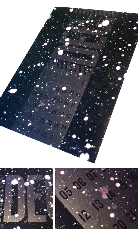
As we kick off the new year, we can’t help but to look even further forward to what lies ahead for humanity. The other source of inspiration for January is a collection of satellite photos being released by High Resolution Imaging Science Experiment (HiRISE), capturing the surface of Mars. Simultaneously familiar and alien, these images sparked our creative fires and our imaginations; leading us to wonder what marvelous technologies the future will bring. After all, we’re also still waiting for our very own flying DeLoreans.
January’s calendar was printed on 12 pt. Nordic cover stock, with process inks. Additionally, it was printed with both matte and UV gloss varnishes to give extra contrast between the dull and shiny surfaces.
We’re offering the calendar for sale on our store. You can get it both as a yearly subscription, or just your favorite month. Take a look here.


Calendar Insert
February, The Saga Continues

Well, it’s a new month—so you know what that means! It’s time for our newest addition to the Alphabet Arm / Flagship Press 2010 calendar. February features a blind-emboss matched with opaque white ink on the stunning Curious metallic silver stock.
The name February comes from the Latin word “februum,” which translates to purification. After the densely-layered imagery we created for January we wanted to make something stark and elegant to purify our “design” palettes—if you will. As a studio we obsess over typography and we certainly enjoyed creating this strictly-typographic composition. Did you know that February doesn’t always have a full moon? This year it ends with one!
Interested in ordering one? We have both subscriptions and single month pieces available on our BigCartel store.


March: Fasten Your Seat Belts

If you hadn’t guessed, we’re huge fans of vintage comics and the campy look of old B-movies. Our March calendar takes the old adage about March weather: In like a lion, out like a lamb and gives it a fresh new take. Finally a project where we can illustrate some boss muscle cars. Zipatone dots and out of register printing on French Paper’s newsprint cover stock gives the piece a truly authentic feel. Flagship Press hooked us up with a killer print job of 2 colors overprinting to create a third. You can get your hands on a subscription to the entire set of calendars here.

April: Hidden Messages
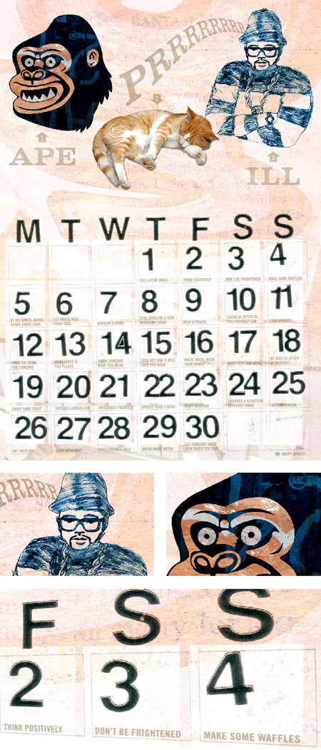
Sure, we’ll admit we’re slaves to our computers and fancy-pants design applications, but we consider them just another tool we use within our creative process. Back in the early stages of our collective careers, a number of us cut our teeth using pencils, Letraset, transparencies, and copy machines. We genuinely enjoy the process of rolling up our sleeves and getting our hands dirty in honor of creating honest design. It allows us to feel less confined by perfect alignment and precise registration and actually embrace all the imperfect little characteristics that often occur. Not to mention that we really dig apes, cats and old school hip hop. Given that, we decided to put our spin on an advent calendar and offer some thoughts or activities to make each day of April a little more fun. By printing all the type as an offline, tinted varnish utilizing Pantone 8340 (10% to be precise), we achieved a slightly “hidden message” vibe to the piece.

Let us set the record straight

Isn’t there something completely satisfying about a vinyl record? One with a sleeve and full-size artwork and even the subtle imperfections from being touched by human hands. Now don’t get us wrong, we’re all for the convenience and portability of digital music, but we’ll always have a soft spot in out heart for records. Flagship Press helped us out with an amazing print job on the May edition of our calendar. Double hits of white and the fluorescent Pantone 805 printed on the ultra-dark Black Kromekote make the label visually pop off the paper. And for the added touch of reality, we’ve used a contrasting dull spot varnish to define the ridges in the record. Did we mention we had them actually drill the center hole?
Boombox-BBQ-Android

June is here and that means that we’re at the halfway point of the year and our calendar project. It also means that summer is has finally arrived — and what’s more reminiscent of summertime than a makeshift robot dancing in the sunshine? We created our boombox-BBQ-android by making a collage of clippings from old magazines and catalogues. We asked Flagship Press to print the metallic spot colors on uncoated paper, Strathmore Grandee in Blazer blue. The textured stock gives a nice understated quality and has a rich tactile feel that demands to be handled.
Did you know July is "National Sweatshirt Month?"
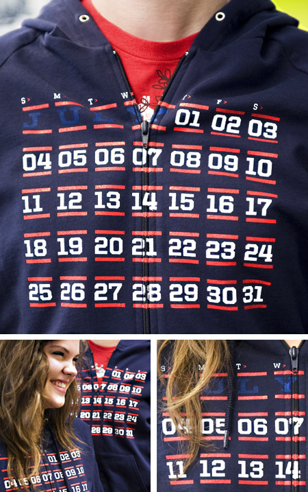
One of the primary objectives of Alphabet Arm is to achieve authenticity within our work. What can we say – we appreciate realism. As well versed as we are in Photoshop’s tools & trickery, we always prefer to “do the real thing” whenever possible. The idea of designing and screen-printing a shirt came up early in the calendar brainstorming process. Sure, we could have cheated it but it seemed like a great opportunity to share a different side of our studio process. We called on some valued colleagues to assist us with the vision. Like Alphabet Arm and Flagship Press, both Liz Linder Photography and Mammoth Printshop value the process of working closely with their clients and place a very high value on customer service. We all tend to treat our clients the way we would want to be treated. Once we were done designing the calendar & sweatshirt, we flew the files over to Mammoth, two weeks later we had “product” in hand. Liz Linder came by the next day for the photo shoot and we were ready for Flagship’s top notch print production! Go Team!

Proud as a…
On quite a few occasions we have discussed the idea of having a studio pet. The obvious choices have been proposed: dalmatian, guinea pig, canary or possibly a turtle named Gary. None of those options were colorful enough for a design studio. So…a peacock seemed like a perfect solution. Part of the inspiration for this month’s design comes from the artwork of fruit crate labels produced in the mid 1950s. We respond to the bold and vivid aesthetic of these classic American labels. As we got deeper into the design process, we proposed the idea of treating Hank (the peacock) as a die-cut to add some dimension to the calendar. Watch where you step.
Still Crankin'

September is half over (already!) and these have been circulating around for a couple weeks, so we figured it’s high time to share them with the rest of world. Our focus was to give props to Flagship Press and their commitment to the environment. Whether it’s printing with soy inks on recycled paper or delivering the finished product in their hybrid SUV (with graphics designed at Alphabet Arm), Flagship Press has made it a priority to run an environmentally sound business. They’re even proud to say that they are 100% powered by the wind energy. That said, we based the design on historical reference. The vibrant colors and geometric, flat shapes were inspired by the posters created for the Works Progress Administration in the 1930’s and 40’s inspired us to create the artwork for September. It’s a call to arms to take responsibility for our own actions and their impact on our environment. Our hero cranks away at the inner workings of a factory powered by nature. Don’t ask us how it all works, the patent is pending.
It's Alive!

This one is for Rube

"Twelve Calendar Inserts and a Partridge in a…"

Winner Winner Calendar Dinner
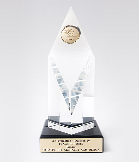
In 2010 Alphabet Arm teamed up with Flagship Press to create a unique, fine-art inspired calendar. Our favorite aspect was that each month featured radically different artwork and gorgeous printing techniques. On top of that, the calendar came with an all-in-one easel/envelope. Well…we were recently informed the co–branded promotion won a Pinnacle Award! Look at us!

Need to be reacquainted with this calendar wizardry? Have a look-see.